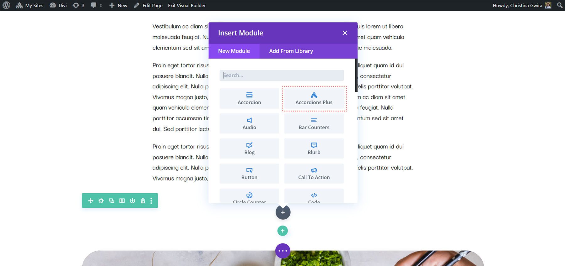
Divi Plugin Highlight: Divi Accordions Plus
Divi Accordions Plus is a third-party module for the Divi Builder that adds a new accordion builder. Use multiple Divi Accordions Plus Modules together on a single page and they work as a single accordion, so when one opens another one closes. Style the accordions together or individually, display icons and images, and lots more. In this post, we’ll look at Divi Accordions Plus, see what it can do, and see how easy it is to use to help you decide if it’s the right product for your needs. We’ll use the Poke Restaurant About Page Layout as a backdrop for this tutorial. So if you haven’t downloaded it already, you can grab it now with your Divi membership.
Divi Accordions Plus Module
Divi Accordions Plus adds a new module to the Divi Builder. Simply add the module anywhere you want within your Divi layouts.
Accordion Submodules
The submodules create individual accordions. Add as many as you want by clicking Add New Item. You can also clone them, rearrange them, and delete them. They follow the settings in the main module, but they have specific content and design settings you’ll need to use.
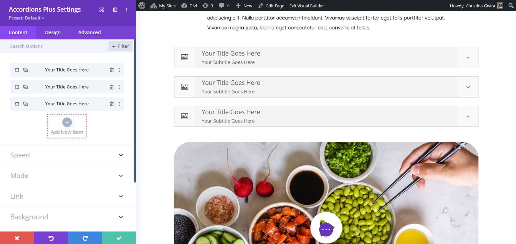
Content
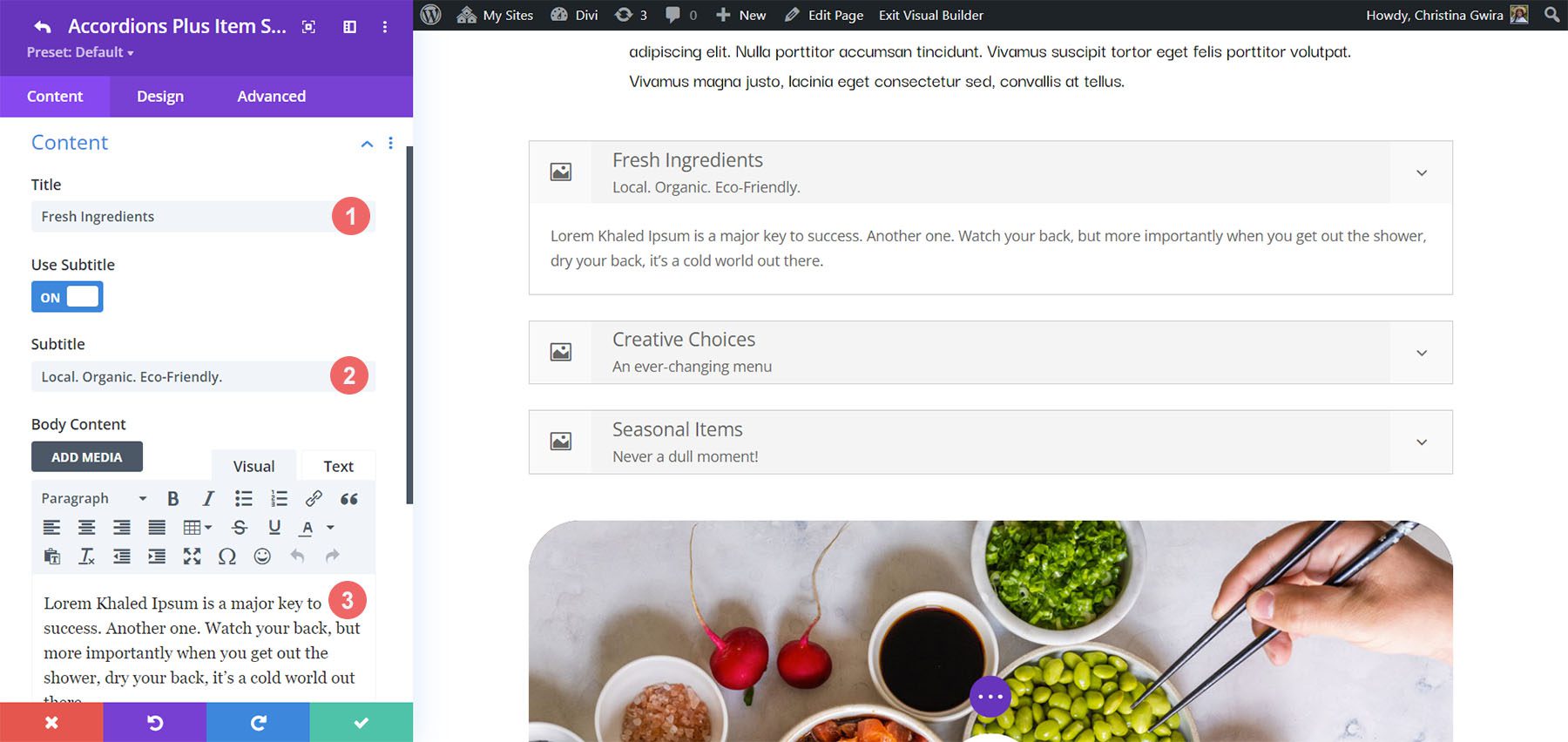
Add a title, subtitle (which you can disable if you want), and body content. These are the main elements of the accordions.
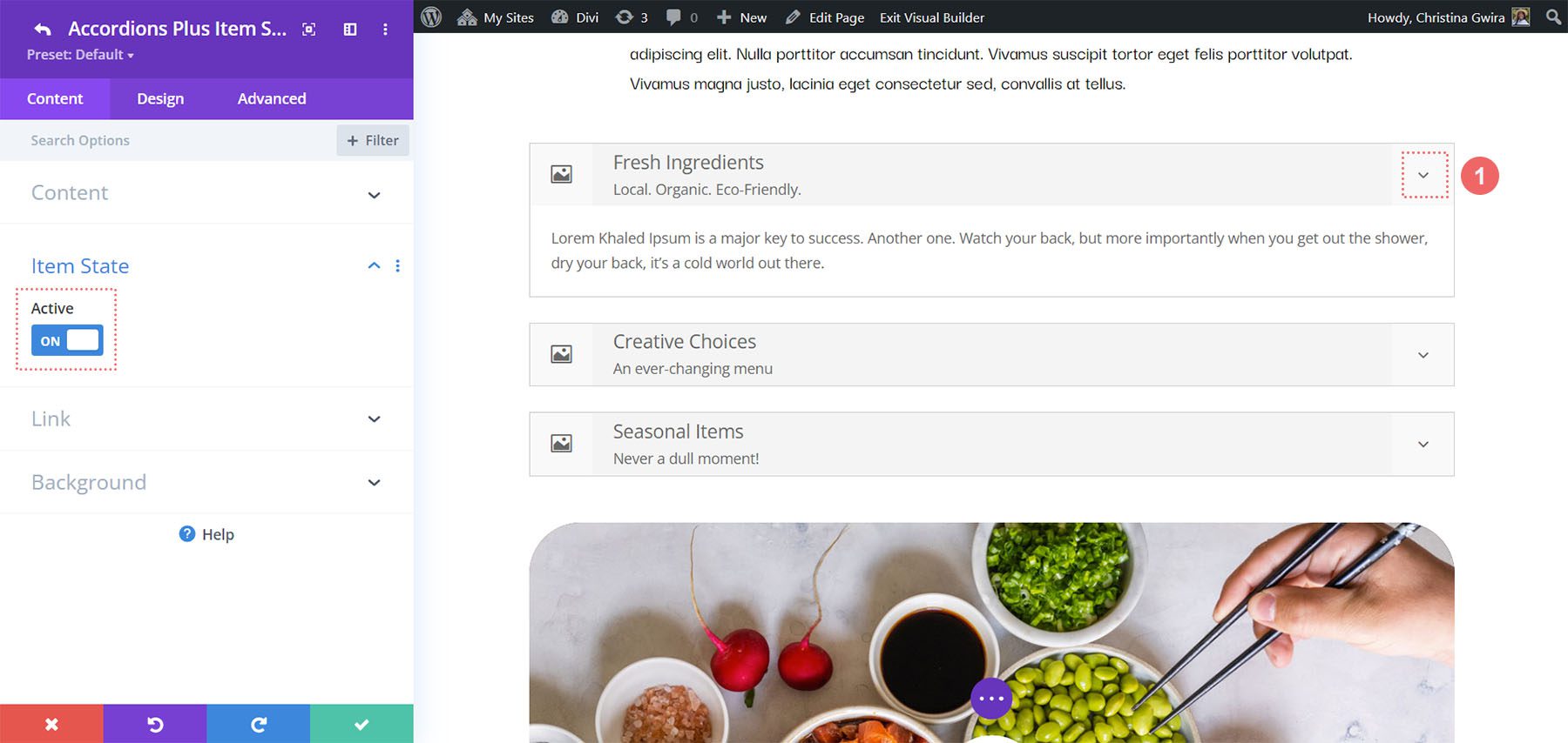
Item State
Item State sets the open or closed state of the accordions when the page loads. It’s off by default, so the accordions are closed. I didn’t open the accordion in this example. It opened automatically when I enabled Item State.
Divi Accordions Plus Accordion Submodules Design Settings
The Design tab for the submodules controls the settings for that one accordion. You can customize them in the main module’s settings if you want them to look the same, but you’ll still need to use these settings to choose the images and icons. Let’s look at the settings that are unique to the submodule.
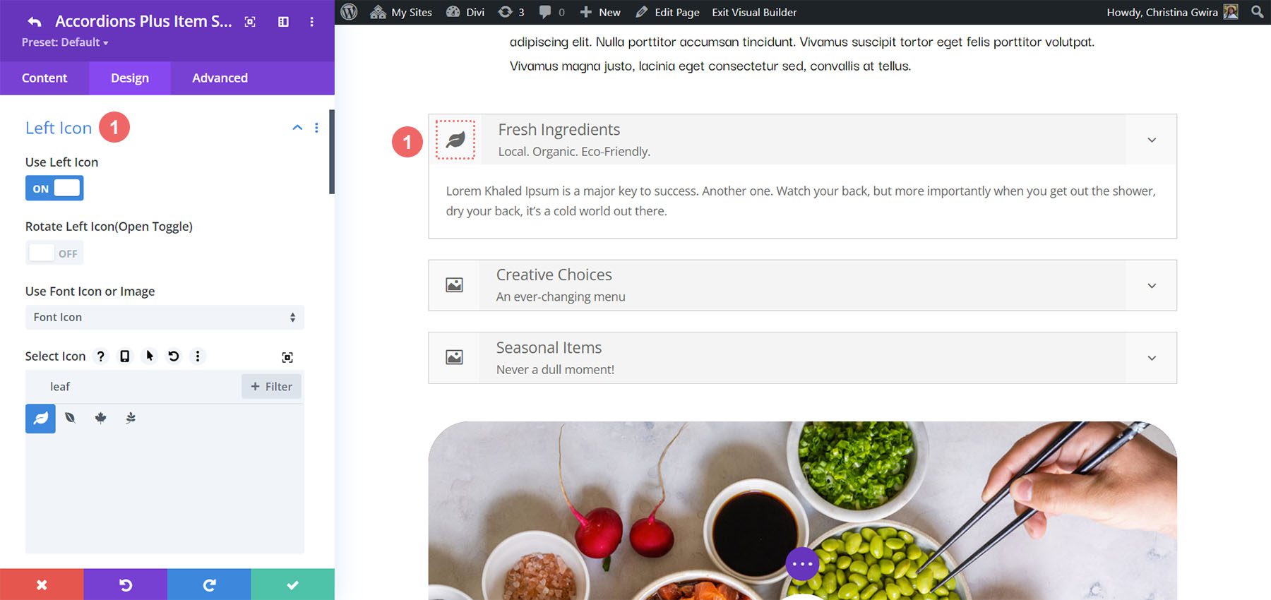
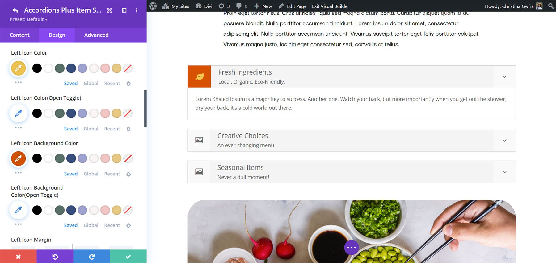
Left Icon
Left Icon controls the graphical element that appears on the left of the accordion. Enable or disable it, have it rotate on open, choose an icon or an image, and style it with the standard Divi tools. An image or icon such as a logo works great on the left. In this example, I selected an image and enabled Rotate Left Icon (Open Toggle), so the image rotated when I opened the accordion.
For this example, I’ve adjusted the background and icon color.
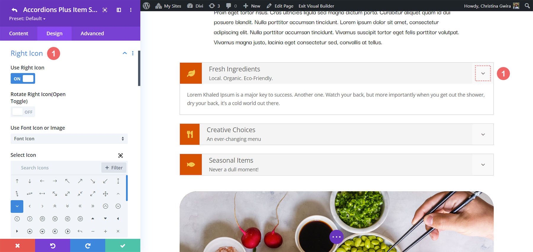
Right Icon
Right Icon controls the graphical element that appears on the right of the accordion. Enable or disable it, have it rotate on open, choose an icon or an image, and style it with the standard Divi tools. An icon that indicates the open or closed state of the accordion works great on the right.
In this example, I’ve selected a different icon, changed the icon color, the background color, and added a styled border.
Divi Accordions Plus Content Settings
The Content tab includes the basic Divi settings and a couple of settings that are specific to Divi Accordions Plus.
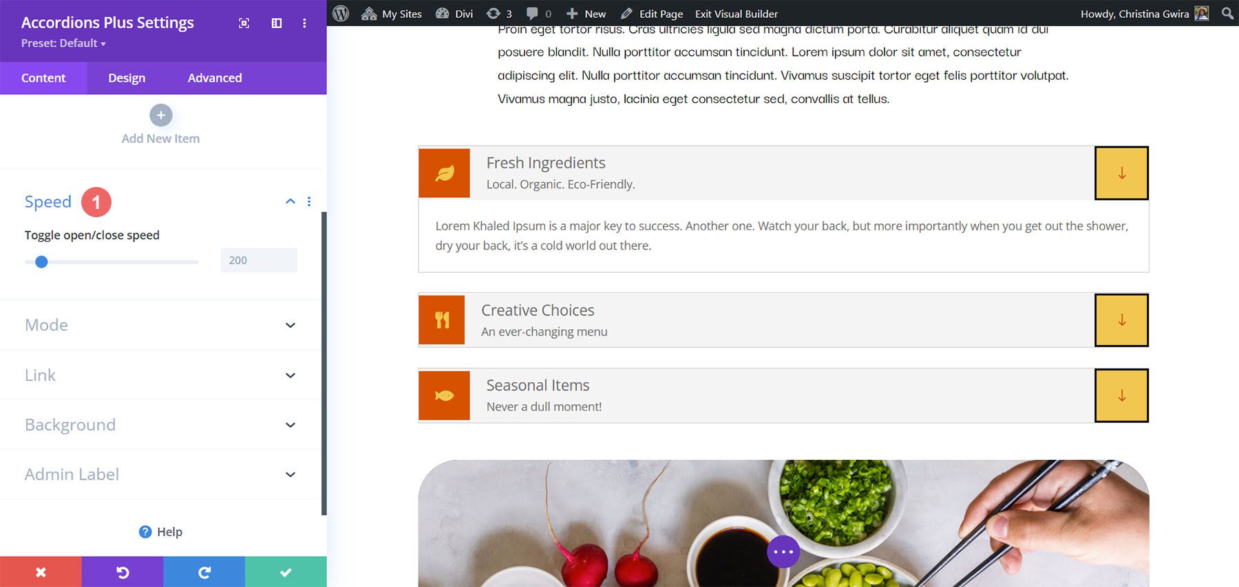
Speed
Speed controls how fast the toggles open and close. It’s set in milliseconds.
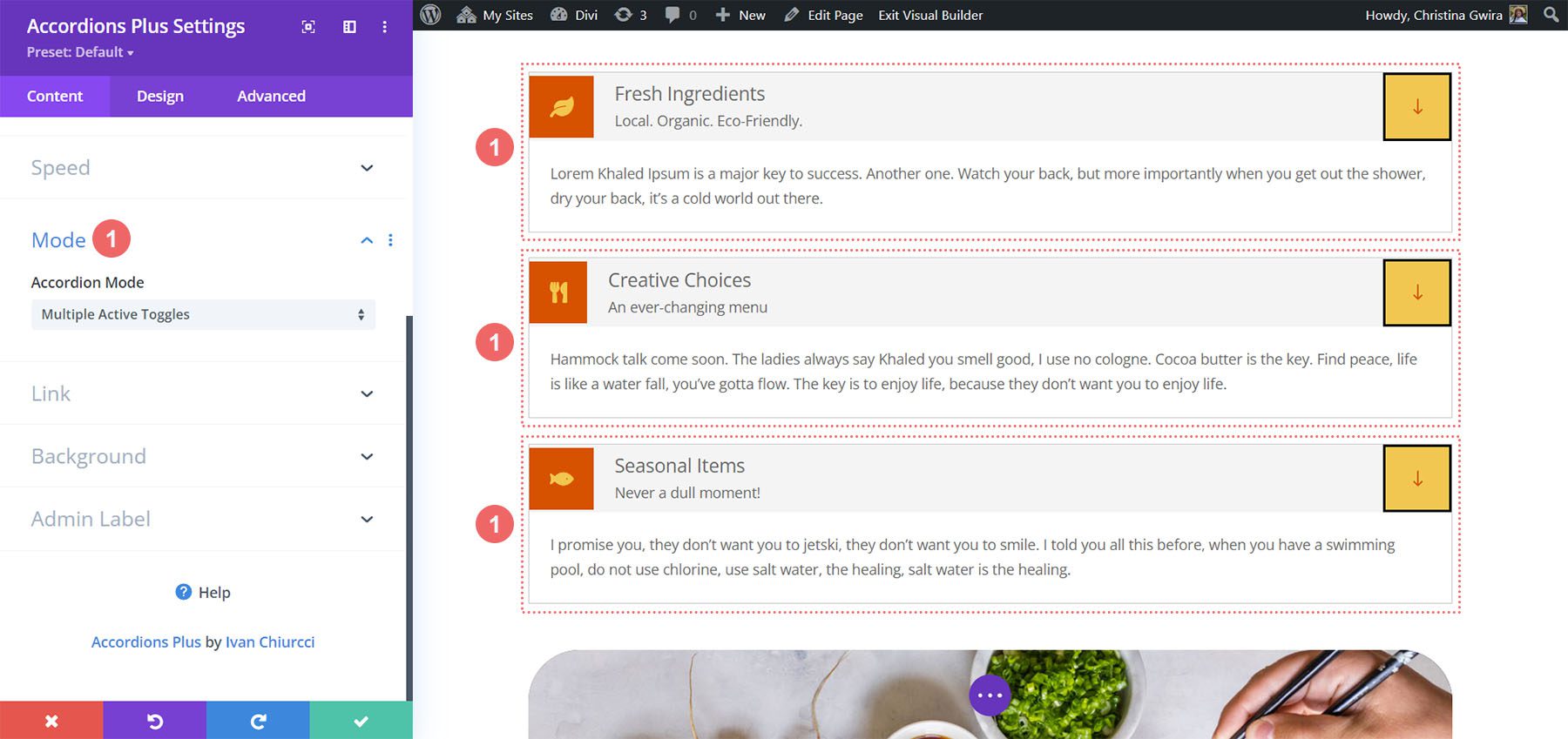
Mode
Mode changes the way the accordions work.
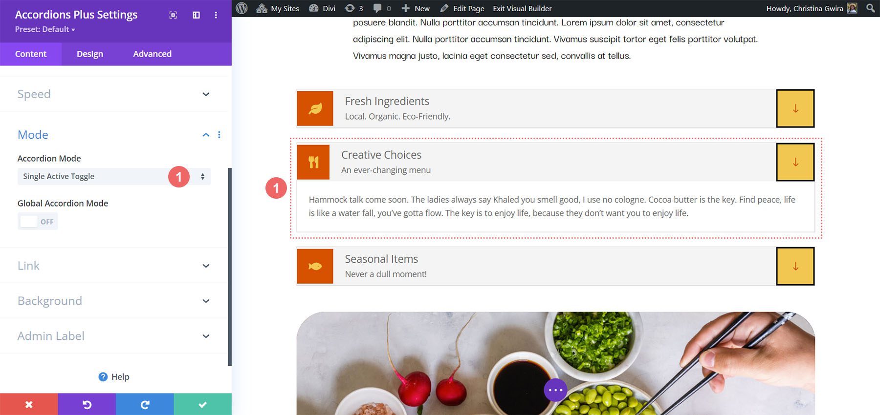
Accordion Mode
Accordion Mode lets you choose between multiple active toggles and a single active toggle. Multiple Active Toggles leave all the toggles open until the user closes them. The example below shows Multiple Active Toggles.
Single Active Toggles only allows for one open toggle at a time. It closes the open toggle when the user selects a new toggle. This example shows Single Active Toggles.
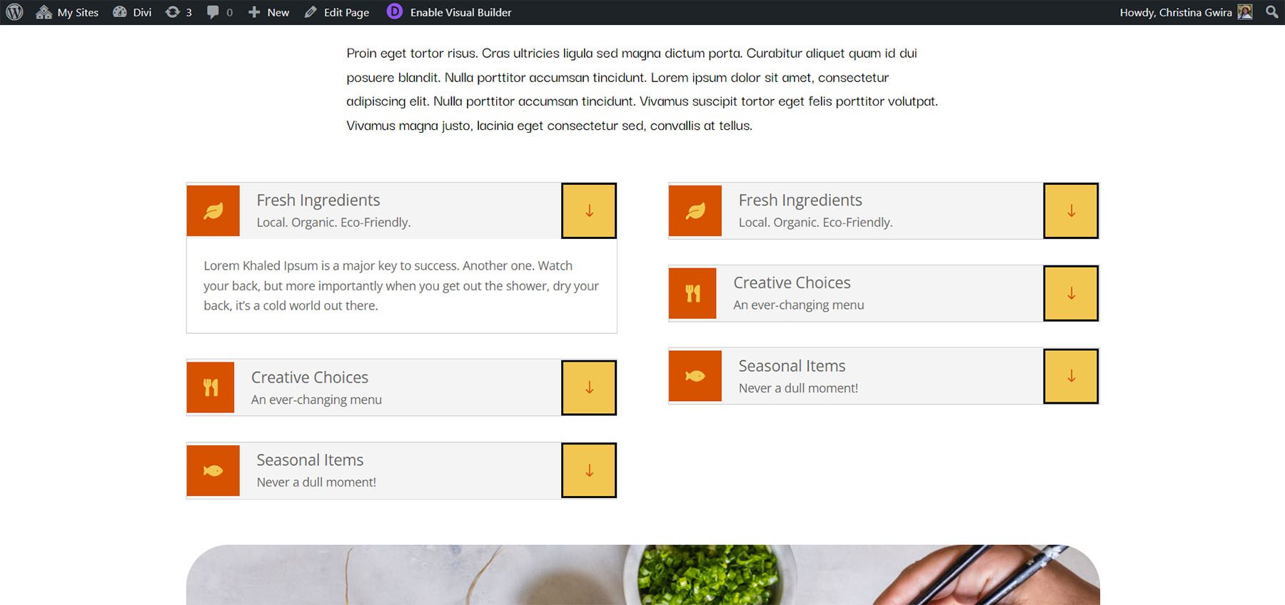
Global Accordion Mode
Global Accordion Mode is a new interesting feature. It allows for a single open toggle regardless of the number of Divi Accordion Plus Modules on the page. Enable Global Accordion Mode within every Divi Accordions Plus module on the page where you want to use the Global Accordion Mode. Any modules that do not have this mode enabled will not be affected by the mode. This is especially great for creating multi-column accordions in the same Row.
In the example below, I’ve added another Divi Accordions Plus module and enabled Global Accordion Mode for both. When I open an accordion in one of the modules, the open accordion in the other module closes.
Divi Accordions Plus Design Settings
The Design settings control the default styles for all the accordions. These settings are overwritten by the individual submodule settings.
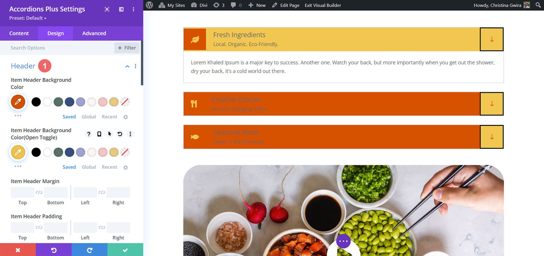
Header
Header controls the background color, the open toggle background color, spacing, borders, and box shadow. In this example, I’ve changed the background colors for the open and closed toggle.
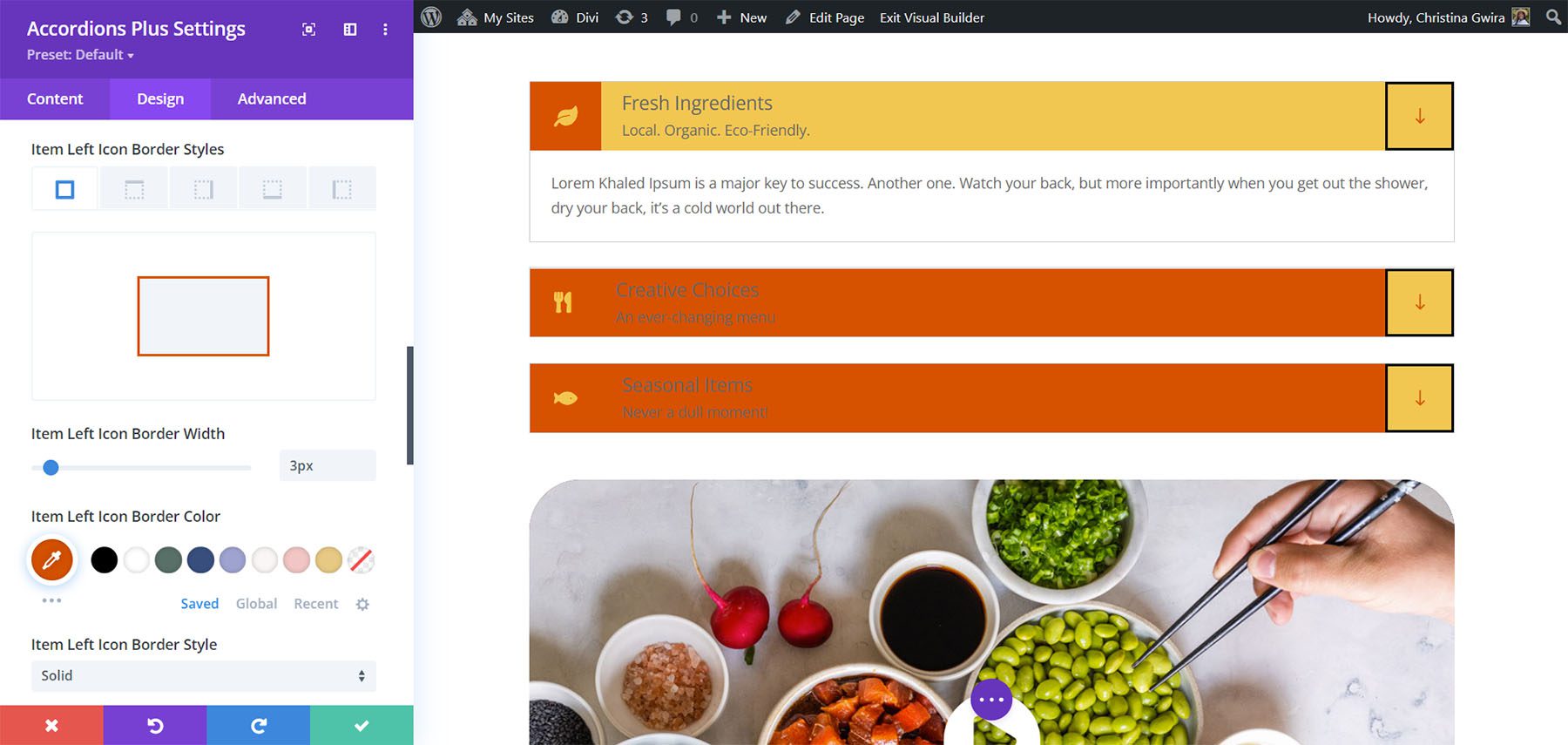
Left Icon
Left Icon controls the icon color, icon open toggle color, background color, open toggle background color, spacing, border, and box shadow for the entire accordion module. If you want to have uniformity in styling, it’s best to set up the colors of the icon here, and then individually select your icon for each toggle in the accordion. In this example, I’ve added and styled a border around the icons to make it more seamless with the background color.
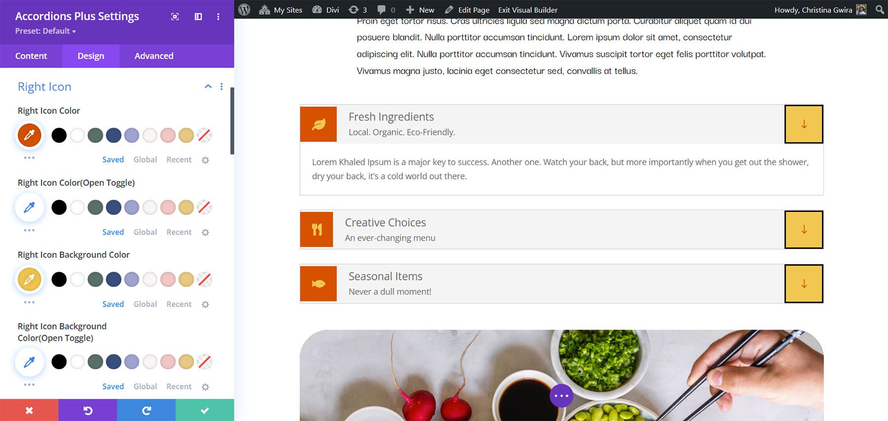
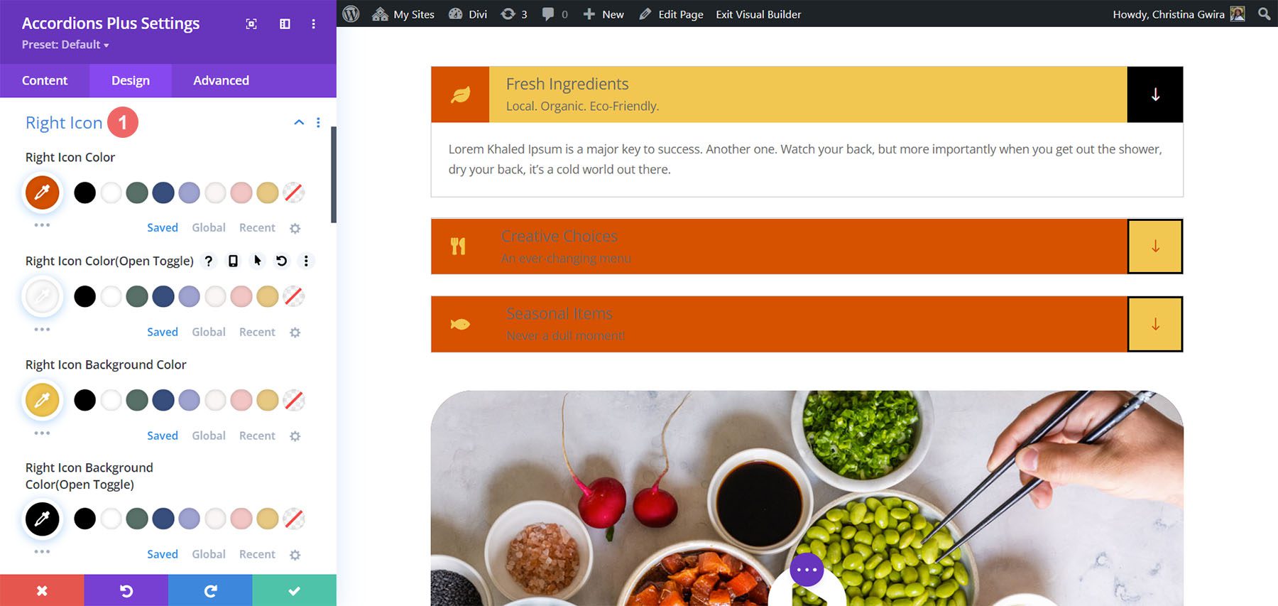
Right Icon
Right Icon controls the icon color, icon open toggle color, background color, open toggle background color, spacing, border, and box shadow. In the example, I’ve adjusted the open toggle colors, the border, and changed the icon color on open toggle.
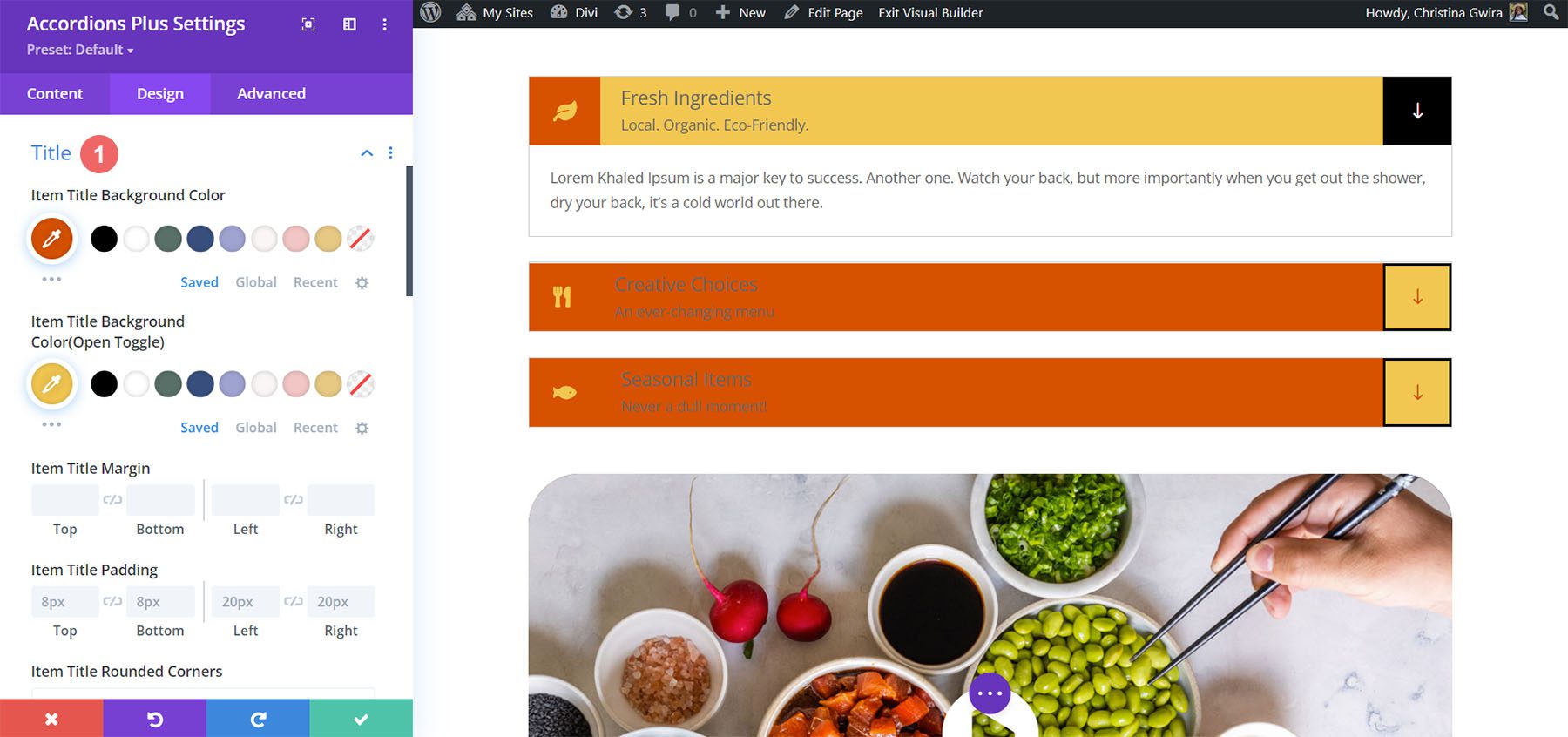
Title
Title controls the title background color, open toggle background color, spacing, border, and box shadow.
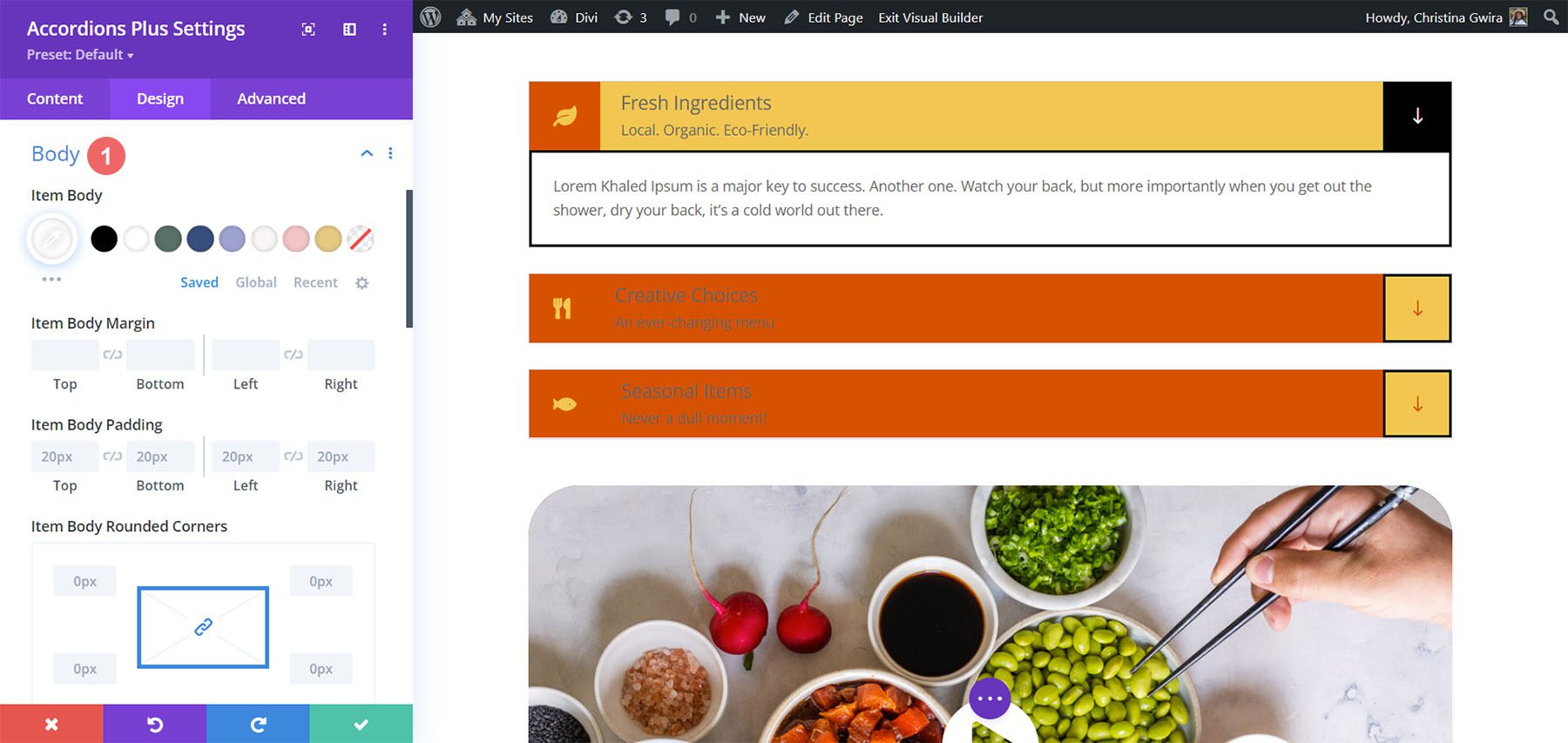
Body
Body controls the item body, spacing, border, and box shadow. I’ve adjusted the border in this example.
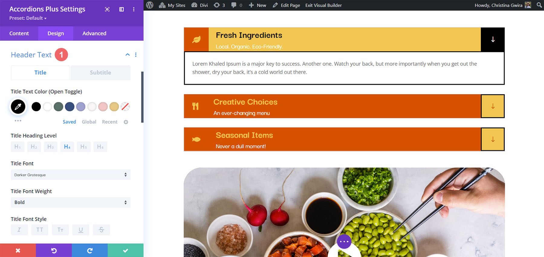
Header Text
Header Text controls the open toggle text and allows you to control the title and subtitle independently from the same menu. It includes all the standard text controls. I’ve adjusted the colors of the titles and subtitles, changed the title font size, and set it to bold in the example below.
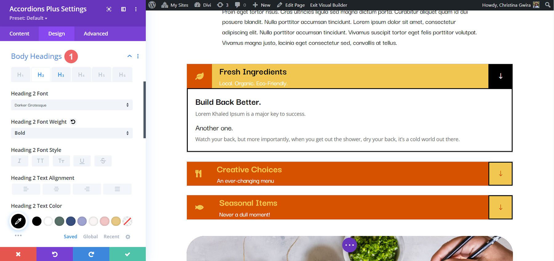
Body Headings
Body Headings includes all the standard text controls for the body headings that you’ve specified in the content area. In the example below, I’ve added both an H2 and H3 heading tag to the body content. I changed the font weights and color for both the headings within the body content.
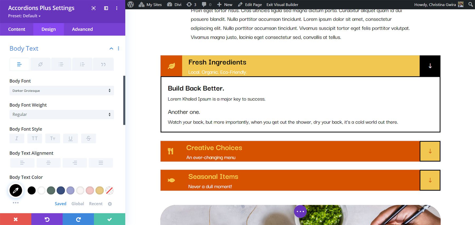
Body Text
Body Text includes all the standard text controls for the body text in the content area. In this example, I’ve changed the font, made it italic, changed the color, and changed the font size.
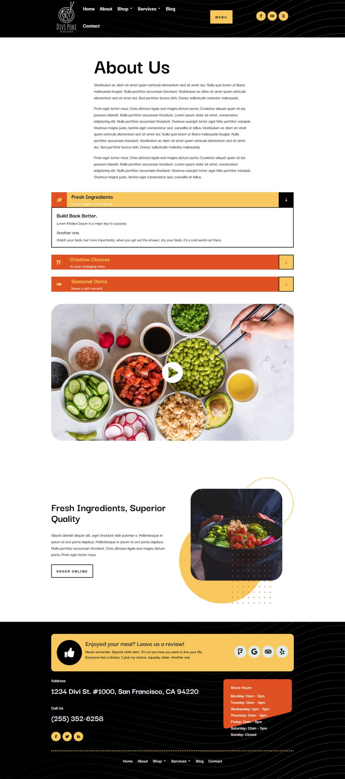
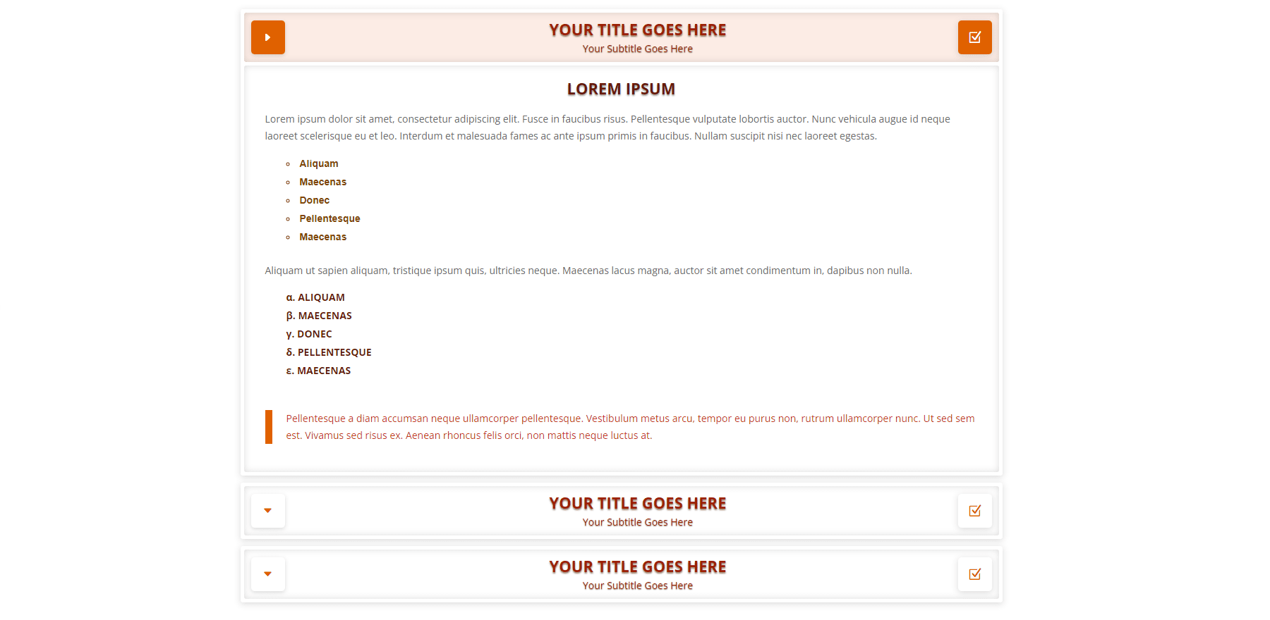
Final Demo with Divi Poke Restaurant
This is what the final accordion looks like within the About Us Page Layout for the Divi Poke Restaurant Layout Pack.
Divi Accordions Plus Demos
Divi Accordions Plus comes with seven demos to get you started.
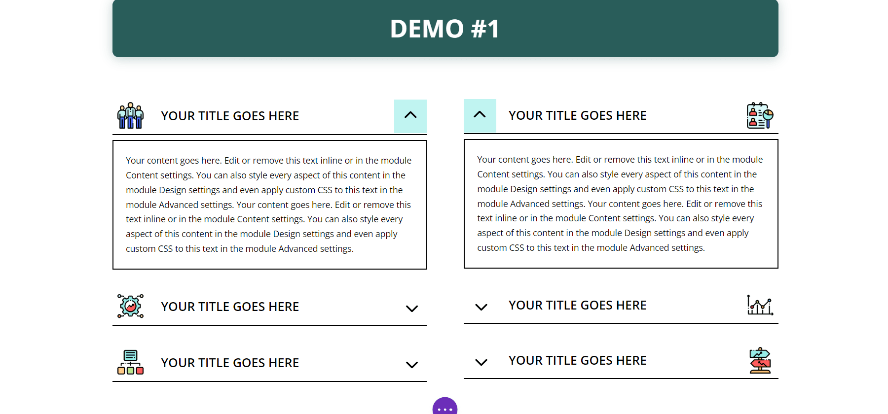
Demo 1
The first demo includes a multi-column accordion with multi-colored icons. The accordions have a single border, and the content is bordered on all sides.
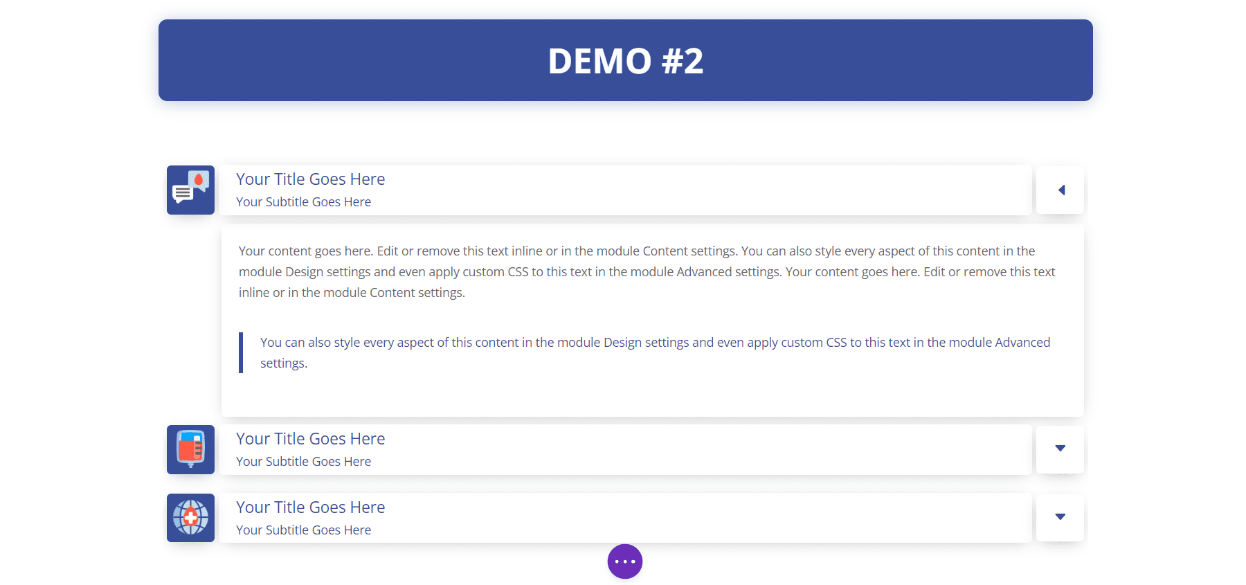
Demo 2
Our second demo presents the accordion in a single column with blue highlights and box shadows. The icons have blue backgrounds.
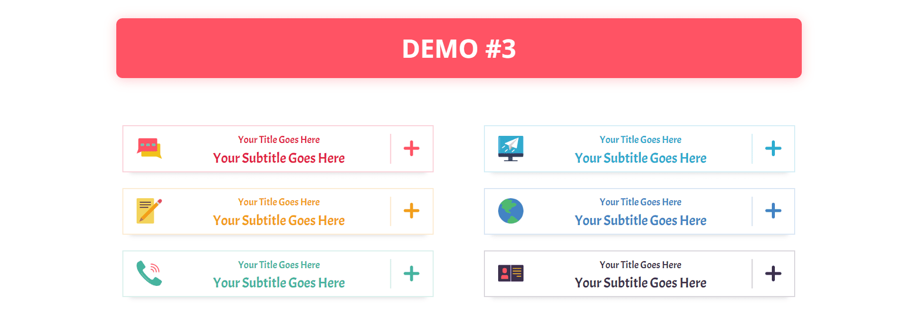
Demo 3
Our third demo uses a two-column layout and utilizes different colors for each of the accordions.
Demo 4
The fourth demo uses a single-column accordion with warm colors and light borders.
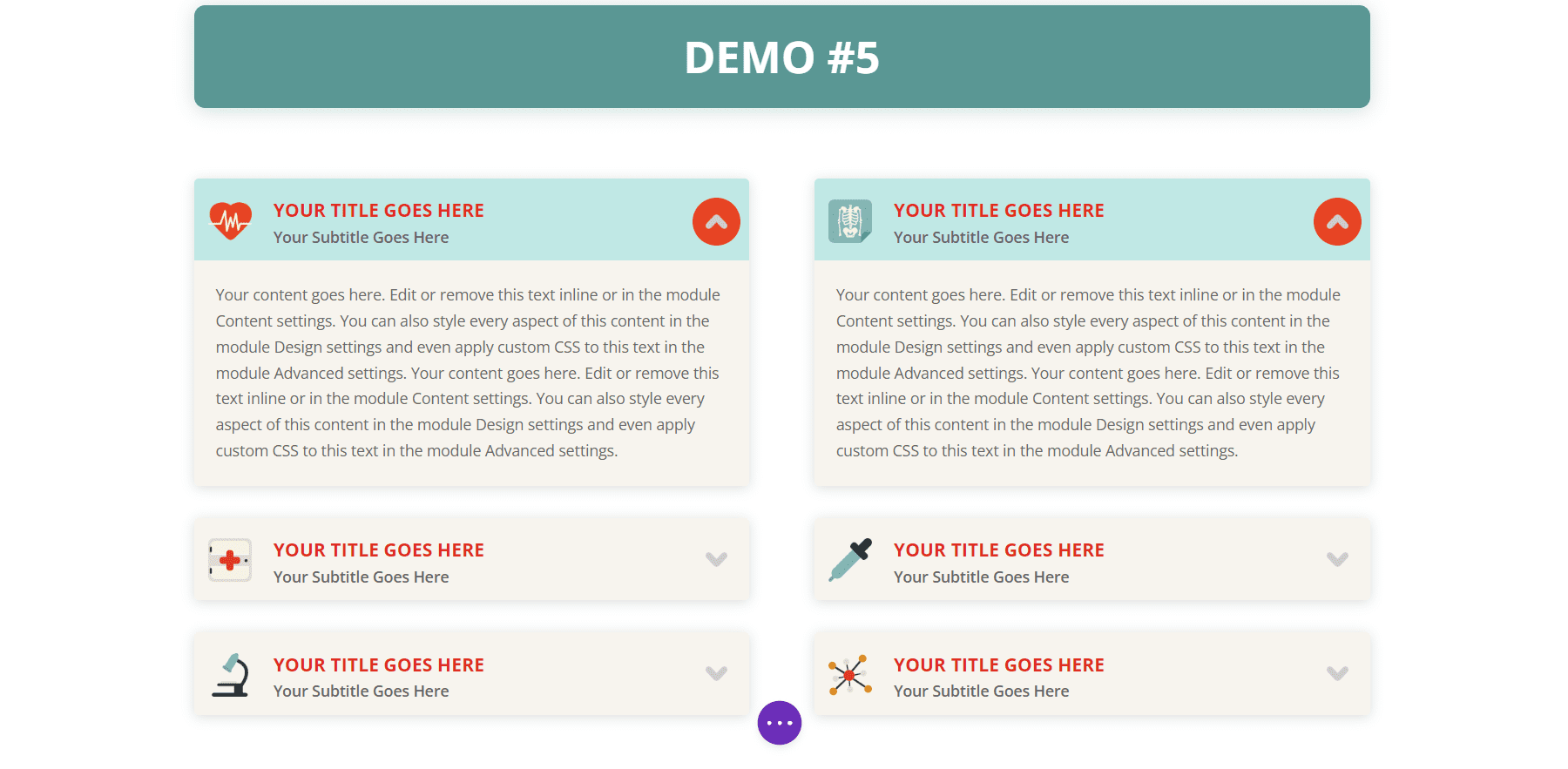
Demo 5
Demo five uses red titles and icons and includes tan backgrounds for the body and green backgrounds for the headers. The accordions are placed in two columns.
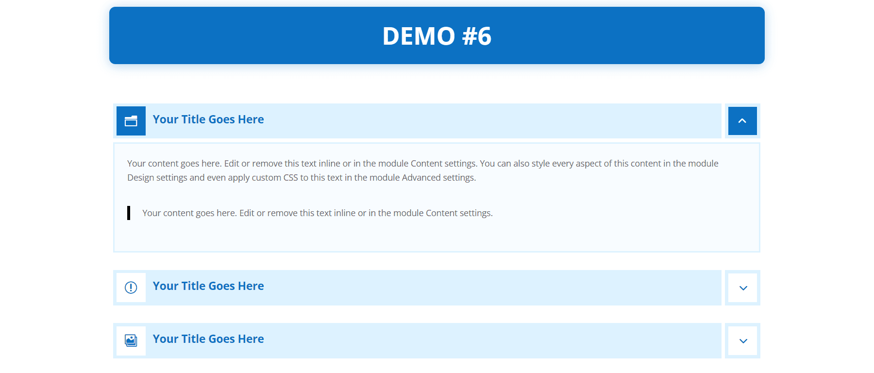
Demo 6
The sixth demo uses light blue header backgrounds with a darker blue for the title text and icon background for the open accordion.
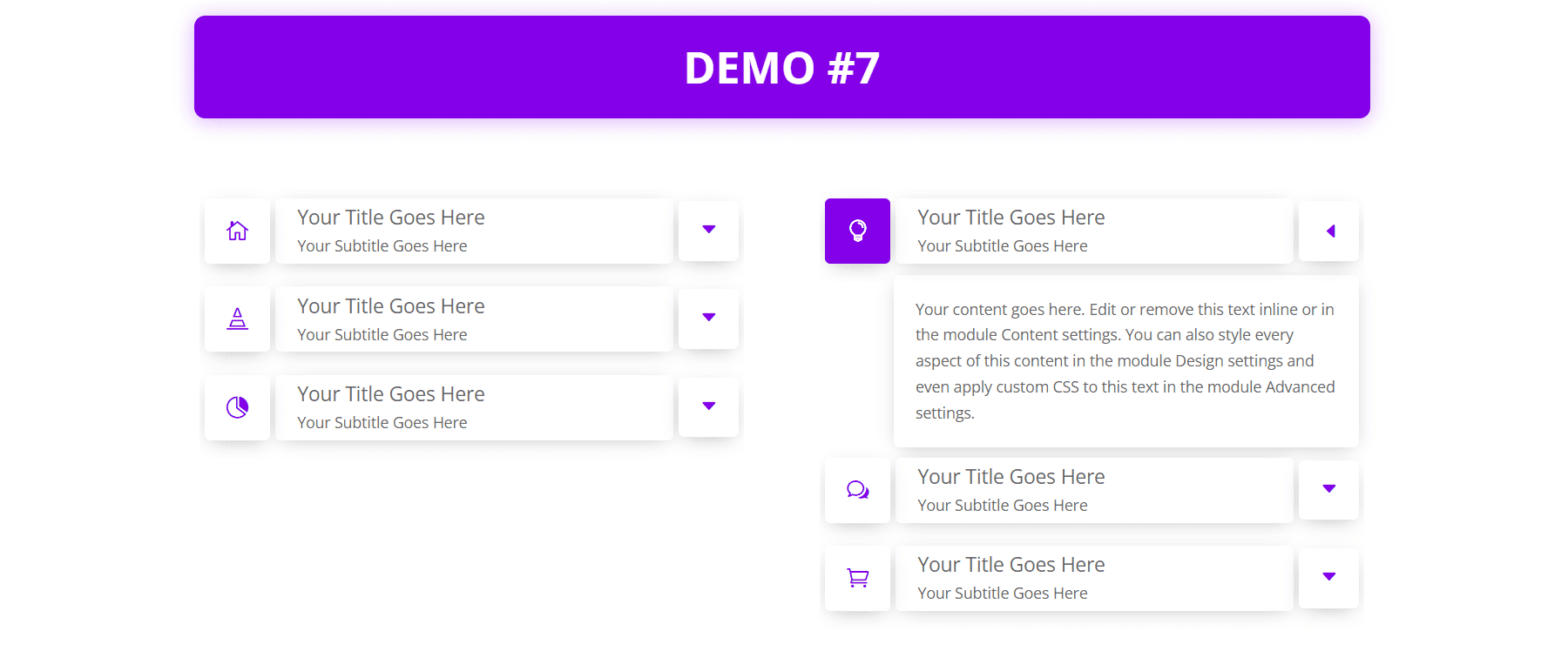
Demo 7
Demo seven displays each of the accordion’s elements independently with box shadows for each element.
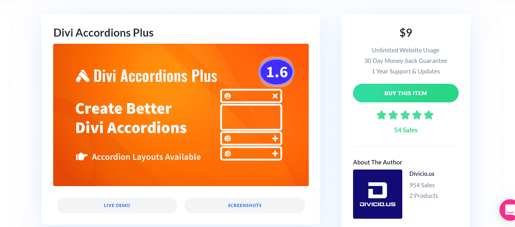
Purchase Divi Accordions Plus
Divi Accordions Plus is available in the Divi Marketplace for $19. It includes unlimited usage, a 30-day money-back guarantee, and one year of support and updates.
Ending Thoughts
That’s our look at Divi Accordions Plus. This is a simple module, but it includes a lot of features for accordions. I especially like that it works with multiple modules on the same page. I found the settings intuitive and every setting I wanted to adjust was there. If you’re interested in a powerful accordion builder that’s easy to use, Divi Accordions Plus is worth a look.
We want to hear from you. Have you tried Divi Accordions Plus? Let us know what you think about it in the comments.
The post Divi Plugin Highlight: Divi Accordions Plus appeared first on Elegant Themes Blog.
The Tech Zone


Comments
Post a Comment