How To Create A Responsive Image Mosaic With Divi 5’s CSS Grid Editor
An image mosaic combines photographs of different sizes in one connected grid. Larger tiles highlight selected images, while smaller tiles fill the spaces around them.
With Divi 5’s CSS Grid Editor, you can build this arrangement visually, resizing and positioning tiles directly on the grid canvas.
In this tutorial, we’ll build a twelve-image mosaic across four columns, create four larger feature tiles, and coordinate the image styling with a preset. Then we’ll adapt the layout for tablet and phone.
Why Image Mosaics Need Responsive Adjustments
A mosaic gets its shape from spans. A tile can stretch across two columns, two rows, or both, creating an arrangement of larger and smaller images.
Those spans need attention when the screen narrows. A tile spanning two columns cannot fit within a single-column grid without an adjustment. An inherited starting position can also place an item outside the intended columns. These settings can create extra grid tracks, gaps, or horizontal overflow.
The goal is to review the placement rules at each breakpoint, keeping the spans that still fit and adjusting those that do not.
Where The Grid Editor Comes In Handy
The CSS Grid Editor shows the grid’s tracks, gaps, and item placement together. Drag a corner to resize a tile or move an item to another position. Divi records these changes as Grid Offset Rules on the container, which is the Row in this example.
Use the device icons at the top of the builder to switch between Desktop, Tablet, and Phone. At each breakpoint, review the inherited layout and add the column, gap, and placement adjustments it needs.
What The Mosaic Looks Like At Each Size
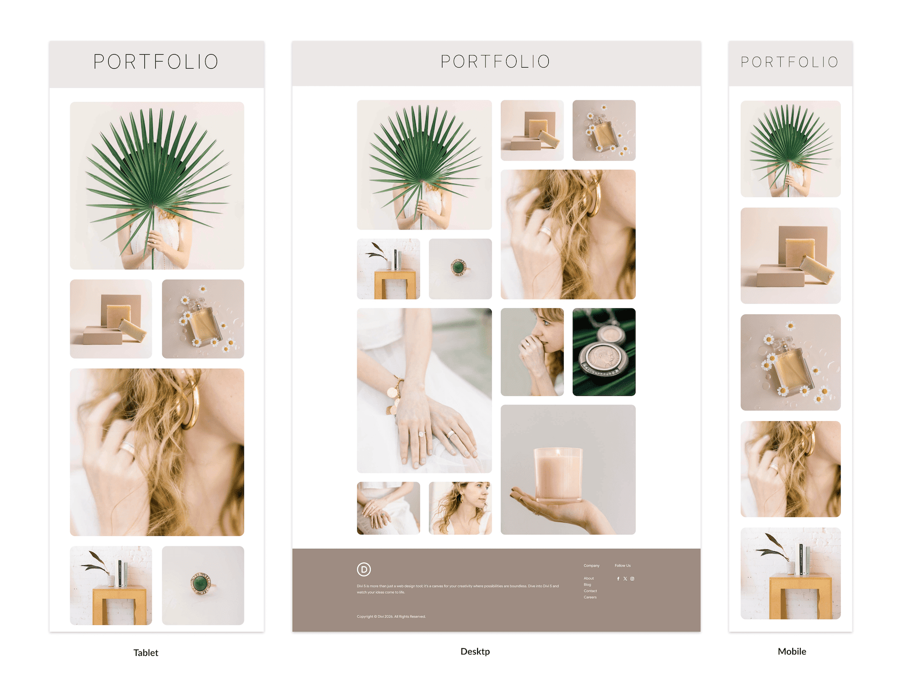
Here are the three layouts before we build them. Desktop uses four columns, with larger feature tiles alternating between the left and right.
Tablet uses two columns. The feature tiles span the full grid width, while the smaller images sit in pairs between them. Phone uses a single column, giving every image its own place in a vertical sequence.
Step 1: Add The Row And Open The Grid Editor
Add a new Row to your Section and give it 12 Columns, as shown below. Each child Column will hold one image.
These twelve content Columns are separate from the grid’s track count. We’ll arrange them across four grid tracks on desktop.
Open the Row settings, go to the Content tab, and click Open Grid Editor. If the button is not available, set the Row’s Layout Style to Grid under Design > Layout first.
The editor opens as a floating panel that you can reposition while you work.

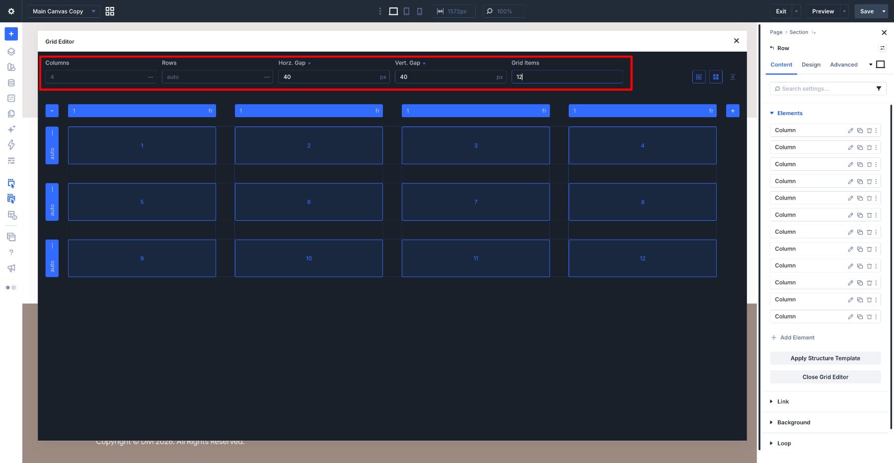
Set Columns to 4 and leave Rows on auto so the grid can create rows as needed. Set both Horz. Gap and Vert. Gap to 40px.
Use 12 in the Grid Items field to preview the twelve child Columns. This field controls the editor’s preview items; it does not add content Columns to the Row.
Turn on Show Grid Lines and Show Track IDs using the controls on the right. These visual guides make it easier to follow the tracks and check where each tile sits.
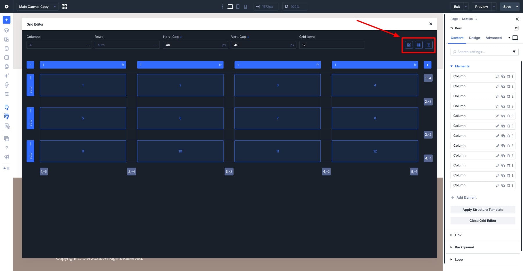
The canvas now shows four equal tracks, each sized at 1fr, with twelve numbered items. Next, we’ll turn four of those items into larger tiles.
Step 2: Shape The Feature Tiles On The Canvas
Start with item 1. Grab its bottom-right corner handle and resize it to cover two columns and two rows. It should occupy the top-left block of the grid.
As the item expands, the surrounding items reflow according to their placement rules. A chip labeled Rule 1 appears to identify the new rule.
Next, resize item 4 to cover two columns and two rows on the right. Position it across the last two columns in rows two and three.
This gives the first two feature tiles a staggered arrangement, with smaller images filling the spaces beside them.
Continue with items 7 and 10, giving each a two-column, two-row span. Place item 7 on the left below the first group, then item 10 on the right, offset one row lower.
Follow the arrangement below, leaving space for the smaller tiles and checking that none of the feature tiles overlap.
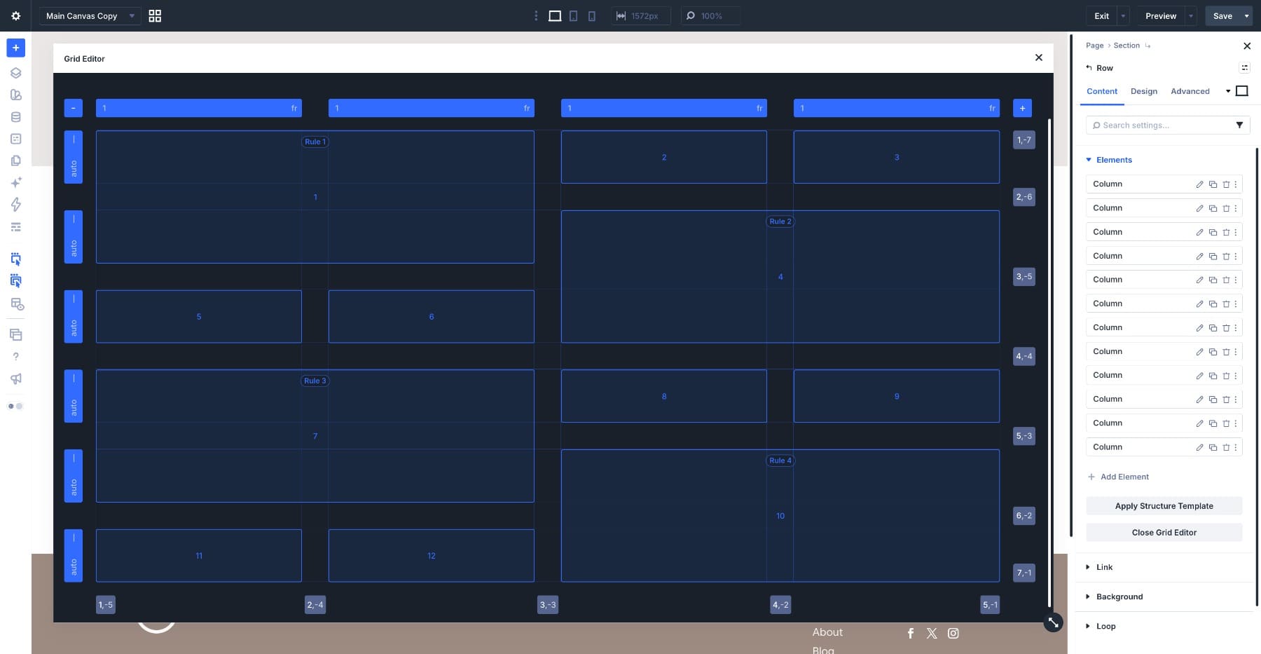
You now have four larger tiles alternating between the left and right, with eight smaller tiles arranged around them. Check the numbered preview items against the example before adding the images.
The placement rules belong to the Row. The Image Modules we’ll add next provide the content inside each tile.
Step 3: Add The Images And Style Them Once
Add an Image Module to each of the twelve child Columns and select a photograph for each one. Item 1 supplies the first feature image, items 2 and 3 fill the smaller tiles beside it, and the remaining images follow the numbered arrangement.
Images with different proportions may not initially line up as intended. We’ll coordinate their sizing, corners, and framing on one Image Module, then reuse those settings across the mosaic.
Open the first Image Module and go to Design > Sizing. Enable Force Fullwidth so the image fills the available width.
Leaving Height on auto avoids a fixed pixel height, but it does not automatically make the image fill its grid area vertically. Use Aspect Ratio when you need a consistent image shape.
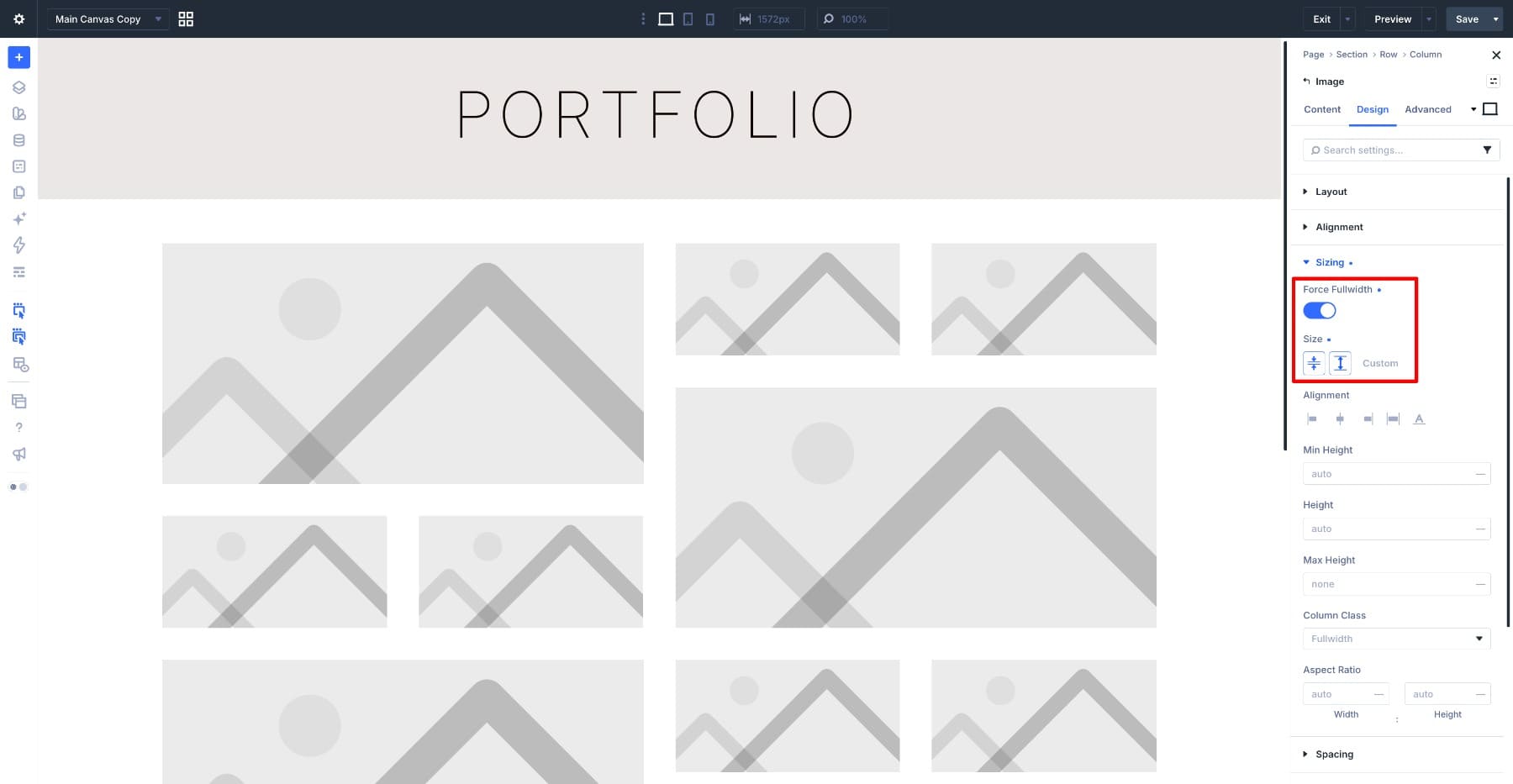
For the square tiles used in this mosaic, set the Aspect Ratio fields to 1 for Width and 1 for Height. This establishes a square frame that scales with the image’s width.
Next, open Border and set all four rounded corners to 20px. This gives the larger and smaller tiles a consistent finish.

Open Framing and set Object Fit to Cover. This fills the image’s frame while preserving the photograph’s proportions, cropping the parts that extend beyond its edges.
Use Object Position to adjust which part of the photograph remains visible. This is useful when a face, product, or other subject sits away from the center.
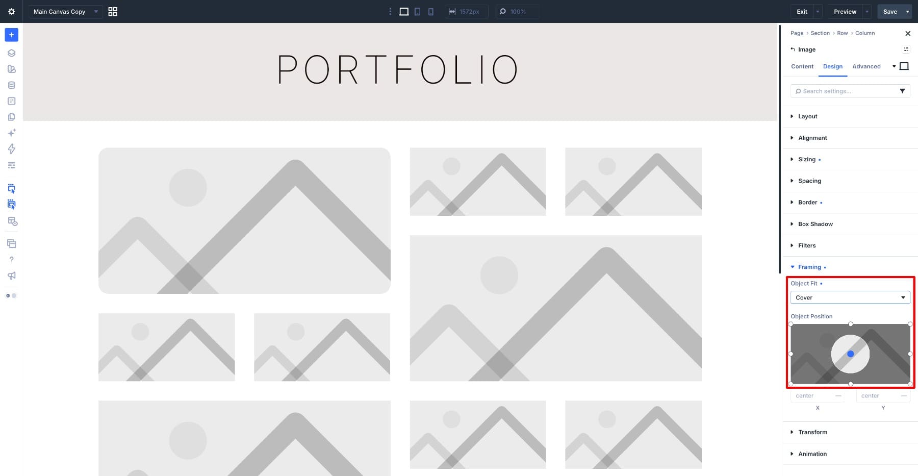
The settings have different jobs: Aspect Ratio establishes the frame’s proportions, while Cover controls how the photograph fills it. Cover alone does not create a square frame or set the grid’s row heights.
To reuse the styling, open the preset dropdown at the top of the Image Module settings and create an Element Preset named Mosaic Image from the current design settings.
Right-click the module and choose Extend Attributes. Select the preset assignment and extend it to the other Image Modules within this Row, as shown below. Keep the extension limited to the preset so each module retains its own photograph.
You can now update the shared styling through Mosaic Image. For example, changing the preset’s corner radius updates the images using that value, unless an individual module overrides it.
Review the crops after applying the preset. Keep photo-specific Object Position adjustments on the individual modules so you can position each subject independently.
Finally, check the tile edges. With equal-width grid tracks, square image frames, and matching horizontal and vertical gaps, the larger two-by-two tiles can align with the smaller tiles around them. If an edge is out of line, check for conflicting image heights, margins, or Column padding.

Step 4: Adjust The Mosaic For Tablet
Switch to Tablet view using the device icons at the top of the builder. Make the following adjustments at this breakpoint so the desktop layout stays intact.
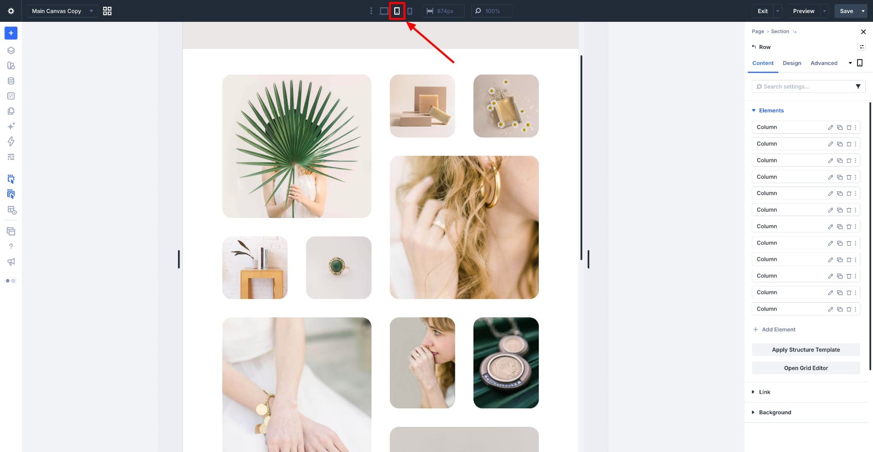
In the Grid Editor, set Columns to 2. The larger images should span both columns, while the smaller images sit in pairs.
Check the inherited placement rules as well as the spans. A feature tile positioned in desktop columns three and four needs a new position within the two-column tablet grid.
Using two columns gives the photographs more room at this width. The layout retains a mix of larger and smaller images without squeezing four tiles across the screen.
Reduce both Horz. Gap and Vert. Gap to 20px.
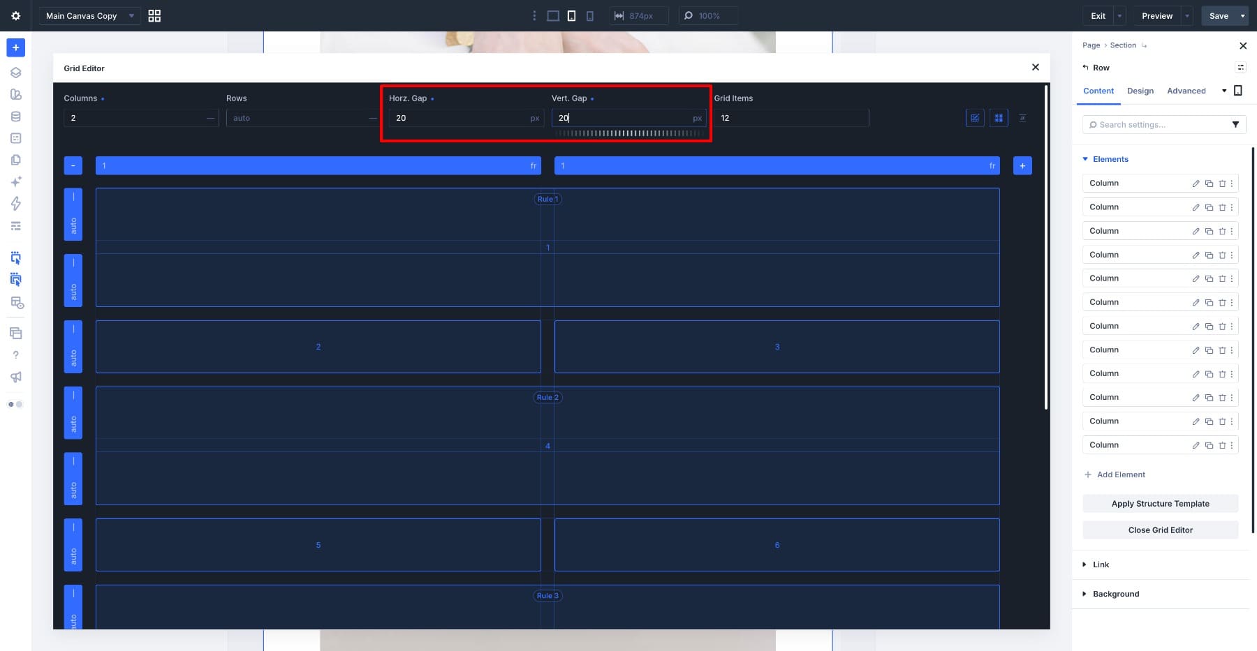
Review the canvas for empty spaces, overlaps, or items outside the two intended columns. If a desktop placement leaves a gap, adjust that item’s position or span for Tablet.
Keep the numbered image sequence in mind while repositioning tiles. The aim is to place the larger images between pairs of smaller images, as shown below.

Step 5: Adjust The Mosaic For Mobile
Switch to Phone view. We’ll simplify the mosaic into a single-column image sequence at this breakpoint.
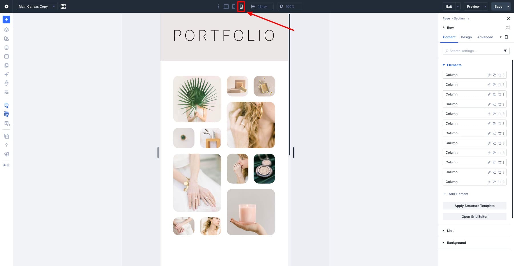
Set Columns to 1. Then resize each feature tile so its Column Span is 1. You can drag its corner inward on the canvas or edit its rule directly.
Also review any inherited Column Start, Column End, and row placement values. Keep every item within the first column, use a single-row span for each tile, and remove or override placements that prevent the images from stacking in sequence.
Simply reducing the column count is not enough if the remaining rules still place an item beyond that column. Checking both spans and positions avoids unwanted tracks and gaps.
Each image should now occupy the available grid width in its own row. The interlocking desktop arrangement becomes a simpler vertical gallery, while the image order remains consistent.

Preview the page at desktop, tablet, and phone widths before saving. Check for horizontal overflow, unintended gaps, and photographs whose subjects have been cropped out.
Adjust an individual image’s Object Position where needed. Also resize the preview between the main breakpoint widths to make sure the layout remains balanced as the available space changes.
Reuse The Mosaic With Different Images
The Row holds the grid structure and placement rules, while the Image Modules hold the photographs. You can replace the images without rebuilding the arrangement, then adjust their crops to suit the new subjects.
The feature rules target item positions. If you reorder the child Columns, the images occupying positions one, four, seven, and ten receive those feature placements.
The Mosaic Image preset keeps the shared image styling manageable, while the breakpoint adjustments let the same collection work as a four-column mosaic, a two-column layout, and a single-column gallery.
Once the structure is in place, you have a reusable starting point in Divi 5 for product photography, an editorial image collection, or a visual portfolio.
The post How To Create A Responsive Image Mosaic With Divi 5’s CSS Grid Editor appeared first on Elegant Themes Blog.
The Tech Zone


Comments
Post a Comment