How To Build A Bento Grid Hero With Divi 5’s CSS Grid Editor
A bento grid brings images, headlines, supporting details, and calls to action into one arrangement of differently sized cards. Shared edges and consistent gaps hold the layout together, while the larger cards give important content more room.
With Divi 5‘s CSS Grid Editor, you can build that arrangement visually. Drag items into position, adjust their spans, and refine the spacing without writing custom CSS.
In this tutorial, we’ll build a four-card bento hero, add content to each card, style it with Design Variables, and adapt the layout for smaller screens.
What Is A Bento Grid?
The name comes from Japanese bento boxes, where different foods occupy separate compartments inside a shared container. Each compartment has its own space, but the arrangement works as a whole.
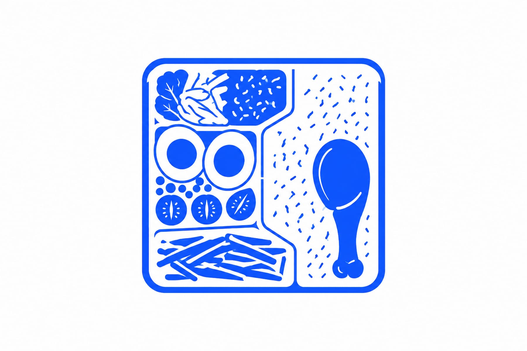
A bento layout applies that idea to web design. Cards of different sizes hold images, text, statistics, or actions within a shared grid. Consistent spacing and alignment connect the cards without making every piece of content look equally important.
Apple’s product presentations provide a familiar example. Larger cards highlight a major feature, while smaller cards present supporting details. The variation in size helps distinguish the main message from the information around it.
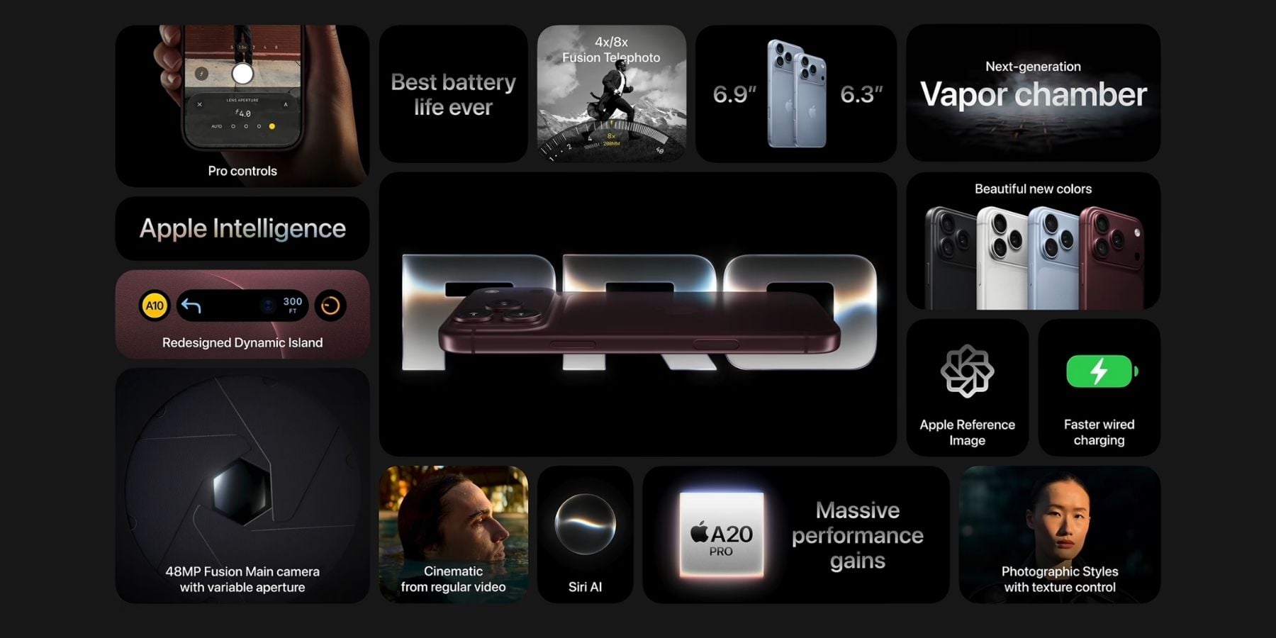
The same approach can work on a product page, agency homepage, or software landing page. The goal is to give each piece of content an appropriate amount of space while keeping the composition cohesive.
The Logic Behind The Design
A bento grid uses differences in size to support visual hierarchy. A large image card can become the focal point, while a smaller card holds a statistic or a short call to action.
Size is only one part of that hierarchy. Contrast, typography, imagery, and placement also influence where visitors look. A large card with little contrast may attract less attention than a smaller card with a strong headline or bright button.
For this hero, we’ll give each card a clear role: a main visual, a headline with supporting text, a statistic, and a call to action. That keeps the layout focused and gives visitors enough context to understand the offer before choosing what to do next.
Building Grids In Divi 5 Is Visual
Divi 5’s CSS Grid controls let you define a layout at the container level. The container determines the grid structure, and its child elements occupy positions within that structure.
This makes it easier to reuse an arrangement and experiment with its proportions. You can change the layout without rebuilding the content inside every card.
The Grid Editor gives those controls a visual interface. It opens as a floating panel alongside the Visual Builder, where you can work directly with a representation of the grid.
Drag an item’s corner to change how many rows and columns it spans, or move the item to another position. You can also adjust track sizes and gaps visually.
As you edit the grid, the layout updates in the builder. This lets you compare different arrangements while keeping the actual page in view.
You can also start with one of Divi’s premade grid templates and customize it in the Grid Editor. A template gives you an initial structure; its proportions and item placement remain editable.
Build A Bento Grid Hero In Divi 5
A hero section needs to introduce the page and make its main message easy to understand. A bento arrangement gives you space for a strong visual, a headline, supporting evidence, and an action without putting everything into one text block.
Our example uses four cards: one large card on the left, one wide card at the top right, and two smaller cards beneath it.
Add A New Section
Start with a blank page in the Visual Builder. If it already contains an empty Section, use that as your starting point. Otherwise, click the blue plus icon to add a regular Section.
Inside the Section, click the green plus icon to open the Row insertion options. You’ll see the available column structures and grid templates.
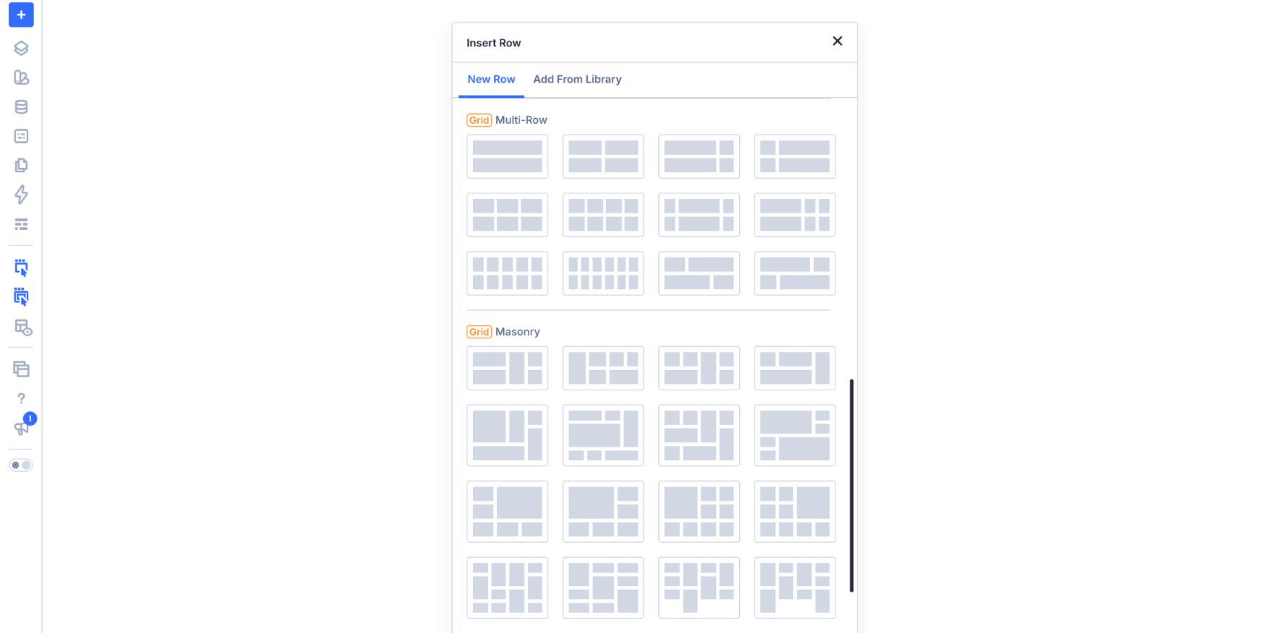
Scroll to Build Custom Grid and select it. This opens the Grid Editor so you can define your own arrangement.
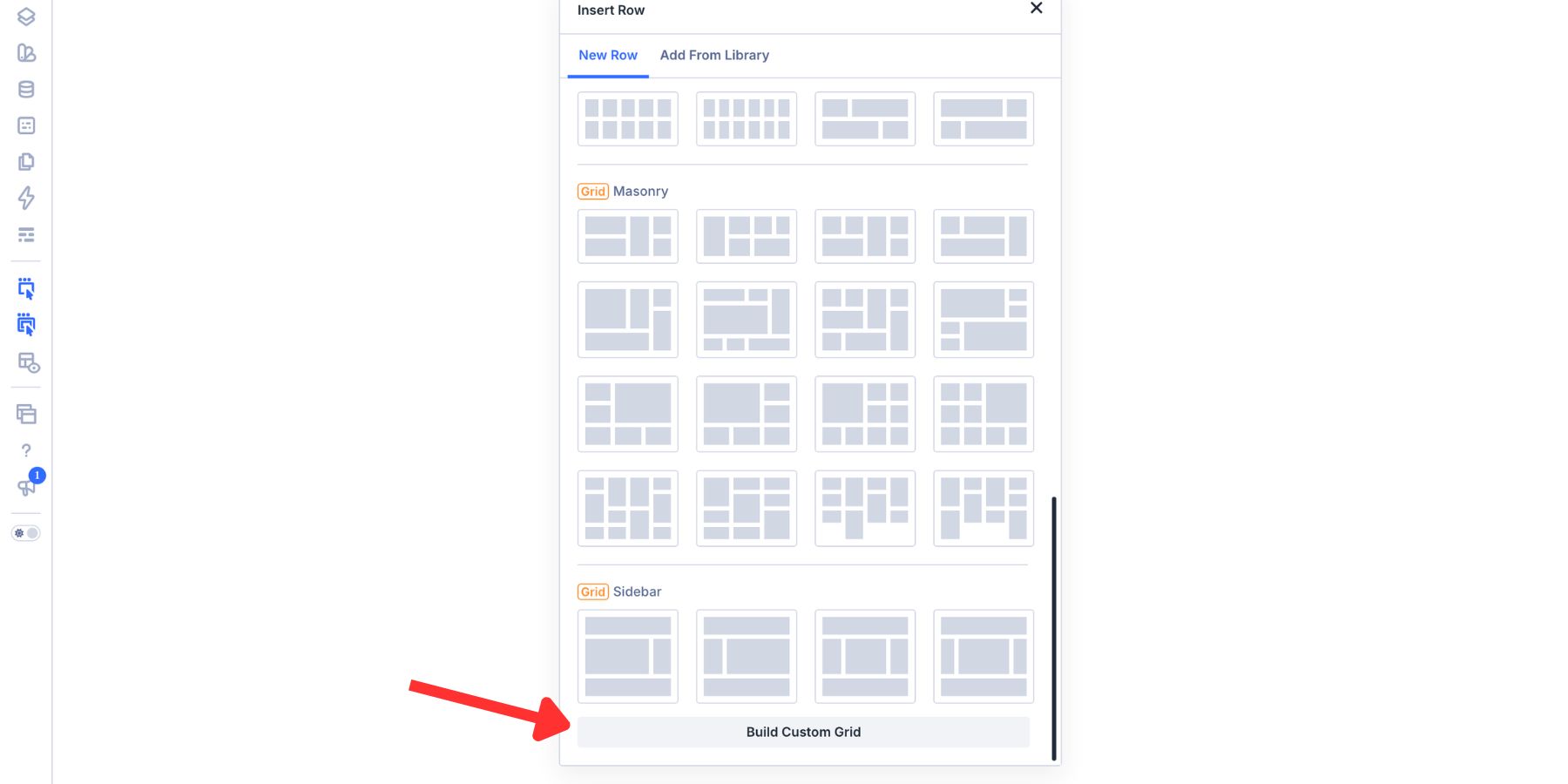
Build The Grid Structure
At the top of the Grid Editor, enter these settings:
- Columns: 4
- Rows: 3
- Horizontal Gap: 20px
- Vertical Gap: 20px
- Grid Items: 4
The Grid Items field controls the number of preview placeholders shown in the editor. It does not add actual Columns or modules to the page. We’ll check the Row’s child Columns after defining the arrangement.
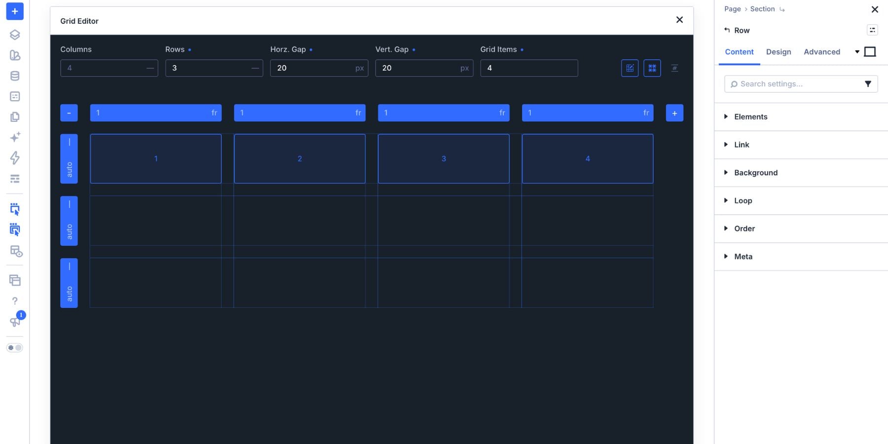
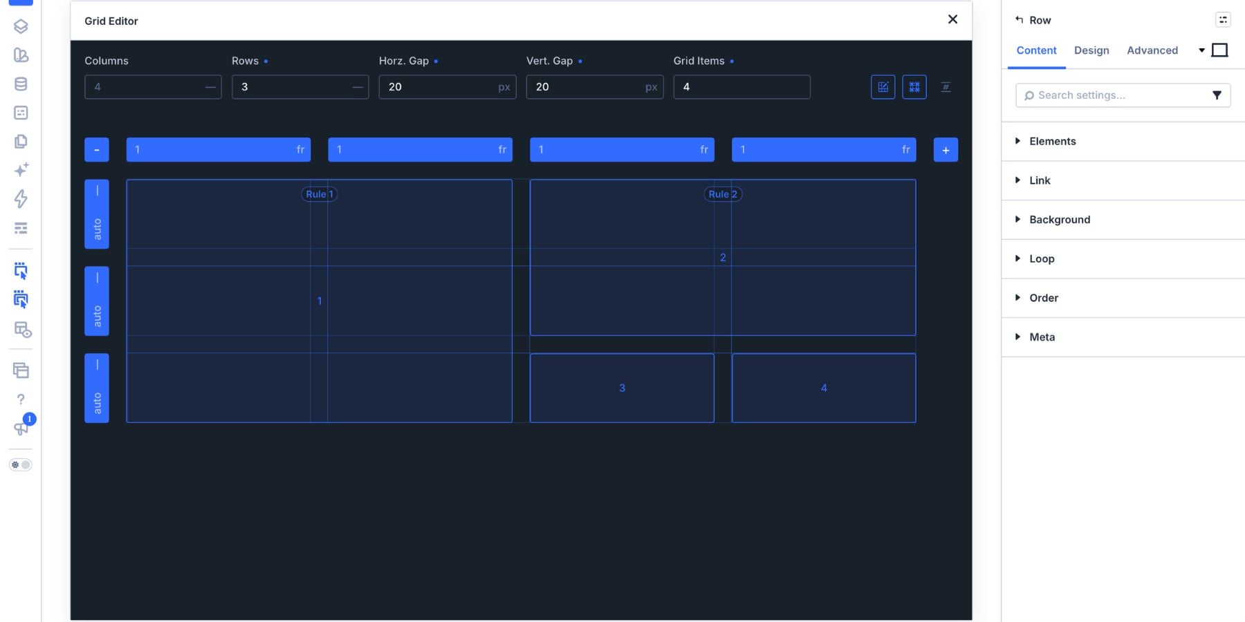
Resize the first item so it spans columns 1 and 2 across all three rows. This becomes the main visual card, occupying the left half of the grid.
Place the second item in the upper-right area. Resize it to span columns 3 and 4 across rows 1 and 2. Its top edge aligns with the main visual card, with the configured gap separating them.
Place items 3 and 4 in the remaining cells: item 3 in column 3, row 3, and item 4 in column 4, row 3. Each occupies one column and one row.
The finished structure has one large card, one wide card, and two smaller cards.
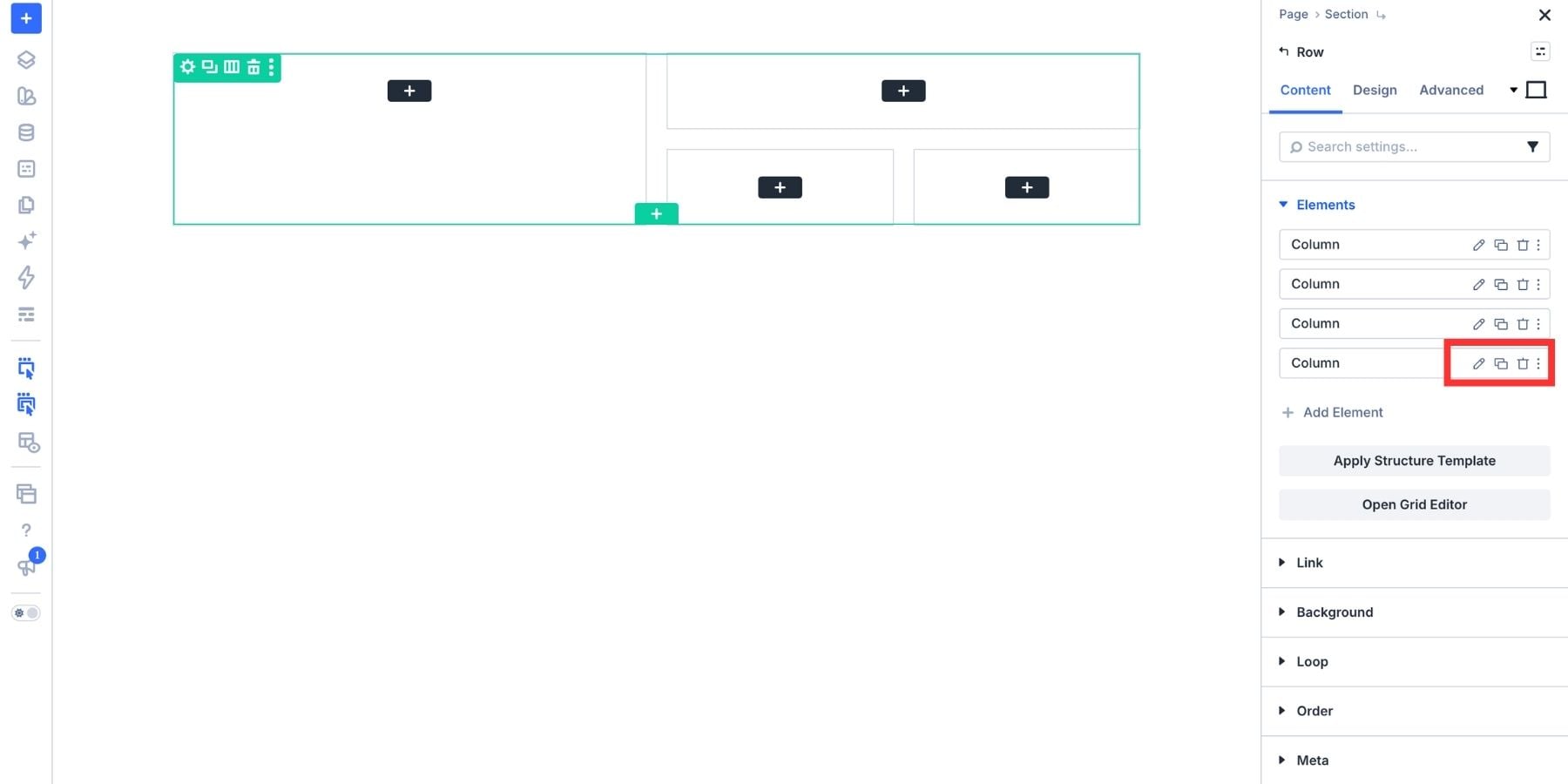
Open the Row’s Content tab and expand Elements to check its actual Columns. Add or duplicate Columns, or remove unused ones, until there are four.
These four child Columns become the cards represented by the editor’s four preview items. Keep their order consistent with the arrangement you created.
The Grid Editor remains available as you build. You can revisit the spans, track sizes, and gaps once the content is in place. The empty structure establishes the arrangement, but the finished content will help you judge its proportions.
Add Content To Each Card
The four cards have different roles, so they do not need the same amount or type of content. Use the large card for the main visual, the wide card for the message, and the two smaller cards for supporting information and an action.
Keep the content concise enough to fit those roles. A larger card does not need more words simply because it has more space.
The Main Visual Card
The first card spans the left half of the grid across all three rows. In this example, it contains an image showing Divi’s layout-building tools.
Add an Image Module to the first Column and select your image. A product visual, team photo, or interface preview can work well here, depending on the page.
You can also use a Column background image when the image is decorative. An Image Module is useful when the visual needs its own image settings and descriptive alternative text.
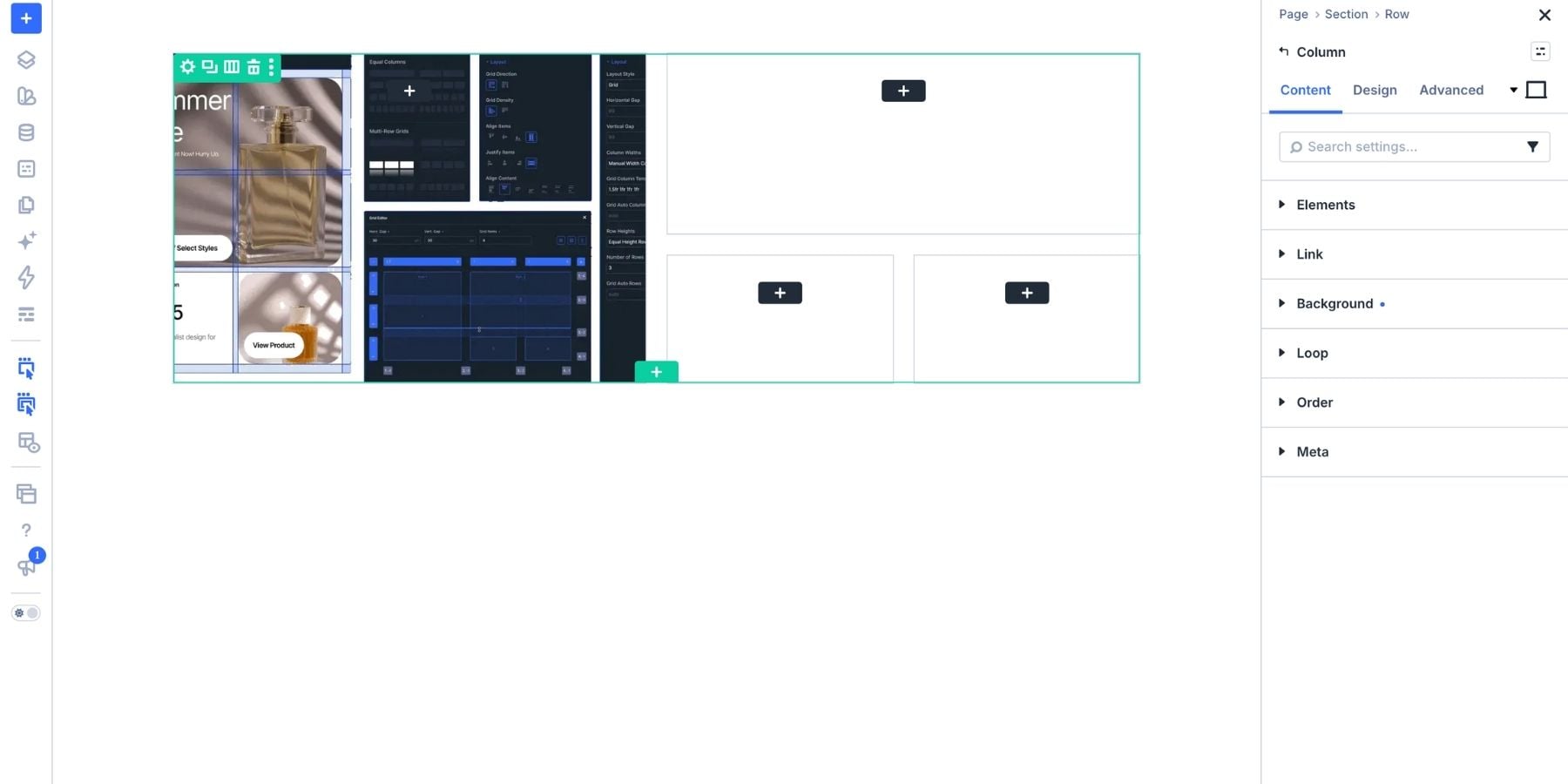
The card can hold other content as well. For example, a portrait and a short testimonial could make social proof the main visual focus. A Video Module is another option when a demonstration would explain the offer more effectively.
Choose content that benefits from the larger space, and check that its crop or proportions work within the card.
The Headline And Supporting Text Card
The second card occupies the top-right area, spanning two columns and two rows. Both the headline and its supporting text belong inside this card.
Add a Heading Module for the main message. Keep it direct and specific to the offer. For a page’s main hero heading, use an appropriate heading level, typically H1.
Below it, add a Text Module with one or two supporting sentences. This gives the headline context without requiring a separate card or changing the four-card structure.
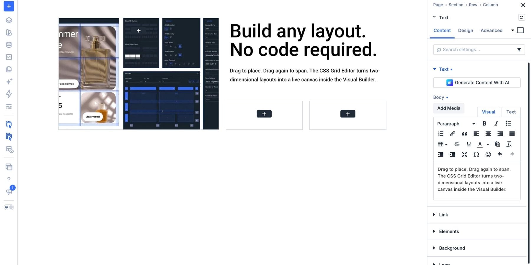
Use the spacing between these modules to make their relationship clear. They should read as one message, with the headline introducing the idea and the body text explaining it.
The Stat Or Feature Card
The third card sits below the headline card on the left. Its smaller footprint suits a single statistic or a short feature highlight.
For a statistic, add a Text Module containing the number, then another Text Module beneath it with a brief explanation. Use a figure you can substantiate and enough context for visitors to understand what it represents.
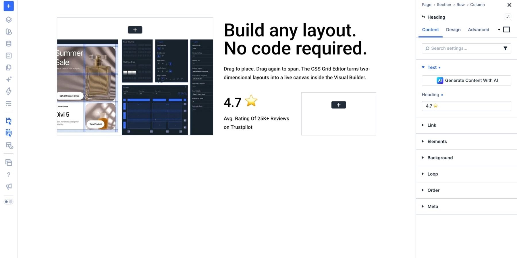
A feature highlight can use the same structure. Replace the number with a short label, then explain the capability underneath. For example, a service page might use this card to highlight its turnaround time or the main deliverable.
Choose one of these approaches for the third card. The fourth card remains available for the call to action.
The CTA Card
Add a Button Module to the fourth card. Use a label that describes the destination or action, such as “Get Divi 5,” “View Plans,” or “Book A Call.”
The example also includes a short heading and supporting text above the button. These give visitors a final piece of context before they act.
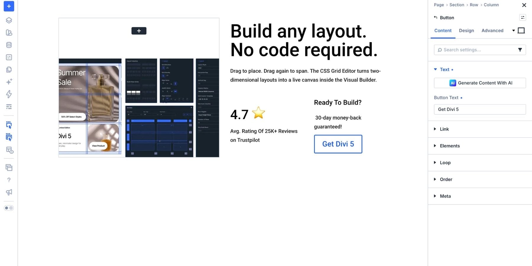
Keep one primary action in this card. Additional links are not always necessary, especially when the rest of the hero already explains the offer. The aim is to make the next step easy to identify.
Style The Cards
The cards already differ in size. Styling helps connect them while distinguishing their roles.
Start with consistent internal padding and rounded corners. Then choose backgrounds and text colors that make each card readable and give the main message appropriate emphasis. The largest card does not also need the strongest background color to stand out.
You can enter values directly into each setting, but shared Design Variables make repeated values easier to manage. A common card radius, font, or brand color can be changed centrally instead of being updated in several places.
Open the Variable Manager from the Visual Builder’s left sidebar. Create or select the variables you want to use, then connect them to the relevant fields.
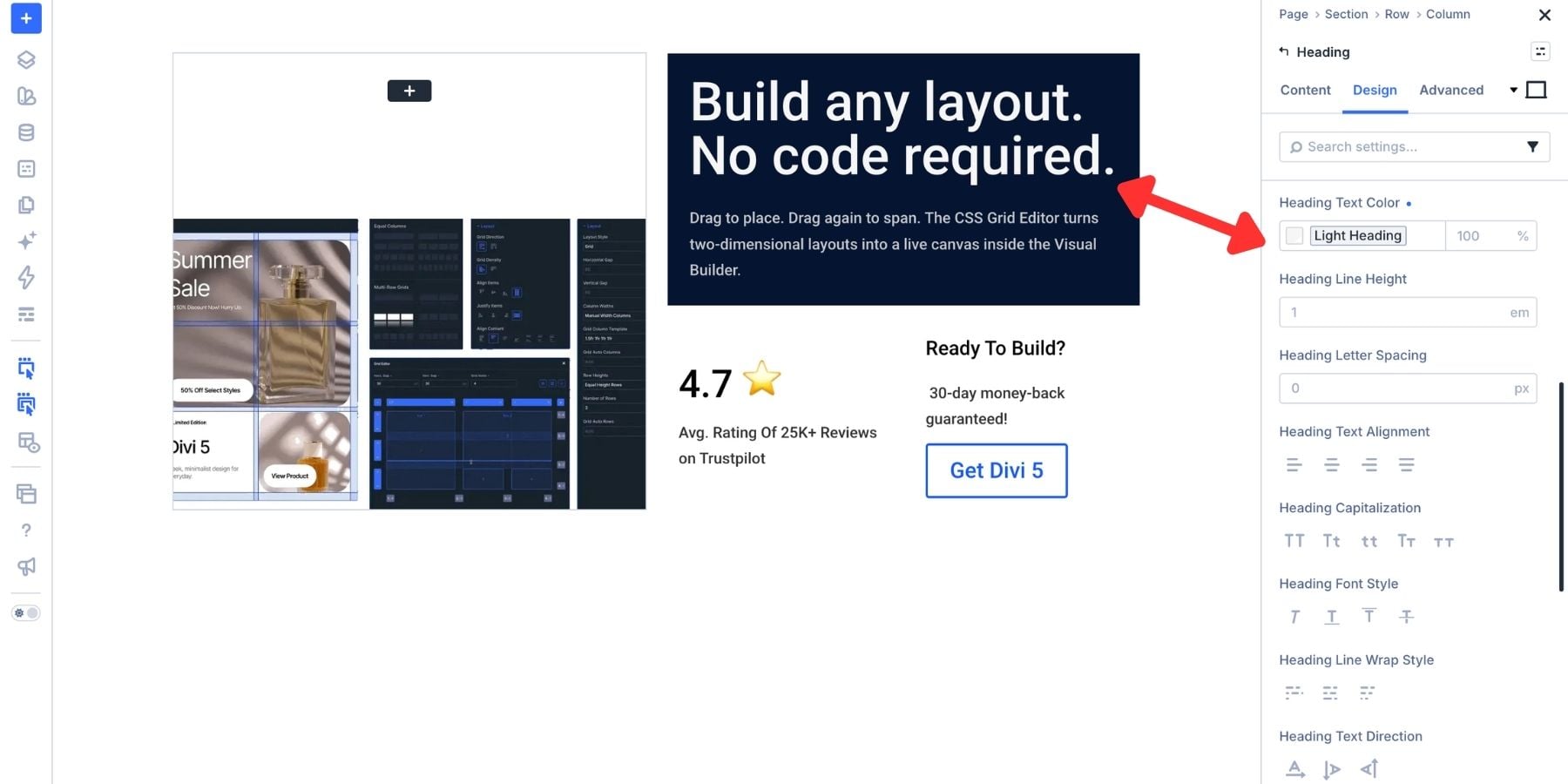
When a variable changes, settings connected to it use the updated value. Settings that still contain manually entered values are not automatically linked, so apply the variables wherever you want that shared control.
What Design Variables Support
Divi 5 supports seven variable types:
- Colors: Reusable brand colors, background tones, and text colors.
- Fonts: Typefaces for headings, body text, buttons, or other text roles. Changes affect the font fields connected to the variable.
- Numbers: Values for compatible settings such as font size, spacing, width, and border radius. These can include supported CSS functions such as
clamp()for fluid sizing. - Text: Repeated content such as a short label or CTA message.
- Images: Shared assets used in compatible image or background fields.
- Gradients: Reusable gradients, which can also use Color Variables for their stops.
- Links: Shared URLs that can be updated from one place.
To add one, open the Variable Manager, choose the type, enter a descriptive name, and set its value. For this layout, names such as “Card Border Radius,” “Hero Heading Size,” and “Card Padding” make their purpose easy to recognize.
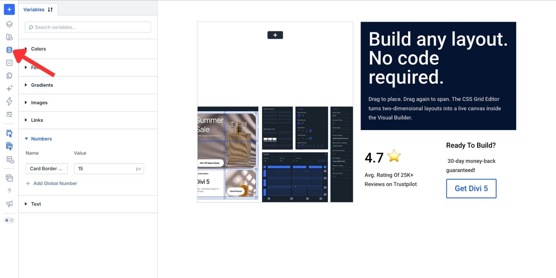
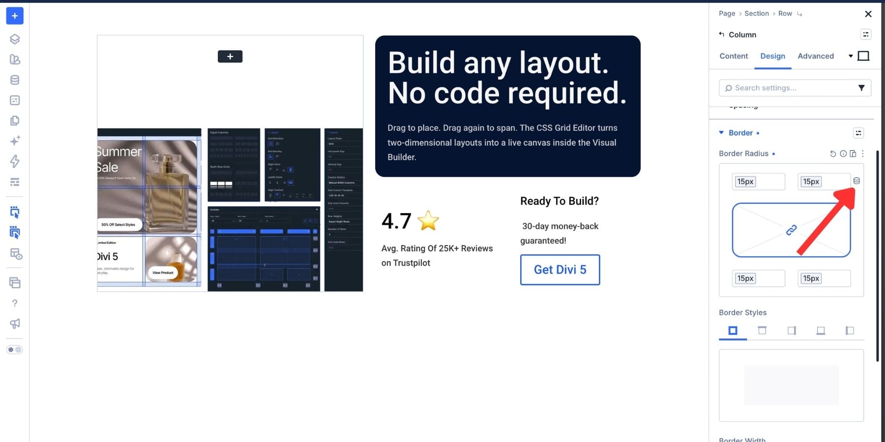
Use the variable control beside a compatible field to select the appropriate variable. For example, connect the corner-radius settings on each card to the same Number Variable.
Use The Variable Generator
If you want related shades for the cards, the Variable Generator can help build a palette from a starting color.
Hover over the Colors group in the Variable Manager and open the generator. Choose a primary color, then adjust the palette settings to create related variations.
The generator can produce tints, shades, tones, and transparency variations using relative color adjustments. Palette options also let you explore relationships between the primary and secondary colors.
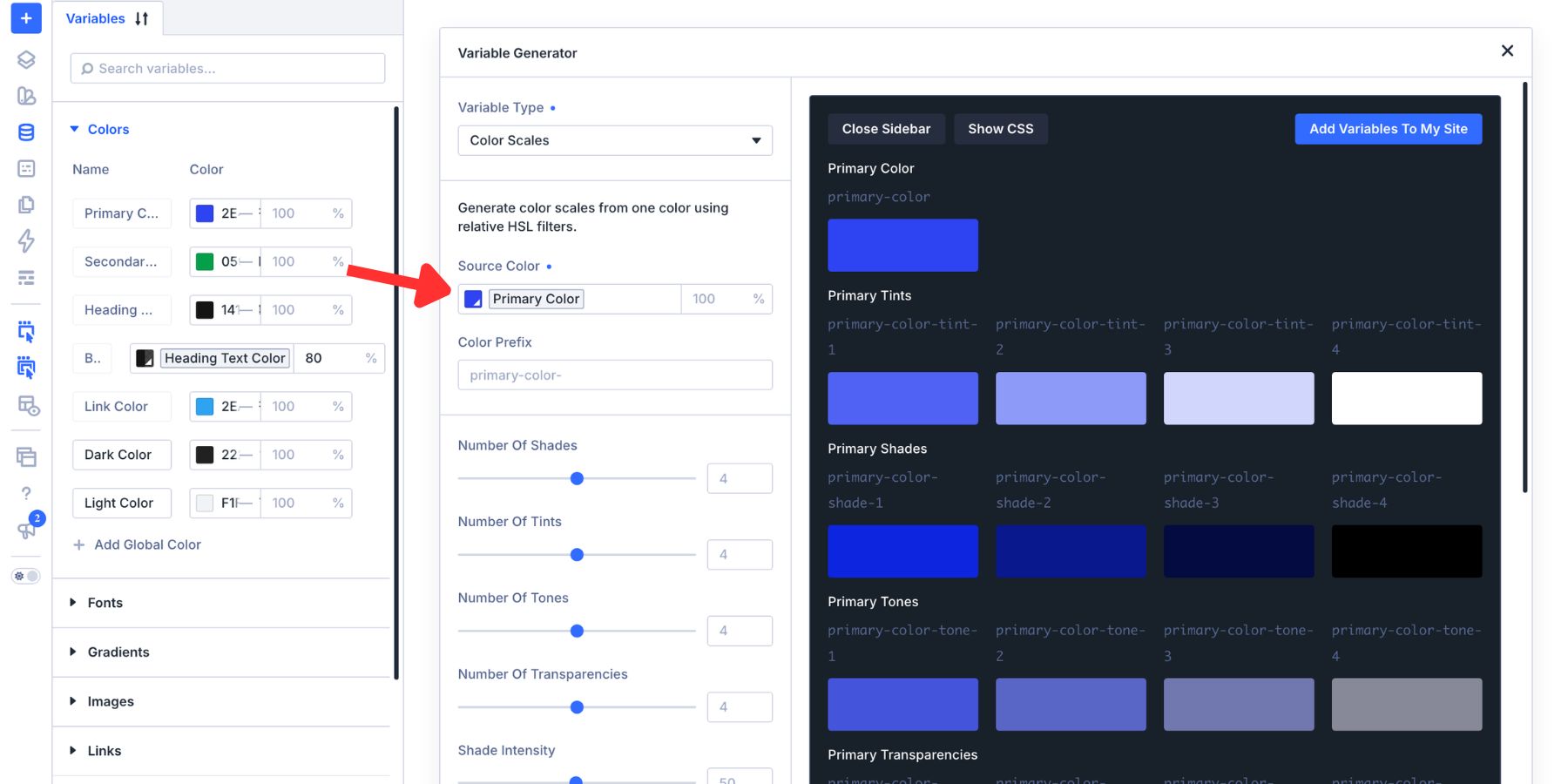
A Complementary palette can create a stronger difference between colors, while an Analogous palette keeps them closer together. Use the Color Style Guide Preview to review combinations, then check the readability of the text on your actual cards.
The Variable Generator also supports number scales for spacing and typography. You can use these to establish related sizes instead of choosing every value independently.
In this example, the headline card uses a deep blue background with light text. The statistic card uses a brighter blue, while the CTA card uses a pale tint and a blue button. The image card provides visual contrast alongside them.
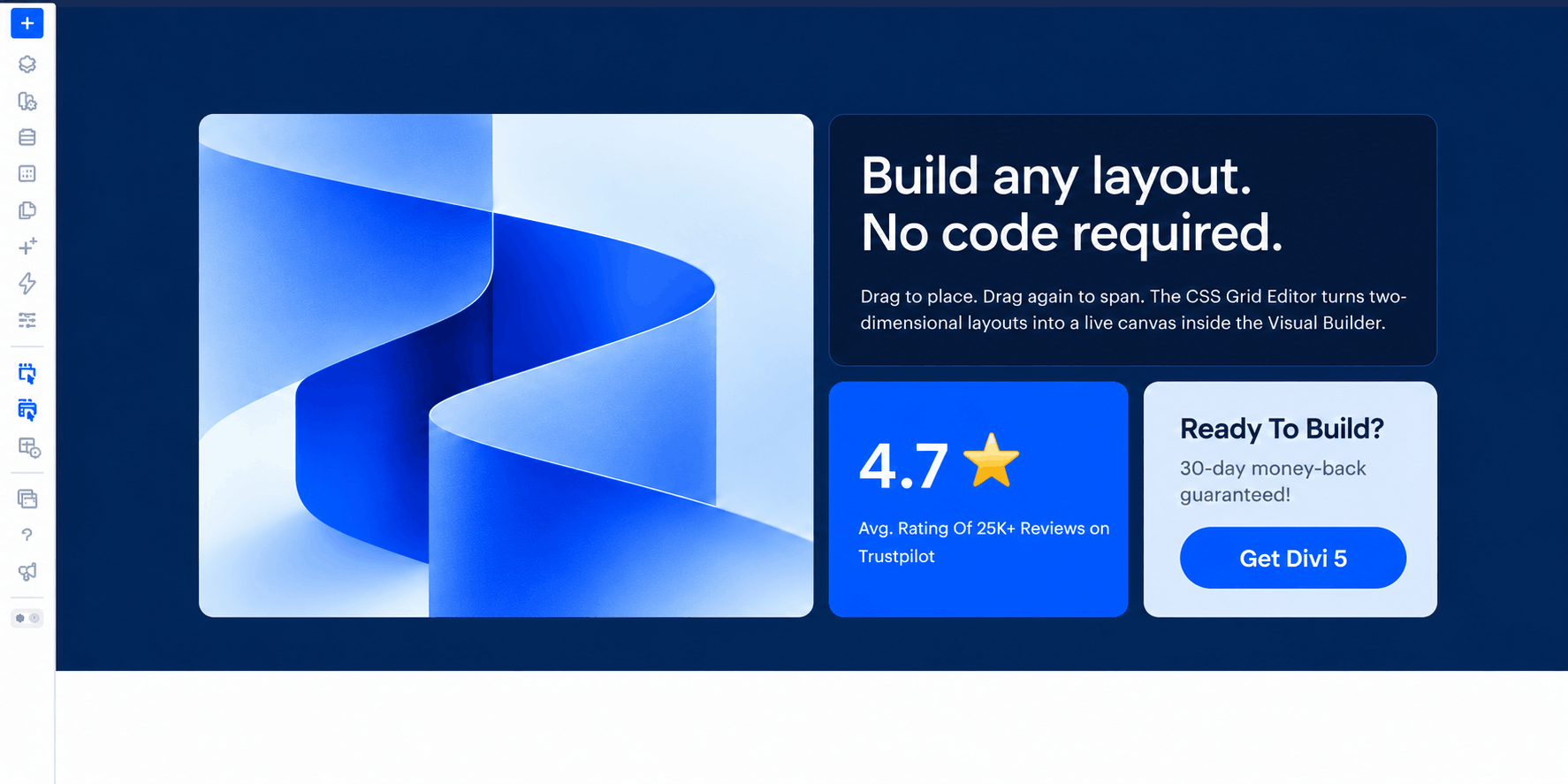
Apply the shared radius to all four cards and use a Section background that complements the palette. Check the card padding and module spacing after adding the backgrounds, since those edges make uneven spacing more noticeable.
The result should feel like one composition, with enough contrast to distinguish the cards without making them compete for attention.
Adjust The Hero For Smaller Screens
The desktop arrangement relies on having enough width for two smaller cards beneath the headline. On a phone, that same structure can make the text cramped and the button difficult to use.
Switch to the Phone breakpoint in the Page Bar at the top of the Visual Builder. Open the Row’s responsive layout settings and configure a single-column arrangement for that breakpoint.
When using a structure template, make sure you are changing the responsive layout rather than deleting or merging the four content Columns. All four cards should remain in the page.
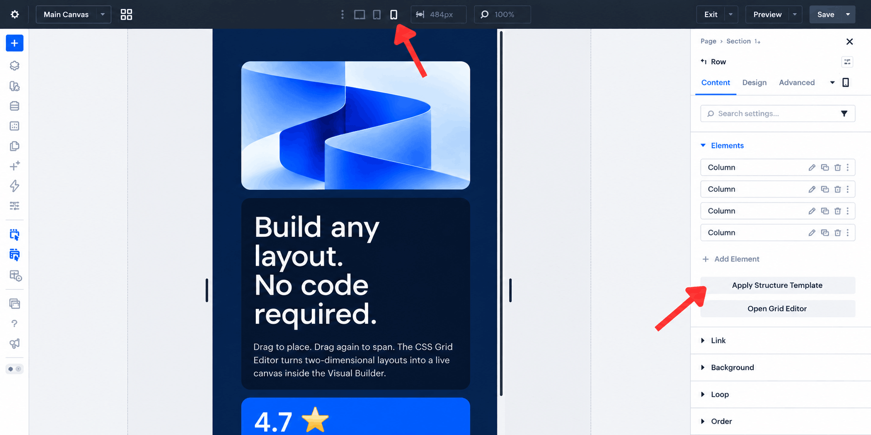
Check the placement rules as well as the column count. If desktop column starts or spans remain active, override them at the phone breakpoint so every card fits the single-column layout. Review row spans and heights so each card has enough room for its content.
The phone view should form a clear vertical stack. In this example, the image leads, followed by the headline, statistic, and CTA. Keep the content order logical rather than relying only on visual positioning.
Finish by checking heading sizes, card padding, image cropping, gaps, and button width. Review the tablet breakpoint too; it may support a different arrangement from either desktop or phone.
These responsive adjustments let the desktop retain its bento composition while smaller screens present the same content in a more readable format.
Build A Bento Hero Visually With Divi 5
A bento hero combines several content types within a shared layout. Different card sizes establish emphasis, while consistent spacing, color, and typography help the cards work together.
With Divi 5‘s Grid Editor, you can build the arrangement visually and refine it as the content takes shape. Design Variables keep shared values manageable, and responsive settings let you adapt the composition without rebuilding its content.
Start with this four-card structure, then adjust the proportions and content to suit your page. Keep the main message clear, give each card a purpose, and check the finished layout across screen sizes.
The post How To Build A Bento Grid Hero With Divi 5’s CSS Grid Editor appeared first on Elegant Themes Blog.
The Tech Zone


Comments
Post a Comment