Part 9 Of Mastering Flexbox: Creating Responsive Columns Without CSS Grid
In Part 8 of our Mastering Flexbox series, we focused on controlling spacing with Gap instead of relying on margin for repeated spacing patterns. We saw how Horizontal Gap and Vertical Gap help create cleaner, more consistent spacing across rows, columns, and Module Groups.
Now, in Part 9, we’re focusing on another common responsive layout question: how do you create flexible multi-column sections without reaching for CSS Grid every time? CSS Grid is still the right tool for true two-dimensional layouts, especially when you need precise row and column placement, overlapping items, or highly irregular grid patterns. But for many everyday layouts, such as card grids, split content sections, sidebar layouts, feature rows, and mixed-width columns, Divi 5’s Flexbox system gives you a faster, more visual workflow.
By combining Column Class, Layout Wrapping, Gap, Justify Content, Align Items, and Display Order, you can build responsive, grid-like column layouts directly inside the Visual Builder. In this post, we’ll show you how Column Class works, how it pairs with the Flexbox controls you’ve already learned, and how to create responsive column patterns that stay flexible across Desktop, Tablet, and Phone.
Let’s dive in.
Why You Often Don’t Need CSS Grid In Divi 5
Many designers assume that every multi-column layout needs CSS Grid. In Divi 5, that is not always the case. Flexbox is especially strong when you are building layouts that flow in one main direction, wrap onto new lines, and adapt naturally as space changes.
That covers many common website patterns, including:
- Equal-width feature grids
- Asymmetric content sections
- Card layouts with wrapped rows
- Content and sidebar combinations
- CTA sections with mixed column widths
- Responsive footer structures
There are several advantages to using Flexbox for these layouts:
- Cleaner alignment and spacing control: Justify Content, Align Items, and Gap let you manage alignment and gutters directly from the parent container.
- Easier responsive reflow: Column Class and Layout Wrapping let columns move onto new lines without duplicating sections or writing media queries.
- Flexible mobile hierarchy: Display Order lets you move important columns earlier or later at specific breakpoints.
- Simpler nesting: Module Groups, Nested Rows, and nested elements can each have their own layout context when part of a Flex structure.
That said, CSS Grid still has its place. Use Grid when your design needs precise two-dimensional control over rows and columns, offset placement, overlapping elements, or a layout that should follow a fixed grid map instead of a natural flex flow.
For many Divi layouts, though, Flexbox is enough. It keeps the structure visual, responsive, and easier to adjust inside the builder.
Understanding Column Class
Column Class is one of the most important sizing tools in Divi 5’s Flexbox system. It lets you choose how much horizontal space a Column should take inside a Flex row. Instead of setting fixed pixel widths, you choose a predefined fraction. Divi then uses that value as the Column’s width basis inside the Flex layout, while still working alongside Gap, Layout Wrapping, and other Flexbox controls.
What Column Class Actually Does
When you set a Column Class on a Column, you are defining how wide that Column should be within the Row’s Flex layout. For example:
- Fullwidth uses the full available row width.
- 1/2 creates a half-width column.
- 1/3 creates a third-width column.
- 1/6 creates a narrower column that can fit into denser multi-column layouts.
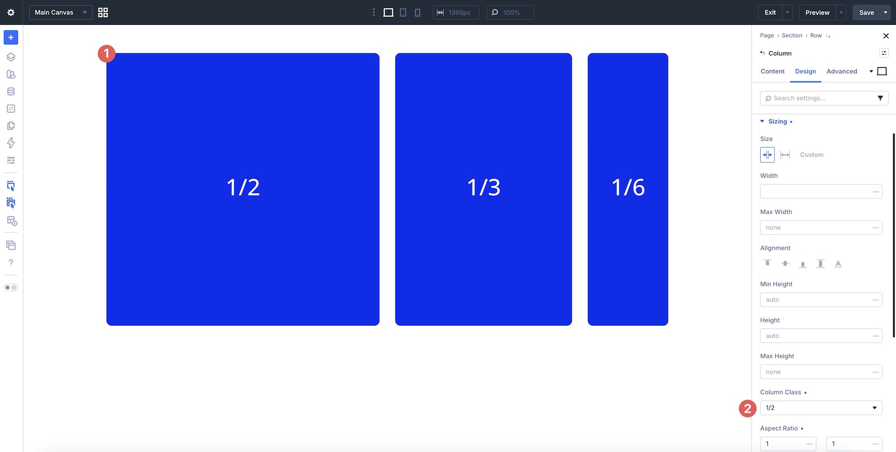
This makes it easier to create equal and asymmetric layouts without writing custom CSS.
You can choose from several predefined widths, including Fullwidth, 3/4, 2/3, 1/2, 1/4, and more. You can also choose No Column Class when you want the Column’s size to be determined by its content and other sizing behavior instead of a predefined fraction.
How Column Class Works With Layout Wrapping
Column Class becomes especially useful when combined with Layout Wrapping. When Wrap is enabled, Columns can sit side by side as long as there is enough available space.
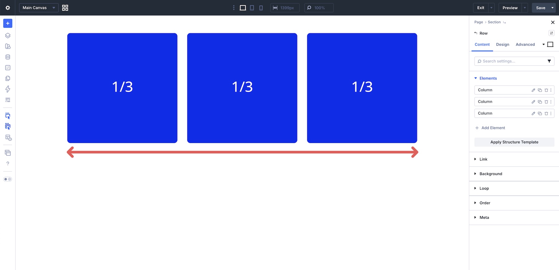
When the combined Column widths and Gap values no longer fit on one line, the Columns can wrap onto the next line. Each Column still respects its Column Class value after it wraps.
This is the core pattern behind many responsive, grid-like layouts built with Flexbox.
Responsive Column Class
Column Class can be adjusted per breakpoint. That means a layout can use wider multi-column settings on Desktop, simpler two-column settings on Tablet, and a single-column stack on Phone.
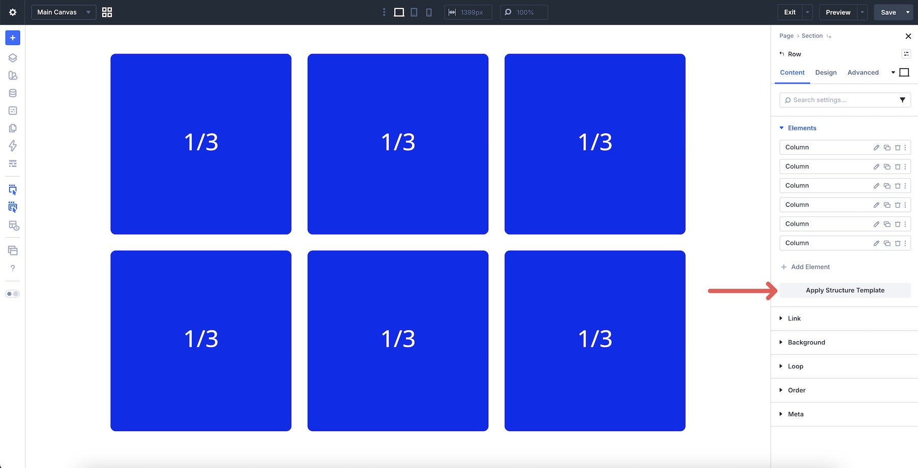
For example, six Columns set to 1/3 on Desktop may work well in a wide layout, but that same structure may feel cramped on Tablet or Phone. In that case, you can adjust individual Column Class values at a lower breakpoint or apply a Structure Template from the Row’s Content tab to update multiple Columns faster.
This gives you responsive structure control without writing media queries or duplicating the same content for different devices.
Combining Column Class With Other Flexbox Controls
Column Class controls the width of the Columns, but the surrounding Flexbox settings control how those Columns align, wrap, space, and reorder. The strongest layouts usually combine several of these controls.
Layout Direction + Layout Wrapping
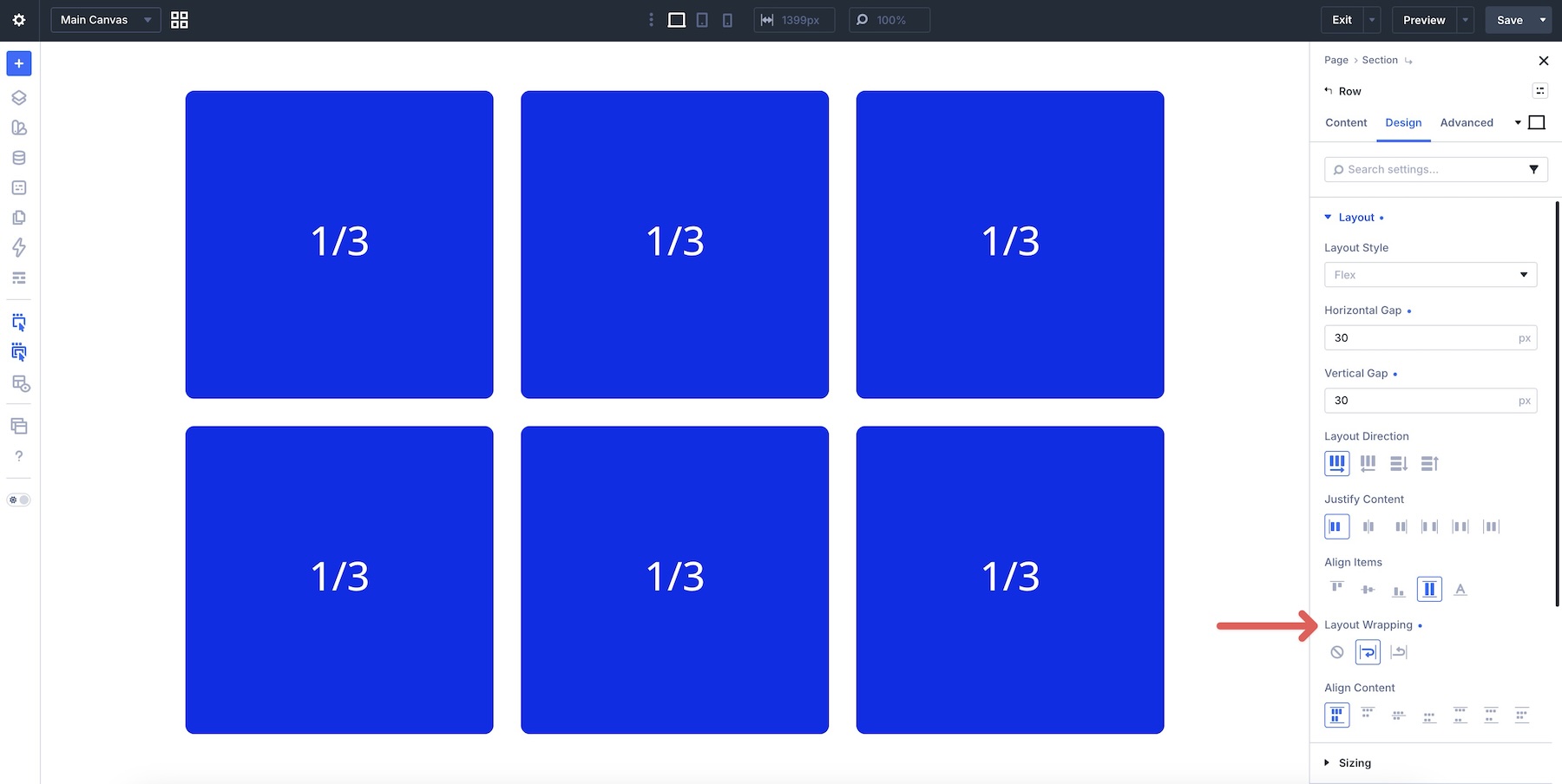
For column layouts, you’ll usually keep Layout Direction set to Row so Columns flow horizontally.
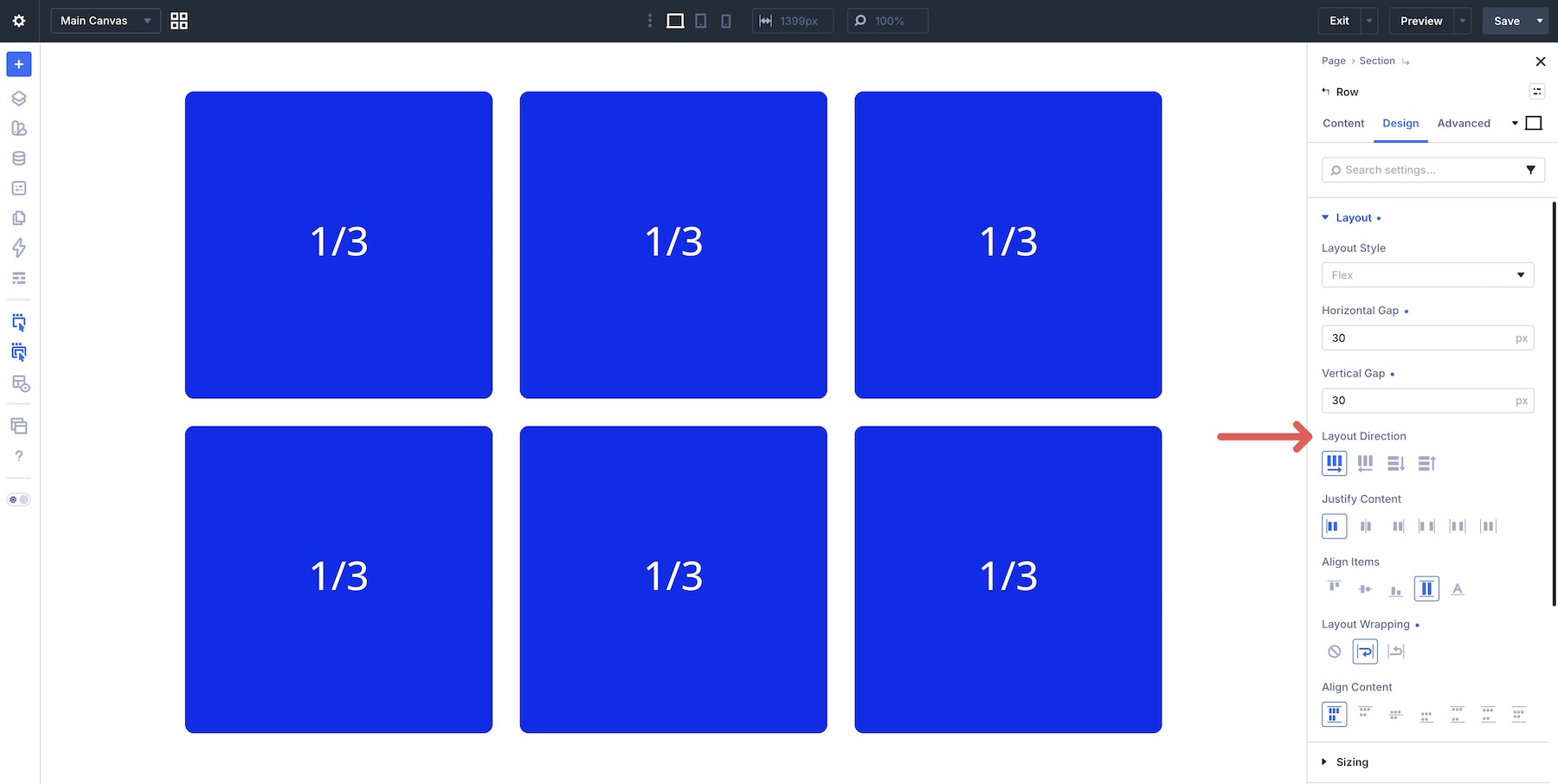
When you enable Layout Wrapping, Columns can move to the next line when they no longer fit side by side. This is what allows one Row to behave like a responsive multi-row layout.
Justify Content And Align Items
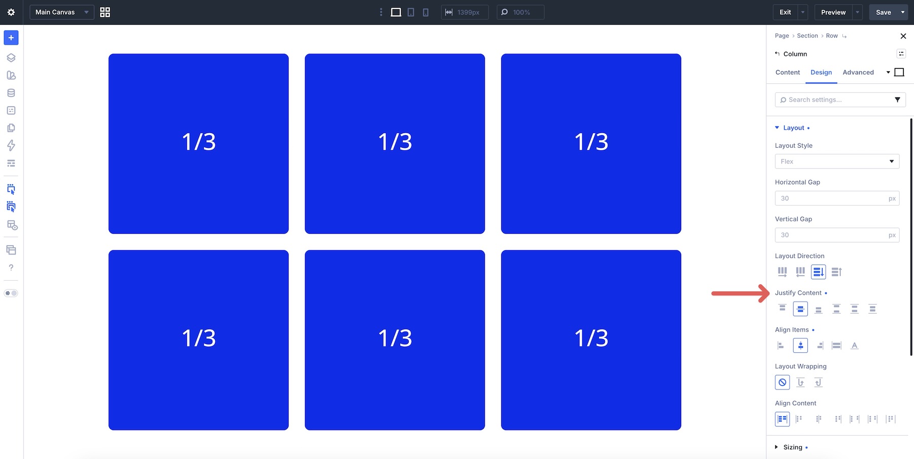
Justify Content controls how Columns are distributed along the main axis. Useful options include Start, Center, Space Between, and Space Evenly.
Align Items controls alignment along the cross axis. In a horizontal row, that usually means vertical alignment. Stretch is useful when you want Columns in the same line to share the available height.
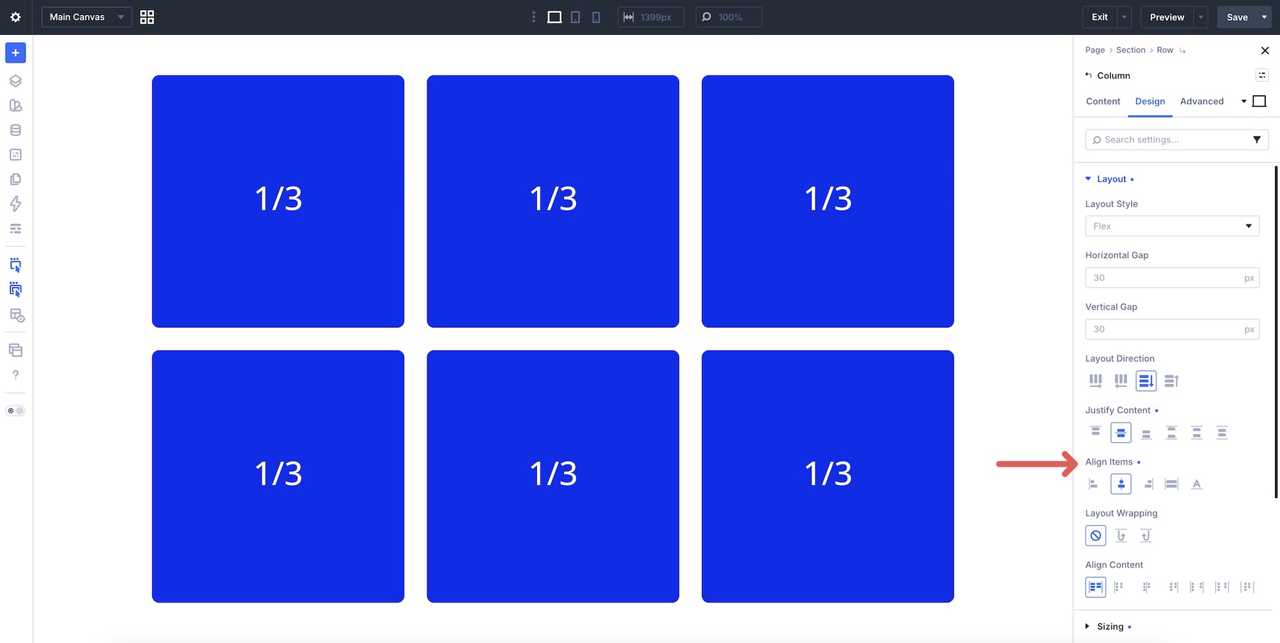
Together, these controls help you refine how Columns sit within the Row after their widths are defined by Column Class.
Horizontal Gap And Vertical Gap
As we covered in Part 8, Gap is usually the cleanest way to control repeated spacing between related elements. Apply Horizontal Gap on the Row to create gutters between Columns.
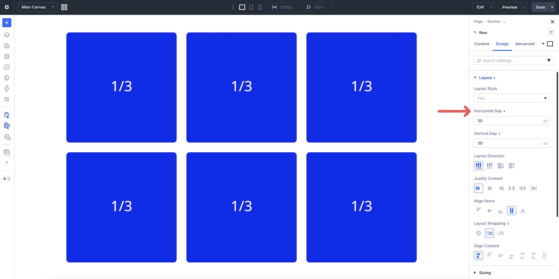
Apply Vertical Gap on the Row to control spacing between wrapped lines of Columns. You can also apply Vertical Gap to individual Columns or Module Groups to control spacing between modules inside them.
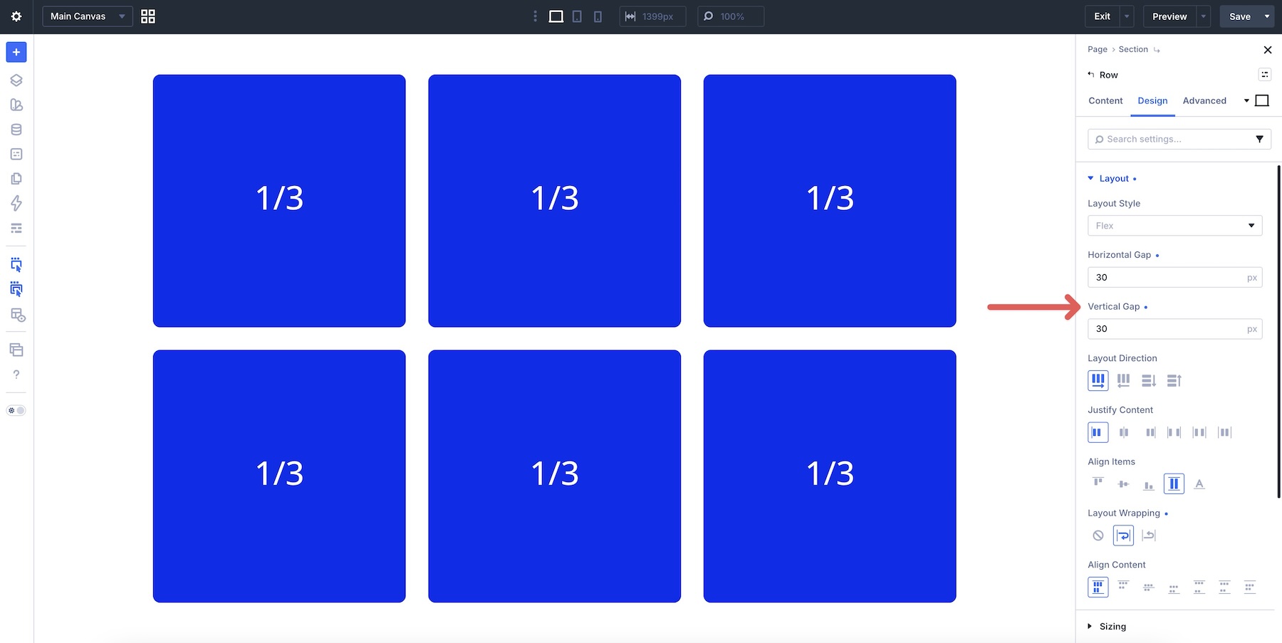
Using Gap instead of repeated margins keeps spacing easier to adjust when Columns wrap on smaller screens.
Display Order
Display Order lets you change the visual order of Columns without moving them in the page structure. This is especially useful at Tablet and Phone breakpoints. For example, you can keep a text Column first on Desktop but move an image Column above it on Phone by giving the image Column a lower Display Order value, such as -1.
Use Display Order selectively. Since visual order can differ from source order, test keyboard focus and reading flow when reordering important interactive content.
Practical Examples
Now that you understand how Column Class works and how it combines with other Flexbox controls, let’s look at five layouts. Each example demonstrates a different responsive column pattern you can build with Flexbox, without switching to CSS Grid.
Example 1: Equal Multi-Column Grid
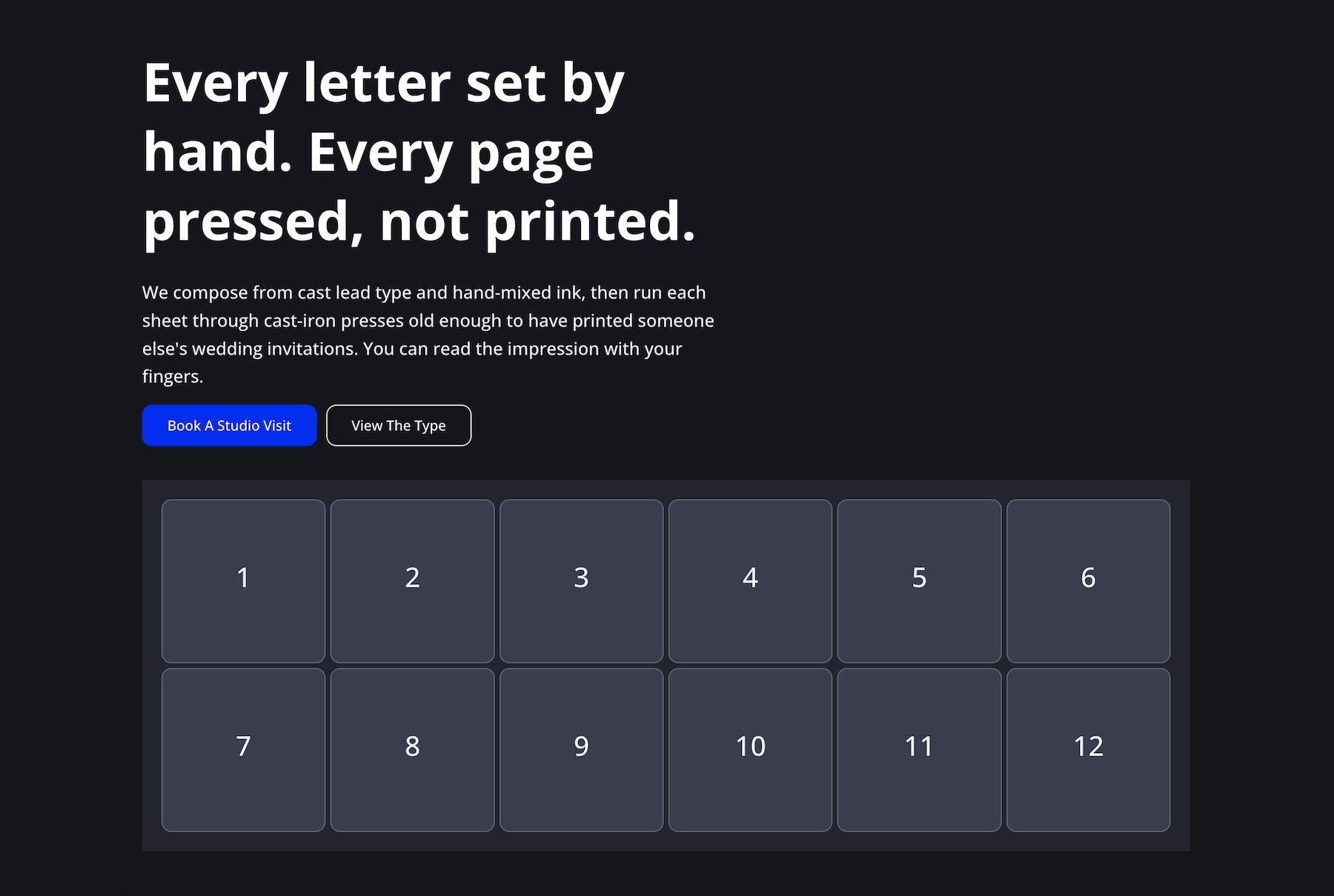
Layout: This Section uses two Rows: one wider intro Row with a Column set to Column Class > 2/3, and another Row with twelve equal items set to Column Class > 1/6. The item Row creates a responsive grid-like layout that can shift from six Columns on Desktop to fewer Columns per line on smaller screens.
Demonstrates: Equal Column Class values, Layout Wrapping, and Gap for consistent gutters.
Example 2: Content + Stats + Quote Bar
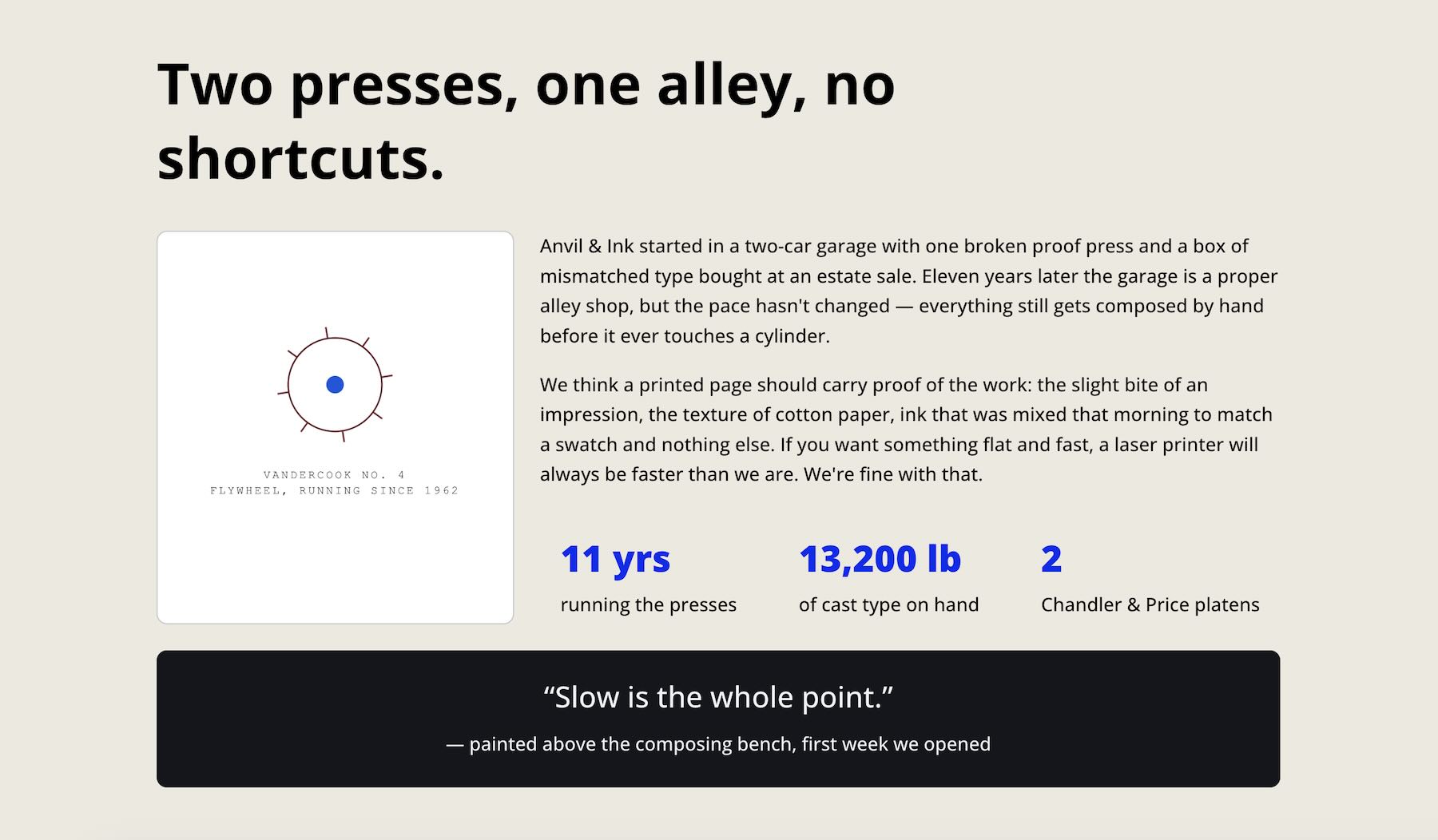
Layout: This layout pairs a visual card on the left with body text and three key stats on the right, using a Nested Row for the stats. A full-width quote bar sits underneath.
Demonstrates: Mixed Column Classes, Nested Rows, optional Display Order, and multi-level Gap control.
Example 3: Asymmetric Card Layout
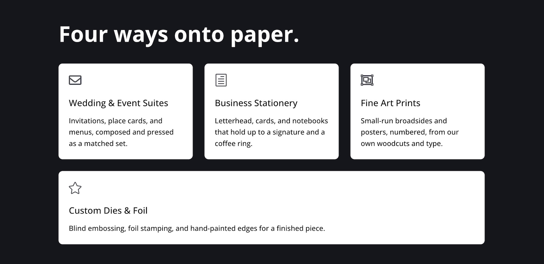
Layout: This Section uses five Columns. The first and last Columns are set to Fullwidth, while the second, third, and fourth Columns use Column Class > 1/3.
Demonstrates: Fullwidth and fractional Column Class combinations, Layout Wrapping, Horizontal Gap, and Vertical Gap.
Example 4: Classic 3×2 Feature Grid
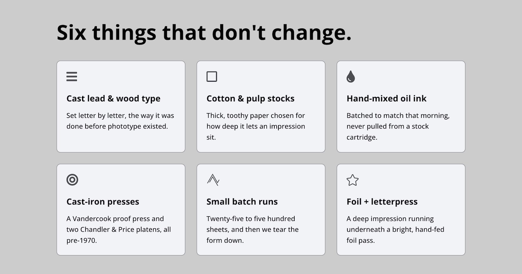
Layout: Six equal feature cards sit inside one Flex Row and wrap into multiple lines.
Demonstrates: Simple responsive Columns using Column Class, Gap, and Align Items.
Example 5: Split Content + Info Card
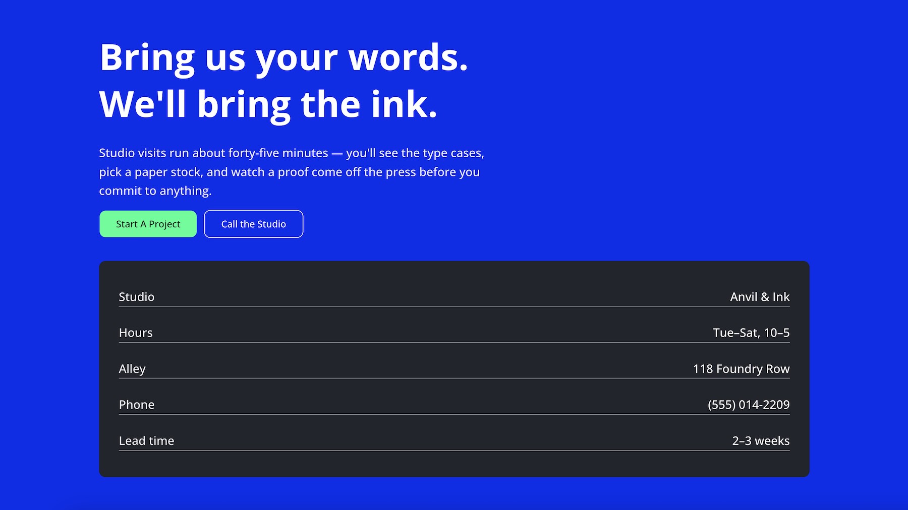
Layout: Large text and buttons sit in the top area, while a dark information panel or table-style card sits below.
Demonstrates: Asymmetric Column Class combinations, Fullwidth rows inside a wrapping Flex structure, and Justify Content > Space Between for distribution.
Step-By-Step Build: Creating A Flexible One-Row Layout
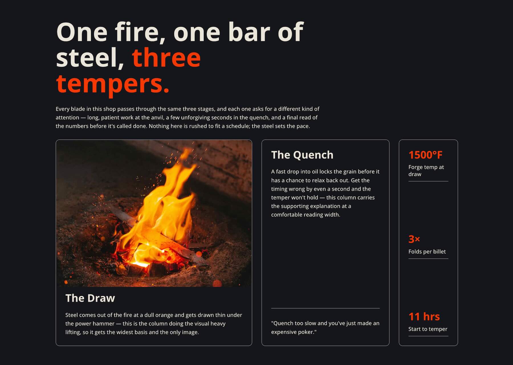
This example shows how to build a multi-column layout using one Flex Row, several Columns, Column Class values, Gap, and targeted alignment settings. On Desktop, the Columns create a balanced multi-line composition. On Tablet and Phone, the same structure reflows with responsive Column Class changes and a Structure Template.
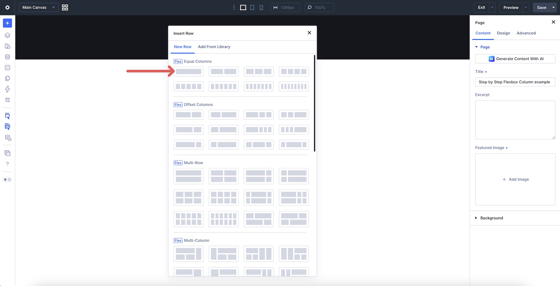
Configure The Row Structure
Start by opening a page in the Visual Builder or adding a new Section to an existing page. Add a single-column Row to the Section.
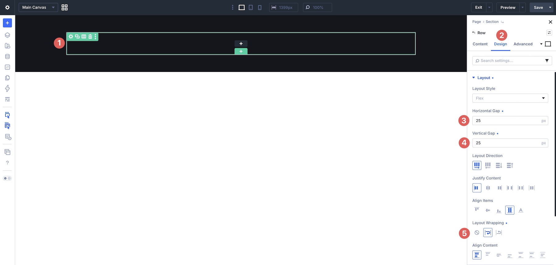
In the Row settings, go to the Design tab. Expand the Layout option group and apply a 25px Horizontal Gap and 25px Vertical Gap. Then enable Layout Wrapping > Wrap.
Configure The First Column
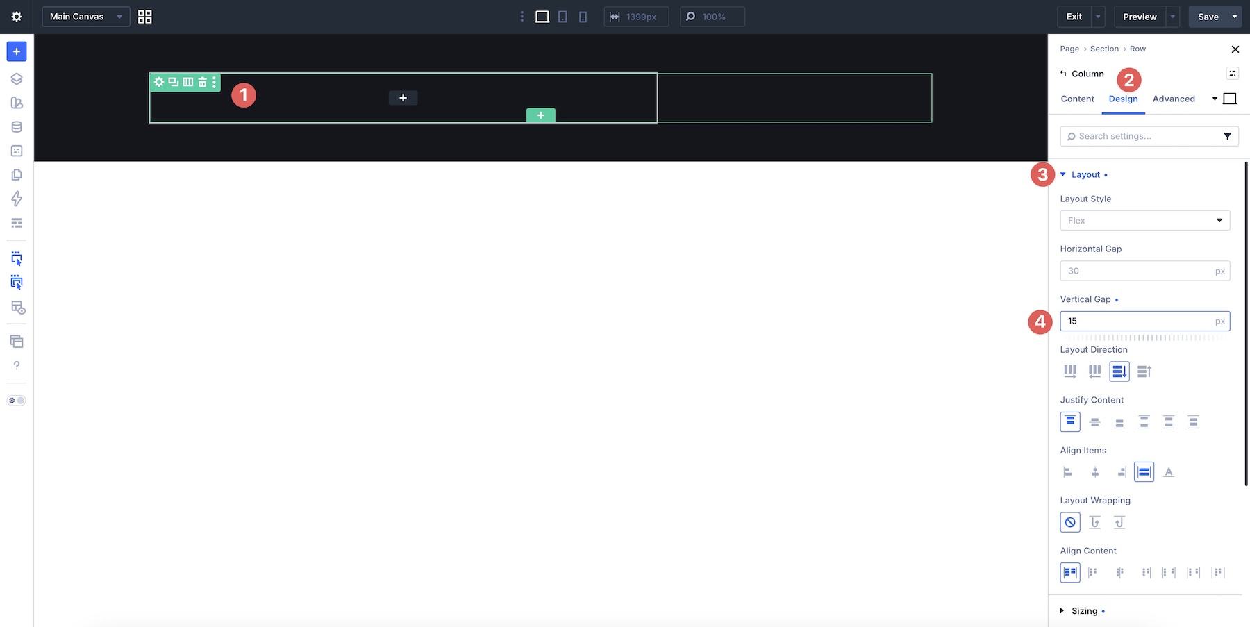
Open the Column settings, go to the Design tab, and expand the Sizing option group. Set Column Class to 2/3.
Next, expand the Layout option group in the Design tab. Set the Vertical Gap to 15px. Keep the remaining Flex settings at their defaults unless your design needs additional adjustments.
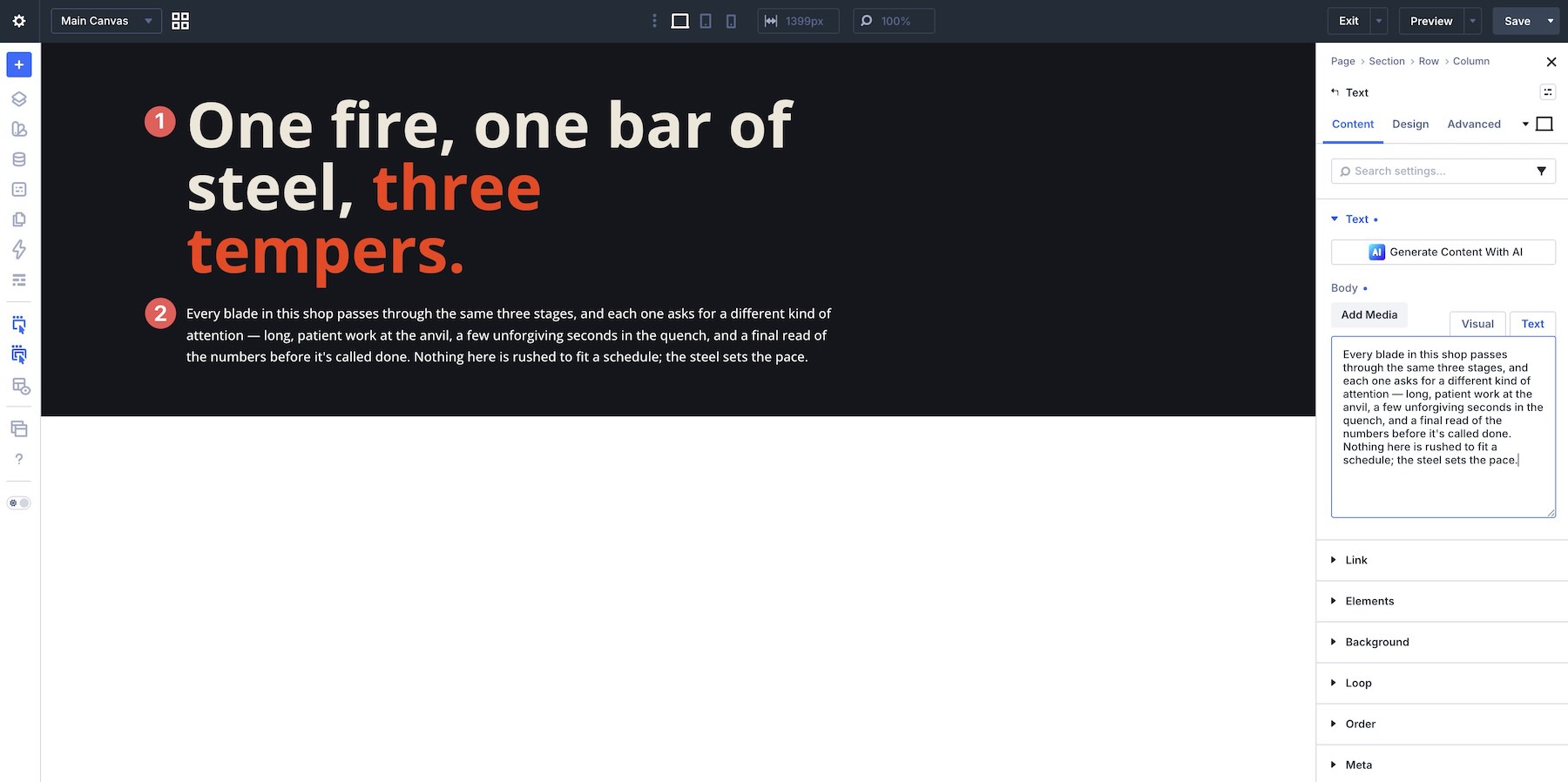
In the first Column, add two Text modules. Add your content and style it as needed.
Add A Second Column
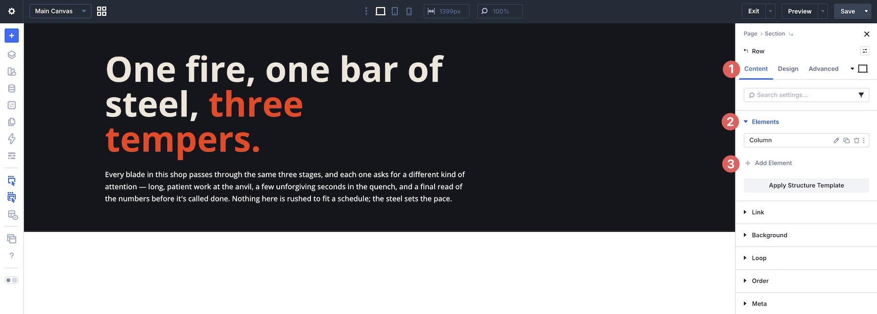
Now add another Column to the Row. In the Row’s Content tab, click + Add Element in the Elements option group.
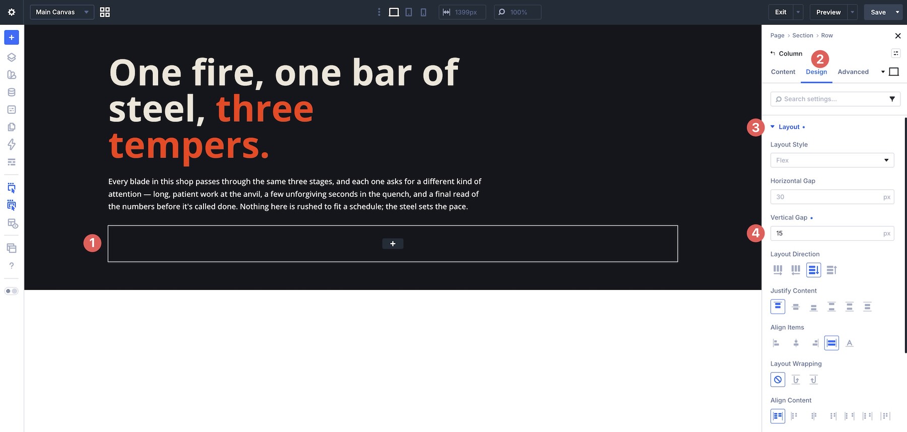
Open the new Column’s Design tab, expand the Layout option group, and add a 15px Vertical Gap.
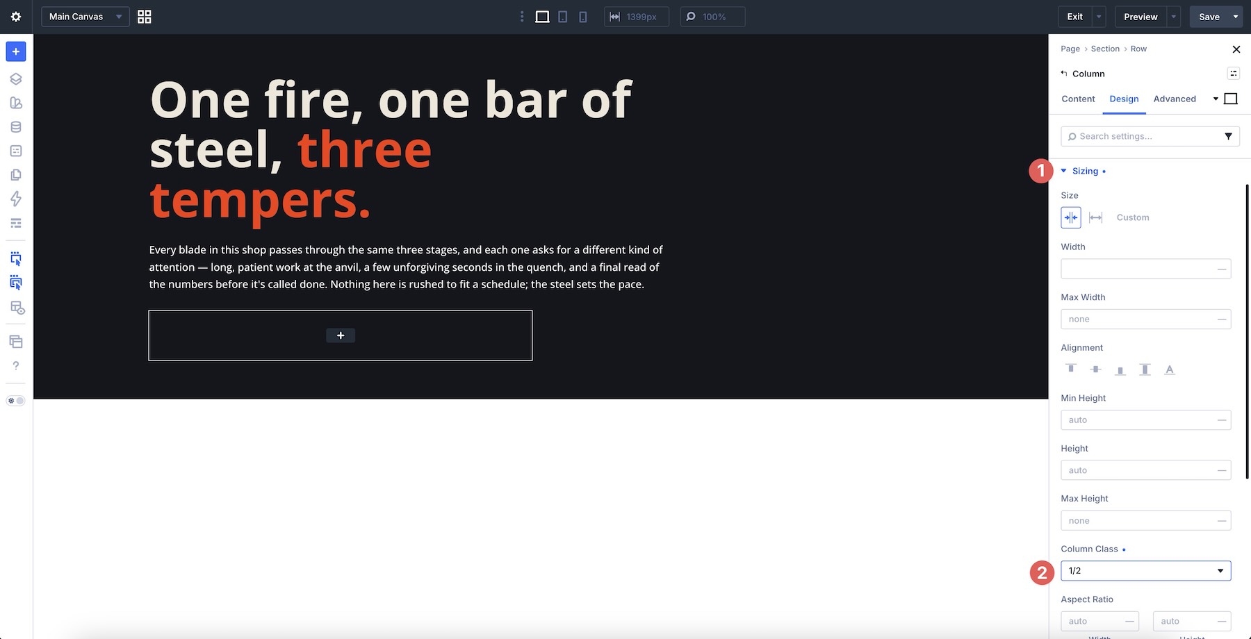
Next, expand the Sizing option group and assign Column Class > 1/2.
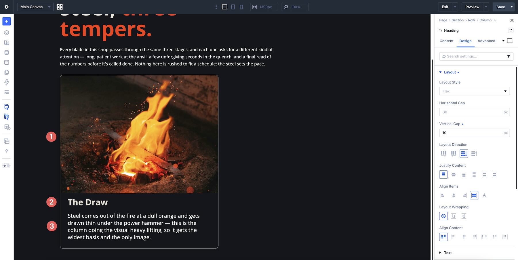
Add an Image, a Heading, and a Text module to the Column, then style them as needed.
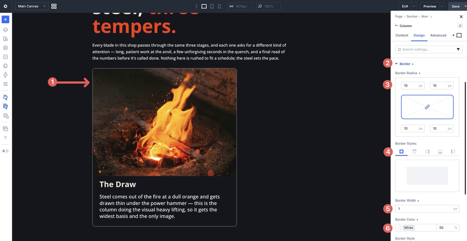
In the Column’s Design tab, add a border, border radius, and spacing.
Add A Third Column
Add another Column to the Row and assign Column Class > 1/3.
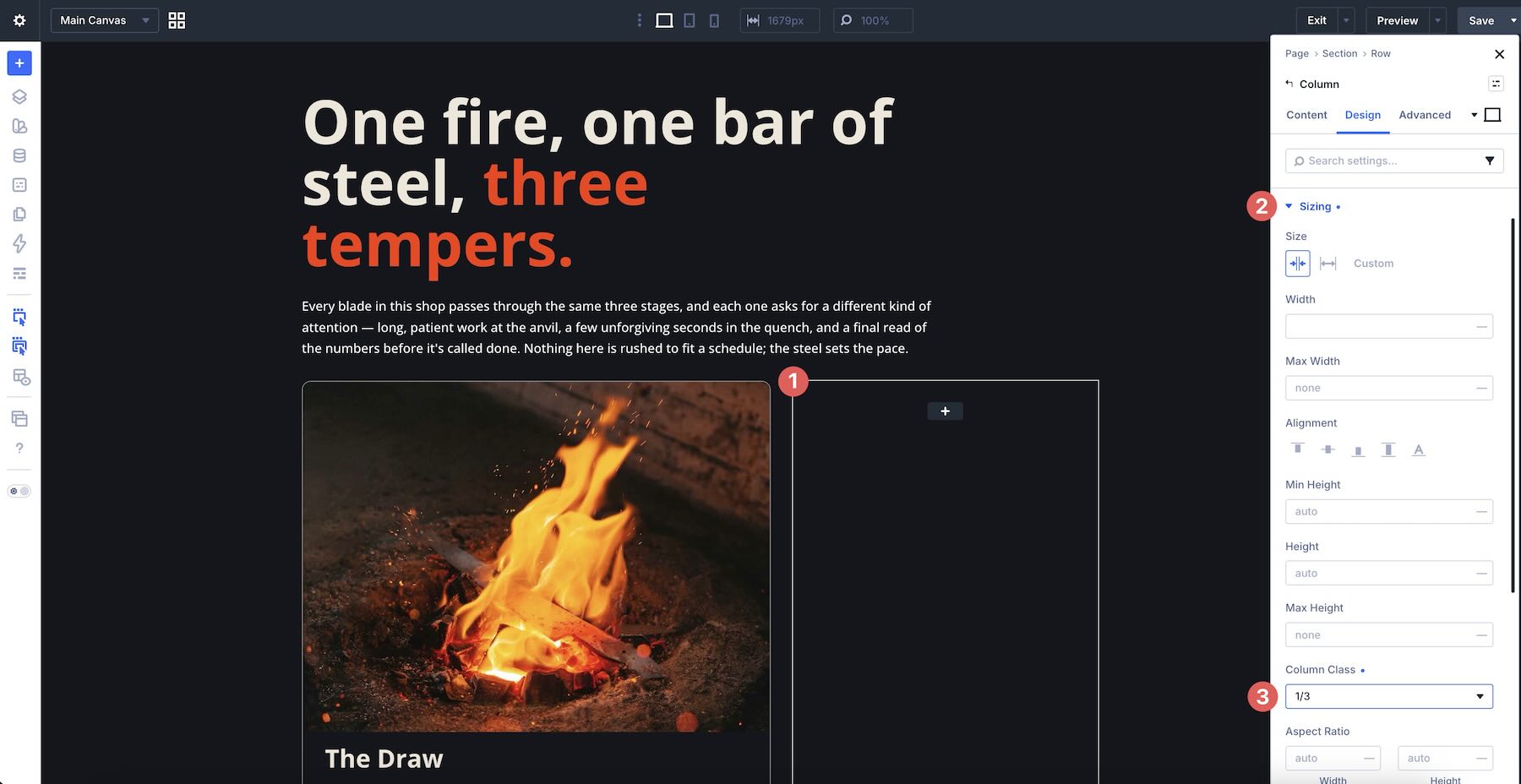
Then right-click the second Column’s Border styles and copy them to the third Column. Add 25px Padding in the Spacing option group to give the Column breathing room.
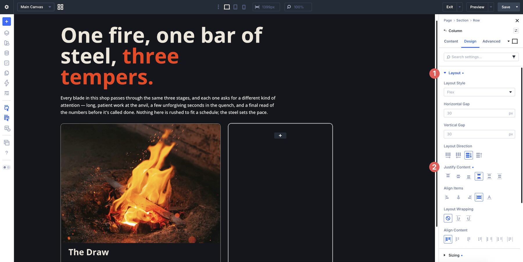
While in the Design tab, expand the Layout option group. Set Justify Content to Space Between.
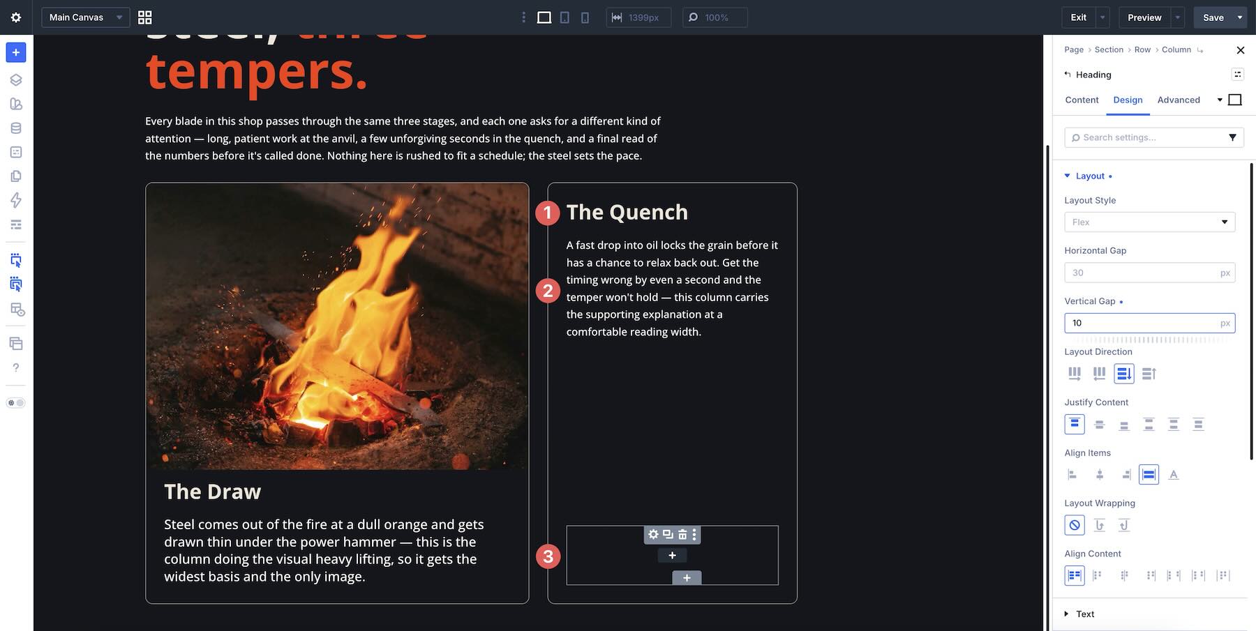
Next, add the content to the Column. Add a Heading, a Text module, and a Module Group, then style them as needed.
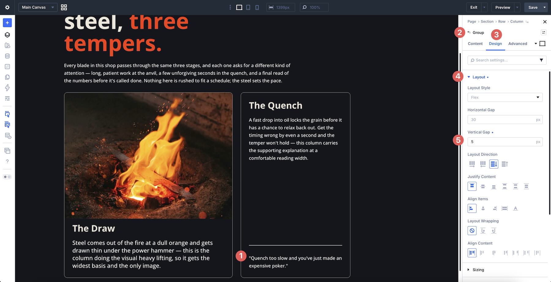
Inside the Module Group, add a Divider module and a Text module. Then open the Module Group’s Design tab, expand the Layout option group, and set a 5px Vertical Gap.
Configure The Fourth Column
Finally, add another Column to the Row and assign Column Class > 1/6.
Right-click the third Column and select Copy Attributes.
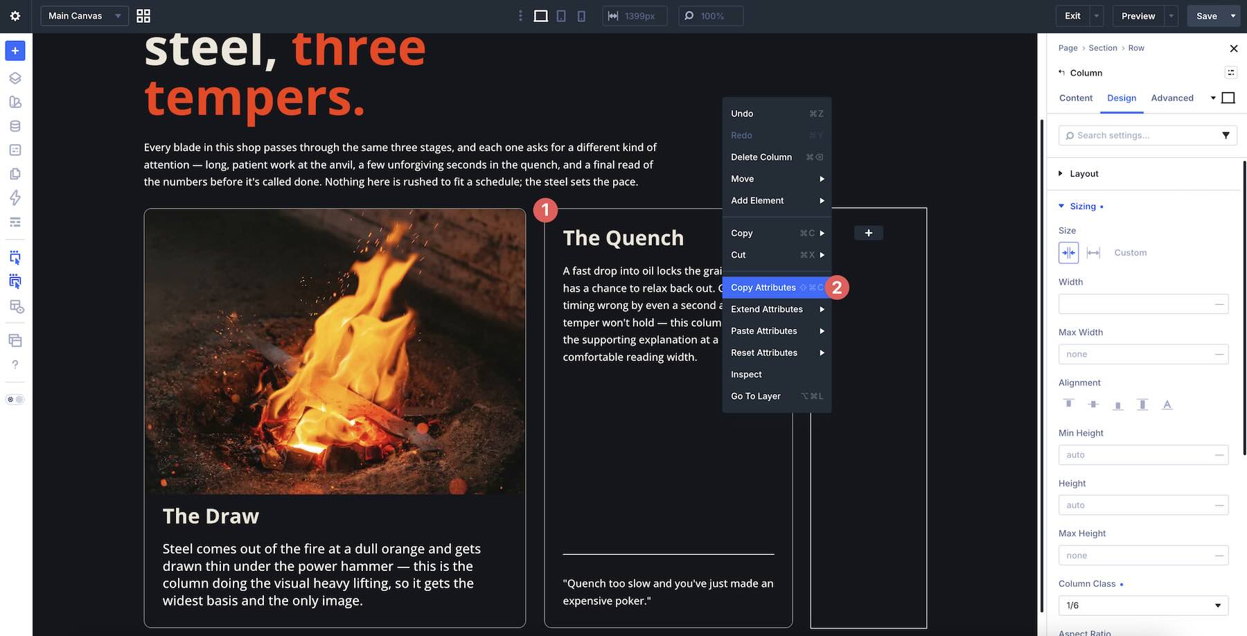
Then right-click the fourth Column, choose Paste, and use Select Design Attributes to paste the border attributes. Repeat the process for the spacing and layout attributes.
Next, add a Module Group to the Column. Place a Heading module and a Text module inside it. Open the Module Group’s Design tab, expand the Layout option group, and set the Vertical Gap to 0px.
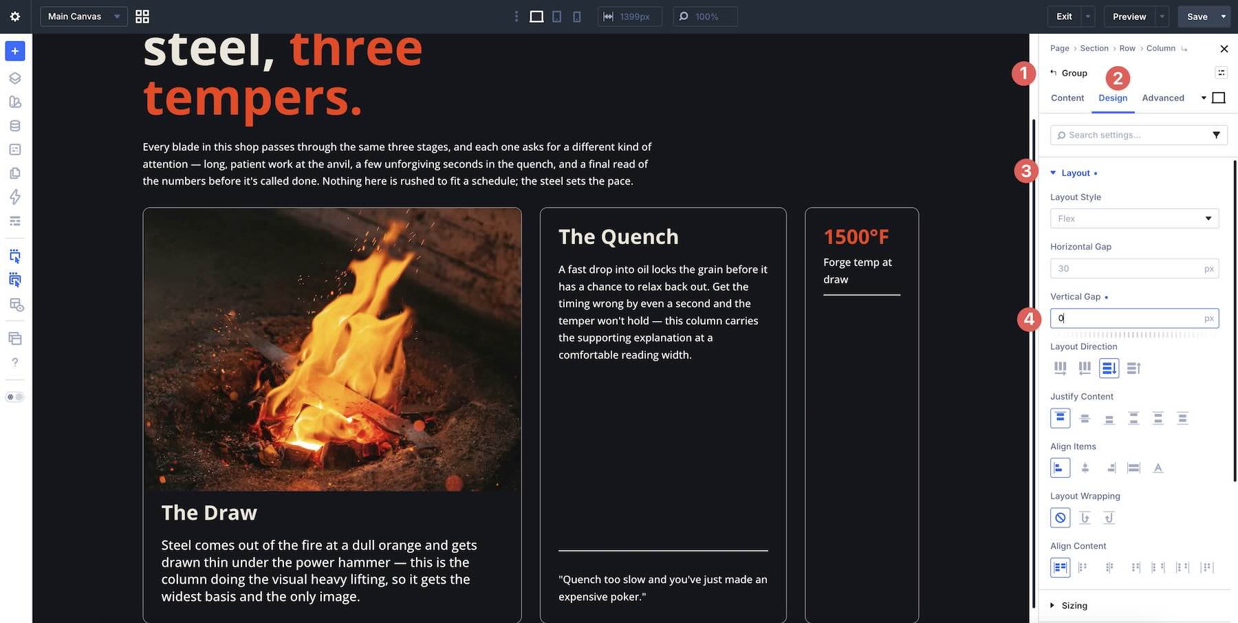
Copy the Module Group twice and update the Heading and Text content for each Group.
Make Responsive Adjustments
Switch to the Tablet breakpoint. Keep the Gap and Flex settings the same as Desktop for now, but change a few Column Class values so the content flows more naturally.
Starting with the first Column, change the Column Class from 2/3 to Fullwidth.
Leave the second Column as is, but change the third Column’s Column Class to 1/2.
Change the fourth Column’s Column Class to Fullwidth and change its Layout Direction to Row. This places the Module Groups side by side inside the fourth Column instead of stacking them vertically.
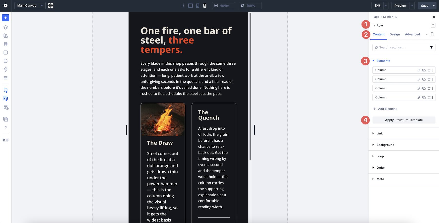
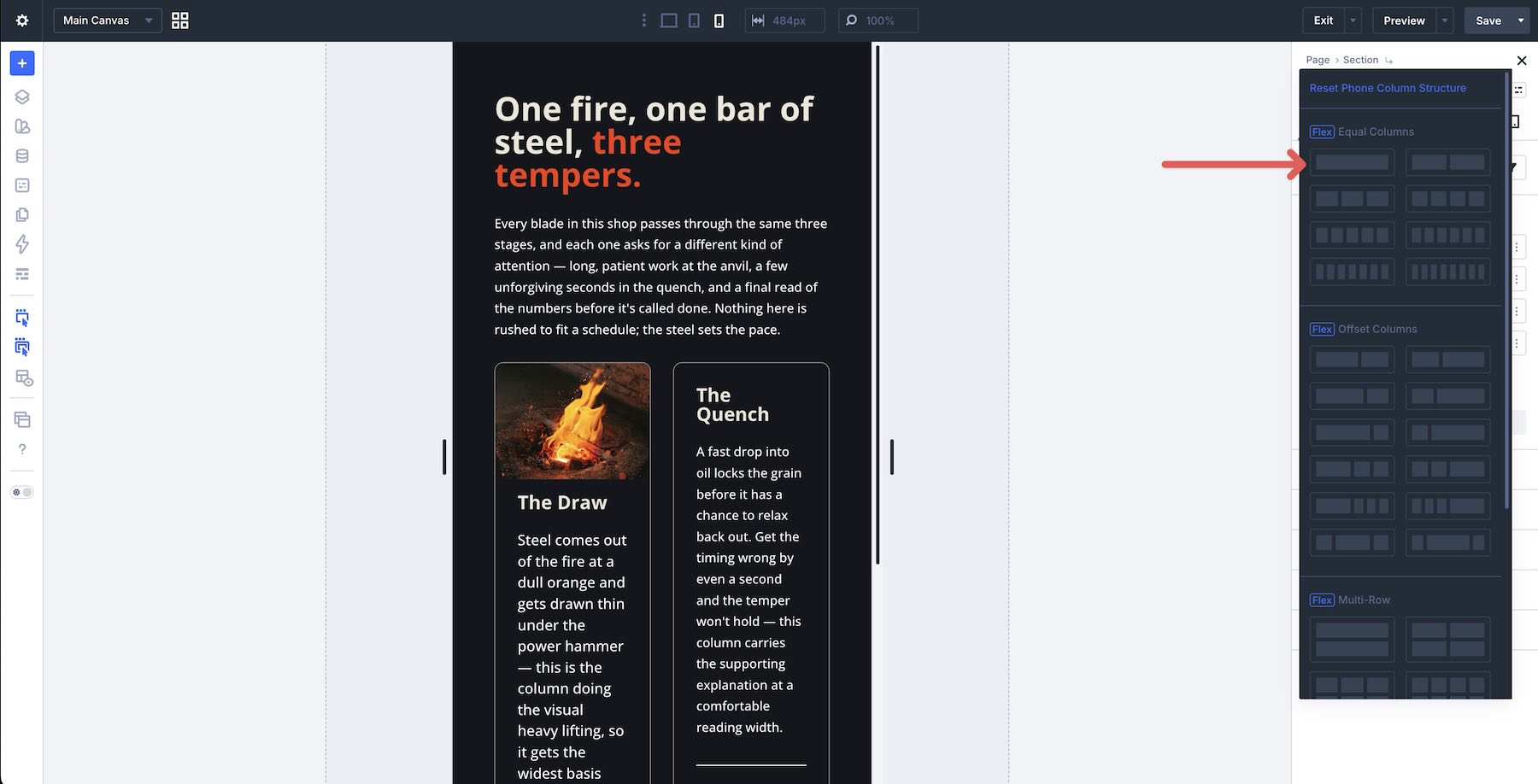
Now switch to the Phone breakpoint. Instead of editing every Column Class manually, apply a Structure Template to resize the Columns for smaller screens. In the Row’s Content tab, expand the Elements option group and click Apply Structure Template.
Choose the Single Row template to apply it to all Columns in the Row.
Now, as you cycle through breakpoints, the same Flex section adapts to Desktop, Tablet, and Phone without rebuilding the layout from scratch.
Tips And Best Practices
Here are a few practical guidelines to help you get the most out of Column Class and Flexbox in Divi 5:
- Choose Column Class combinations carefully: Start with the simplest fractions that achieve your design, such as 1/2, 1/3, 1/4, and 2/3. Complex combinations can make responsive adjustments harder to track later.
- Use Layout Wrapping when one Row should become multi-line: If the layout contains related items, such as cards or stats, one wrapping Row can be easier to manage. If the content types are very different, multiple Rows may still be cleaner.
- Manage spacing with Gap at the right level: Use Row-level Horizontal Gap and Vertical Gap for spacing between Columns and wrapped lines. Use Column-level or Module Group-level Gap for spacing between modules inside each Column.
- Test with real content: Placeholder text can hide wrapping and alignment issues. Use realistic headings, paragraphs, button labels, and image dimensions before finalizing the responsive structure.
- Use Grow To Fill only when it solves a clear alignment problem: Grow To Fill can help equalize internal spacing in card-style layouts, especially when combined with Justify Content > Space Between, but it should not replace a clean structure.
- Avoid overcomplication: Column Class, Gap, and Layout Wrapping are enough for many responsive column layouts. Add Justify Content, Align Items, Display Order, or Grow/Shrink only when they solve a specific issue.
Download The Files
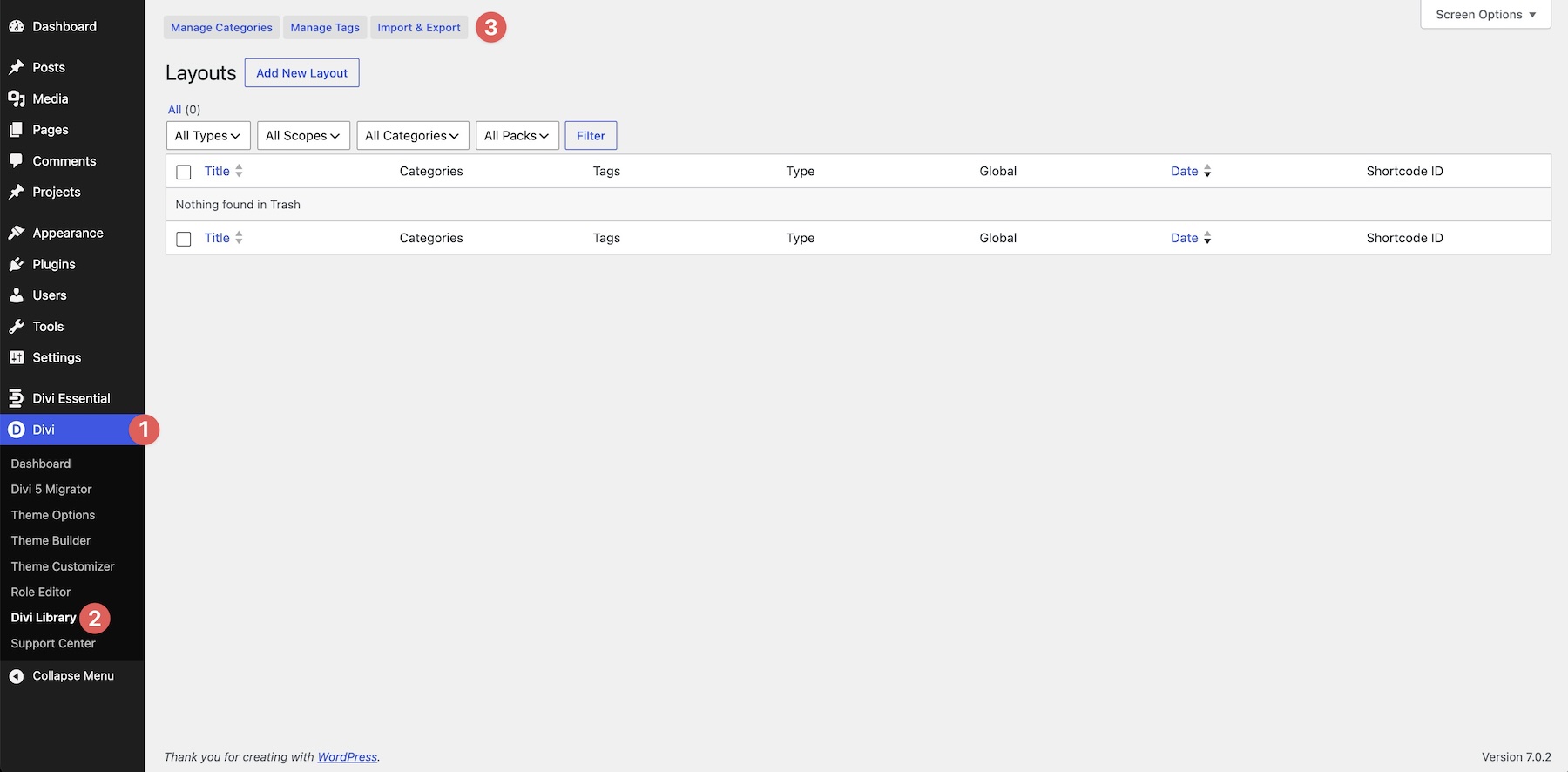
To help you explore responsive Columns in Divi 5, we’ve created a zip file with the layouts used in this post. To use them, go to Divi > Divi Library in the WordPress dashboard and click the Import & Export button.
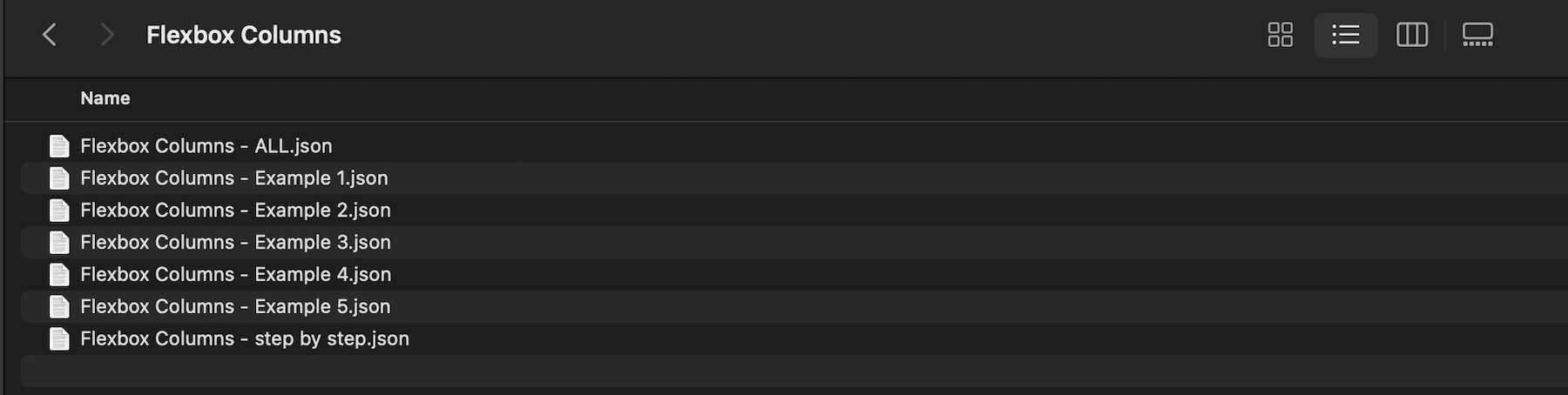
The zip file includes seven files: one Flexbox Columns – ALL.json file, individual JSON files for examples 1-5, and one JSON file for the step-by-step example.
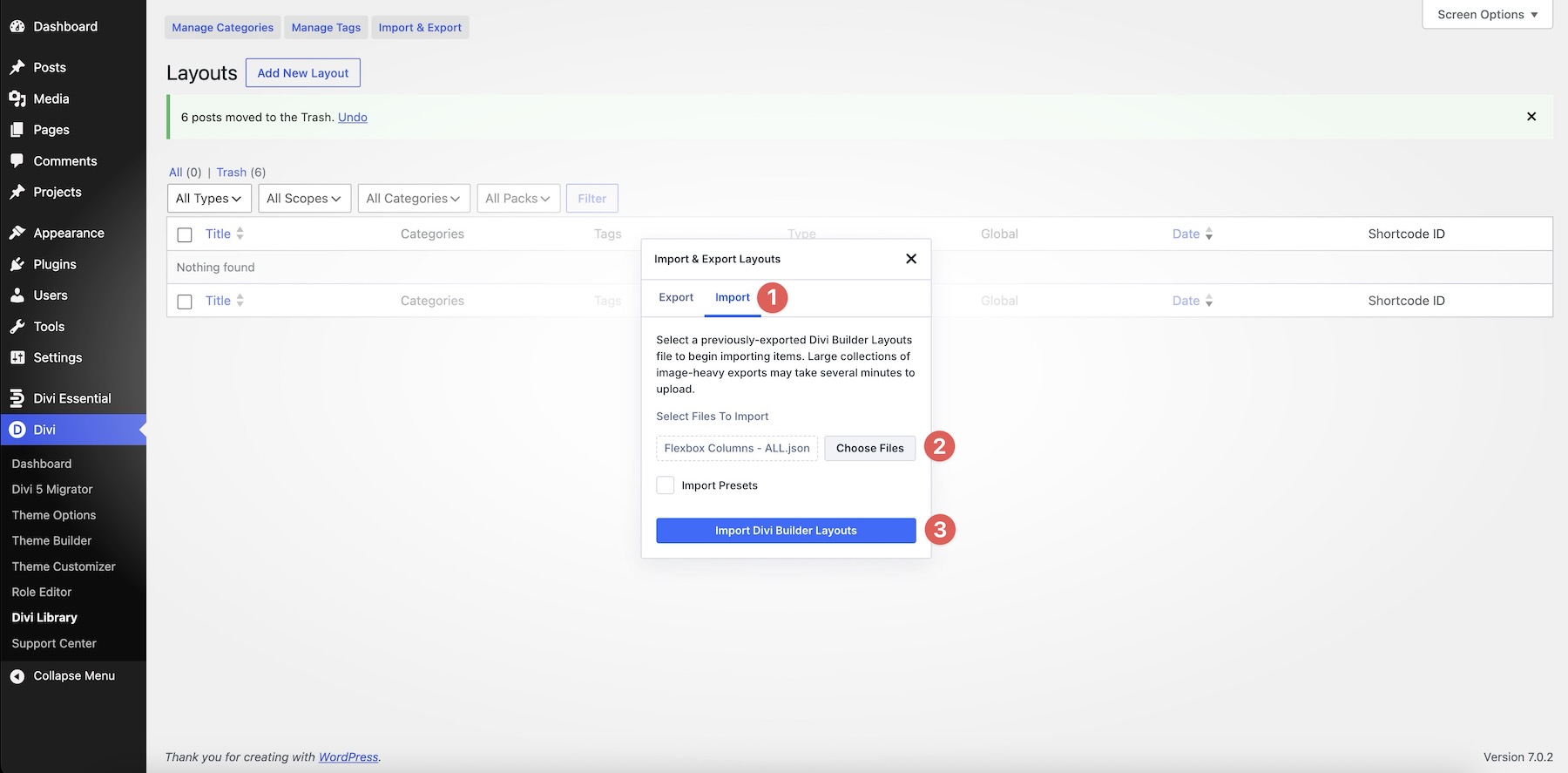
To import the files, select the Import tab, choose a file, and click Import Divi Builder Layouts.
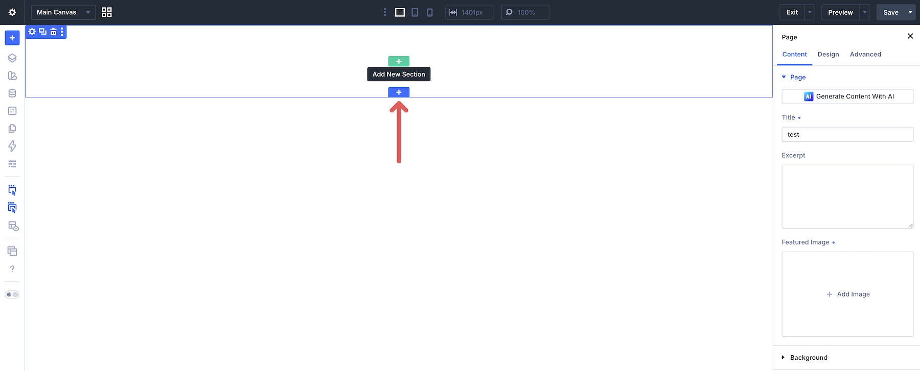
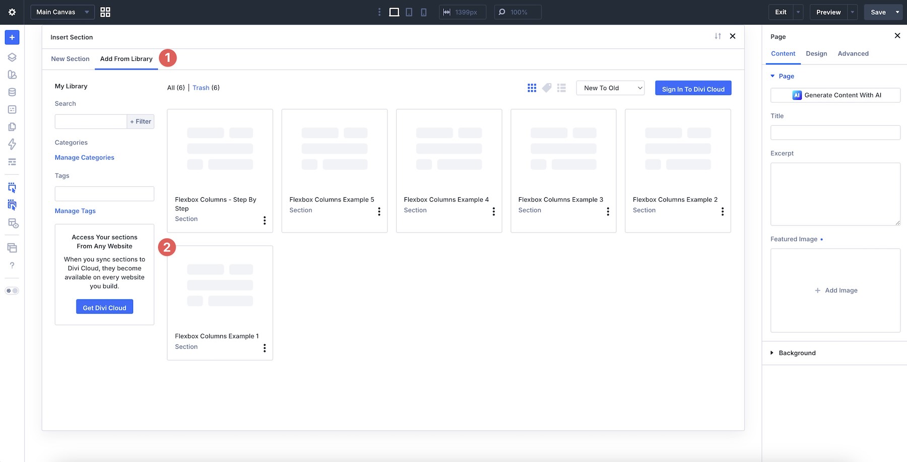
Next, open a new or existing page in the Visual Builder. Click the blue + icon to add a new Section.
Click the Add From Library tab and select a layout to load it onto the Canvas.

Build Responsive Columns In Divi 5
With Column Class and the Flexbox controls in Divi 5, you can create flexible multi-column layouts that adapt across breakpoints without reaching for CSS Grid in many common scenarios. You’ve now seen how to define Column widths, combine them with Layout Wrapping, Gap, Justify Content, Align Items, and Display Order, and adjust the same layout structure across Desktop, Tablet, and Phone.
In the final installment of the series, Part 10 Of Mastering Flexbox: Best Practices And Helpful Tips, we’ll bring everything together with practical recommendations, common pitfalls to avoid, and workflow tips for building cleaner Flexbox layouts in Divi 5.
Download the example layouts from this post, experiment with different Column Class combinations, and start applying these patterns to your own projects. Once you understand how Column Class, Gap, and Layout Wrapping work together, responsive Columns become much easier to build and maintain.
The post Part 9 Of Mastering Flexbox: Creating Responsive Columns Without CSS Grid appeared first on Elegant Themes Blog.
The Tech Zone


Comments
Post a Comment