How To Create A Typography System With Variable Fonts In Divi 5
A strong typography system is more than choosing a heading font and a body font. It defines how type scales, how different text roles relate to each other, and which decisions stay consistent as the website grows. Variable fonts make that system much more flexible.
Instead of choosing only from fixed stops such as Regular, Medium, and Bold, a variable font can give you continuous control over supported axes such as weight, width, slant, optical size, Grade, and other font-specific characteristics.
Divi 5 brings those controls directly into the Visual Builder and connects them to the rest of its design system. Pair Variable Fonts with Font Variables, the Variable Generator, Number Variables, and Presets, and you can turn individual typography choices into a reusable sitewide framework.
In this tutorial, we’ll build that framework from the ground up. Think of it as a blueprint: choose the right variable font, establish the font family globally, generate a responsive type scale, define how each typographic role uses the font’s axes, and save those decisions as Presets that can be reused throughout the site.
What Are Variable Fonts And How Do They Help?
A variable font is an OpenType font that can store a range of typographic variations inside one font family. Instead of the type designer committing only to separate fixed styles, such as Regular at 400 and Bold at 700, the font can define a continuous range between supported extremes.
Weight is the clearest example. A static font family might provide separate files for Regular, Medium, Semi Bold, and Bold.
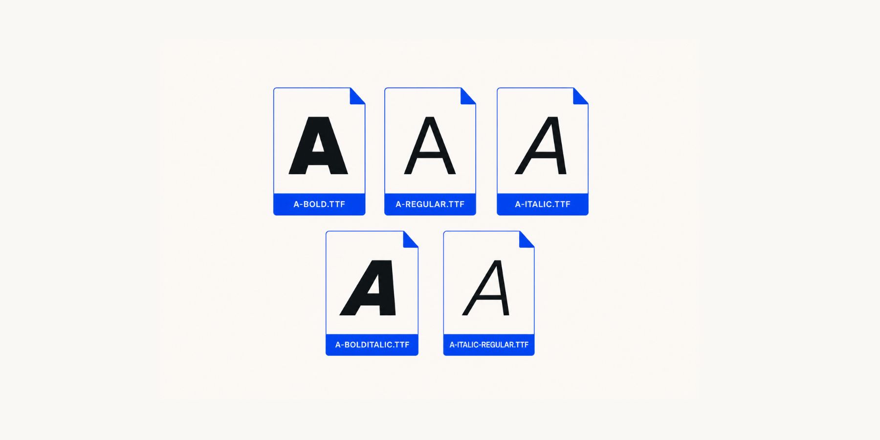
A variable font with a weight axis can instead expose a continuous range, such as 100 through 900. If you choose 520, you are using a point within the range defined by the typeface rather than being limited to the closest named weight.
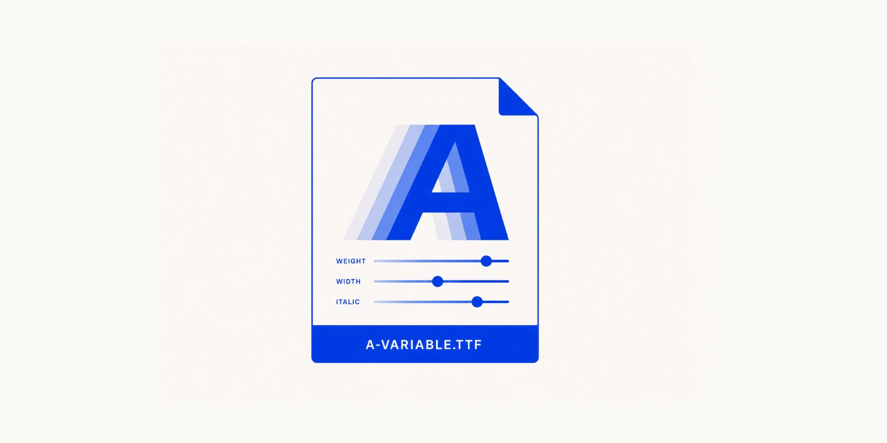
Other axes can work the same way. A variable font might include width, slant, optical size, Grade, or more specialized controls alongside weight. Fonts such as Recursive and Roboto Flex are good examples of how much variation can live inside one family. That gives you more room to create hierarchy without automatically reaching for another typeface. Body copy, section headings, buttons, labels, and display text can all feel distinct while still sharing the same underlying font family.
A variable font can also replace several separate static font files when served appropriately, although the exact loading behavior depends on the font and how it is delivered. For a design system, however, the bigger benefit is flexibility: you gain more usable typographic values without multiplying the number of font families you have to manage.
Introducing Variable Fonts In Divi 5
A variable font may contain several axes, but those controls are only useful if your design tool can expose them. Divi 5 supports variable fonts through its Google Fonts integration. When you select a supported variable font, Divi reads the available axes and displays the relevant controls directly inside the text settings.
The exact controls depend on the font. A simple variable font might give you Weight and Optical Sizing. Another might also support Width, Slant, Grade, Roundness, or several custom axes. That means the Visual Builder adapts to the font you select instead of presenting the same generic variable-font controls for every typeface.
More importantly, these controls can become part of Divi 5’s broader design system. Font Variables can manage the typeface, Number Variables can manage the size scale, and Presets can store the specific axis values and typography settings for each role. That is where a flexible font becomes a reusable typography system.
The Blueprint: Build The Typography System In Layers
Before changing settings, it helps to separate the system into layers. The finished typography system will have six:
- Font Family: Choose the variable font and store the main typefaces as Font Variables.
- Size Scale: Use Divi 5’s Variable Generator to create reusable Font Size Variables for headings and supporting text.
- Variable Font Axes: Decide how Weight, Width, Optical Sizing, Slant, Grade, and any other supported axes should behave.
- Typography Roles: Turn those controls into intentional recipes for body copy, headings, buttons, and other text types.
- Option Group Presets: Save those recipes so the same typography can be used across compatible modules.
- Element Presets: Combine typography with the other design decisions that define complete modules.
This order matters because each layer depends on the one beneath it. The font family gives you the available axes. The Variable Generator provides the sizing scale. The role definitions decide how those values work together. Presets then distribute those decisions throughout the site.
If you later change the font family or the generated size scale, you can update the foundation instead of rebuilding every heading manually.
Building A Variable Typography System In Divi 5
Now let’s build the system. The goal is not simply to make one heading look good. We want a structure that can carry typography consistently across pages, modules, templates, and future content.
1. Find The Right Variable Font
Start with the font itself.
Divi 5 includes Google Fonts in its font picker, including supported variable fonts. If you want to research the available axes before choosing one, the Google Fonts website is useful because you can filter the library to variable fonts and inspect individual typefaces in more detail.
Use the Variable filter to narrow the collection to fonts with variable data.
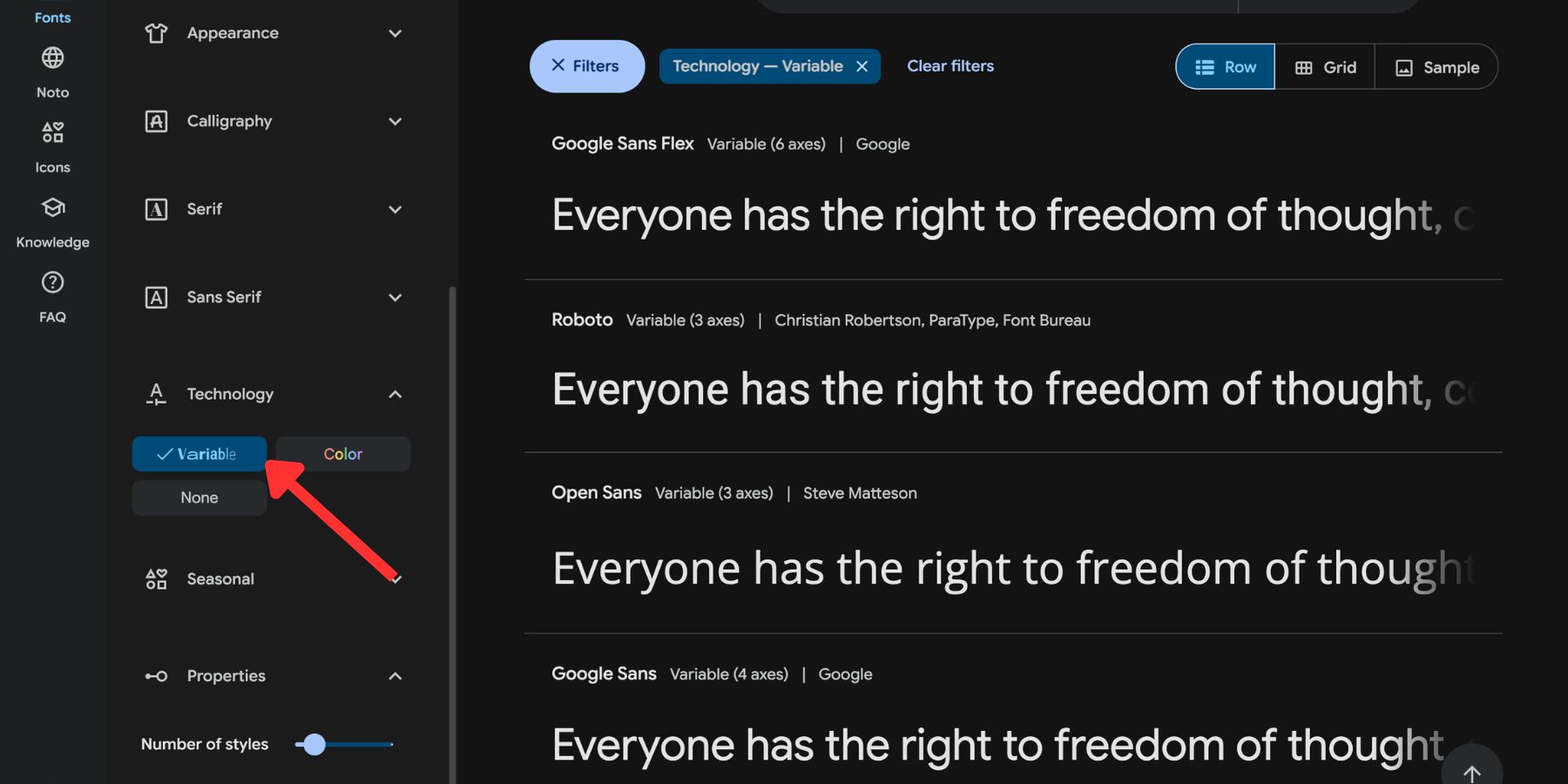
Pay attention to the axes each font supports. Two variable fonts can offer very different levels of control. One might vary only by weight. Another might include weight, width, slant, Grade, optical size, and additional custom axes.
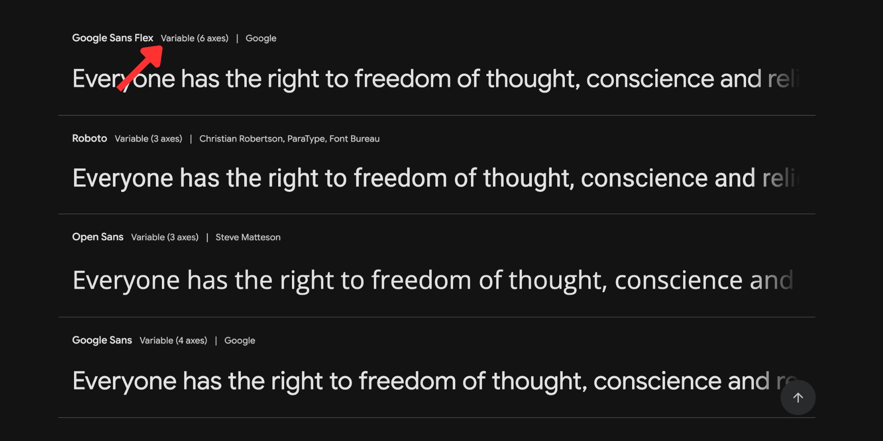
More axes are not automatically better. For a straightforward corporate site, a wide Weight range may be all you need. An editorial, portfolio, or experimental design may benefit from Width, Optical Size, Slant, Grade, or more expressive custom axes.
Open the font’s detail page and test its available controls.
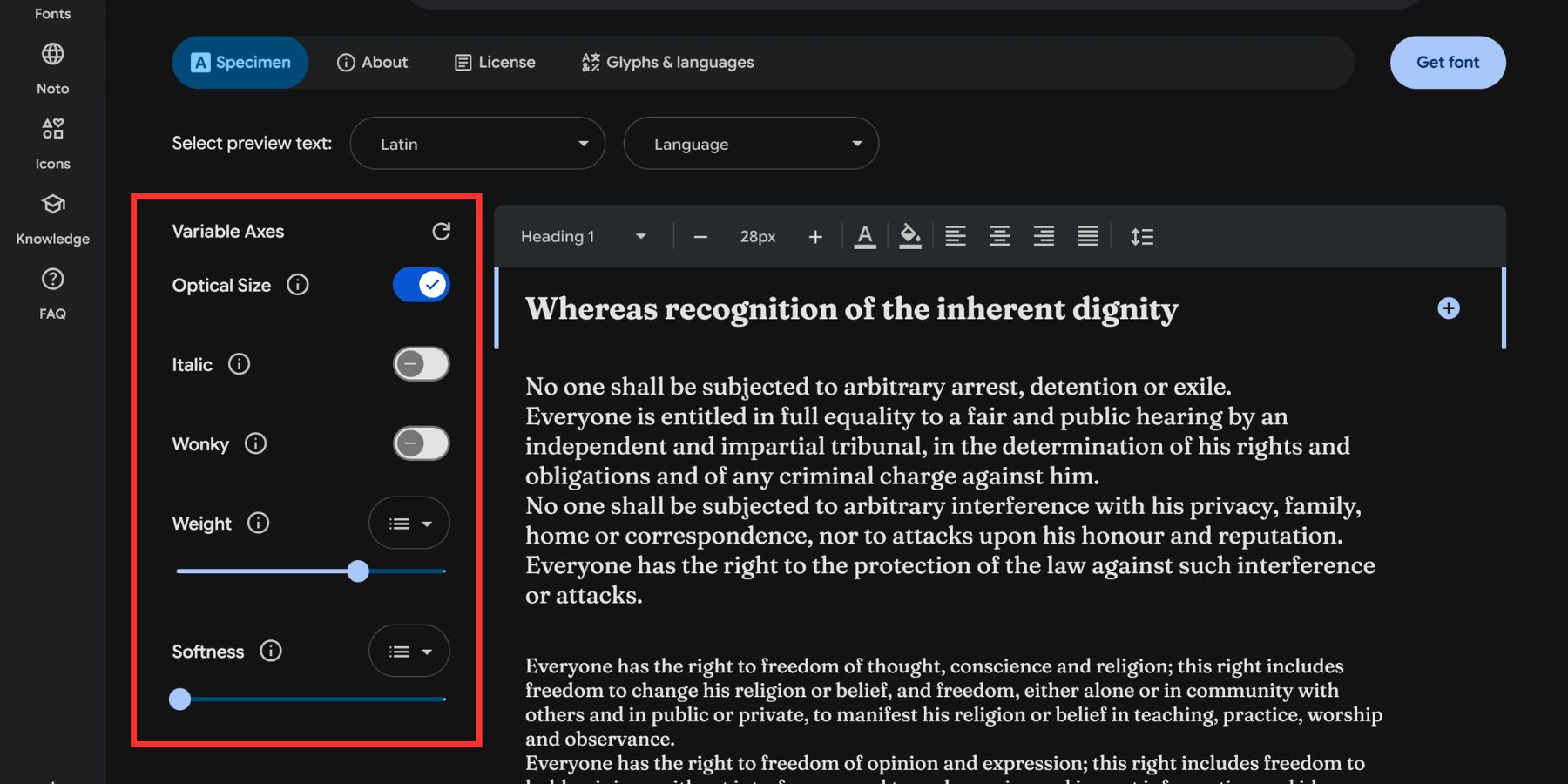
Look at both the number of axes and their ranges.
If you want a single-family typography system, make sure the font can create enough contrast between the roles you need. A wide weight range, useful width controls, and optical sizing can often do more for a system than a long list of decorative axes you may never use.
2. Set Up The Font In Divi
Once you’ve chosen the typeface, decide whether you are still testing it or ready to make it part of the system.
Use Font Variables For The System
For a finished typography system, start in the Variable Manager. Design Variables store reusable values that can be referenced throughout the site. For typography, Font Variables handle the font family while Number Variables can handle font sizes and related measurements.
Open the Variable Manager and switch to the Fonts section. Divi includes Heading and Body font variables that you can use as the foundation for the site. Set your chosen variable font for the Heading variable, Body variable, or both depending on the system you want to create.
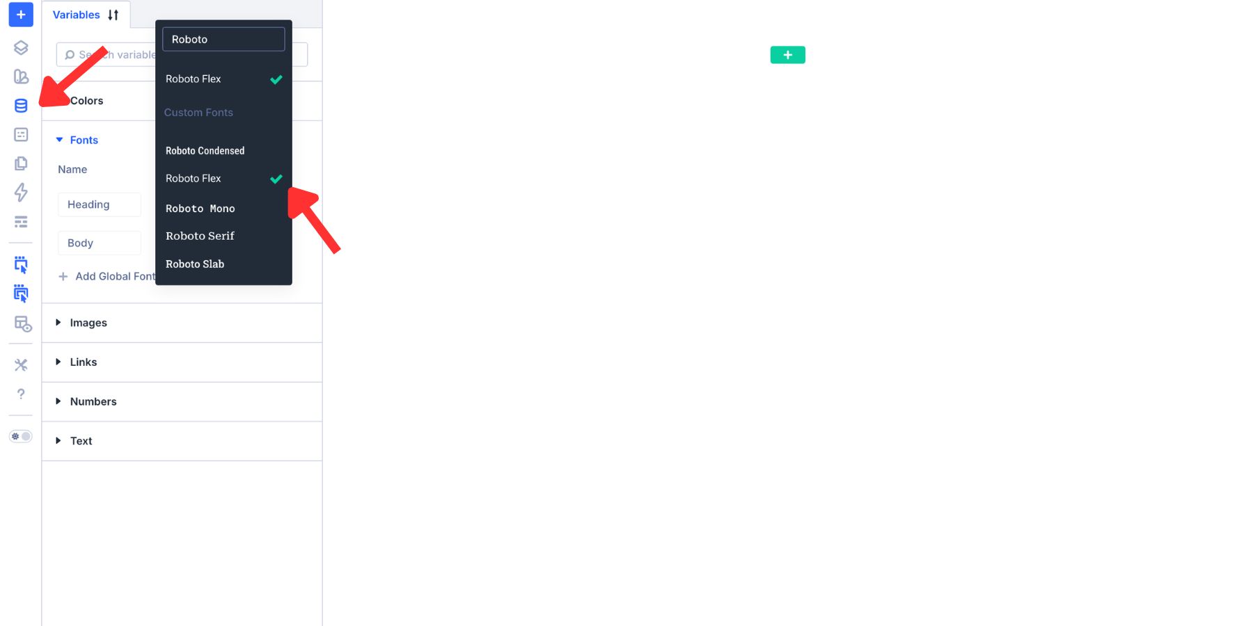
A single-family system can use the same variable font for both Heading and Body, then create hierarchy with size, Weight, Width, Grade, and other supported controls. You can also create additional Font Variables for special roles such as display text, quotations, or accent typography.
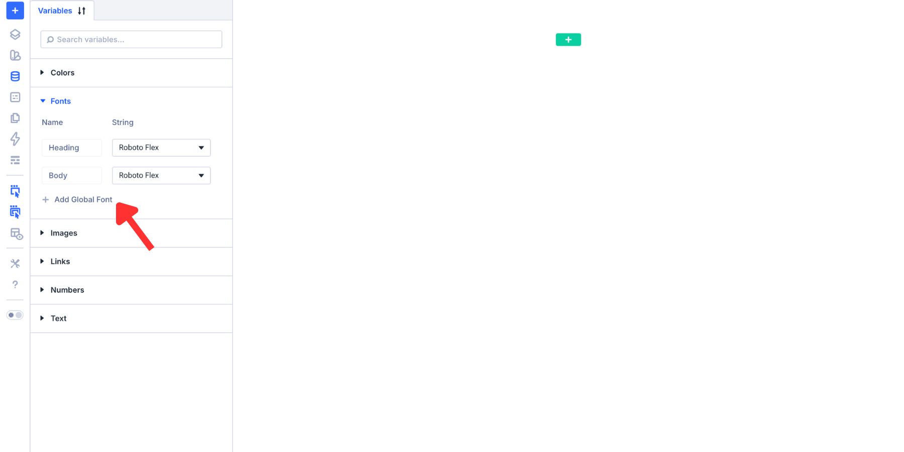
Once a Font Variable is referenced in your typography settings or Presets, changing its typeface later updates those connected instances.
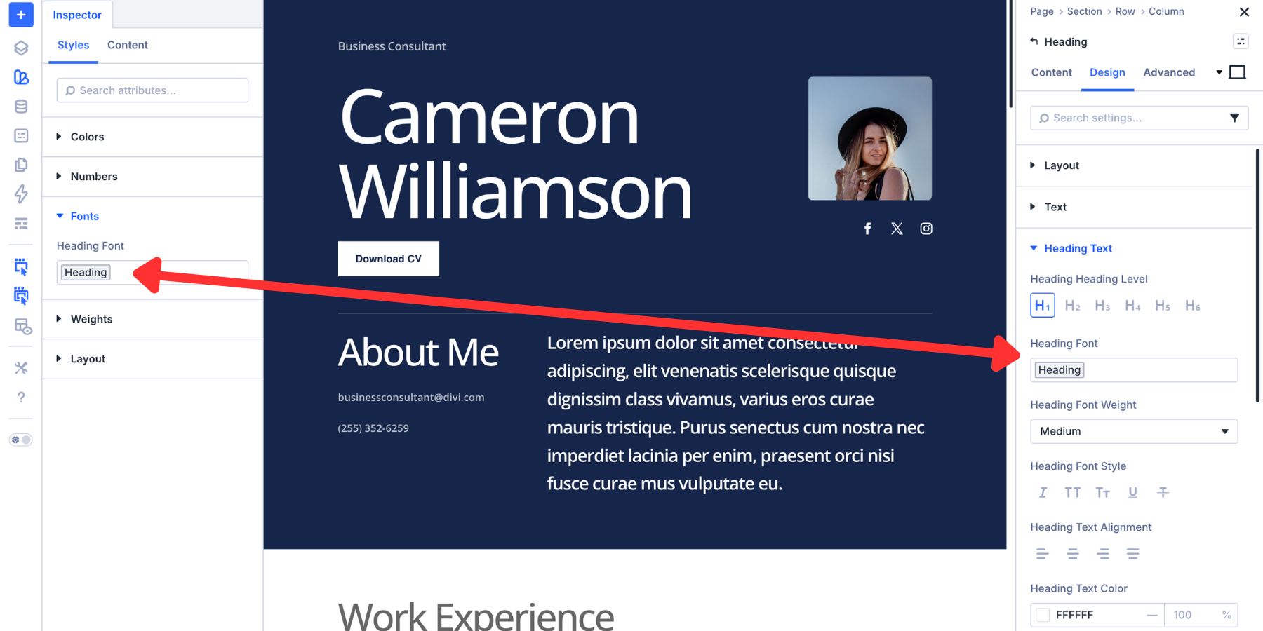
To use one of your additional Font Variables, click the variable icon beside a compatible font field and select it from the list.
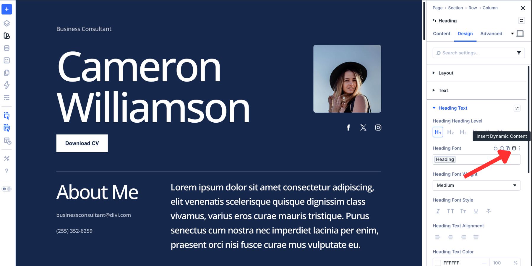
This is why the font family belongs near the bottom of the blueprint. A direct font value can work on one module. A Font Variable gives the rest of the system something reusable to reference.
Use The Font Directly While Testing
Direct assignment still has a place when you’re evaluating a typeface. Open any module with text settings, go to the relevant text option group in the Design tab, and choose the font from the font picker.
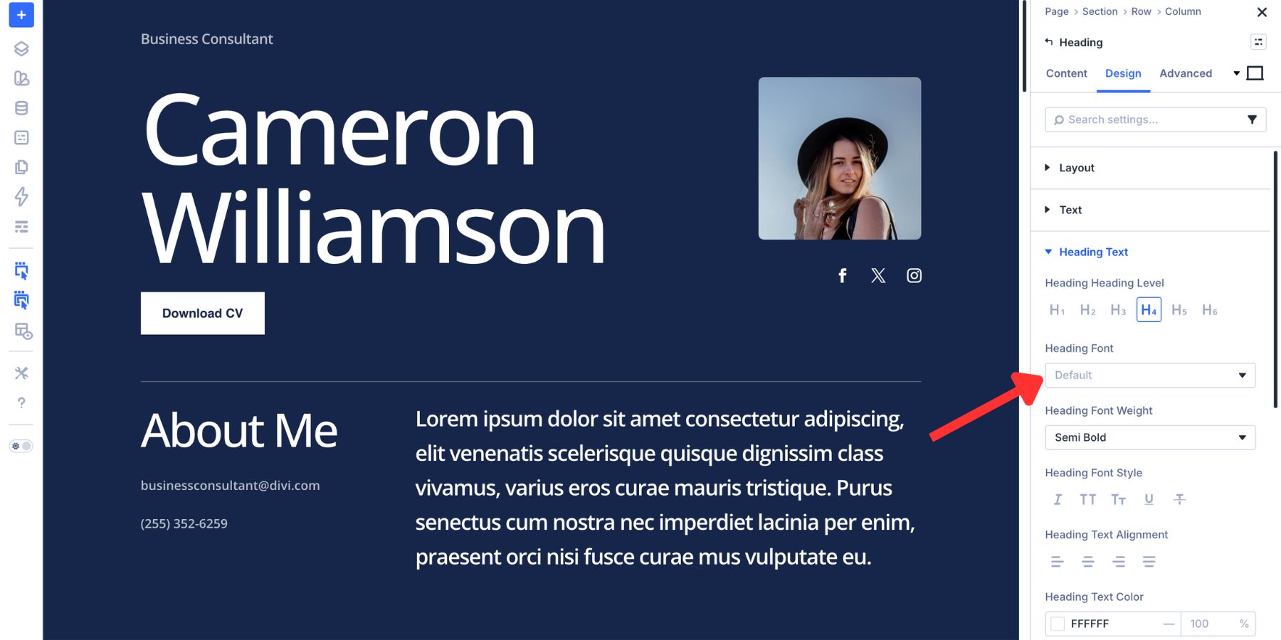
Divi displays the supported variable font controls for that typeface, allowing you to test its range before committing it to your Font Variables and Presets. Once you know the font belongs in the system, move the family choice into a Font Variable rather than repeating the direct value throughout the site.
3. Generate Your Font Size Scale With The Variable Generator
The font family is only one part of typography. The next layer is size. You could create H1, H2, H3, body, small text, and supporting sizes manually as Number Variables. Divi 5’s Variable Generator gives you a faster way to establish that scale. Open the Variable Manager and find the Numbers group. Hover over it and choose Generate Fluid Sizing Variables.
Inside the generator, select Font Size as the variable type. The Variable Generator can create three useful kinds of typography scale:
- Fluid: Generates clamp()-based values that scale smoothly between minimum and maximum sizes as the viewport changes.
- Fixed Responsive: Generates separate values for Divi’s responsive breakpoints.
- Fixed Single: Uses one fixed value across screen sizes.
For a fluid typography system, choose Fluid. Divi will generate a series of Number Variables that you can use for your typography roles. Depending on how many steps your system needs, those can become values such as:
- Display
- H1
- H2
- H3
- H4
- Body Large
- Body
- Body Small
The exact names are up to you. What matters is that the scale is intentional. A generated font-size variable controls size. It does not automatically determine the variable font’s Weight, Width, Slant, Grade, or other axes. We’ll define those separately in the next layers of the blueprint and combine everything inside Presets. That separation is useful.
Your H2 size can change globally without changing its Weight. Your font family can change without rebuilding the scale. And a button can use the same body-size variable while applying a completely different axis recipe. If you later decide the whole site feels too large or too compressed, adjust the generated variables rather than visiting every typography preset one by one.
4. Explore The Variable Font Axes
Now we have the font family and the size scale. The next layer is deciding how the font itself should behave. When you apply a supported Google variable font in Divi 5, additional controls appear beneath the normal typography settings. The exact selection depends on the axes contained in that font.
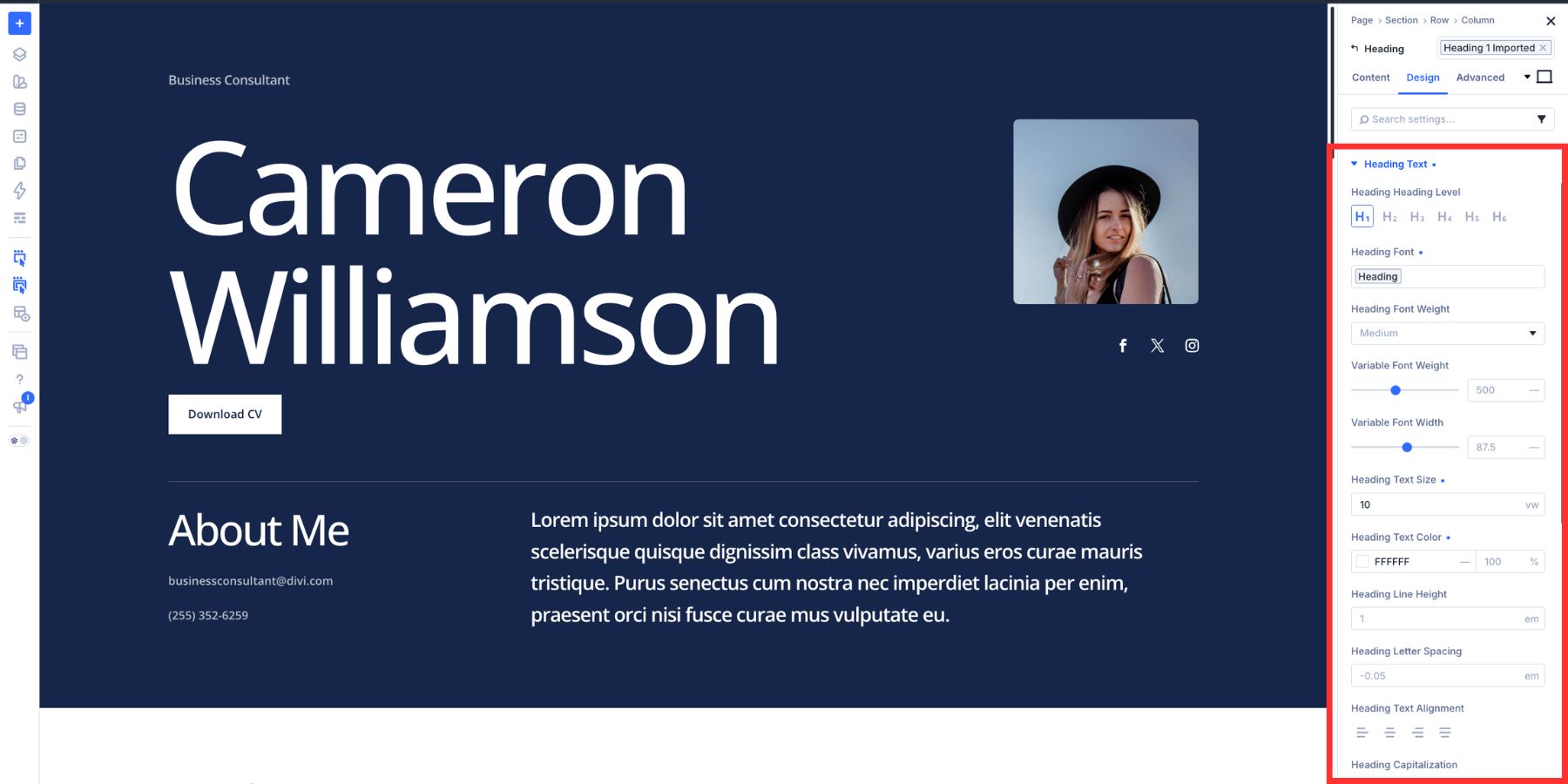
Some typefaces expose only a few axes. Others give you a much wider set. Before creating presets, test the useful range of each axis and decide which ones actually contribute to the system.
Variable Font Weight
Standard font weight controls are usually organized around familiar named values such as Regular, Medium, Semi Bold, and Bold. The Variable Font Weight control lets you work between those fixed stops when the typeface supports a continuous weight axis.
The available range depends on the font. A typeface may span 100 through 900, while another uses a narrower range. A value such as 550 can give a heading more presence than Medium without pushing it all the way to Bold.
That precision becomes especially useful when nearby typography roles need hierarchy without looking like completely different styles.
Optical Sizing
Some variable fonts include an Optical Size axis. Optical sizing lets the typeface adapt details of its letterforms for different display sizes. Depending on the font, this can influence characteristics such as proportions, spacing, stroke treatment, or contrast.
In Divi 5, enable Optical Sizing when the chosen font supports it.
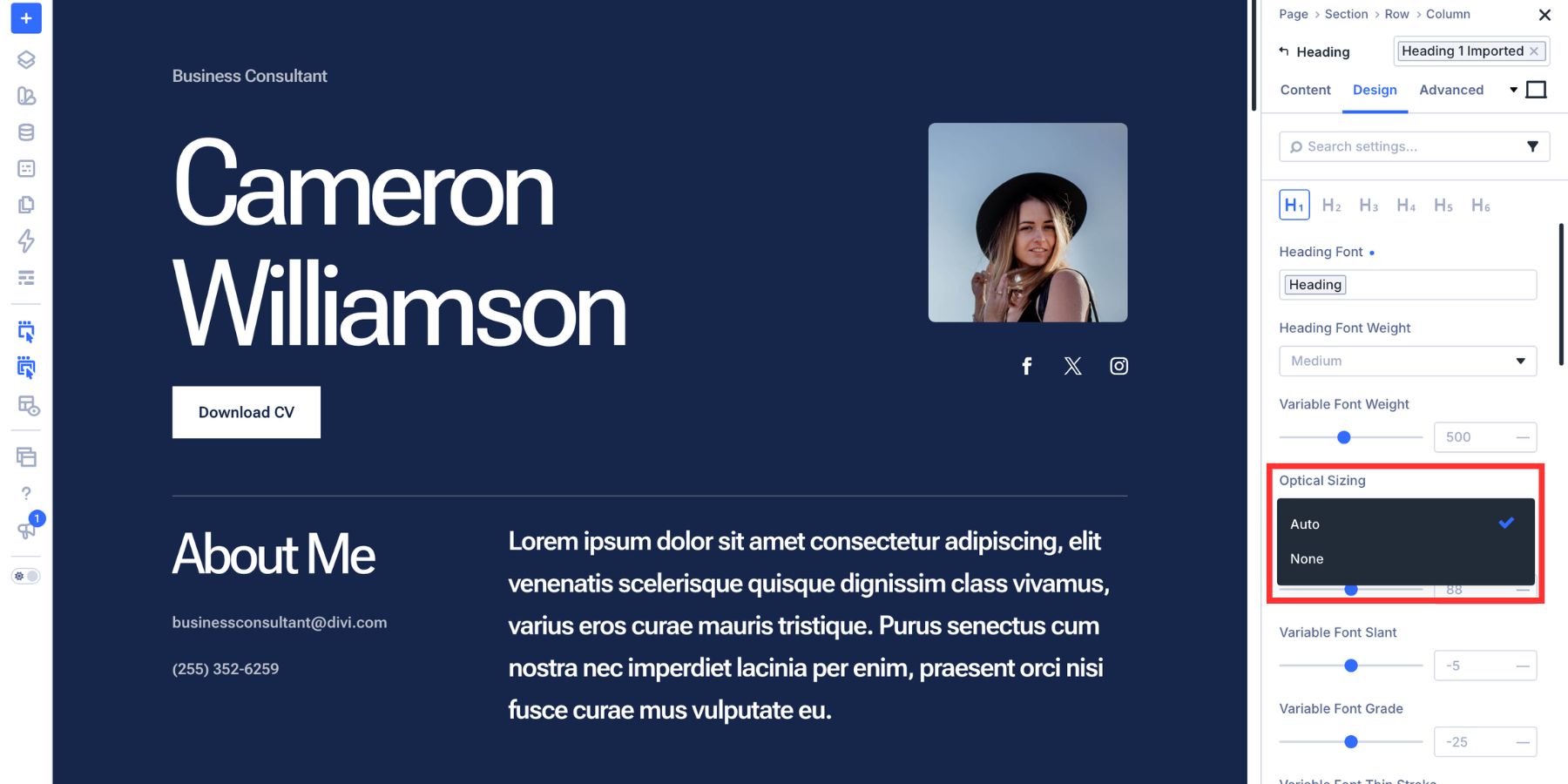
This is useful in a system where one font needs to cover both small body copy and large display headings. Always check that the typeface actually includes an optical-size axis before making it part of your typography recipe.
Variable Font Width
Width changes how condensed or expanded the letterforms appear without requiring a different font family. This can be one of the most useful axes in a single-family typography system. A narrower heading can carry strong visual weight without taking over the entire line. A wider subheading can create contrast against the level above it even when both use similar font sizes or weights.
The neutral value depends on the typeface, so treat the font’s default as your reference point and test both narrower and wider values around it. Width is particularly useful for:
- Large hero headings
- Section headings
- Navigation
- Buttons
- Compact cards
- Editorial display text
Variable Font Slant
Slant and italic are related, but they are not the same thing. A Slant axis tilts the existing upright letterforms when the font supports that variation. An italic design may instead use alternate glyph shapes specifically drawn for the italic style.
Use Slant when a controlled lean supports the typography role, such as a pull quote, accent heading, or label. If the design specifically depends on true italic letterforms, choose a font that provides the appropriate italic behavior rather than treating Slant as a replacement for it.
Variable Font Grade
Grade changes the visual density of a typeface with less impact on the space occupied by the text than changing its Weight.
That makes Grade useful for fine-tuning text in different visual contexts. For example, a heading may feel slightly heavier against a dark background than it does against white. A small Grade adjustment can change its visual density without requiring you to rebuild the rest of the typography recipe.
Divi displays this control only when the selected font provides the relevant Grade axis.
5. Turn The Same Font Into Different Typography Roles
This is where the blueprint starts looking like a system instead of a collection of controls. The same variable font can perform several jobs by combining the generated size variables with different axis values.
For this example, we’re using Roboto Flex and creating three common typography role groups: body copy, section headings, and button text. The exact values are not universal rules. They are starting points that demonstrate how the roles can relate to each other.
Body Copy
Body copy should support reading rather than compete for attention. A Weight around 360–400 can provide a useful starting range for Roboto Flex, depending on the background, font size, and content.
If Optical Sizing is available, leave it enabled so the font can use its size-aware behavior.
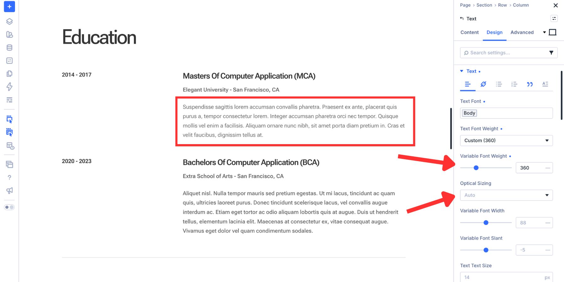
Pair that axis recipe with the Body Number Variable generated earlier. Now body text has two separate system references:
- The Font Variable controls the family.
- The Number Variable controls the size.
The preset we’ll create later will hold those variables alongside the Weight, Optical Sizing, line height, and other role-specific decisions.
Section Headings
Section headings are where the single-family approach becomes much more interesting. Instead of introducing another typeface just to create contrast, use the same family with a different combination of Weight, Width, Size, and Grade.
For our H2, set the Weight to 660 and Width to 100.
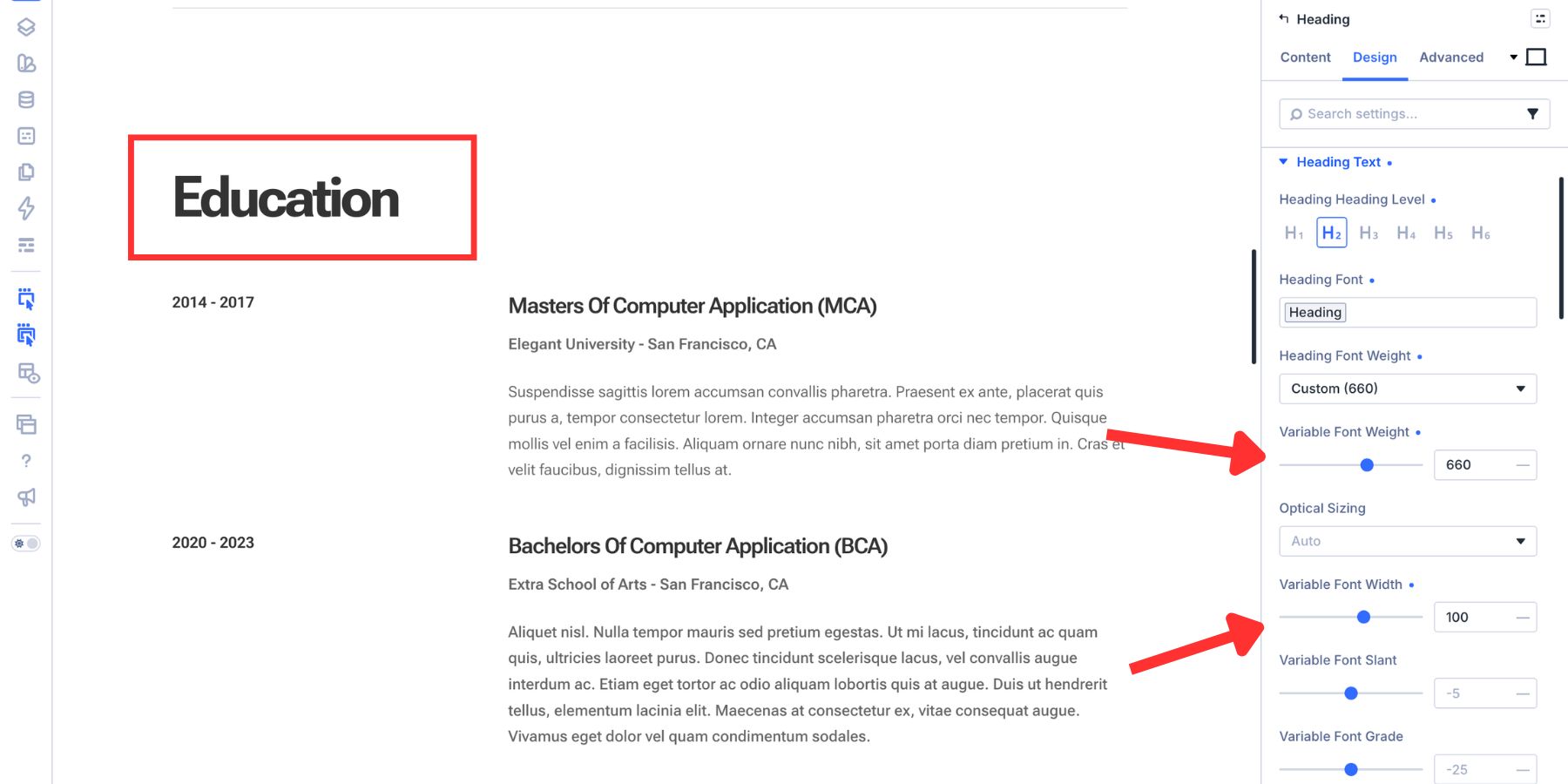
Apply the H2 Number Variable from the size scale as the text size. For the H3, keep a similar Weight but increase Width to around 150 in this particular font, creating a more expanded shape that separates the level from the H2 above it.
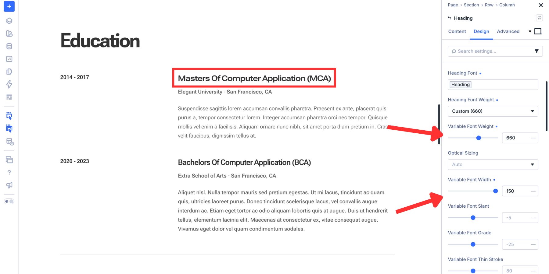
You can also test a small Grade adjustment, such as +10, when the heading needs slightly more visual density without substantially changing its dimensions. The important part is the relationship.
H2 and H3 still belong to one family, but the combination of generated size variables and variable-font axes gives each level its own role.
Button Text
Buttons need enough visual emphasis to communicate action without competing with headings. Open the Button module’s Design tab and find Button > Text. For this example, set Variable Font Weight to 580.
Then set Variable Font Width to 90, which makes the text slightly more condensed than the font’s neutral width in this example.
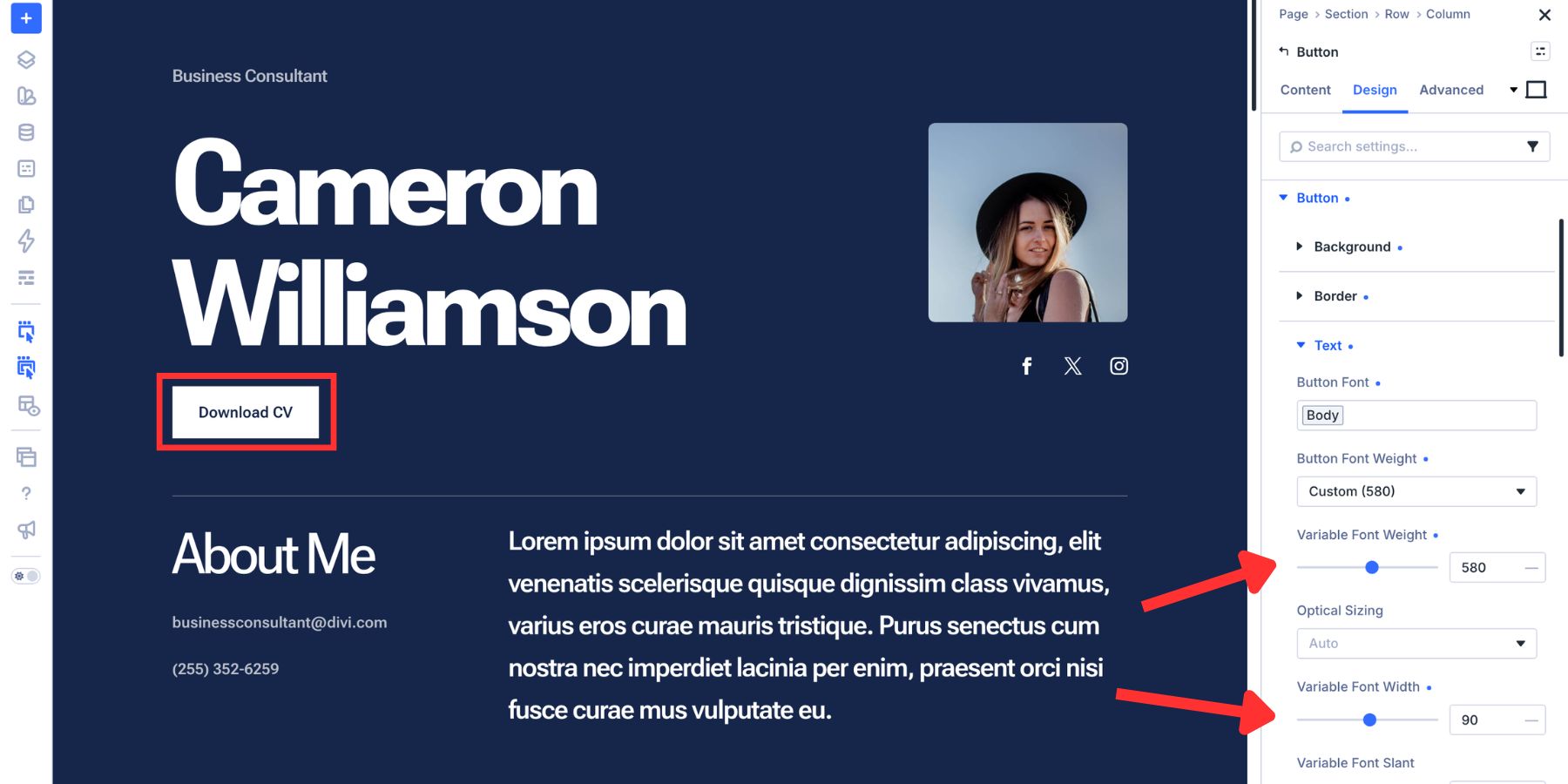
Set Letter Spacing to 0.06em.
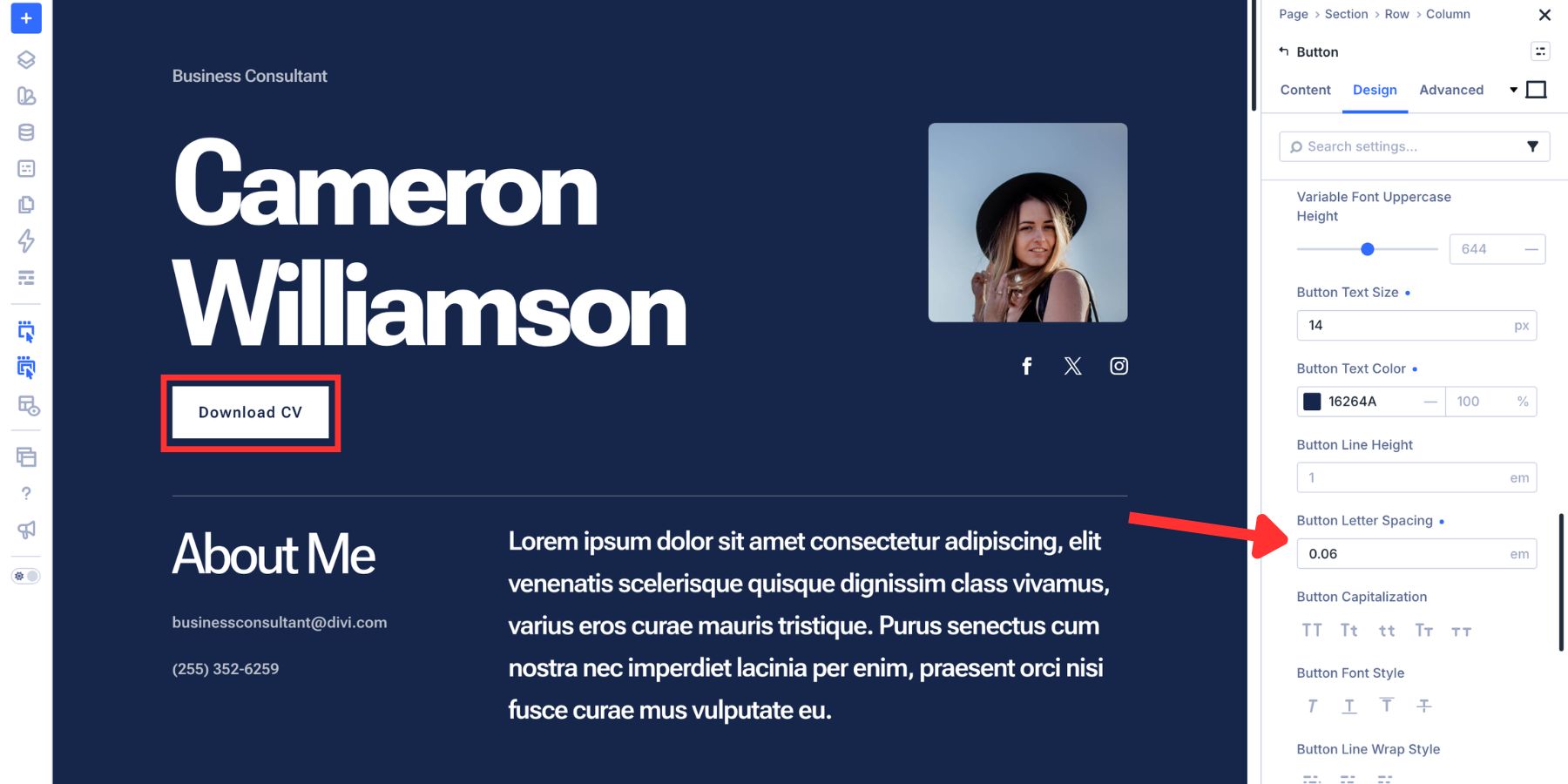
You can then connect the button to an appropriate Number Variable from the typography scale. The resulting button belongs to the same font family as the rest of the site but has its own recognizable recipe. That is the core advantage of this approach: hierarchy comes from coordinated values instead of isolated styling.
6. Standardize The Typography With Option Group Presets
At this point, the system has all the ingredients:
- Font Variables for the typeface
- Number Variables for the sizing scale
- Axis values for each typography role
- Line height and letter spacing decisions
Now we need a reusable layer that combines them. That is where Option Group Presets come in. Imagine you’ve finished an H2 recipe:
- Heading Font Variable
- H2 Font Size Variable
- Variable Font Weight
- Variable Font Width
- Optical Sizing
- Line Height
- Letter Spacing
Instead of rebuilding those settings on every H2, save the relevant Heading Text option group as a Preset.
Open the Heading Text option group on a module, hover over the group title, and click the Preset icon.
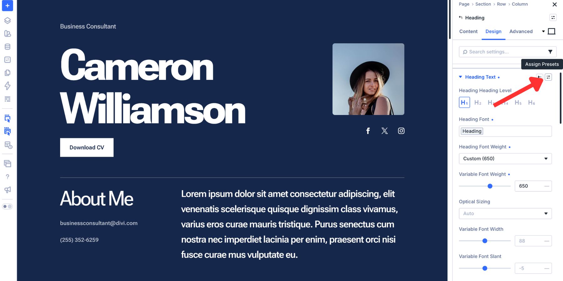
Click New Preset From Current Styles and give the preset a clear role-based name, such as:
- Heading – H1
- Heading – H2
- Heading – H3
- Body – Default
- Body – Small
- Button – Default
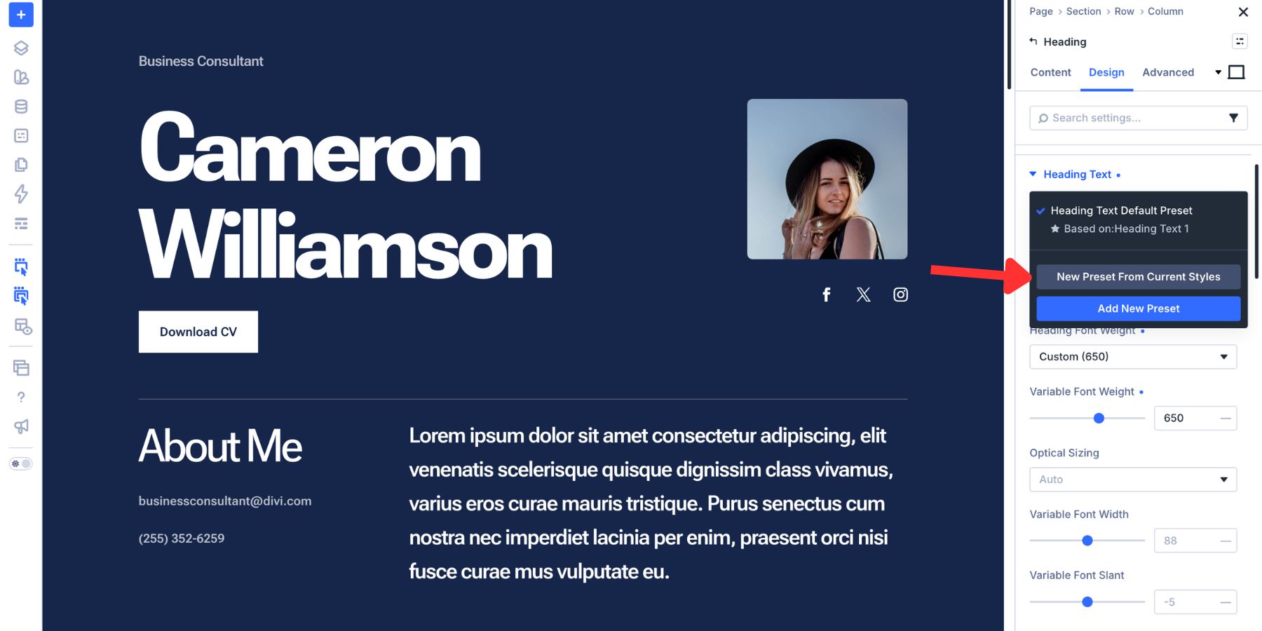
To use the style elsewhere, open the same compatible option group, click the Preset icon, and select the preset.
Start with one typography preset for each role that actually repeats. For headings, that will often mean H1 through H6. Body text may need Default, Large, and Small. Buttons may need one standard style and perhaps a smaller variation.
Each Preset can reference the Number Variables generated by the Variable Generator, so the size scale stays connected to the system rather than being copied as static values. Set a Preset as the default when you want compatible elements using that option group to inherit that typography treatment automatically. And because the Presets themselves are global, editing a shared Preset updates the connected instances throughout the site.
Text Element Presets And The Full System
Option Group Presets handle individual groups of design decisions. Element Presets let you bring those groups together into a complete module configuration. For example, a Text module Element Preset could combine:
- Your heading typography presets
- Your body typography preset
- Text color presets
- Spacing presets
- Other repeated Text module settings
That makes the Element Preset the top layer of the blueprint: a reusable component built from smaller shared decisions underneath it. To create an Element Preset, click the Element Preset icon at the top of the module settings panel.
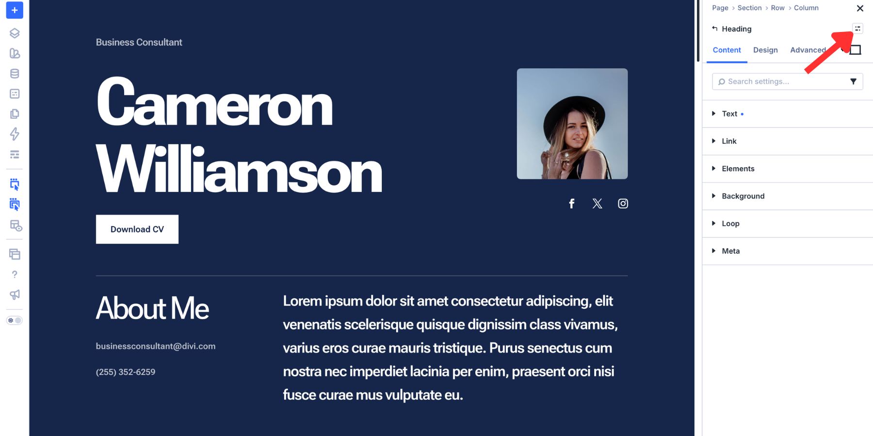
The relationship between the layers now looks like this:
Font Variables → Font Size Variables → Option Group Presets → Element Presets → Pages
The Variable Generator strengthens the second layer by giving the size system a mathematical structure. Variable Fonts give the typography recipes more range. Presets distribute those decisions. That is what turns a collection of font settings into a typography system.
Best Practices For Variable Font Systems
Once the structure exists, the main goal is keeping it intentional. Variable fonts can expose a lot of controls, but more choices do not automatically create a better system.
- Generate The Scale Before Styling Every Heading: Use the Variable Generator to establish the font-size system first. This gives your H1 through H6 and supporting roles a shared mathematical relationship before you start fine-tuning Weight, Width, Grade, and other axes.
- Keep Size And Axis Decisions Separate: Let Number Variables control font sizes and let Presets control how the variable font behaves. This makes the system easier to update because changing the scale does not require rebuilding every axis recipe.
- Use Only The Axes That Have A Job: A font may expose ten controls, but your system might only need Weight, Width, and Optical Sizing. Repeating three intentional values is more useful than creating random variations just because the controls exist.
- Audit Grade Against Different Backgrounds: If your font supports Grade, test important typography on both light and dark surfaces before saving the Preset. A subtle Grade variation can help adjust visual density without rebuilding the rest of the role.
- Don’t Use Slant As A Substitute For Italic: Slant changes the angle of upright forms. If your design needs true italic glyphs, use a font that provides the appropriate italic forms or axis.
- Test Presets With Real Copy: A Weight of 580 may look balanced on a two-word heading and feel much heavier on a three-line title. Test short headings, long headings, buttons, paragraphs, and wrapping states before making the Preset part of the system.
- Name Everything By Role: Names such as H2, Body Small, Button Default, and Display Large are easier to maintain than names based on isolated values such as 52px or Weight 660. The values may change later. The role stays the same.
- Change The System From The Lowest Useful Layer: If every heading is too large, adjust the size variables. If only H2 feels too heavy, update the H2 Preset. If the entire brand typeface changes, update the Font Variable. Make the change at the layer that actually owns the decision.
A Divi 5 Typography System You Can Keep Building On
Variable fonts in Divi 5 give you range, but range alone is not a system. The system comes from deciding where each value belongs. Store the font family in Font Variables. Generate the sizing scale with Divi 5’s Variable Generator. Use supported variable font axes to give each typography role the right character. Save those combinations as Option Group Presets, then bring them into complete modules with Element Presets.
Once those layers are connected, your typography becomes much easier to manage. If the heading scale needs more contrast, adjust the Number Variables. If an H2 needs more presence, change its axis recipe. If the brand switches typefaces, update the Font Variable. Each decision has a clear place to live. Variable fonts have always contained this flexibility. Divi 5 exposes the controls visually, and its Variables, Variable Generator, and Presets give you the structure to use that flexibility consistently across an entire website.
That is the difference between finding typography settings that look good and building a typography system you can keep using.
The post How To Create A Typography System With Variable Fonts In Divi 5 appeared first on Elegant Themes Blog.
The Tech Zone


Comments
Post a Comment