Divi Product Highlight: Divi Carousel Module
Carousels give you a compact way to present repeating content without turning a page into a long stack of cards. They can work especially well for testimonials, team members, portfolio projects, images, products, logos, and other content visitors may want to browse.
Divi Carousel Module by DiviGear brings a dedicated carousel-building workflow into the Divi Visual Builder, with multiple layouts, flexible navigation, responsive controls, animation effects, detailed item styling, lightbox support, ratings, social links, and the ability to place additional Divi elements inside individual Carousel Items.
It is compatible with both Divi 4 and Divi 5, so the same module can be used across existing websites and new Divi 5 builds. In this product highlight, we’ll explore its main features and then build a polished team member carousel from start to finish.
Overview Of Divi Carousel Module
Divi Carousel Module is a third-party Divi extension from DiviGear designed specifically for creating highly customizable carousels inside the Visual Builder.
Instead of limiting the carousel to one type of content, the module gives you a flexible Carousel Container with individual Carousel Items inside it. Those items can contain images, headings, supporting text, buttons, social links, ratings, lightbox content, and additional Divi elements.
That makes the module useful for a wide variety of layouts, including:
- Team member carousels
- Testimonials
- Portfolio projects
- Image galleries
- Logo carousels
- Service or feature cards
- Video carousels
- Promotional content
The module also includes several ways to change how those items move and appear, from traditional horizontal sliders to Coverflow-style presentations and centered layouts.
Its settings stay inside Divi’s familiar Content, Design, and Advanced tabs, so the carousel can be configured and styled visually alongside the rest of the page.
The result is a purpose-built carousel workflow with granular control over the Carousel Container, individual Carousel Items, responsive behavior, navigation, motion, and styling.
Key Features And Settings
Before building our example, let’s look at the main areas of the module.
Flexible Content Management
A carousel begins with the main Carousel Container and the individual Carousel Items inside it. Each item can hold common carousel content such as an image, title, subtitle, body copy, button, social links, and ratings.
The Elements tab expands that further by letting you add additional Divi elements inside a Carousel Item.
Carousel Items can also be reordered, duplicated, or removed as the content changes.
That child-item structure is useful because you can establish the carousel’s overall behavior at the container level while still customizing individual slides when a specific item needs a different treatment.
Multiple Carousel Types And Layouts
The module offers several ways to change the presentation of the carousel. You can create traditional horizontal scrolling layouts, emphasize a centered item, use Coverflow-style effects, and adjust how many Carousel Items remain visible at once.
Those settings can be configured separately for desktop, tablet, and phone.
Spacing and alignment controls let you refine the relationship between the visible items so the same carousel can move from a wide desktop presentation to a more focused mobile layout.
Navigation And Interaction
Navigation can be configured around the way you want visitors to browse. Available options include arrow navigation, dot navigation, autoplay, pause on hover, keyboard controls, mouse wheel controls, looping, dragging, and timing settings.
You do not need every interaction enabled at once. A testimonial carousel may benefit from simple arrows and dots, while a more visual image carousel might use autoplay and dragging. Choose the controls that make the content easiest to browse, then test the finished interaction across keyboard, mouse, touch, and responsive layouts.
Detailed Styling Controls
The Carousel Container and individual Carousel Items both include extensive design settings. You can control images, titles, subtitles, body text, navigation, backgrounds, borders, shadows, overlays, spacing, and other visual details.
Individual Carousel Items also have their own settings, which lets you establish a consistent base design at the container level and then make targeted adjustments where needed.
That can be useful when one testimonial, service, team member, or promotional card needs to stand out without redesigning the entire carousel.
Advanced Carousel Options
The module also includes settings for more specific carousel behavior. These include lazy loading, RTL support, z-index controls, custom spacing, transforms, custom CSS, autoplay, looping, and desktop dragging behavior.
The workflow we build below does not require custom CSS, but the option remains available when a project needs a more specialized treatment.
How To Use The Divi Carousel Module
The easiest way to understand the module is to build something practical with it. For this example, we’ll create a team member carousel with responsive item counts, navigation controls, equal-height cards, Coverflow motion, custom styling, and individual team member content.
We’ll first configure the Carousel Container, then style it, build one complete Carousel Item, and duplicate that finished item to populate the rest of the carousel.
Step 1: Add The Divi Carousel Module
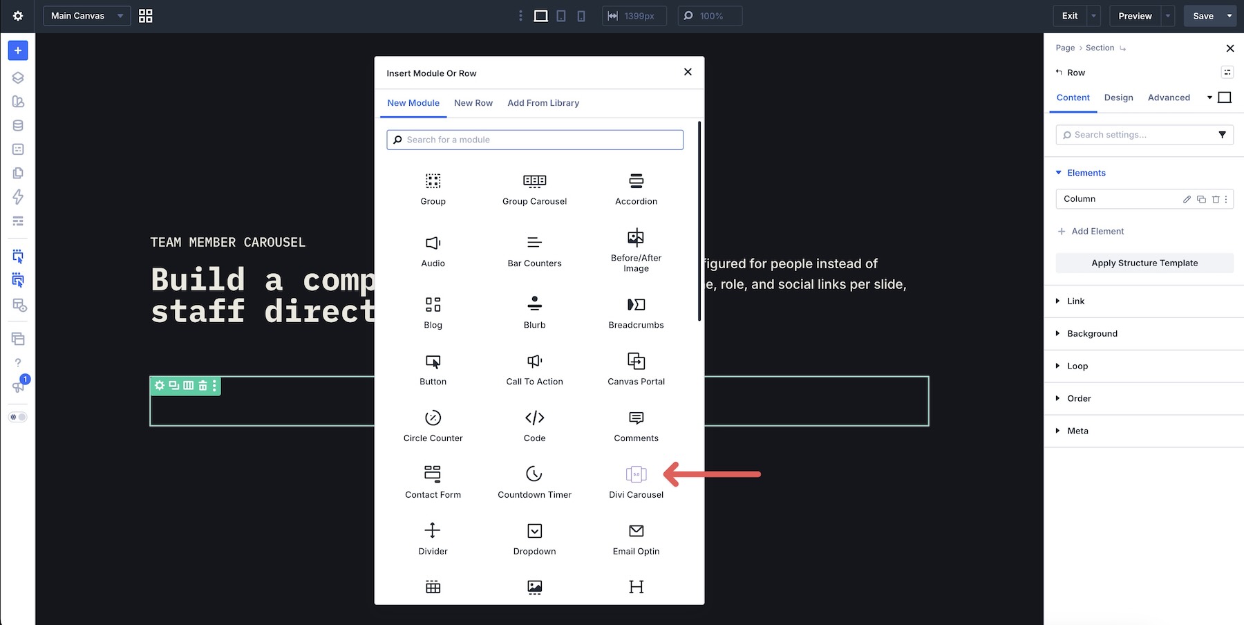
Open an existing page or create a new one in the Visual Builder. Add a single-column Row where the carousel should appear, then click Add Module and choose Divi Carousel.
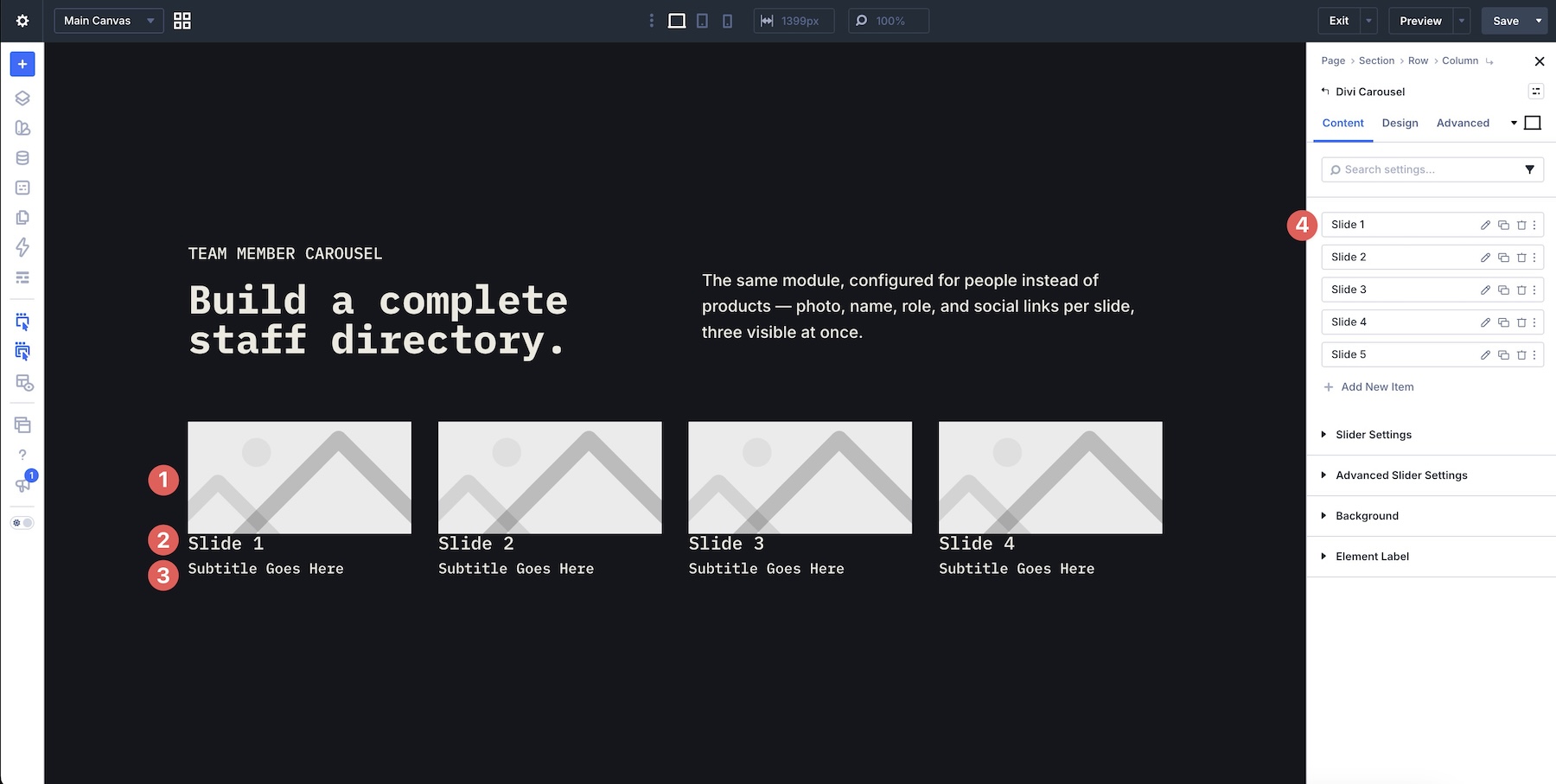
The module starts with five placeholder Carousel Items. Think of the outer module as the Carousel Container and each slide inside it as a Carousel Item.
The placeholders give you an immediate preview of the carousel structure while you configure the main settings.
Step 2: Configure The Carousel Container
Start with the main Carousel Container before editing the individual team members. These settings determine how many items visitors see, how the carousel moves, and which navigation controls are available.
Open Slider Settings in the Content tab. Set the number of visible items using Show Item Desktop, Show Item Tablet, and Show Item Mobile.
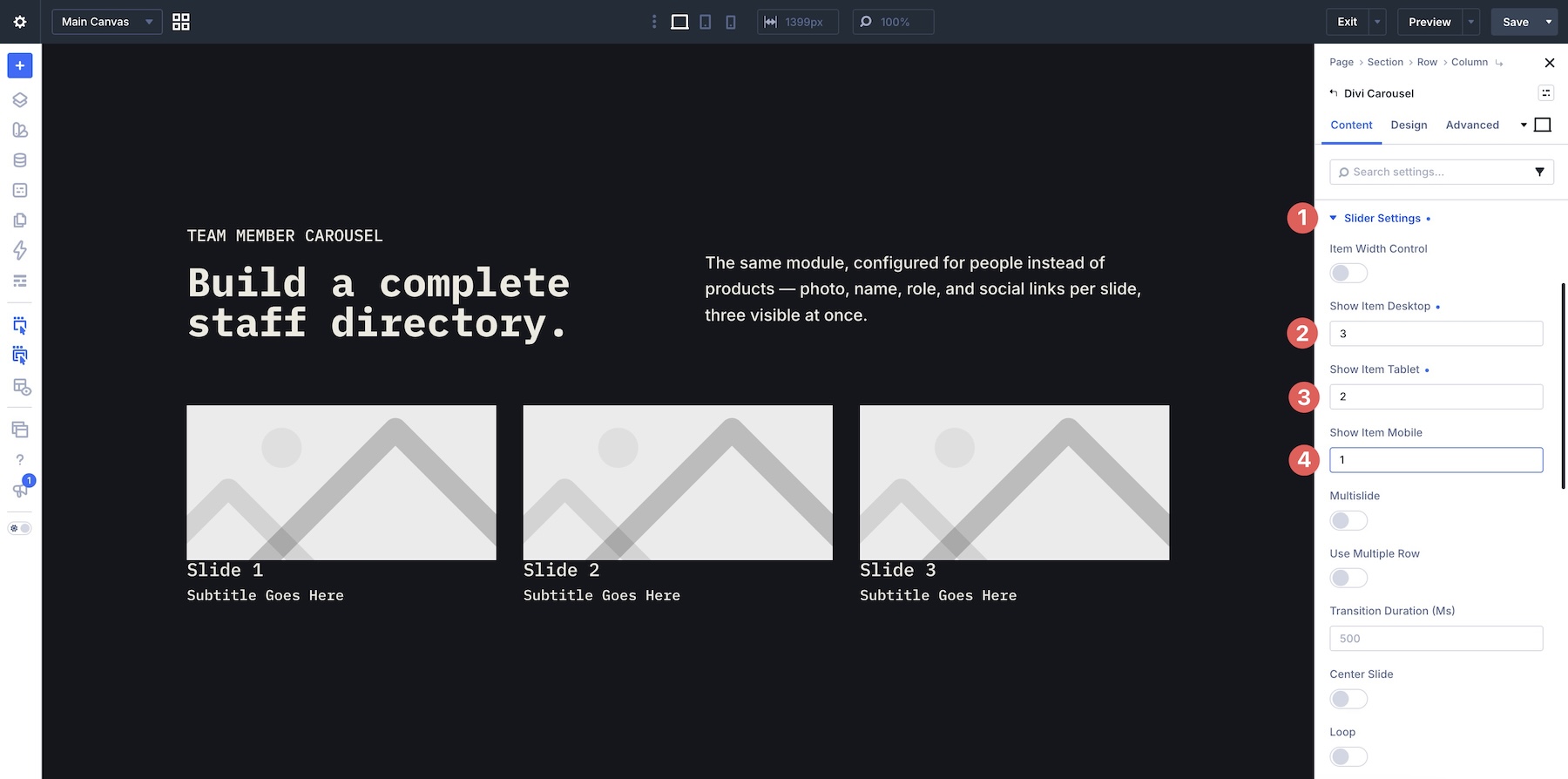
This is one of the first settings worth handling because it establishes the basic rhythm of the carousel across breakpoints. A multi-card desktop layout can become a more focused one-item or two-item experience on smaller screens without rebuilding the carousel.
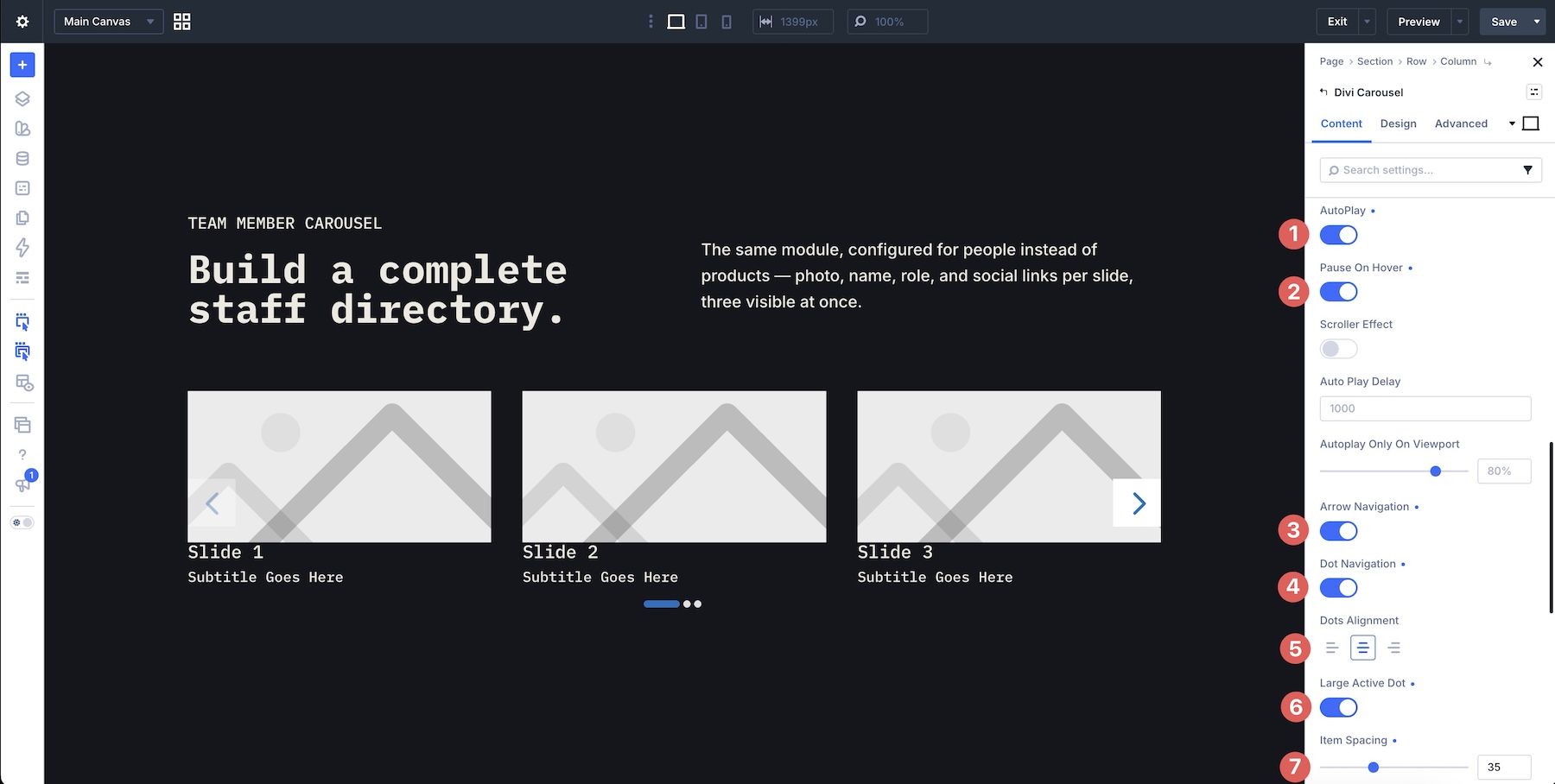
Next, configure the movement and navigation. For this team carousel, enable Autoplay and Pause On Hover. That lets the carousel advance automatically while giving visitors time to stop and read an individual profile. Enable Arrow Navigation and Dot Navigation as well.
Choose the Dots Alignment that works with the layout and enable Large Active Dot if you want the current position to stand out more clearly. Finally, adjust Item Spacing to control the gap between team member cards.
For a card-based design, enable Equal Height Item so profiles with different amounts of text can still align consistently. You can also enable Lazy Loading and Start Loading Before Transition Start to manage how carousel media is loaded as visitors move through the items.
Keyboard Control provides another way to navigate the carousel, while Mouse Wheel Control can be enabled when that interaction fits the page experience.
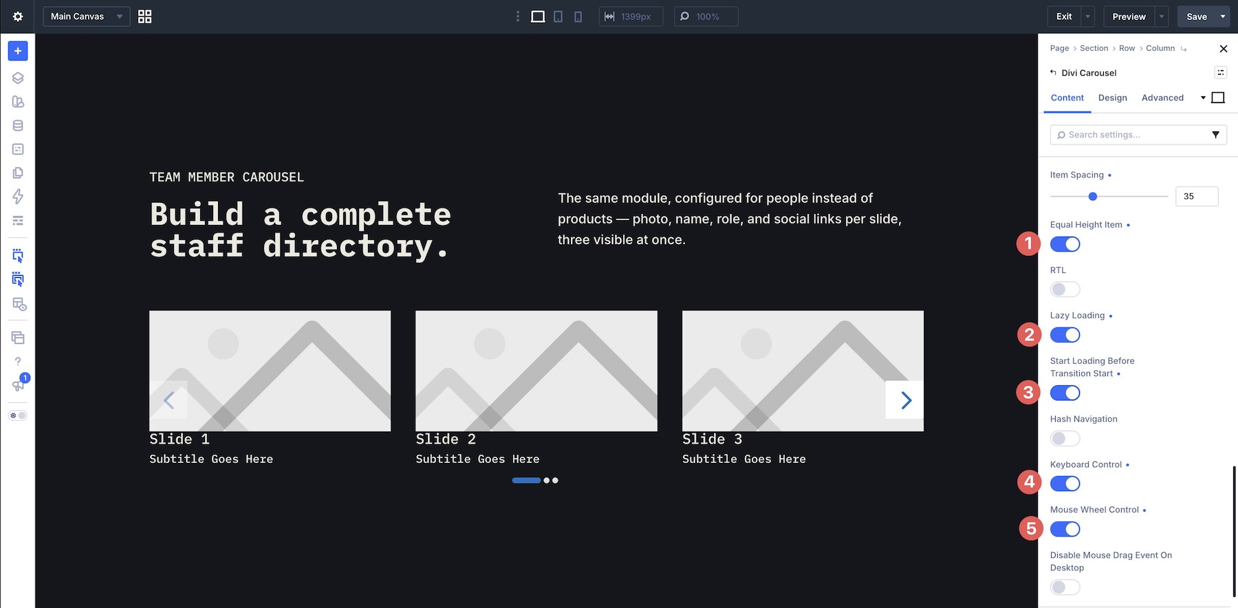
Test optional interaction controls on the finished page rather than enabling everything automatically. The carousel should remain predictable alongside the rest of the page’s scrolling and keyboard behavior.
Add A Coverflow Effect
For a more dimensional presentation, open Advanced Slider Settings. Choose Coverflow from the Slider Effect field.
This places more emphasis on the active Carousel Item and creates stronger visual separation between the current profile and the surrounding items. With the carousel behavior established, move to the Design tab.
Step 3: Style The Main Carousel Container
The Carousel Container’s Design tab establishes the shared visual language for the items inside it. Start here whenever multiple Carousel Items should use the same image, typography, navigation, spacing, or container styling.
Overlay Settings
If your carousel uses an image or video lightbox, the Overlay controls let you design the interaction that appears over the media. You can enable an image overlay, show it on hover, choose the overlay background, and add an animated overlay icon.
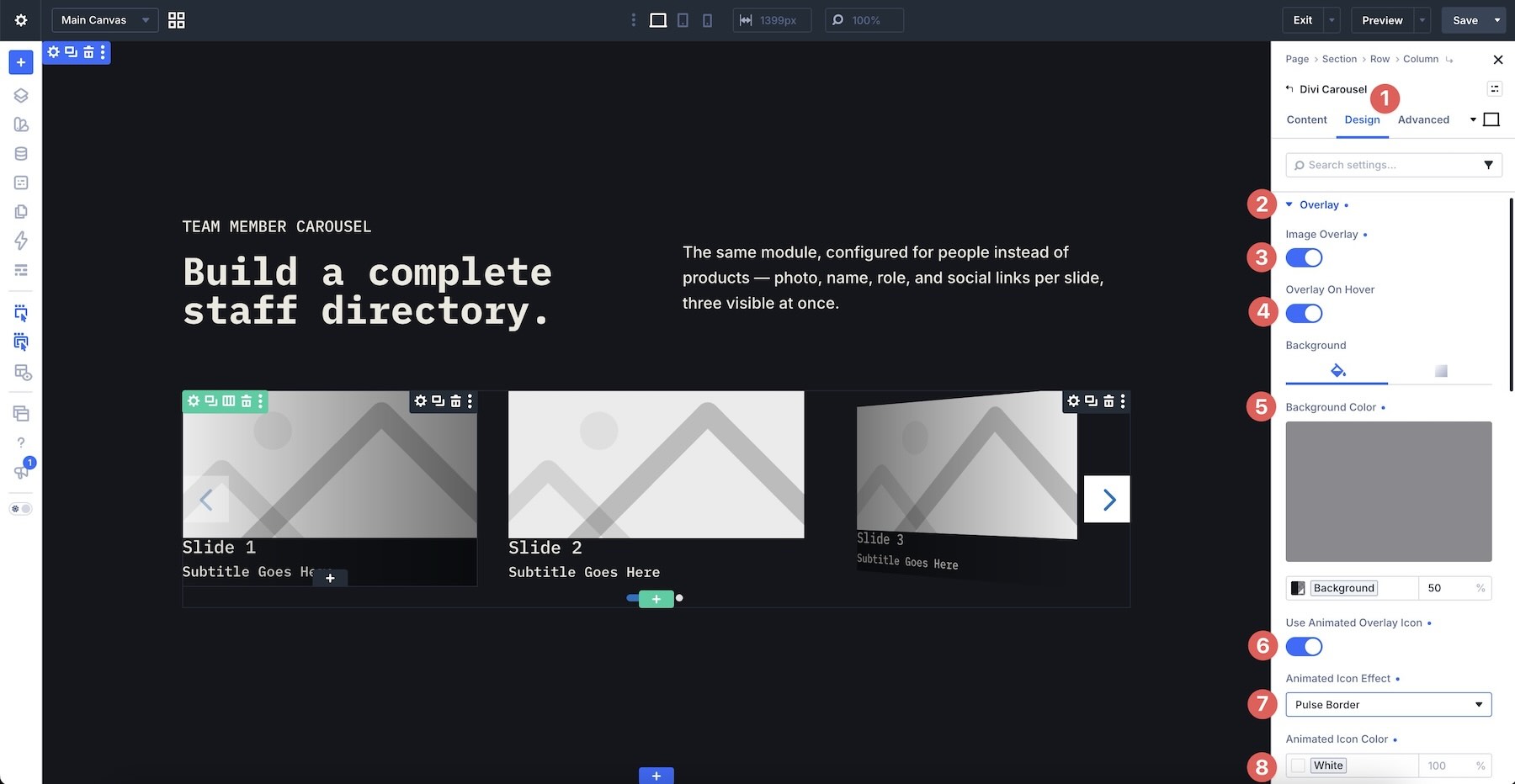
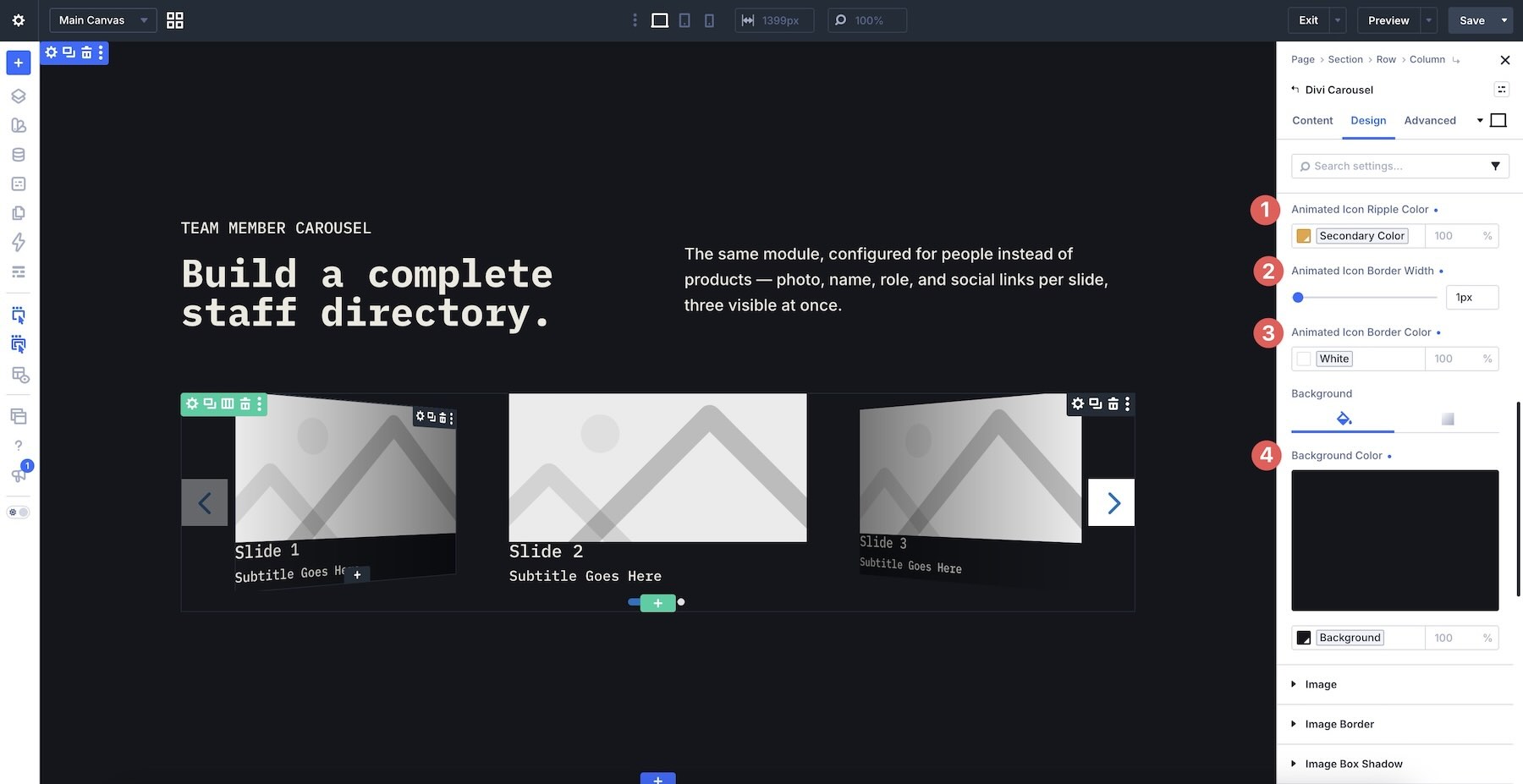
Available animated icon treatments include None, Ripple, and Pulse Border. Depending on the effect, additional controls become available for properties such as ripple color, border width, border color, and icon background.
Style The Images
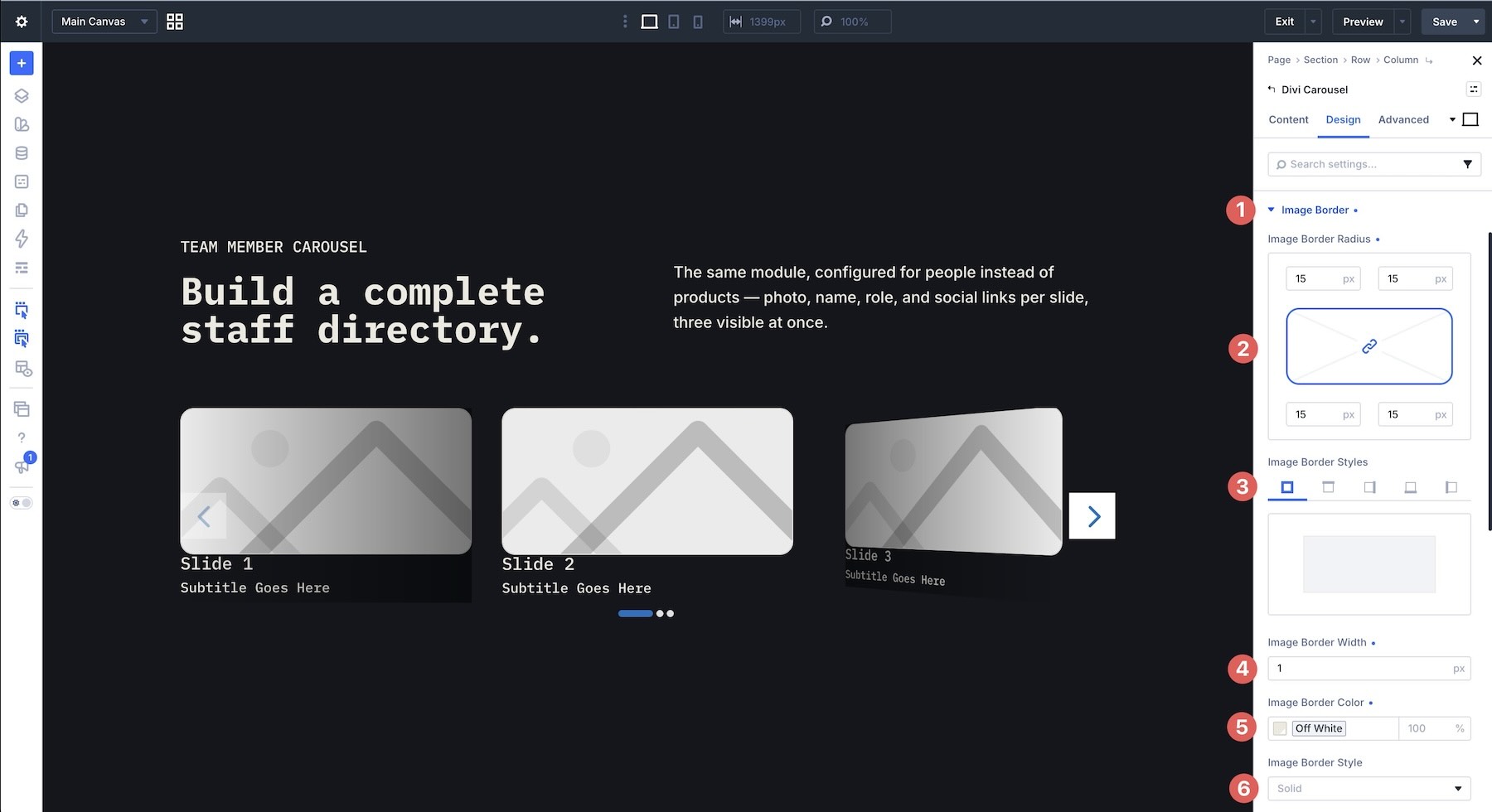
The Image, Image Border, and Image Box Shadow option groups control the shared presentation of Carousel Item images. Inside Image, adjust properties such as alignment, full-width behavior, and maximum width.
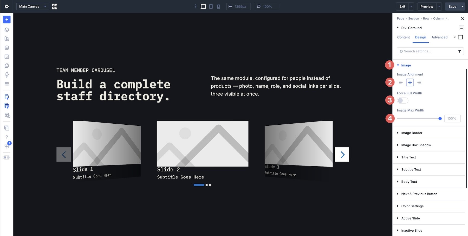
Use Image Border to set the border radius, width, style, and color.
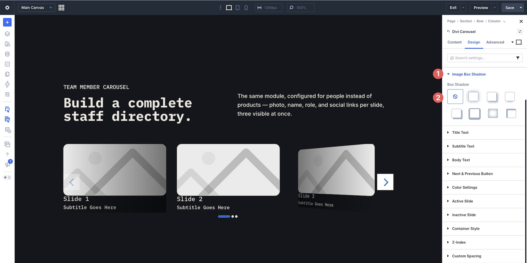
If the design needs more separation from the background, use Image Box Shadow to add depth.
Style The Title, Subtitle, And Body Text
Open the Title, Subtitle, and Body Text groups to establish typography for the Carousel Items.
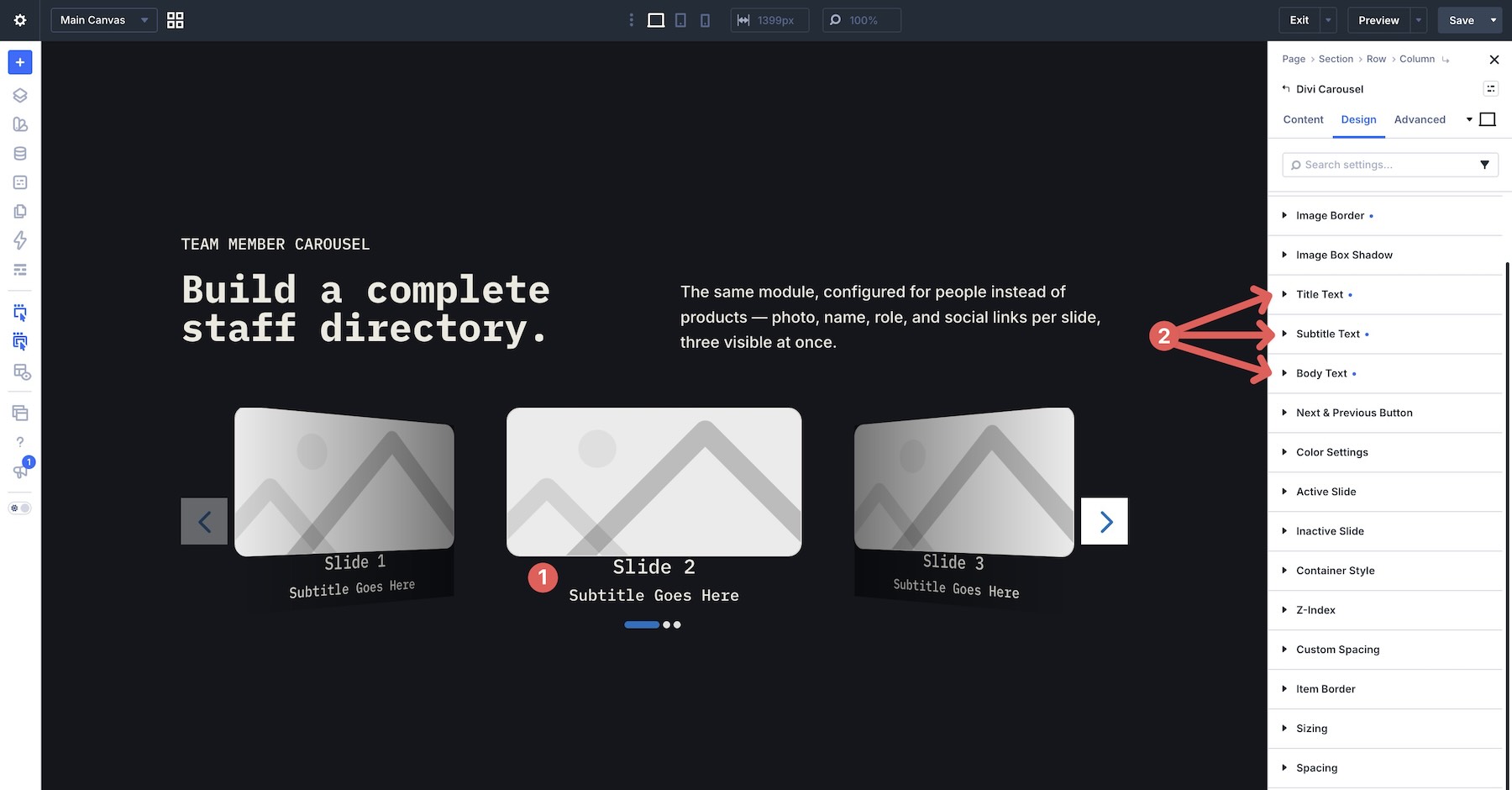
Alongside familiar font, weight, size, color, line-height, and letter-spacing controls, the Divi 5 version exposes additional text styling options in these groups. Depending on the selected font and text type, these include Variable Font controls and options such as Line Wrap Style, Text Direction, Hyphenation, Text Columns, Fill Type, and Stroke Width.
This lets the carousel typography follow the same visual system as the rest of a Divi 5 design rather than feeling like a separate component.
Customize Arrow And Dot Navigation
Next, open the Next & Previous Button settings. Navigation arrows can be positioned in several locations, including:
- Middle & Inside the container
- Middle & Outside the container
- Top
- Bottom
Additional controls let you show middle-position arrows only on hover, adjust their alignment, choose custom Previous and Next icons, change the icon size, and control the spacing around each button.
Then open the color settings to define the Arrow Color, Arrow Background Color, Dots Color, and Dots Active Color.
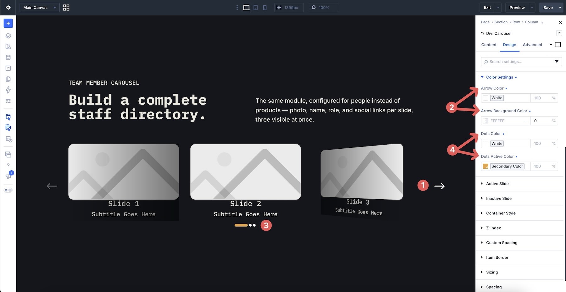
Use enough contrast that navigation remains easy to find against the surrounding carousel content.
Differentiate Active And Inactive Items
The Active and Inactive Slide settings let you apply different backgrounds to the current Carousel Item and the items around it.
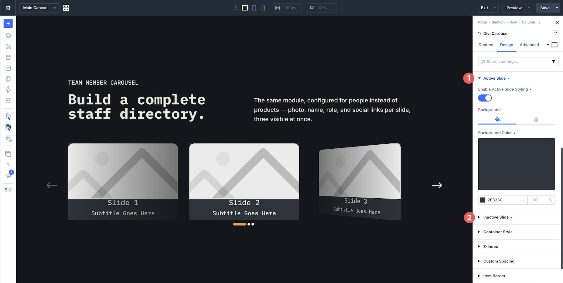
For card-style designs, a subtle color or gradient difference can reinforce which item is currently in focus without needing a dramatic animation.
Add Container Fade Effects
The Container Style group includes fade controls that can soften the edges of the visible carousel. Choose primary and secondary colors and adjust the fade spacing to control where the effect transitions.
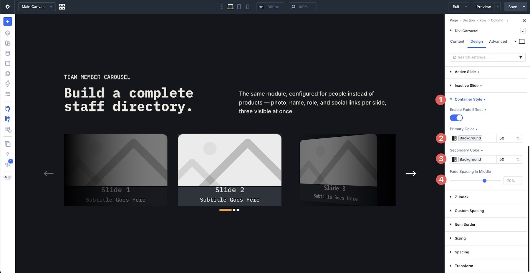
This can be especially effective with Coverflow or centered layouts because it draws attention toward the middle of the carousel.
Control The Z-Index
The Z-Index settings control how the image and content containers stack relative to other carousel effects. For example, increasing the Image Container and Content Container z-index values can keep the profile image and text above fades, overlays, or other styling applied around them.
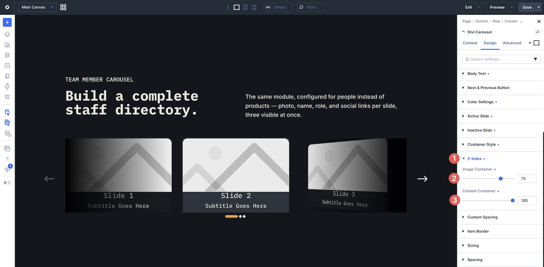
Only increase these values when the design actually needs a different stacking order.
Fine-Tune The Spacing
The Custom Spacing controls let you adjust both the overall Carousel Container and the elements inside its Carousel Items.
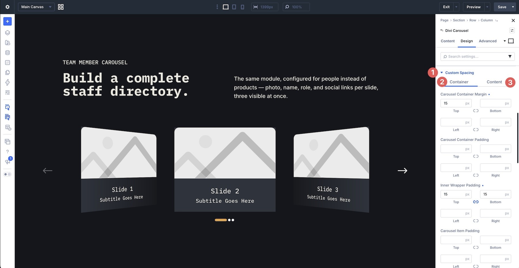
Inside the Container settings, you can control spacing for areas such as the main carousel, inner wrapper, Carousel Items, image container, content container, social media container, and ratings.
The Content controls go more granular, with spacing for images, titles, subtitles, text, buttons, and social media elements.
Social links and ratings are configured on individual Carousel Items through their Meta settings, so those spacing controls become relevant once the corresponding elements have been enabled.
Style The Carousel Item Borders
Use Item Border to define the overall frame around each Carousel Item. Controls include border radius, width, color, and style.
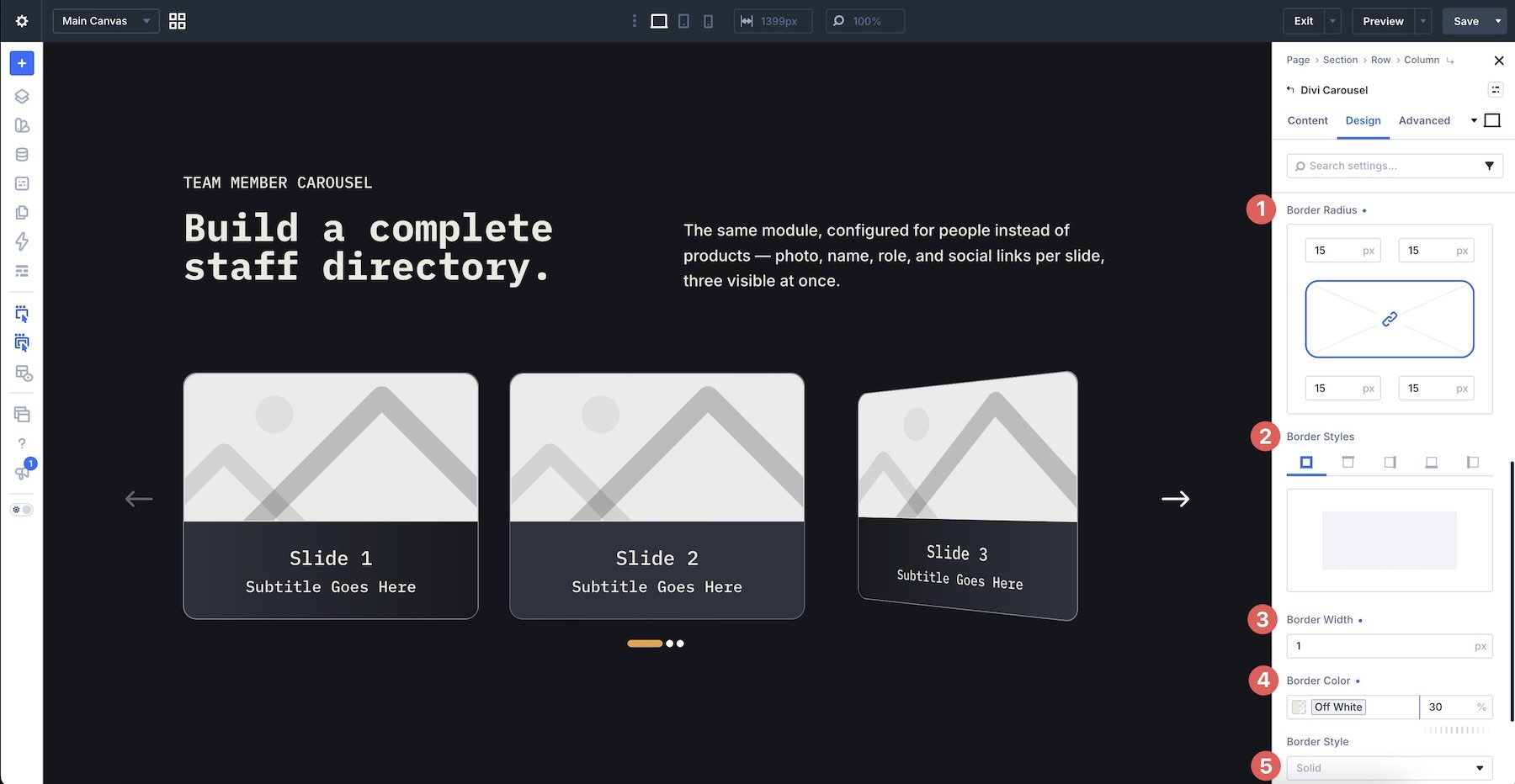
Because this applies to the complete Carousel Item rather than only its image, it works especially well for card-based team, testimonial, service, and portfolio carousels.
Step 4: Add Content To The First Carousel Item
With the shared carousel styling in place, build one finished team member card before populating the remaining items. Open the first Carousel Item. In Main Content, enter the team member’s Title, Subtitle, and supporting text.
If the copy needs to remain compact, use Content Limit to restrict how much text appears in the Carousel Item.
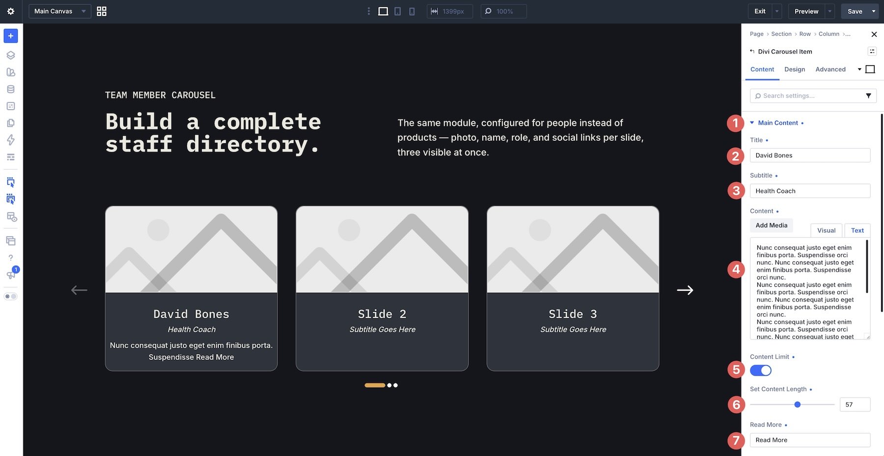
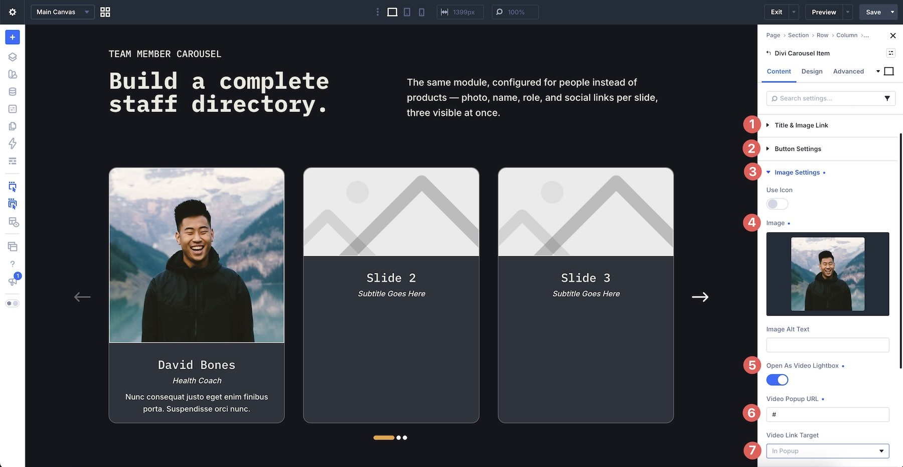
Next, open Title & Image Link if either element should lead somewhere when clicked. You can also add a button for a dedicated call to action.
Then open Image Settings, upload the team member image, and configure the lightbox behavior if needed. The image can open in an Image Lightbox or Video Lightbox when the design calls for expanded media.
Add Social Links Or Ratings
The Meta group adds optional supporting information. Enable Use Social Media when the team member card should include social links, or Use Rating for carousel types that benefit from a rating.
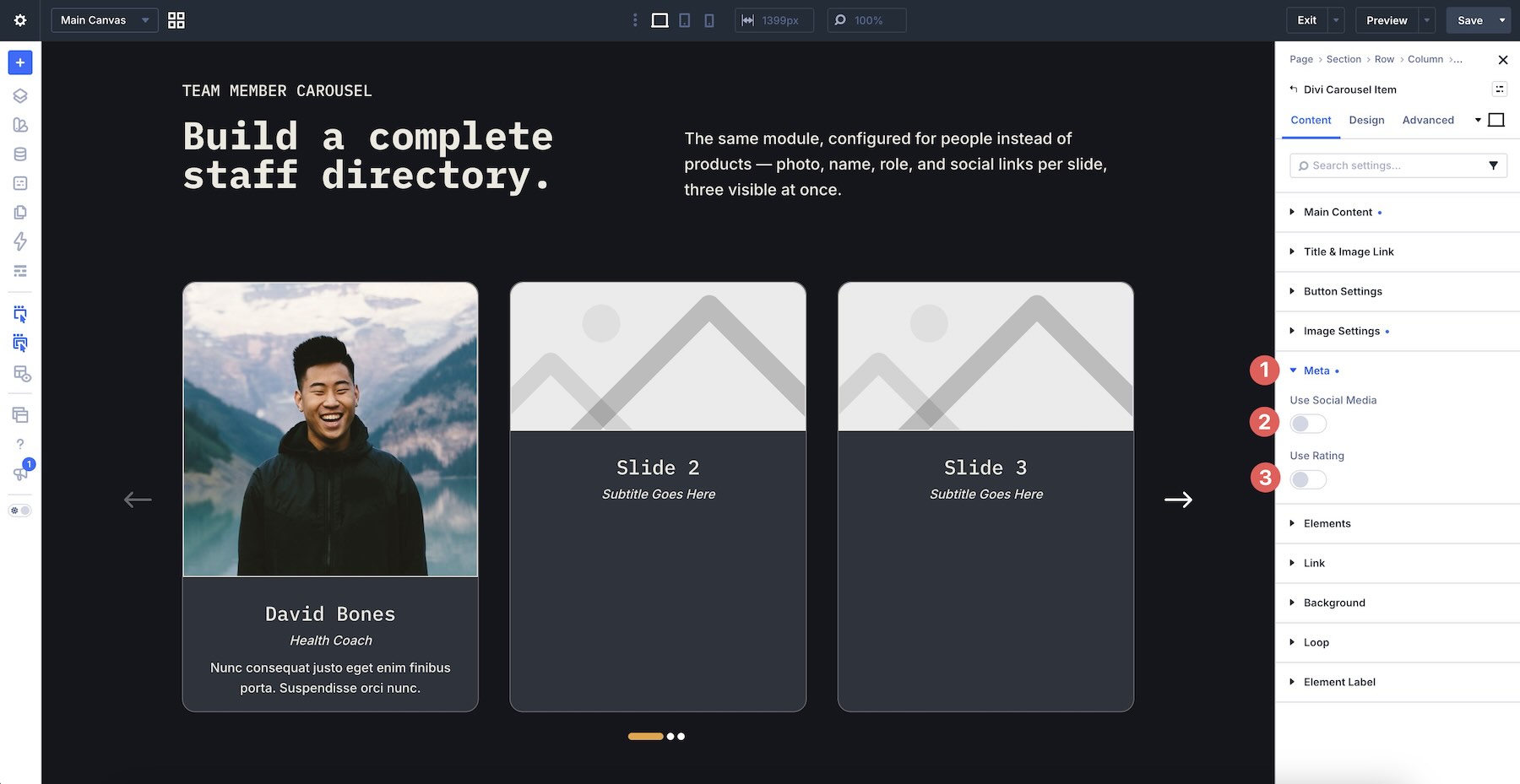
When social media is enabled, additional fields appear for Facebook, Twitter (X), LinkedIn, Instagram, and email links, along with link-target controls.
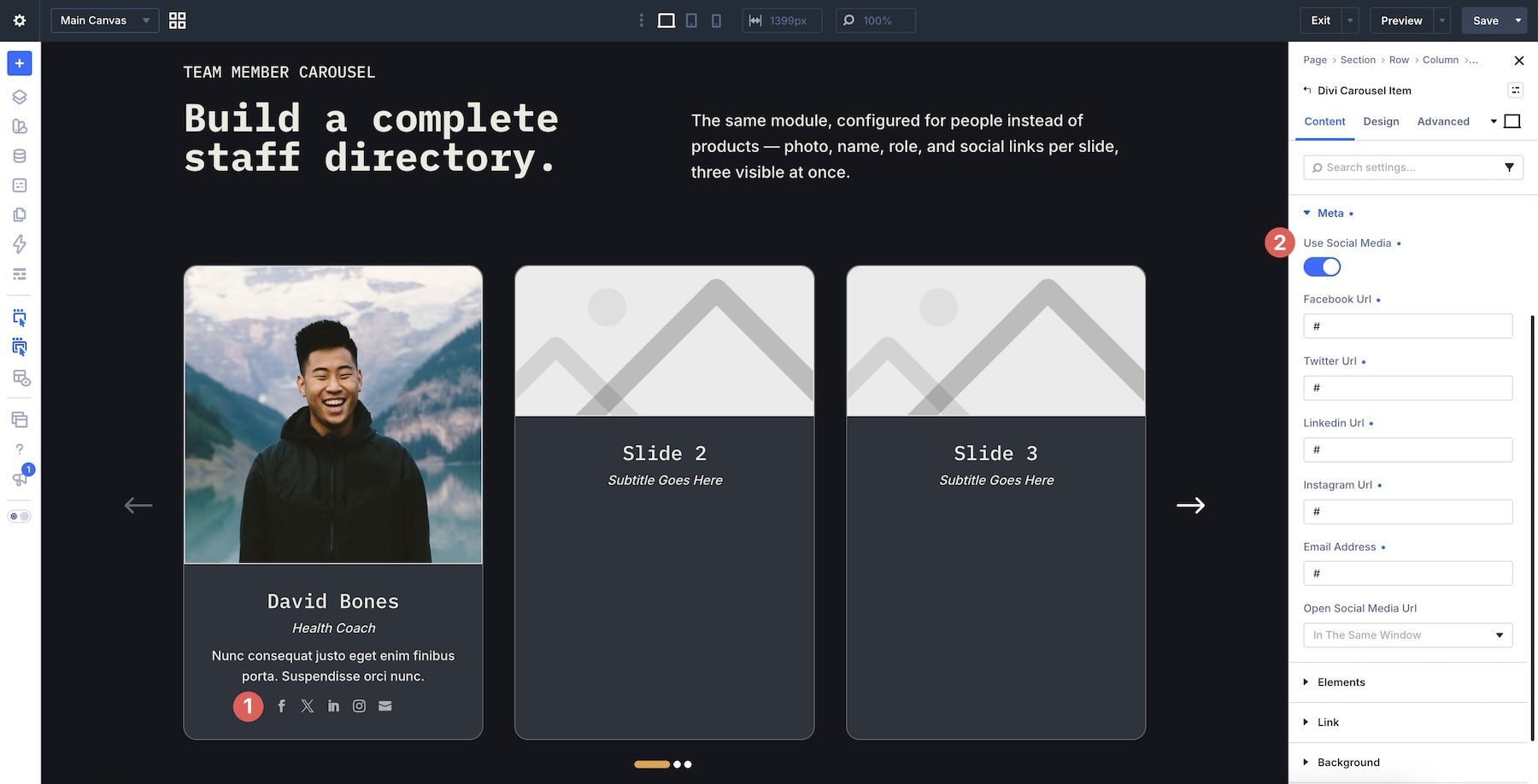
For our team member example, these fields provide a straightforward way to add relevant profile links without creating separate icon modules for every item.
Add Additional Divi Elements
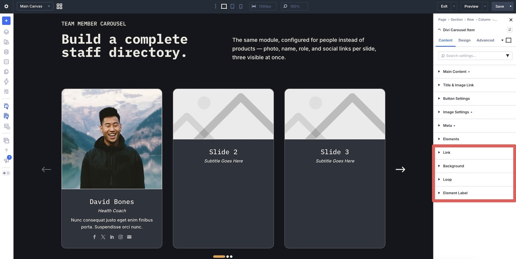
A Carousel Item does not have to stop at its built-in content fields. Open the Elements tab and click + Add Element to insert additional Divi elements, a Row, or saved content from the Divi Library.
This is useful when the carousel needs a more custom card structure than the default image-and-text layout.
Additional groups such as Link, Background, Loop, and Element Label provide controls for the overall Carousel Item, including linking the container, adding background treatments, using Divi’s Loop functionality where appropriate, and keeping items easier to identify inside the Builder.
Step 5: Fine-Tune The Carousel Item Design
Most shared styling belongs at the main Carousel Container level. The individual Carousel Item Design tab is useful when you need additional control over the contents of a specific card.
Choose The Image Position
Open Image Styles to change where the image appears relative to the Carousel Item content. Available positions include Top, Bottom, Left, Right, and Inside Content.
This makes it possible to create several card structures from the same underlying Carousel Item.
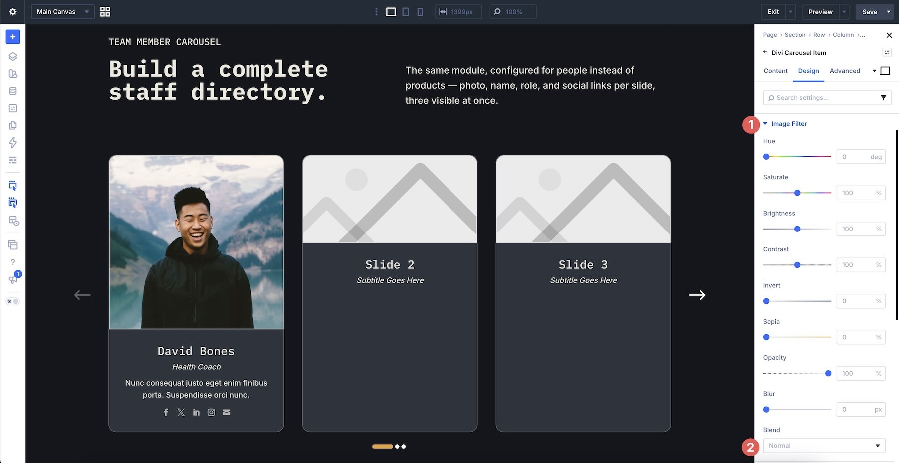
Apply Image Filters
The Image Filter group includes familiar image controls such as hue, saturation, brightness, and opacity. Blend modes such as Multiply, Screen, and Color Burn are also available when you want the image to interact more strongly with the Carousel Item background.
Override Text And Button Styles When Needed
The Title Style, Subtitle Style, Content Style, and Button groups provide item-level versions of the shared styling controls.
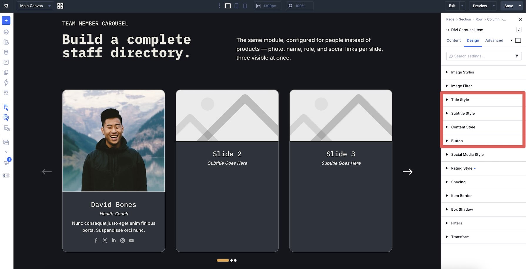
For a consistent team carousel, keep most typography at the main Carousel Container level. Use the individual controls when a particular Carousel Item intentionally needs to stand apart, such as a featured testimonial, promoted service, or highlighted profile.
Style Social Media Icons
When social links are enabled, the Social Media Style group controls their presentation. You can adjust alignment, vertical position, icon color, background, border radius, border width, border color, border style, and box shadow.
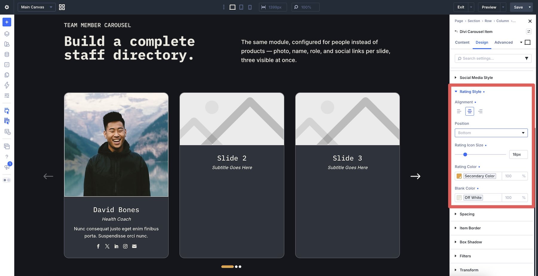
Style Ratings
If Use Rating is enabled in the Meta group, the Rating Style settings appear in the Design tab. These include alignment, vertical position, icon size, rating color, and the color used for unfilled rating icons.
Finish With Additional Design Controls
The remaining groups include familiar Divi controls for Spacing, Item Border, Box Shadow, Filters, and Transform.
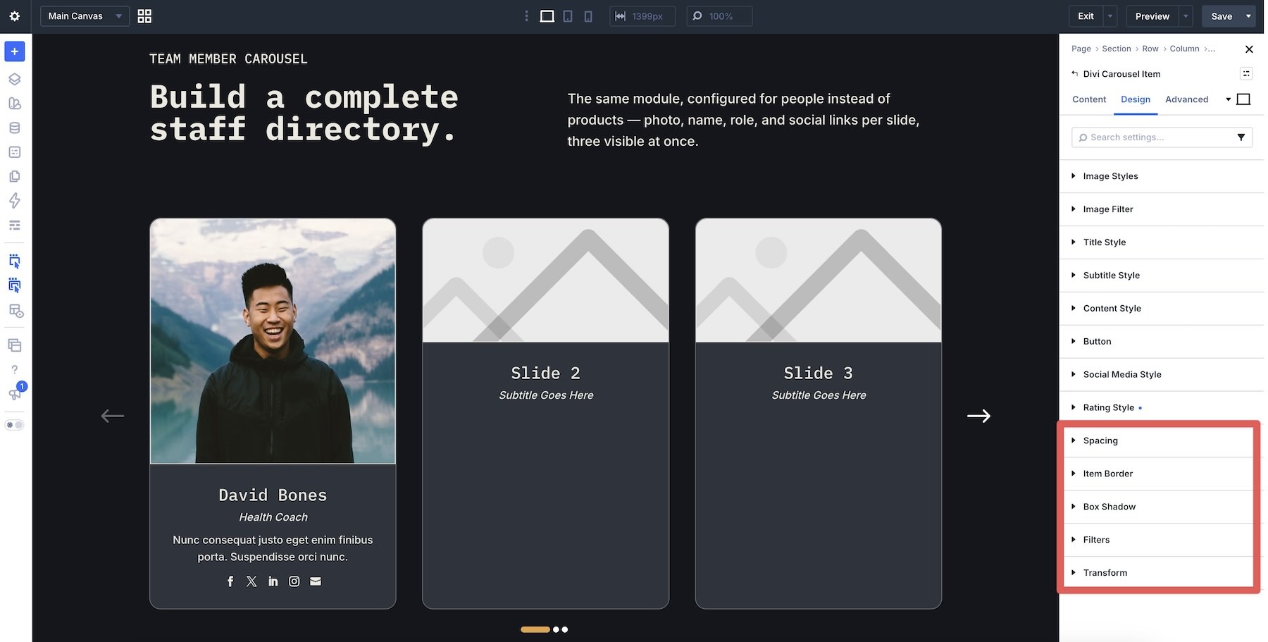
Use these for final refinements rather than creating unnecessary differences between every item.
Step 6: Build The Remaining Carousel Items
Once the first team member card is complete, use it as the template for the remaining Carousel Items. First, remove any unused placeholder items with the Delete Item control.
Then duplicate the finished Carousel Item.
Replace the image, title, subtitle, copy, links, and other item-specific information in each duplicate. Because the base item was already styled before duplication, every new team member begins with the same structure and design.
Continue duplicating and replacing content until the carousel is complete.
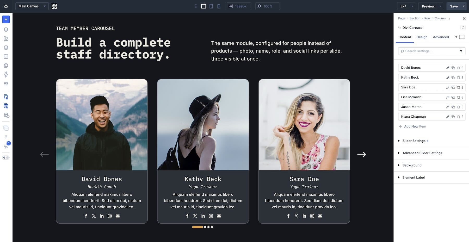
At this point, preview the carousel at each breakpoint and test arrows, dots, autoplay, hover behavior, keyboard controls, dragging, links, and any lightboxes you enabled.
Who Is Divi Carousel Module For?
Divi Carousel Module is a good fit for Divi users who frequently build content that benefits from a scrollable, card-based presentation.
- Agencies and freelancers can use it to create reusable carousel patterns for team members, testimonials, services, portfolios, and client-specific content.
- Portfolio and creative websites can use image-focused layouts, Coverflow effects, and lightboxes to present projects more visually.
- Business websites can organize teams, services, testimonials, logos, and other repeated content without taking up as much vertical space.
- Content-heavy sites can use additional Divi elements inside Carousel Items when the standard image-and-text structure is not enough.
And because the module is compatible with both Divi 4 and Divi 5, it can be used across a mixed portfolio of existing client sites and newer builds.
Build More Flexible Carousels With DiviGear
Divi Carousel Module gives Divi users a purpose-built carousel workflow with a broad range of content, layout, navigation, responsive, motion, and design controls.
The main Carousel Container handles the shared experience, while individual Carousel Items give you granular control when a specific slide needs something different. Add lightboxes, social links, ratings, additional Divi elements, custom navigation, responsive item counts, Coverflow effects, or detailed card styling depending on what the project calls for.
Everything we built in this tutorial stays inside the Visual Builder, making the module feel integrated with the rest of the Divi workflow.
Divi Carousel Module is currently available in the Divi Marketplace for $29. The license includes unlimited website usage, one year of support and updates, and a 30-day money-back guarantee. It is compatible with both Divi 4 and Divi 5.
If carousels are a recurring part of the websites you build, DiviGear’s module gives you a dedicated toolkit for creating them while staying inside Divi.
The post Divi Product Highlight: Divi Carousel Module appeared first on Elegant Themes Blog.
The Tech Zone


Comments
Post a Comment