What Is calc() In CSS (And How To Use It)
Some CSS functions are powerful but rarely used, not because they’re difficult, but because easier alternatives are available. Calc() is one of them. It’s super useful but often overshadowed by clamp().
Calc() solves some layout problems that clamp() can’t touch. It’s great for fine-tuning section heights, adjusting for sticky headers, and mixing flexible and fixed units in one line of code. And here’s the good news: you can use calc() without writing a single line of code.
In Divi 5, it’s built right into the interface, so just type your value, and Divi handles the rest. Want to see how? In this post, you’ll learn how calc() works, where it helps, and how to use it inside Divi 5.
👉 Divi 5 is ready to be used on new websites, but wait a little before migrating existing ones.
What Is calc() In CSS?
Calc() is a native CSS function that lets you perform simple math like adding, subtracting, multiplying, and dividing (with some limitations depending on context) directly within your style rules. It’s great for tweaking sizes and spacing, especially when mixing fixed and flexible values to get smoother layouts without hardcoding everything.
Let’s understand this with an example. Suppose you want an element to take up 80% of the screen but still leave room for padding. You can write:
width: calc(80% - 40px);
This tells the browser to calculate the width dynamically by subtracting 40 pixels from 80 percent of its container. When combined with centering techniques like auto margins, the remaining space from the subtraction is distributed evenly. The value adjusts automatically based on the screen size.
At first glance, it might not seem groundbreaking. But calc() is ideal for solving everyday layout issues, like broken spacing on small screens, elements overlapping fixed headers, and off-center sections. Instead of lengthy media queries, calc() in one line is often enough. Here are some common one-line use cases:
- padding: calc(5vw + 20px); keeps padding fluid. Even on small screens, it never drops below 20 pixels.
- height: calc(100vh – 80px); keeps content visible when you have a fixed header. It adjusts automatically based on the screen height.
- width: calc(60% – 1rem); gives you flexible control over section width while maintaining consistent spacing. You can adjust the surrounding margins using values like margin-left: calc(40% + 0.5rem); to visually center or align the element within its container.
In short, calc() removes the need to write extra CSS for every breakpoint. Instead of rewriting styles repeatedly, you can build logic directly into your values and let the layout respond automatically. You’re not only defining sizes but also deciding how elements should behave.
Understanding How calc() Works
The basic syntax of calc() looks like this:
calc(value operator value)
Here, you can use any valid length or unit in value, and the operator can be +, -, *, or /.
For instance, if you want to reduce an element’s width by 40 pixels, you’d write width: calc(100% – 40px);. Notice the use of %? That’s what makes the width flexible.
If we used calc(100px – 40px), the result would always be 60 pixels, that is, static. But by using a percentage, we let the browser calculate the size based on the screen or parent element. It adjusts automatically as the layout changes.
Quick tip (& also a common rule): Always add spaces between values and operators to make calc() work properly. Without spaces, the CSS won’t work. Below, you’ll see the container width getting restored to default since the calc() function without spaces is no longer valid:
Using Multiple Units
You just saw how the real benefit of calc() comes when you start combining different relative units. For example, percentages with pixels or viewport widths with rems, because that’s when your layout starts responding based on the screen size changes.
To make that clearer, here are a few useful combos to try to see how they work in real layouts.
| Unit Type | Unit | Description | Example using Calc |
|---|---|---|---|
| Static | px (pixels) | Fixed size, relative to the screen's resolution | calc(100px - 20px) |
| Relative | % (percentage) | Relative to the parent element's size | calc(50% - 10px) |
| Relative | em (Ems) | Relative to the element's font size | calc(2em + 5px) |
| Relative | rem (root ems) | Relative to the root element's font size | calc(1.5rem + 3px) |
| Relative | vw (viewport width) | Relative to the browser's viewport width (1vw = 1% of viewport width) | calc(100vw - 50px) |
| Relative | vh (viewport height) | Relative to the browser's viewport height (1vh = 1% of viewport height) | calc(100vh - 50px) |
| Relative | vmin | Relative to the smaller dimension of the viewport (width or height) | calc(5vmin + 10px) |
| Relative | vmax | Relative to the larger dimension of the viewport (width or height) | calc(5vmax - 5px) |
You can also combine multiple values and units in one line, which makes sizing responsive layouts more accurate. This example below uses %, px, and rem to mix layout scaling, fixed spacing, and typography:
width: calc(50% - 40px + 1rem);
- 50% scales with the container
- 40px subtracts fixed space like a sidebar
- 1rem adds spacing based on the font size
Nesting calc() Functions
You can also nest one calc() inside another to build more complex layout logic. It’s a great way to mirror how you think about design (layer by layer) with clear relationships between values. For example, width: calc(200px – calc(100px + 2rem));
Here, the browser first calculates 100px + 2rem, which could represent padding, margins, or another element’s size. It then subtracts that total from 200px to get the final width. The width stays relative because of rem.
This kind of nesting comes in handy when your layout depends on more than one factor. Instead of doing the math yourself or hardcoding fixed values, you can write the relationship directly in the CSS. It keeps your design flexible and easier to update later.
You won’t need nested calc() often, but it can help when dealing with layered spacing or overlapping elements. That said, you might want to start with simple calculations first, as they can get overwhelming. Adding complexity will feel natural once you get comfortable with how it works.
Why Use calc() When You Have clamp()?
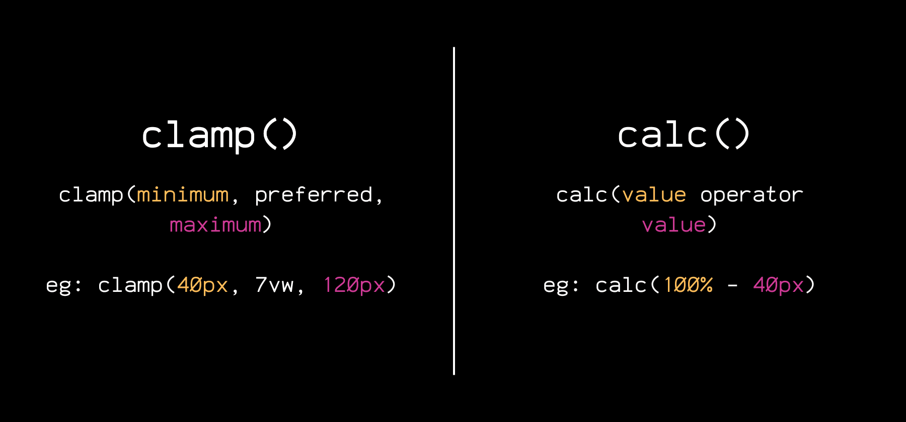
If you use clamp() more often, you might have this question. To get a clear answer, it would be a good idea to understand the difference between the two:
| Feature | clamp() | calc() |
|---|---|---|
| Purpose | Fluid scaling within a defined range | Math between values or units |
| Syntax | clamp(min, preferred, max) | calc(value operator value) |
| Responsive by default | Only if used with fluid units | Only if used with fluid units |
| Accepts multiple unit types | Yes | Yes |
| Useful for | Font sizes, spacing, container widths | Layout math, spacing logic, fixed offsets |
| Can be nested or combined | Works well with calc() but cannot be nested | Can be nested and used inside clamp() |
Clamp() is modern, so getting excited about using it for building fluid designs without relying on media queries is easy. But even though clamp() feels smarter, there are many situations where calc() is more relevant, such as the following:
- Subtracting Fixed Values From Flexible Layouts: Using height: calc(100vh – 80px) makes sure that a section fills the screen minus the height of a fixed header, so elements don’t overlap. Clamp() can’t do this because it doesn’t support subtraction.
- Offset Elements With Precision: A value like margin-left: calc(50% – 200px); shifts an element relative to its container while keeping it visually balanced. clamp() can’t perform this kind of relational positioning.
- Aligning Side-By-Side Sections: Helps you create responsive two-column layouts where one column with width: calc(60% – 2rem); takes up 60% of the space minus a consistent gap. clamp() is ideal for scaling a single value, while calc() excels when relationships between multiple values are needed.
All in all, clamp() is great when defining how a single value should scale across screen sizes. But calc() is what you need when your layout depends on more than one thing at once, like in the cases above.
Combining calc() + clamp()
While calc() and clamp() are powerful on their own, why use one when you can combine both? You can nest calc() inside clamp() to build fluid designs with built-in logic, like combining flexible scaling with precise control.
For example, padding: clamp(1rem, calc(2vw + 10px), 3rem); creates spacing that scales between 1rem and 3rem, but the “preferred” value is based on a calc() formula that mixes viewport width and a fixed value.
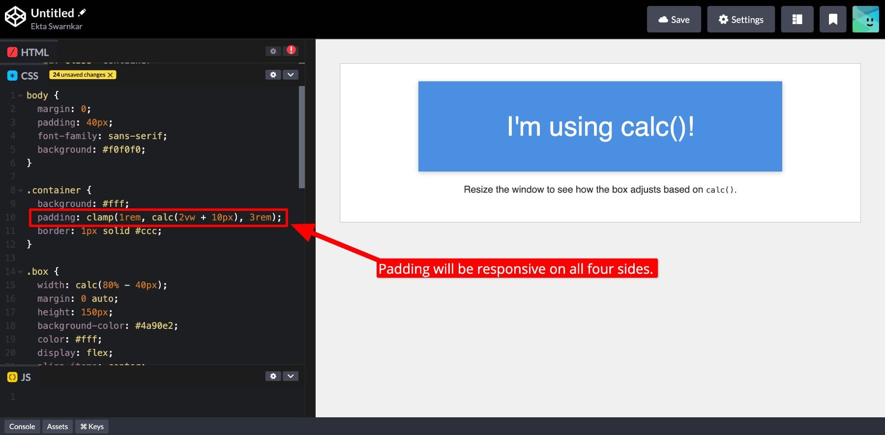
This gives you responsive, logical, and precise control over your design. Once you learn when to use calc() and clamp() individually and when to combine them, you can fully control your layout without relying on custom breakpoints
Using CSS Variables With calc()
You can also extend calc()’s flexibility with CSS variables. Combine variables with other units, do math on them, and build layout logic around reusable values. For example, if you define :root { –gap: 40px;}, then using the padding: calc(var(–gap) + 1rem); helps you set responsive padding based on your root values.
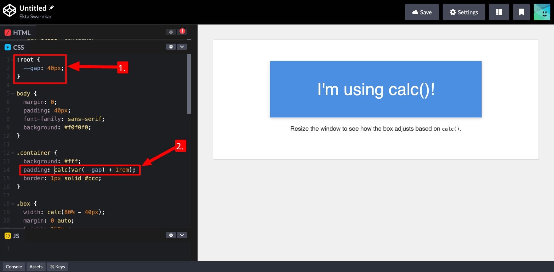
Note: While using CSS variables inside calc(), wrap your variable around var(). See how I did above.
This allows you to build a complete website using a consistent design system (your CSS variables) while still having precise control with calc(). And if you want to make (global) changes, such as adjusting spacing across your layout, you can do it by changing the root values.
It isn’t this easy with clamp(). While clamp() supports CSS variables, each value must resolve to a complete, valid unit. What do I mean by this?
A function like clamp(1rem, var(–fluid-size), 3rem) works only if –fluid-size resolves to something like 4vw. And if you need to do math with a variable, such as adding or subtracting from it, you need to wrap that part in calc(). These minor things make calc() essential when building dynamic values with variables.
Calc() In Divi 5
Both calc() and clamp() are advanced CSS functions that give you powerful control over layouts, spacing, and responsiveness, but only if you’re comfortable writing code. That limits their use to developers or web professionals. But what about those who prefer visual workflows and still want to use calc() and clamp() in their designs? Can you do this?
Yes, you can. Inside Divi 5, both calc() and clamp() are available as Advanced Units, and you don’t have to write a single line of code to work with them.
Subscribe To Our YouTube Channel
All you do is enter calc() directly inside any numeric input field, and that’s it.

The Divi Builder acts instantly. Once you enter your calc() value, you get live feedback while designing. There’s no need to switch between the builder, DevTools, or previews, and no guessing how it will look.
Divi 5 makes building smarter and more flexible designs easy without touching code. You can even combine calc() with Divi’s design variables or your own CSS variables to create reusable, dynamic layouts. I’ll show you how to do that in the next section.
By the way, did you know Divi 5 also supports all CSS functions in advanced units? You might want to learn about them as well 👇🏻
Learn Everything About Divi 5’s Advanced Units
How Divi 5 Makes Using calc() Effortless
You just saw that Divi 5 makes using calc() in your designs effortless while giving you instant previews as you work. But there’s more. Divi gives not just a workaround but a fully integrated, no-code way to build responsive, logic-based layouts using the same tools developers rely on, without writing a line of code.
Here’s how it helps you use calc() heroically while quietly working in the shadows:
1. Apply calc() To Any Numeric Field
Just because you’re not coding doesn’t mean you’re limited. In Divi 5, calc() works anywhere a numeric value is accepted (think: width, height, padding, margin, gap, font size, anywhere). If the field accepts a number, it supports calc().
And applying calc() is relatively straightforward. All you need to do is choose calc() from the other advanced units and enter your formula.
This means you can handle layout math visually without leaving the builder. Whether subtracting a fixed header’s height, adding flexible spacing to font sizes, or mixing units for better responsiveness, Divi lets you do it all directly inside the design fields.
Just type in your formula, and the result updates instantly — no code panels, no tab switching, and no second-guessing. It’s full control, built right into your workflow.
2. Get Instant Live Previews
One of the best parts about using calc() in Divi 5 is that you can see what you’re doing in real time. You don’t have to guess how the spacing or alignment will look. When you enter your calc() formula, the builder updates instantly.
As you can see, the padding changed immediately as I entered the calc() values. I also switched between different breakpoints to show you how the padding adjusts based on the screen size.
Whatever changes you make, you’ll see the result as you type. This immediate feedback helps you understand how the calculation affects your layout and lets you tweak values quickly without switching tabs.
3. Build Advanced Workflows With calc()
Using calc() in Divi 5 isn’t powerful because you can now add or subtract values. The real strength is in unlocking smarter workflows. Divi lets you combine calc() with advanced tools like clamp(), CSS variables, Design Variables, and Option Group Presets, all inside a visual builder.
You’re not limited to simple one-off adjustments. Using Divi, you can create layout systems that respond fluidly to screen size, follow consistent spacing rules, and update automatically when design tokens change. Let’s see how:
1. Extend calc() With CSS Variables
Divi 5 supports CSS variables directly inside design fields, which means you can define reusable values and calculate from them visually. Let’s say I want to use a fixed padding on all my page sections, so I’ll save it as a CSS variable:
:root {
--section-padding: calc(4rem + 2vw);
}
To do so, I’ll go to Page Settings > Advanced > Custom CSS and add my root values here:
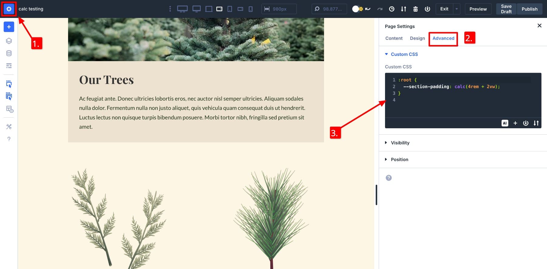
Now, instead of entering the full formula everywhere, you can just use var(–section-padding) in any padding field inside Divi. The result updates live, and if I change the root value later, the entire layout instantly reflects that change.
Notice the updated Advanced Unit shows calc var, which means the CSS variable was inserted using the var() function inside a calc() formula.
Using CSS variables in Divi is surprisingly simple. You can just define them on the page itself without touching your stylesheet. This helps maintain a consistent design framework, test new values, and build responsive layout rules.
2. Use calc() In Your Design Framework
Divi 5 lets you save calc() values as Design Variables, making it easy to reuse one layout logic across your entire website. Let’s say you want your service sections to always fill the screen minus the height of a fixed header. Then, you can create a Number Variable and name it Section Height with Value calc(120vh – 30px).
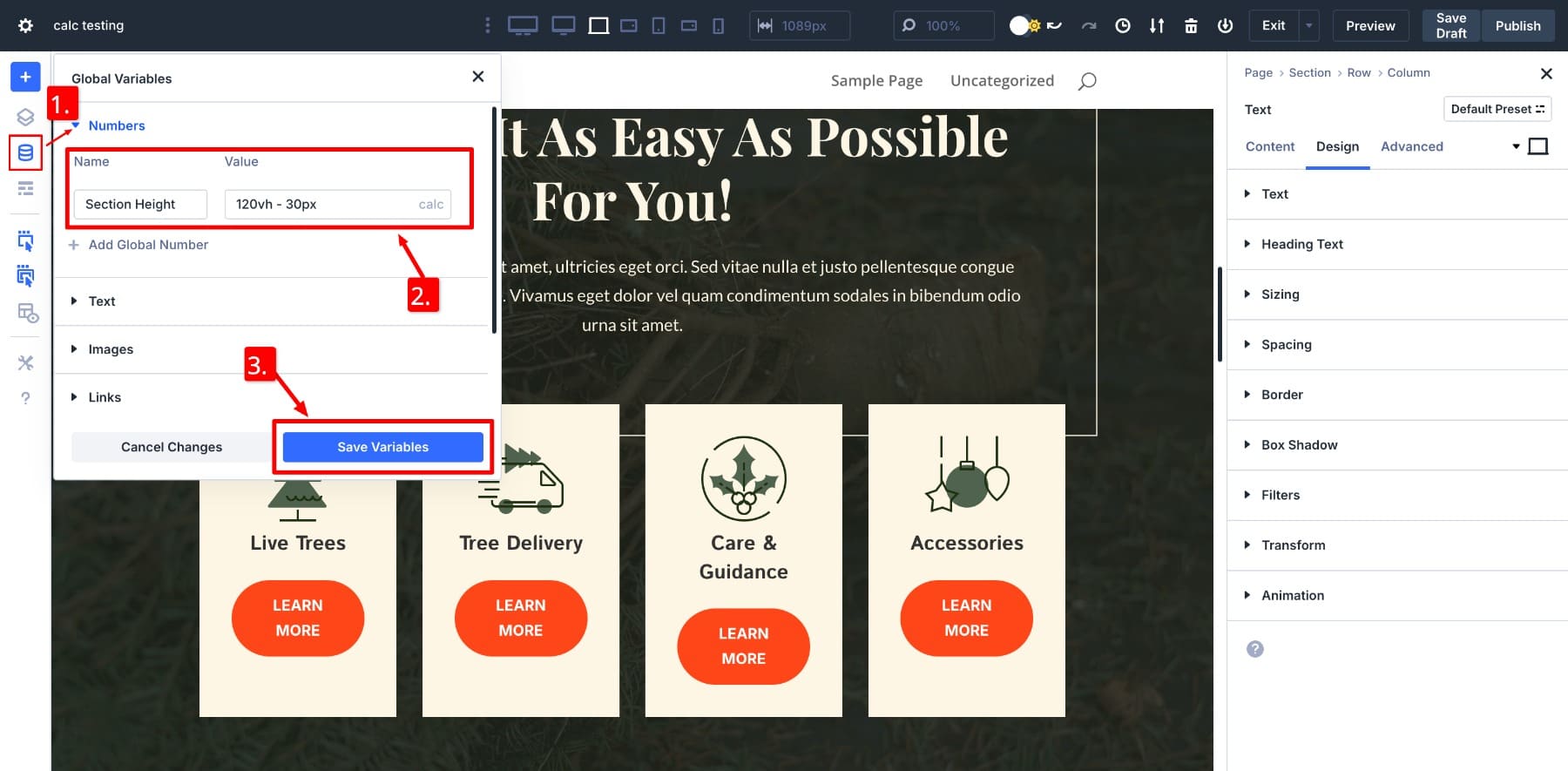
Here, 30px is the fixed header’s height.
Now, to apply the saved variable, go to the section’s Design Settings and hover over the Height to locate the Dynamic field icon. Click on it, and your saved variable will pop up. Click on Section Height to apply it.
This approach gives you full layout control while keeping your design consistent. You’re not locked into presets or static values. Instead, you’re building logic that adapts across pages, templates, and screen sizes all visually.
Design variables unlock great possibilities. For example, you can build your design framework visually and use it on all your website pages to keep design rules consistent throughout. We also recommend you build your typography and spacing and sizing systems before designing any page.
3. Create & Save Option Group Presets
Once your layout uses calc() values consistently, Divi 5 makes saving that logic for reuse easy. You can store your entire styling setup (or individual settings such as padding, gaps, margins, and widths) as Option Group Presets. This means instead of applying calc() formulas repeatedly, you just select a preset, and the layout math gets applied instantly.
For example, if you’ve used padding: calc(4rem + 2vw) across multiple sections, you don’t need to retype it everywhere. Just save it as a preset:
Now, apply your saved preset wherever needed. Everything updates visually, so you can see the effect live immediately.
Even better, if you’ve used design variables in those presets, you can update the values globally later. Change the variable once, and every preset using it will reflect the update. This makes large-scale edits fast and consistent.
Notice how by changing the saved values in design variables, they also get updated in the padding section while also giving us a live preview? That’s because I used the Section Height variable inside the Spacing Section preset.
That’s the power Divi 5 brings. It helps you scale your design system while keeping advanced layout logic consistent across the site. Once you get used to combining advanced units like calc() (See here more calc() use cases with tips on mastering them effectively) with Divi’s modular design system, you will unlock an efficient and fun way to build websites.
Divi Makes The Math Feel Easy
You don’t have to be a developer to use CSS functions like calc() and clamp(). Divi 5 brings these advanced tools into a visual interface that’s easy to explore, test, and apply. You can do everything from simple layout tweaks to complex design systems without writing a line of code.
Whether you’re adjusting spacing, using variables, or building reusable presets, Divi makes responsive design math accessible for everyone. Want to test how smoothly calc() works inside Divi? Download the Divi Public Alpha today and experience it for yourself.
👉 Divi 5 is ready to be used on new websites, but wait a little before migrating existing ones.
The post What Is calc() In CSS (And How To Use It) appeared first on Elegant Themes Blog.
The Tech Zone


Comments
Post a Comment