Responsive Design with CSS Media Query Breakpoints (The Easy Way)
There’s nothing worse than meticulously designing a web page and checking it on a mobile phone, and nothing is readable. Thankfully, CSS offers several ways of addressing this exact situation. One of the most long-standing tools in the CSS toolbelt is Media Queries.
Media Queries let you specify design rules in very specific situations. If you know how to write CSS, you can start writing media queries in about five minutes. But their benefits are not beyond you if you aren’t a pro with CSS—I’ll show you how WordPress’ best page builder lets you build media queries without ever realizing it.
What Are Media Queries and Important Things to Know
Websites are opened on all sorts of devices, from large desktop displays to cell phones. Media queries are a key CSS tool for achieving a readable and well-designed site regardless of screen size. Media Queries allow you to conditionally apply CSS styles based on screen size, device type, orientation, resolution, and more.
The iPhone’s release was really the first time that responsive design became an essential part of web design. Much of the web was simply unreadable on mobile devices. Today, the situation is much better, but things are still complicated. There are dozens of flagship phones out there with all sorts of screen resolutions and dimensions.
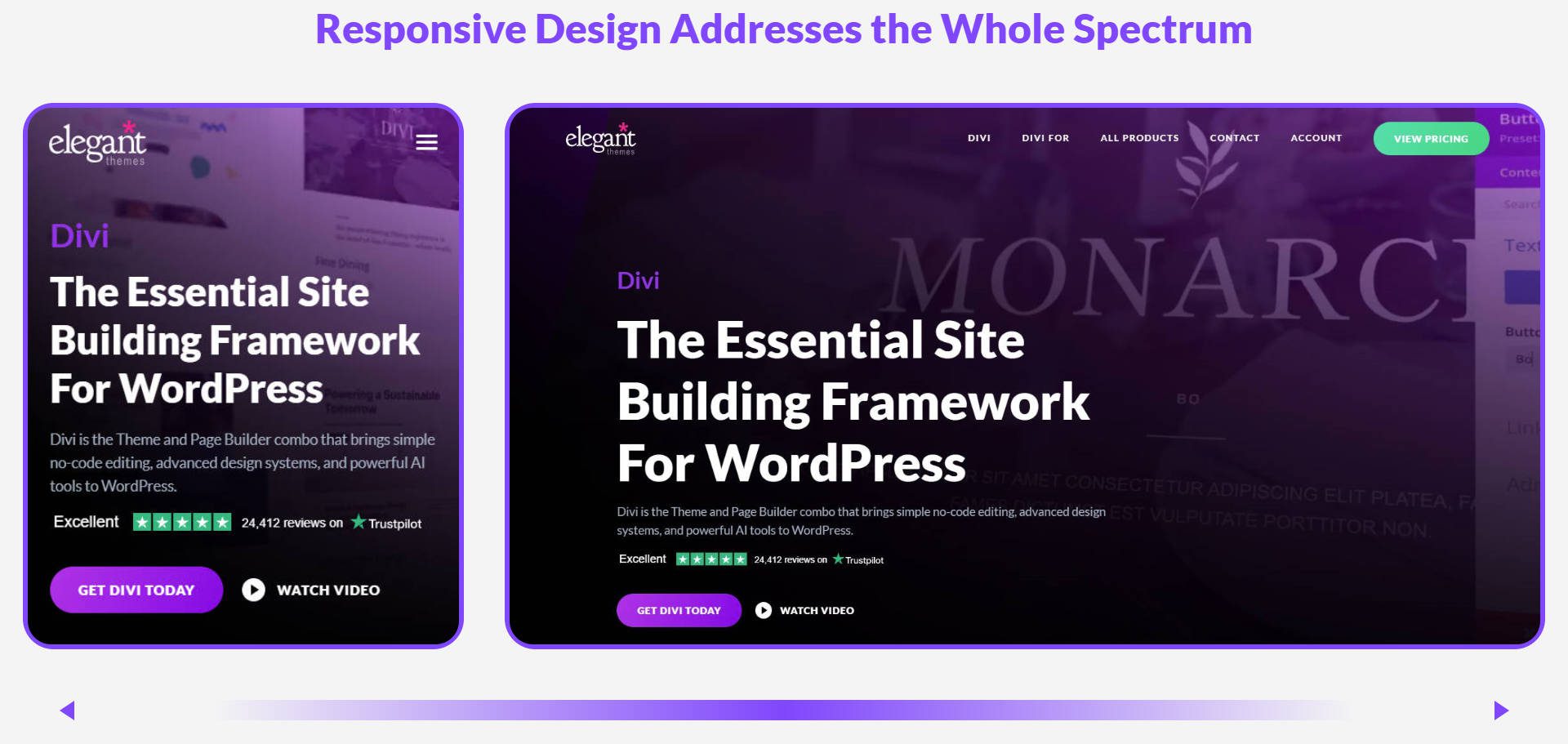
More than that, desktop displays are getting to absurd proportions (a 40+ inch display is in my future), meaning web designers have to create websites that work between 2.5 and 41 inches wide.
And maybe a little bit smaller if this catches on.
The Syntax of Media Queries
Media queries use a specific structure in CSS.
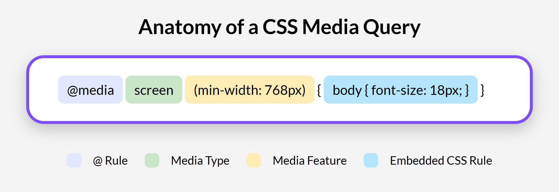
It starts with @media, which tells the browser you are defining a media query. Next, you specify the media type. For websites, screen is the most common type, as it applies to computer screens, tablets, and smartphone displays. There are others, like print and
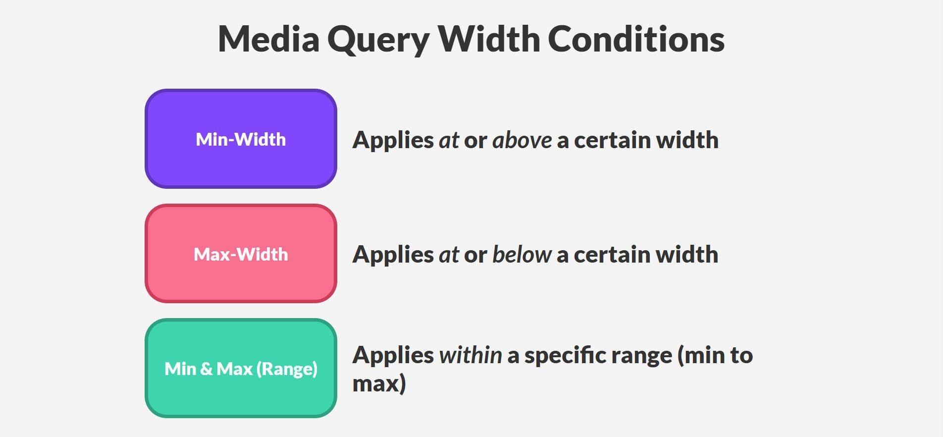
After the media type, you add media features within parentheses. These are the conditions that trigger the media query. Width is the critical media feature. You’ll often use max-width and min-width to target different screen widths. Max-width applies styles when the screen is at or below a certain width. Min-width applies styles when the screen is at or above a certain width.
Inside the media query, you write standard CSS rules. These CSS rules will only be applied when the media query’s conditions (usually width conditions) are met.
Media Queries can target more than device width. Orientation detects if a device is in portrait (vertical) or landscape (horizontal) mode. Resolution and device-pixel ratio are used for high-resolution or “retina” screens to ensure sharp images and text. Pointer and hover can differentiate between devices with touch input versus mouse-based interactions. So, after you learn the basics of width-based media queries, there’s still more for you to learn.
Best Practices When Writing Media Queries
Media Queries quickly get hard to manage. Follow these key practices to keep your styles organized and scalable:
- Mobile-First Designing → Start with your smallest breakpoint as the base, then use min-width to scale up instead of constantly overriding styles.
- Use Adaptive Layouts → Flexbox and Grid can eliminate the need for excessive media queries by making elements flow by default.
- Keep Styles Modular → For easier maintenance, place component-specific media queries inside the component’s CSS file rather than a global stylesheet.
Setting Breakpoints
Breakpoints are specific screen widths that media queries can target. Breakpoints roughly match up to device categories: small phones, tablets, and desktops. However, those figures are just mental categories. While there are standard “defaults,” it’s best to test your site in your browser’s Dev Tools. Examine your site’s design to determine where breakpoints are needed.
Here’s an example of a page with default breakpoints set but where the design suffers because the mobile breakpoint looks better than the tablet breakpoint at 770px.
Here are some default Media Queries ranges you can start with (but feel free to deviate if your design demands something different):
- Phones: Up to 480px
- Landscape Phones & Smaller Portrait Tablets: 481px to 768px
- Landscape Tablets & Laptops: 769px to 1024px
- Larger Displays: 1025px to 1366px
- Extra Wide Monitors and TVs: Above 1366px
Here’s how the Bootstrap Framework has their breakpoints set:
/* Base styles (applied to all devices) */
body {
font-size: 16px;
}

/* Small screens (≥576px) */
@media (min-width: 576px) {
body {
font-size: 17px;
}
}

/* Medium screens (≥768px) */
@media (min-width: 768px) {
body {
font-size: 18px;
}
}

/* Large screens (≥992px) */
@media (min-width: 992px) {
body {
font-size: 19px;
}
}

/* Extra large screens (≥1200px) */
@media (min-width: 1200px) {
body {
font-size: 20px;
}
}

/* Extra extra large screens (≥1400px) */
@media (min-width: 1400px) {
body {
font-size: 21px;
}
}
Media Queries solve so much of what can go wrong with responsive web design. It’s just that they aren’t always the easiest to work with. They can be hard to manage and diagnose problems within because they are essentially more CSS that you have to write.
How Divi Makes Media Queries Easier to Work With
Applying media queries quickly becomes overwhelming with so many breakpoints you could create rules for. While it works, it can easily become taxing.
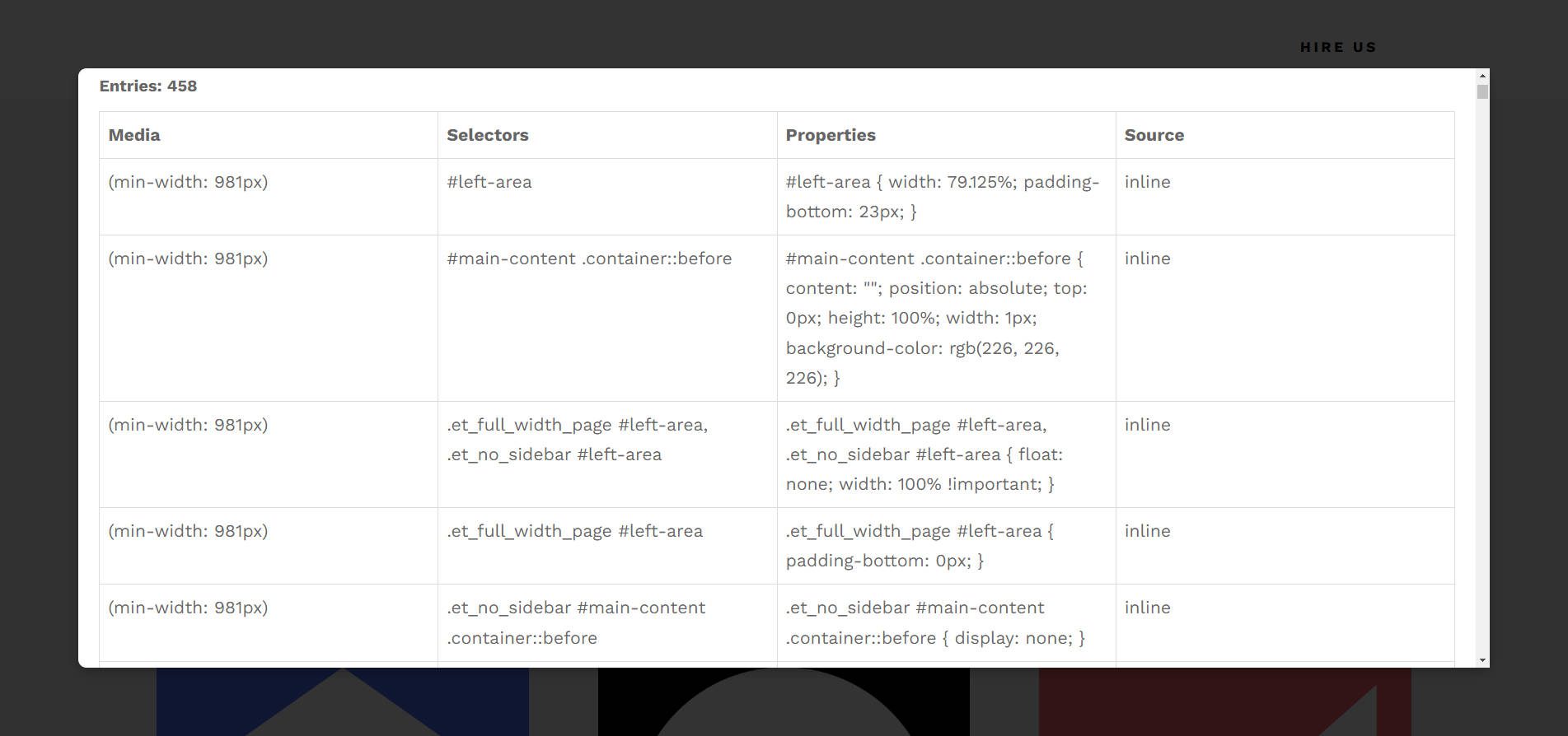
This page has 458 media queries, with only three breakpoints. Imagine if it had seven breakpoints set—that’s a lot. I built a simple tool to find, count, and display all the media queries on a page so I could show you this visually.
That’s actually the main benefit of a visual design tool like Divi. With Divi, Media Queries are abstracted out of view and are automatically created based on your design decisions within a visual page builder. You get all the benefits of finely tuned designs (on multiple breakpoints) without having to write or manage each individual media query.
Instead, Divi makes it easy to manage (find, update, and delete) every module’s responsive settings. It’s quite the opposite of managing hundreds of media queries in a stylesheet. That method requires a lot of jumping around a .css document, using Ctrl+F/Cmd+F to find the queries to edit. Inside Divi, all your responsive settings are saved on the module itself. To edit a style, find and click the element on the page, go to the responsive view you want to edit, and make your changes. All of Divi’s design tools are modulated to work at that breakpoint, making it very intuitive.
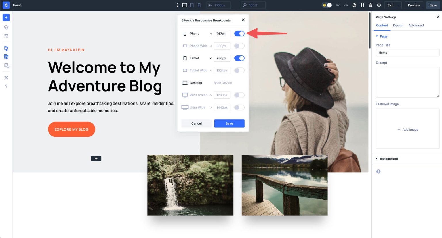
Divi allows you to define your own breakpoint widths. That means you don’t need to use a default setting that doesn’t quite align with your needs. You can change any breakpoint to apply precisely at the seam you need. Note that breakpoints are set site-wide.
Other Things that Help You Build Responsive Websites
While media queries help you control designs at specific breakpoints, modern CSS tools can reduce reliance on them by making elements inherently flexible. What if your layouts could adjust themselves automatically—without extra media queries?
CSS Grid: Responsive Layouts Without Breakpoints
CSS Grid is a layout system that places elements into a grid, and the whole grid structure automatically adjusts to the available spacing. It is good for displaying a set number of items along a structure column and row layout. Unlike Flexbox which works across one axis, Grid works across two dimensions of control.
When to Use Grid
- When you need a dynamic grid that rearranges itself based on available space.
- Ideal for cards, galleries, dashboards, and multi-section layouts.
Example: Auto-Fitting Grid Without Media Queries
.grid {
display: grid;
grid-template-columns: repeat(auto-fit, minmax(200px, 1fr));
gap: 20px;
}
✅ Why It Works
- Auto-fit fills the row with as many columns as can fit. If extra space remains, columns grow instead of leaving empty gaps.
- Minmax(200px, 1fr) means each column is at least 200px but grows in instances with any extra space.
- No media queries are required—columns adjust naturally based on screen width.
CSS Flexbox: Adaptive Alignment
Flexbox is a layout system designed for arranging elements along a single axis (row or column). It dynamically distributes space between items, making it ideal for navigation menus, buttons, and content alignment.
When Flexbox is Helpful
- When designing navbars, buttons, and form layouts that adjust based on available space.
- When elements need equal spacing or dynamic wrapping without writing breakpoints.
Example: Wrapping Navigation Without Media Queries
nav {
display: flex;
gap: 10px;
flex-wrap: wrap;
justify-content: center;
}
✅ Why It Works
- Flex-wrap: wrap; allows items to break onto a new line when they no longer fit in a single row, meaning that they adjust naturally to different screen sizes.
- No media queries needed—items flow naturally as the container resizes.
Clamp() for Fluid Typography
The clamp() function allows font sizes (or other properties) to scale dynamically between a minimum and maximum value, all based on screen size. This makes text readable on small screens but doesn’t grow too large on bigger displays.
When Clamp() is Helpful
- When designing headings and body text that should be fluid without needing media queries.
- Prevents text from becoming too small on mobile or too large on ultra-wide screens.
Example: Clamp() on a Heading
h1 {
font-size: clamp(1.5rem, 2vw, 3rem);
}
✅ Why It Works
- The H1 heading will be at least 1.5rem and will scale dynamically at 2% of the viewport width but never exceed 3rem.
- There is no need for media queries to adjust typography for different screen sizes
- Clamp() works fluidly—even between breakpoints.
Logical Properties (Unitless Values)
Logical properties replace hard-coded values (like width, height, left, and right) with flow-aware terms like inline-size (width) and block-size (height). These adjust automatically based on text direction and don’t rely on precise measurements per each breakpoint.
When Logical Properties are Helpful
- When designing multi-language websites that switch between left-to-right (LTR) and right-to-left (RTL) layouts.
- Useful for internationalization without needing different stylesheets or media queries.
Example: Logical Properties on a Container Instead of Fixed Values
.container {
inline-size: 100%;
block-size: auto;
}
✅ Why It Works
- Inline-size ensures full width in any writing mode (LTR or RTL) without hard coding for each writing mode separately.
- Works without needing separate styles for Arabic, Hebrew, or other RTL languages. This eliminates the need to write separate CSS for different text directions, allowing layouts to adjust automatically.
Tools for Working with Media Queries
Any web designer should know one or two of the tools below. They’ll help you see how your response designs are shaping up, no matter which CSS modules you use to achieve your end result.
1. In-Browser Responsive Design Tools
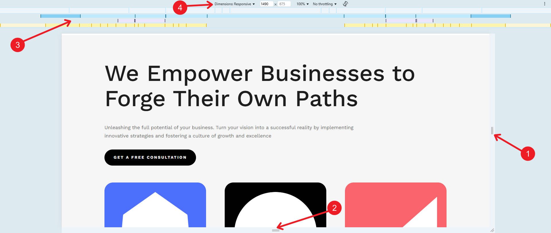
Google Chrome’s and Firefox’s responsive view in the Developer Tools is very handy (Chrome pictured above). With it, you can simulate various predefined devices, including popular smartphones and tablets. You also have:
- Page Width Handle (Draggable Resizing)
- This allows you to manually adjust the viewport width by dragging to test how the website responds at different screen widths.
- Page Height Handle (Draggable Resizing)
- This allows you to manually adjust the viewport height by dragging to test how the website responds at different screen heights.
- Media Query Breakpoints Overview
- A visual representation of active CSS media queries. The blue bars indicate min-width breakpoints, the yellow bars show max-width, and the purple/pink bars highlight other media features (like min and max).
- Viewport Dimensions & Device Selection
- This displays the current viewport width and height in pixels. You can select predefined device sizes or set custom widths to test responsiveness at standard intervals.
You can open Chrome’s or Firefox’s DevTools by pressing Ctrl + Shift + I on Windows/Linux or Cmd + Option + I on Mac.
2. Cross-Browser Testing Tools
LambdaTest
LambdaTest is a cloud-based platform that allows developers to test their websites on various devices and operating systems. The platform also supports automated workflows, which are particularly useful for large-scale projects.
BrowserStack
BrowserStack provides real-time testing on real devices, ensuring the most accurate results. Its ability to simulate different screen resolutions, browsers, and operating systems makes it an essential tool for responsive testing. Developers can integrate it with their CI/CD pipelines for seamless testing workflows. BrowserStack offers different tools for testing media queries:
- Live Testing (Manual testing on real devices).
- Responsive Testing (Quick checks for different screen sizes).
- Automated Testing (Using Selenium, Playwright, or other automation tools).
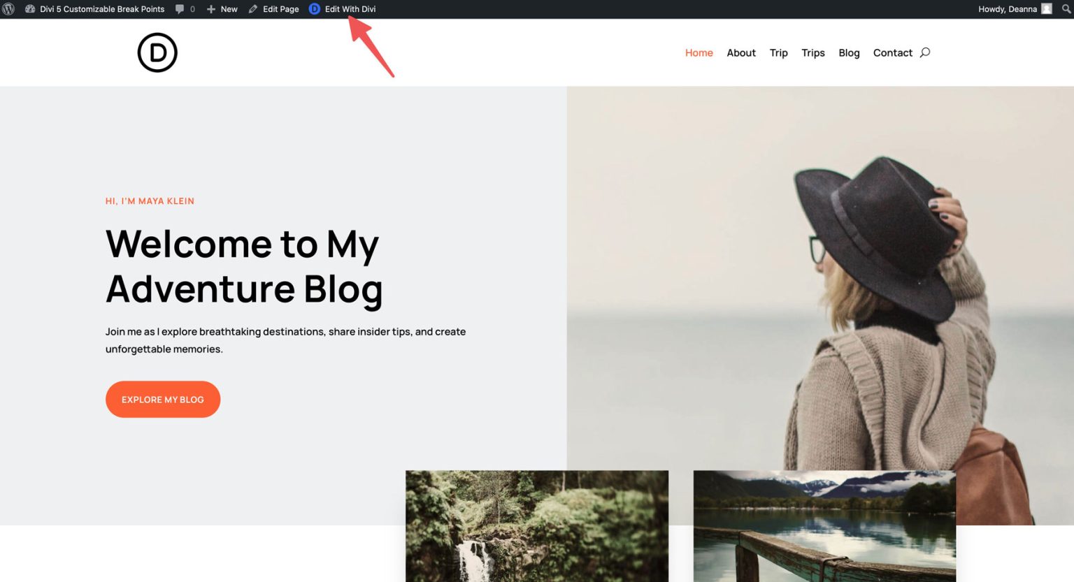
How to Use Divi to Create Media Queries Without Coding Them
Since you have some more understanding of Media Queries (along with how to test them), I wanted to show you exactly how it works inside of Divi. Divi 5 introduces an advanced breakpoint system, giving users more control over responsive design. You can access breakpoints directly within the Visual Builder on any page.
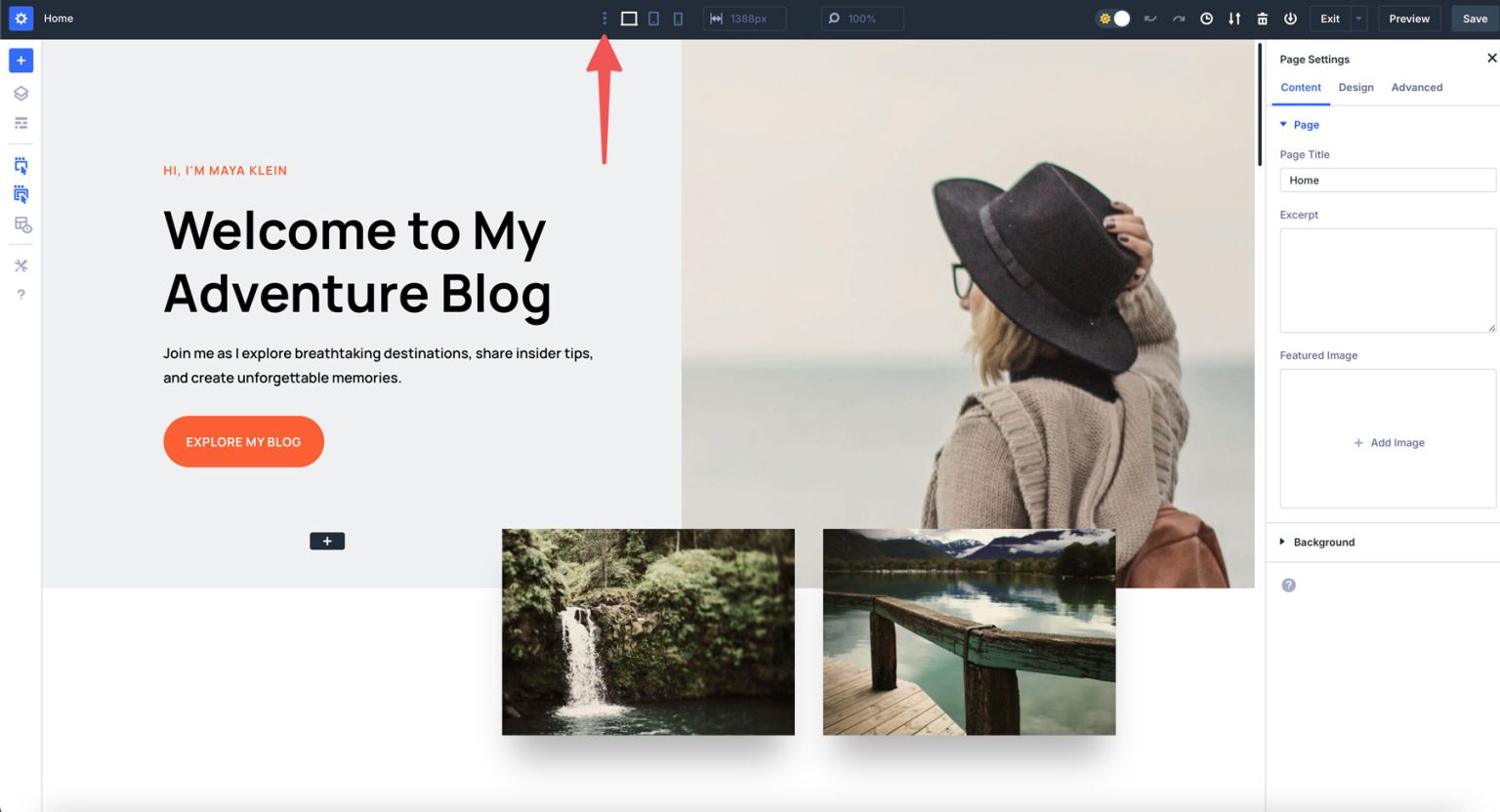
Click the “three-dot icon” in Visual Builder’s main taskbar to view a list of the breakpoints you can add and customize.
Find the toggle switches inside the settings to enable or disable breakpoints as needed. You can also set custom values for all breakpoints.
When you’re breakpoints are ready to go, you can click on any module on the page. From there, change to the breakpoint you want to make the change on, select the styles you want to edit, and make your changes.
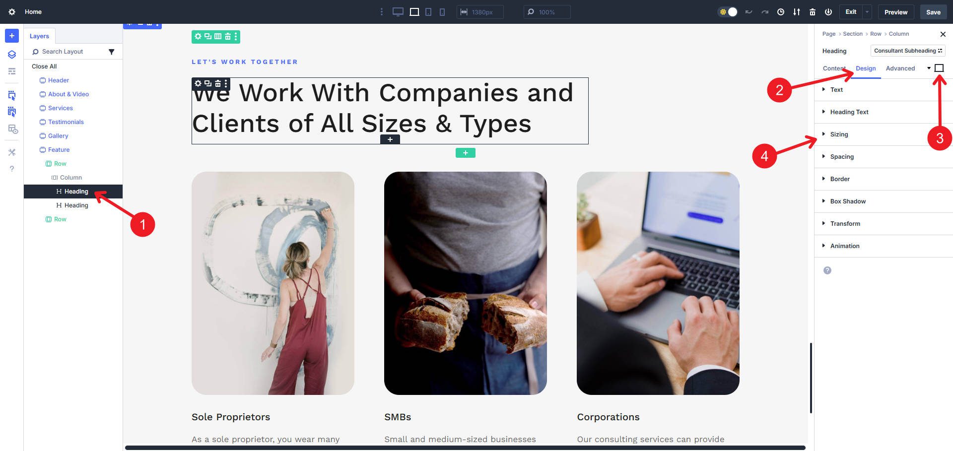
You can see exactly how it will look at that breakpoint, and you can even use the draggable width bar to see how it would look throughout the breakpoint’s range.
Responsive settings applied in a module on the Phone, Phone Wide, Tablet, and Tablet Wide breakpoints use min-width media queries. Responsive settings applied in a module at the Widescreen and Ultra Wide breakpoints use max-width media queries. These are automatically created for you; you don’t need to write them manually—it’s just how they work behind the scenes.
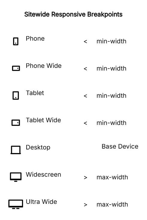
Desktop acts as the base device between the closest breakpoints above and below it. The base device doesn’t use media queries, just standard CSS. But again, Divi makes sure that you never have to worry about writing these media queries yourself. As you make changes in the UI, those media queries are automatically created.
Start Using Media Queries
Responsive design makes it so that every website visitor gets a good experience. A one-size-fits-all approach won’t cut it with devices ranging from wearables to ultra-wide monitors. Media queries and modern CSS techniques give you the tools to build sites that adapt intelligently to any screen size. And if working with CSS directly is intimidating, Divi makes it as easy as ever to achieve the same effect without needing to write or manage separate media queries.
Are you building a new site or redesigning your current one on WordPress? Use Divi 5 to create the easiest responsive website of your life.
The post Responsive Design with CSS Media Query Breakpoints (The Easy Way) appeared first on Elegant Themes Blog.
The Tech Zone


Comments
Post a Comment