Getting To Know The Divi 5 Interface: 10 Changes & Improvements
Divi 5 introduces a host of improvements not only behind the scenes but also in the way you interact with the Visual Builder. While the overall interface may feel familiar to long-time users, several enhancements have been made to improve efficiency and make building websites faster and more intuitive.
In this post, we’ll explore the key changes and improvements in Divi 5’s interface that are designed to streamline your workflow and enhance your design experience.
Learn more about the Divi 5 Public Alpha and how to download it. 👇
Key Changes In The Divi 5 Interface
One-Click To Edit
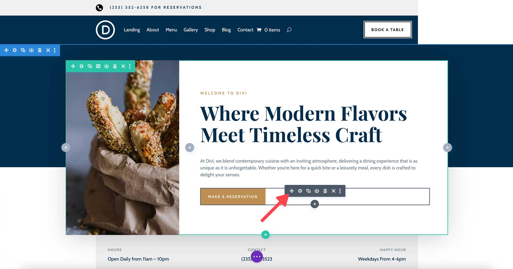
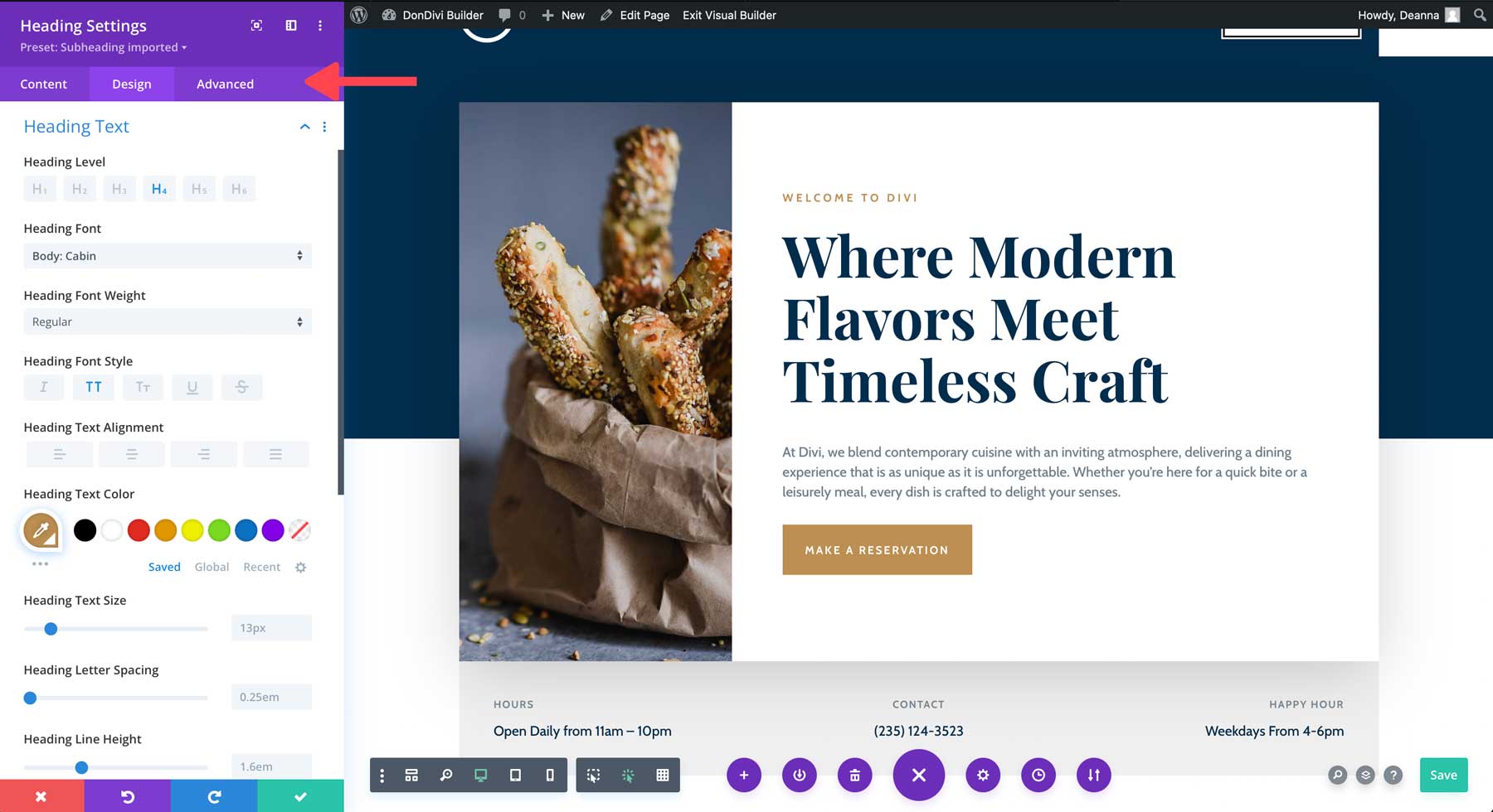
Divi 5 introduces a streamlined interaction method: one-click editing. In Divi 4, you had to carefully click on small icons within the module to access its settings. Sometimes, those icons were overlapped or hard to find, leading to frustration and unnecessary steps.
How It Works:
Instead of clicking on small, specific icons, you can now click anywhere on a module to access its settings. Once you click, the settings panel immediately opens, eliminating the need to find specific icons or menus.
Benefits:
This reduces the number of clicks required to access settings, saving time and making the design process smoother, especially when working with multiple modules on a page.
Real-Life Example:
Imagine you’re working on a complex homepage with many text and image modules. In Divi 4, you’d have to click a small gear icon on each module to open the settings panel. With Divi 5, you simply click on any text block or image to edit it directly, speeding up the process and making it feel more fluid and intuitive.
Right-Click For Controls
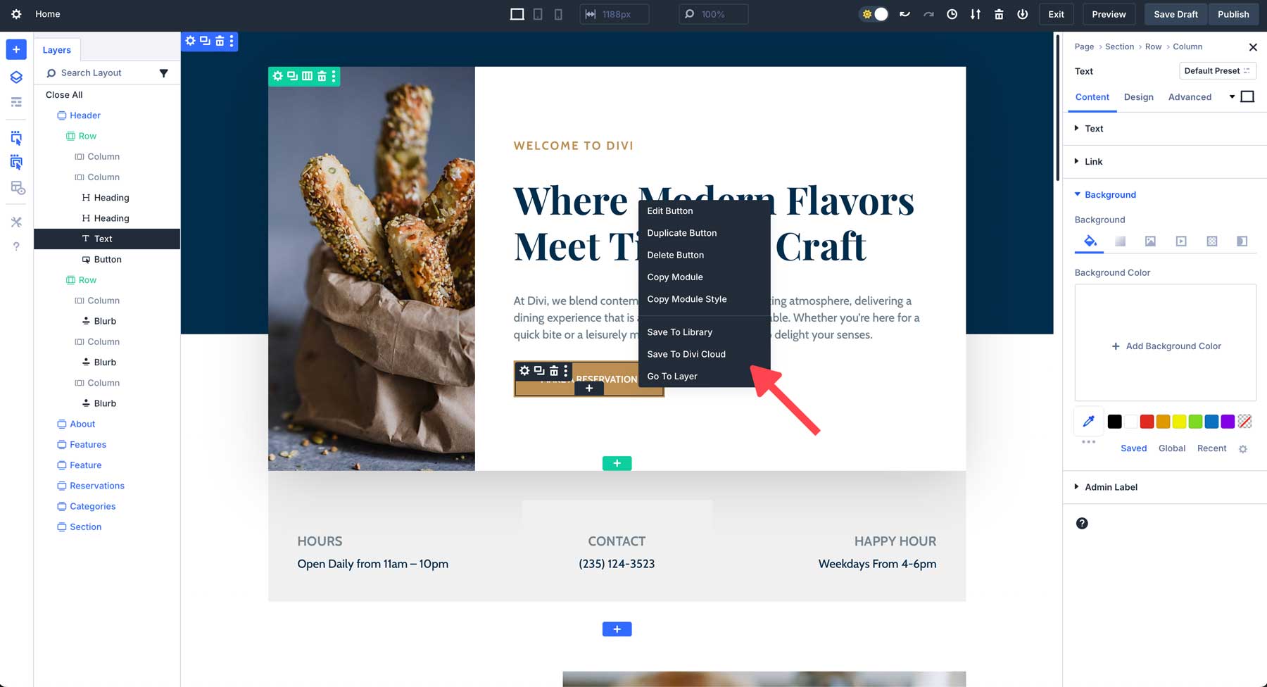
In Divi 5, the ability to right-click on any module to bring up a context menu is a game-changer for efficient design. Instead of navigating through multiple menus or layers, you can now access a wide range of settings instantly.
How It Works:
Right-click on any module or section to open a custom context menu. This menu offers options for copying module styles, adjusting settings, saving the module to the library, and more.
Benefits:
This significantly speeds up tasks like duplicating styles across modules or making quick adjustments without searching the sidebar for the right settings.
Real-Life Example:
Suppose you’re building a portfolio page, and you want to apply the same style to several image galleries. In Divi 4, you would have to manually adjust the settings for each gallery. In Divi 5, you can right-click on a gallery module, copy its design settings, and then right-click on another gallery to paste the styles. This saves time and ensures consistency across your designs.
Multi-Panel Docking & Tabbed Panels
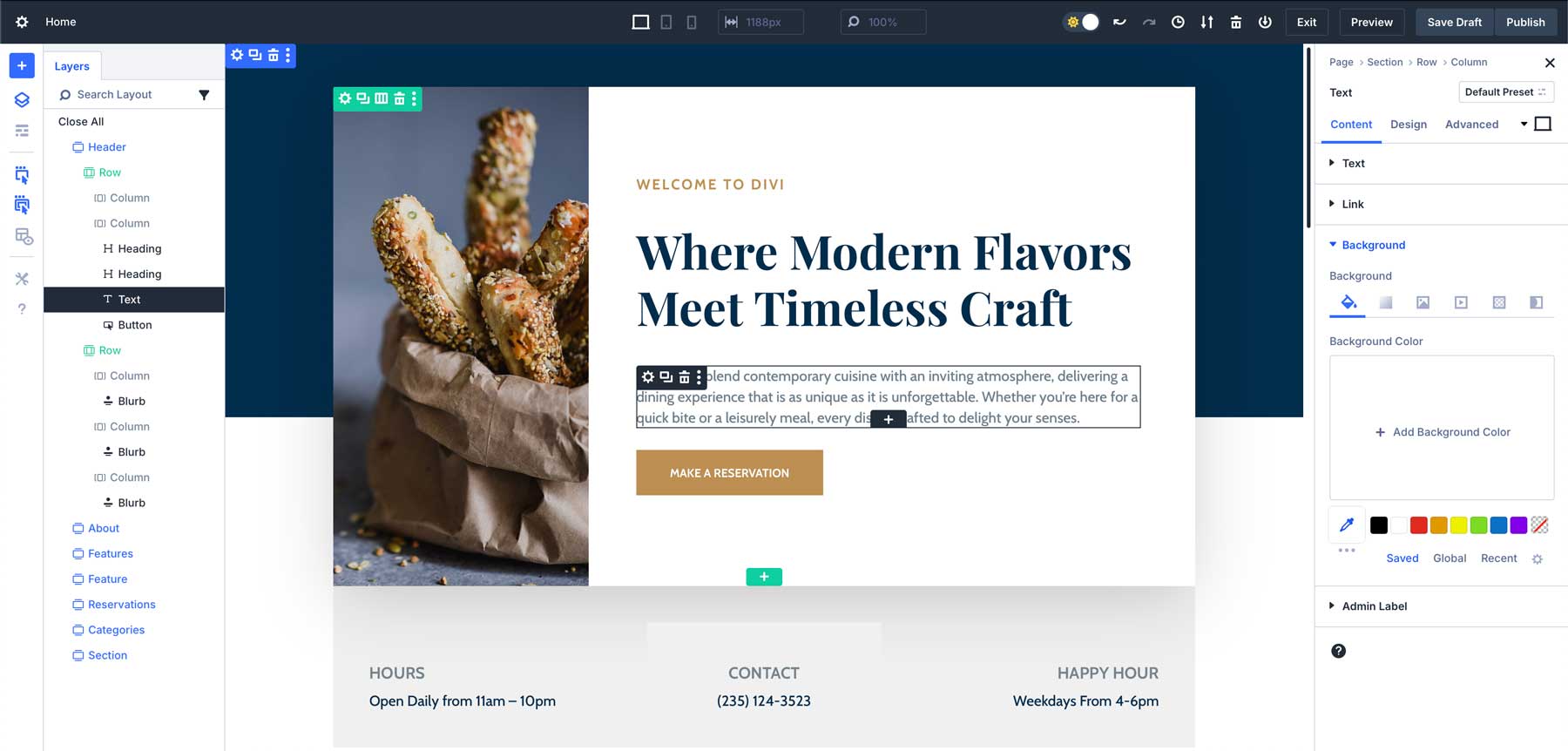
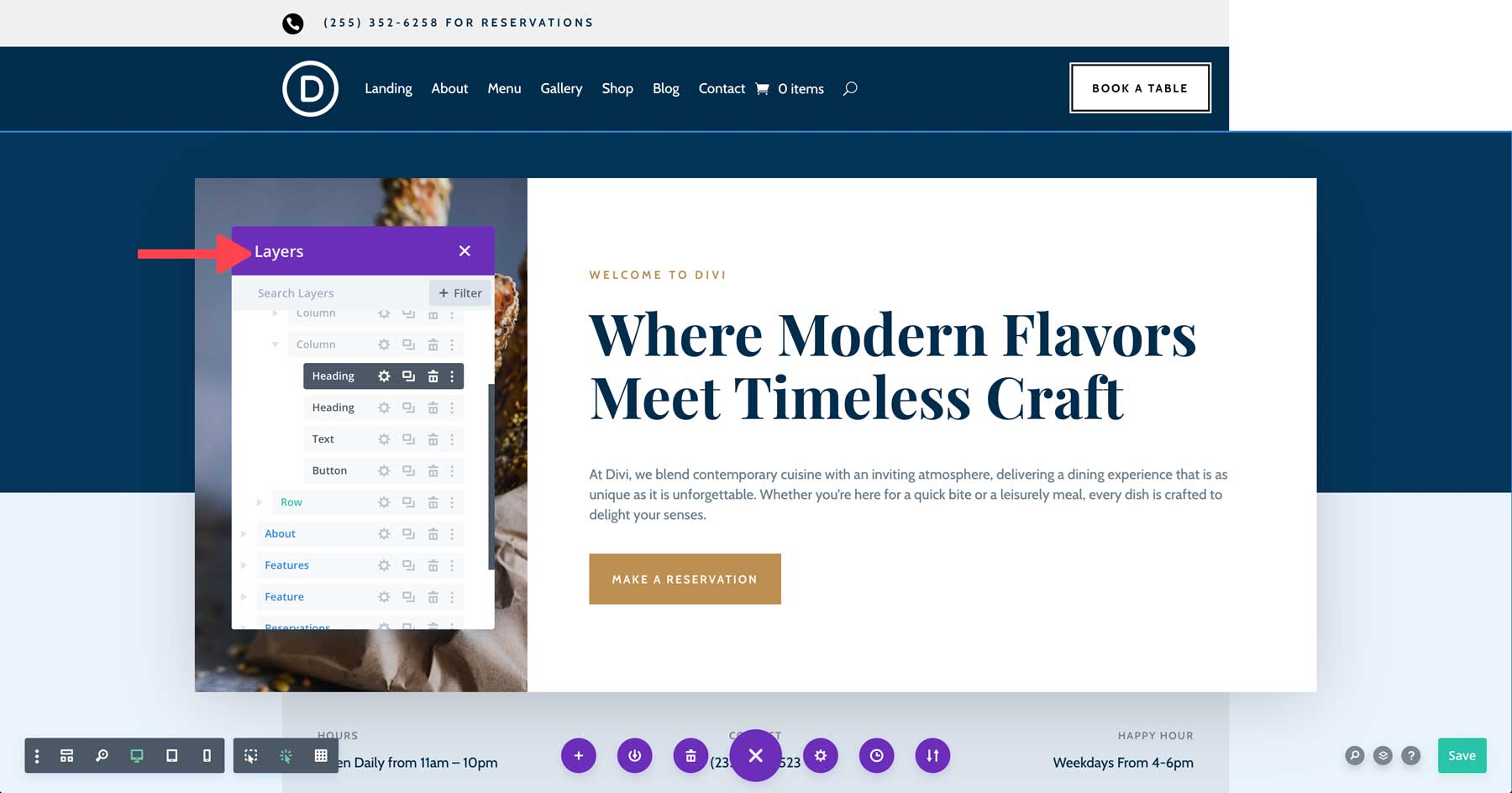
One of the most powerful features in Divi 5 is the introduction of multi-panel docking and tabbed panels. In Divi 4, managing complex designs could feel overwhelming. The single-panel setup meant constantly switching between different settings, cluttering your workspace and making it difficult to multitask.
How It Works:
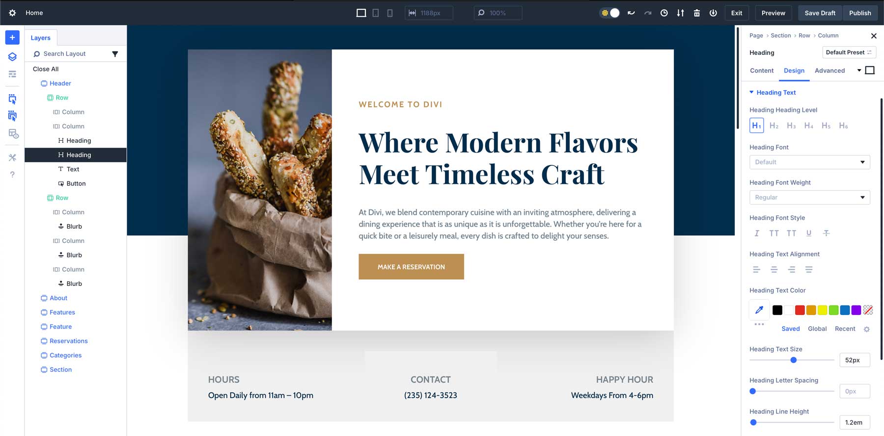
In Divi 5, you can now open multiple settings panels simultaneously and dock them side by side. This is especially helpful when working on different parts of the page and needing quick access to multiple settings simultaneously. You can also organize the panels into tabs, making it easy to switch between them without losing track of your work.
Benefits:
This feature is perfect for multitasking, as it allows you to keep different settings panels open and ready for adjustments without having to close one to open another.
Real-Life Example:
Picture a scenario where you’re designing a landing page with complex settings. You’re adjusting the design of the hero and CTA area. Before Divi 5, you would have to keep switching between the builder settings and the layers panel. Now, you can click and drag them side-by-side, providing a quick way to design your page more efficiently.
Light & Dark Mode
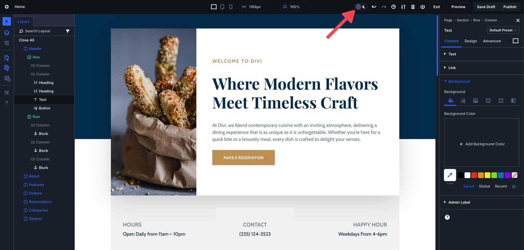
Divi 5 includes the much-anticipated addition of light and dark modes, allowing users to switch between themes depending on their environment. This feature isn’t just about aesthetics—it’s about improving comfort and usability during long design sessions.
How It Works:
You can toggle between light mode and dark mode from the builder settings. This allows you to work in the theme that best suits your environment, reducing eye strain.
Benefits:
Designers who work late into the night or in low-light environments can now switch to dark mode, which reduces glare and makes the editing experience more comfortable. Conversely, users who prefer a brighter workspace can stick to light mode.
Real-Life Example:
If you’ve ever worked on a project late at night, you know how harsh bright interfaces can be. In Divi 5, you can switch to dark mode to keep your focus on the design without hurting your eyes. It’s a simple change, but it makes a huge difference in comfort and productivity.
Responsive, Hover, & Sticky Editing Improvements
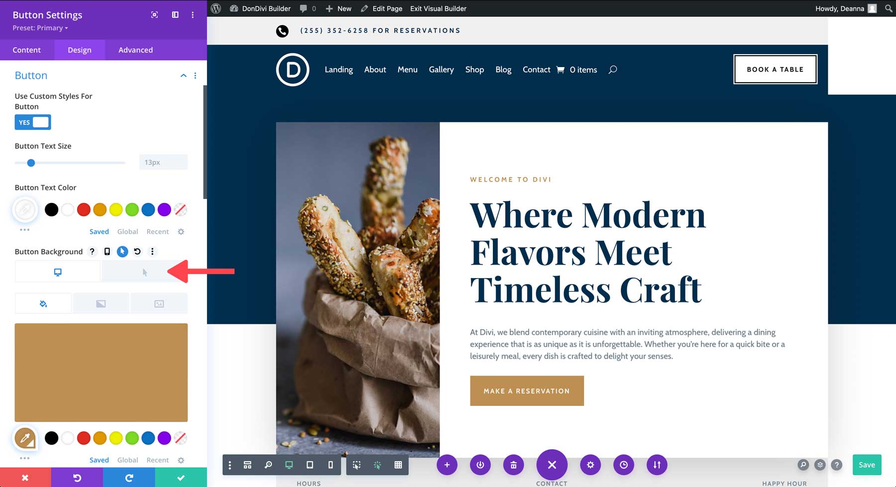
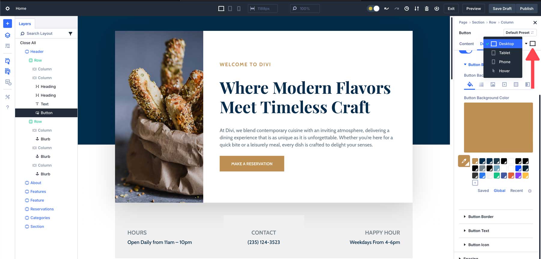
In previous versions of Divi, responsive editing, hover effects, or sticky positioning required enabling these features at the option level. Divi 5 simplifies this process by making these settings more accessible and easier to implement.
How It Works:
These features are now available directly in the settings panel, allowing you to make adjustments faster without needing to enable them first. You can now easily apply responsive design settings, hover effects, or sticky positioning without extra steps. Users can switch between default, hover, sticky, and responsive states without having to open separate controls or activate individual modes.
Benefits:
This saves time when working with advanced design effects, making it easier to apply responsive settings, hover effects, or sticky positioning on the fly.
Real-Life Example:
Let’s say you’re creating a call-to-action button with a hover effect. In Divi 4, you would first have to enable hover settings before applying the effect. In Divi 5, hover options are built right into the settings panel, so you can add effects immediately, streamlining the design process.
Settings Panel Breadcrumbs
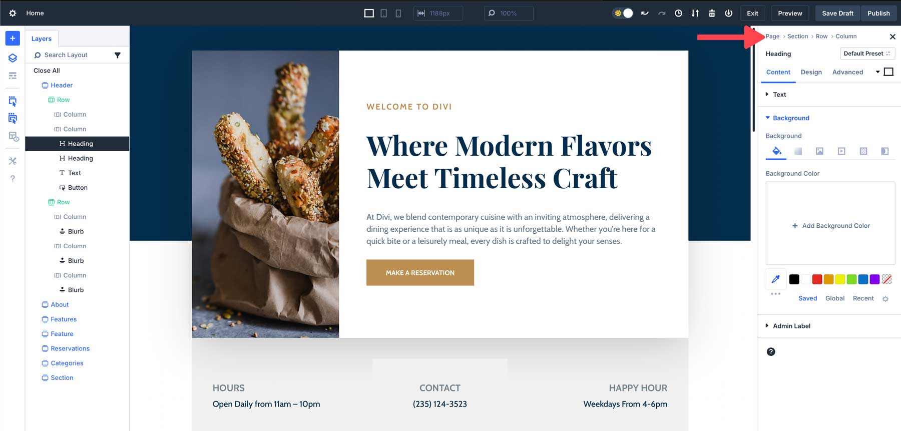
Navigating through the nested settings of a module in Divi 4 often left users confused about where they were. Without a clear path back, it was easy to get lost while making adjustments, especially in more complex designs. Divi 5 introduces a new feature: breadcrumbs in the settings panel. This small but helpful addition makes it much easier to navigate through different layers of settings, especially when working with complex modules.
How It Works:
Breadcrumbs appear at the top of the settings panel, showing you the hierarchy of the settings you’re currently viewing. You can quickly jump back to previous levels by clicking on the breadcrumb links, allowing faster navigation without losing your place.
Benefits:
Breadcrumbs make navigating through complex module settings faster and more intuitive, reducing the time spent backtracking or searching for specific options. There’s no need to close or re-open various settings. Simply click the area you wish to edit, and Divi will quickly open the module you want to edit without hassle.
Real-Life Example:
Imagine you’re editing a pricing table module with multiple tiers and settings for each. In Divi 4, you might find yourself clicking through multiple panels and losing track of where you are. With Divi 5, breadcrumbs guide you back through the settings, making it easier to jump between different pricing tiers and quickly make adjustments.
Canvas Scaling
The ability to scale the canvas is one of Divi 5’s most useful additions for users working on responsive designs. In Divi 4, designing for different screen sizes could be cumbersome. Users often had to resize their browser window or switch views manually to see how their design would look on smaller devices, adding unnecessary steps to the process.
How It Works:
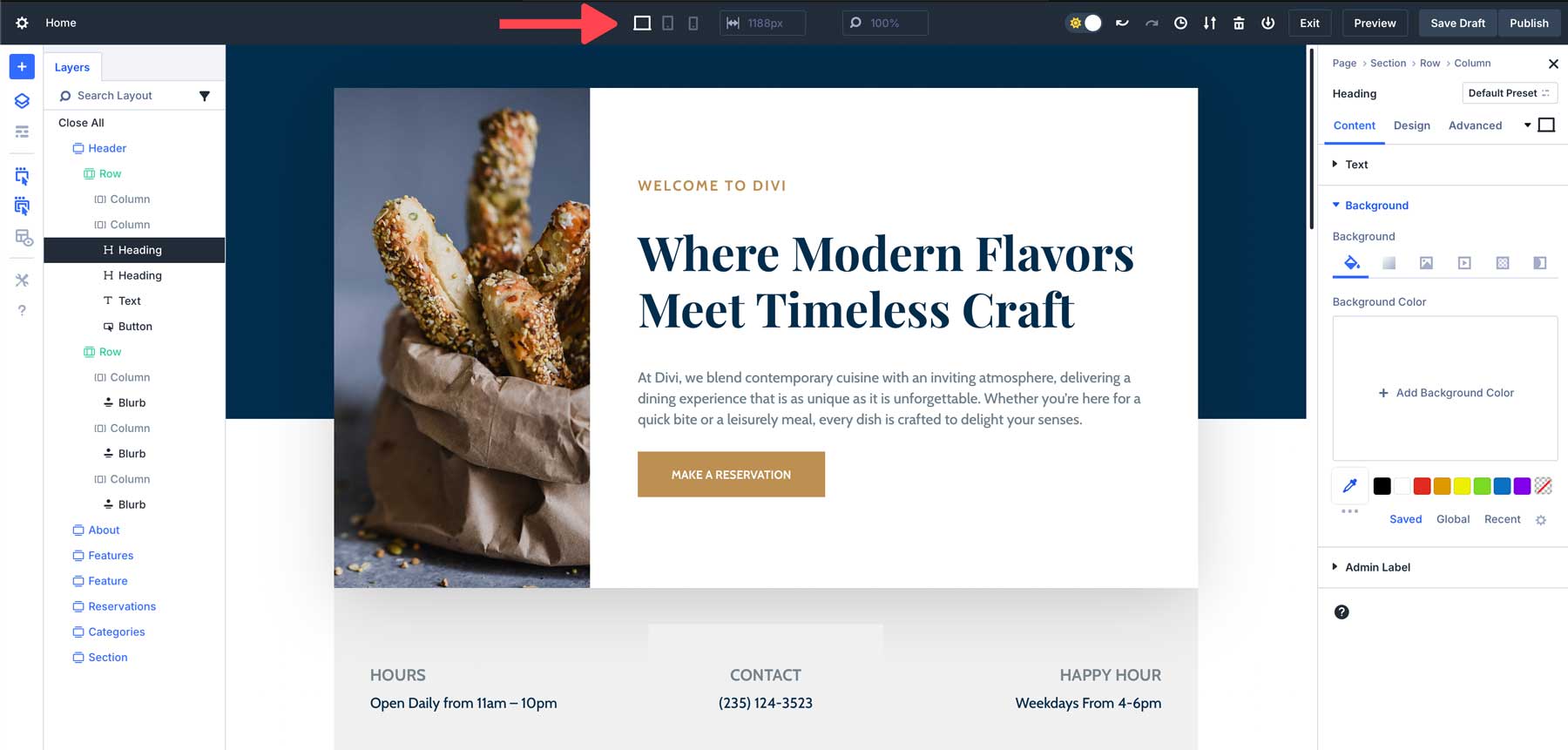
Divi 5 allows you to scale the canvas directly in the builder. You can adjust the size of the canvas to see how your design looks at different breakpoints without needing to resize your browser window.
With canvas scaling, you can quickly switch between desktop, tablet, and mobile views, adjusting your design in real time to ensure it looks perfect on every screen. This saves you time and eliminates the guesswork, making responsive design faster and more intuitive.
Benefits:
This is especially useful for designing responsive layouts, as it allows you to make real-time adjustments without having to constantly switch between devices or breakpoints. With the ability to zoom in and out, users have better control over the design elements or get an overview of the entire web page instantly.
Real-Life Example:
If you’re designing a home page that needs to look good on both desktop and mobile, you can scale the canvas in Divi 5 to preview how your design will look on a mobile device without needing to adjust your browser window or leave the builder. This makes responsive design faster and more accurate.
Smaller Docked Panels & No Overlap
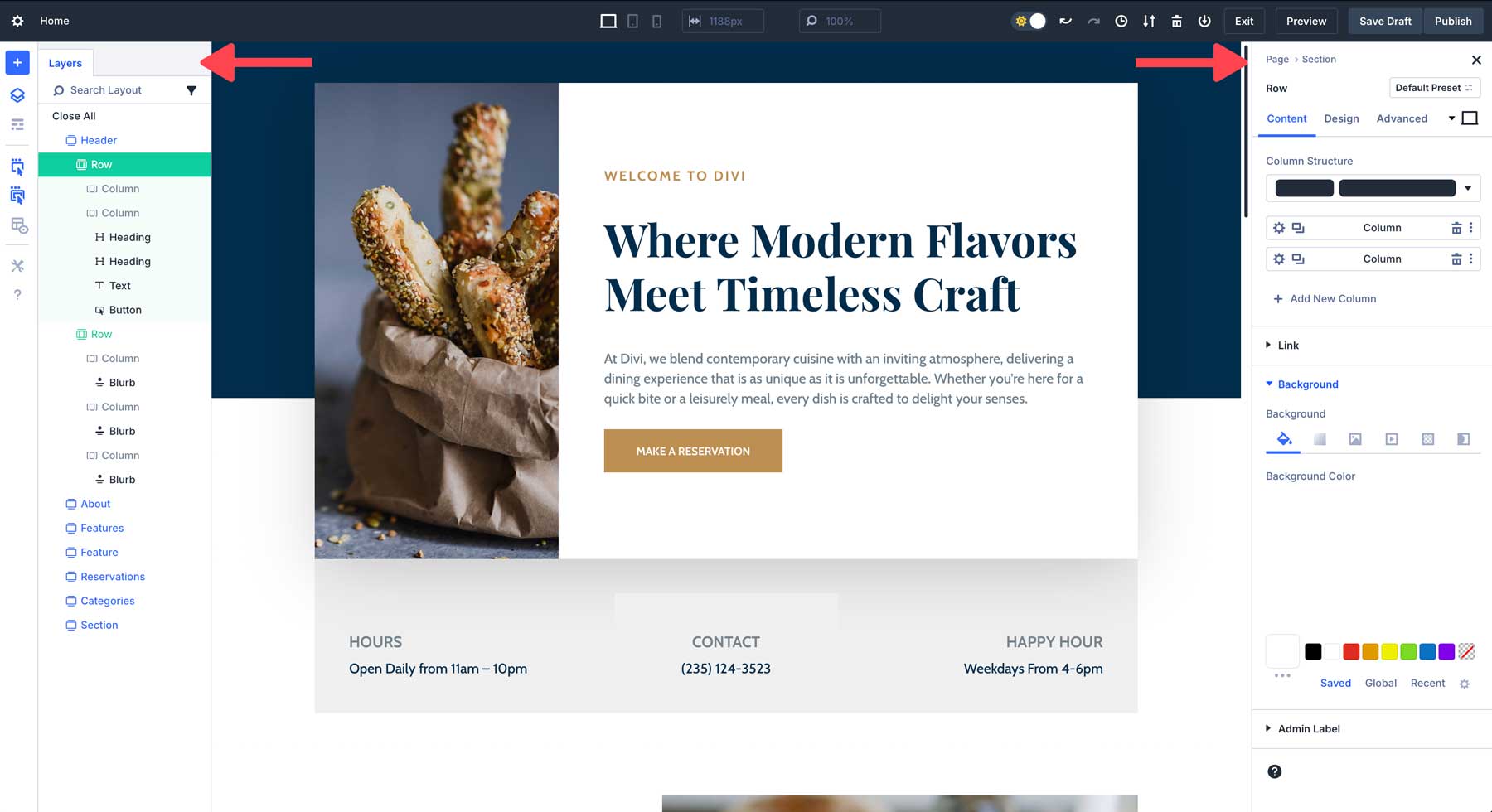
One of Divi 5’s most notable improvements is the introduction of smaller, docked panels, designed to eliminate the constant interruption caused by modal windows. Previously, users had to deal with modals that opened and closed frequently, often getting in the way and requiring adjustments to see the full layout. Divi 5 solves this with a cleaner, more streamlined approach.
How It Works:
The new, smaller, docked panels in Divi 5 provide a more efficient way to interact with the Visual Builder. Instead of large, floating modals that obstruct your view, Divi 5 introduces a compact docked panel system. Panels are anchored to the sides of the builder interface, ensuring they don’t interfere with your workspace.
Benefits:
By using docked panels, users prevent constant disruptions to their workflow. Settings are always visible, allowing you to quickly make changes without unnecessary clicks or navigation. Not only that, docked panels provide a cleaner, more organized workspace. You can manage multiple tasks, dock multiple panels at once, and easily switch between different tools and settings to make you a more efficient designer.
Real-Life Example:
Imagine that you’re working on a complex layout for a grocery store. Your task involves changing multiple sections, adjusting colors, adding animations, and ensuring the design is responsive. By unflattering your workspace, you can focus more on the tasks rather than closing intrusive modals as you work.
Lean, Mean, & Animation Free
Divi 5 is designed to be lean, mean, and animation-free by stripping away anything that doesn’t directly benefit the user. Instead of being weighed down by unnecessary features or flashy effects, Divi 5 focuses purely on performance and usability.
How It Works:
Divi 5 has been rebuilt from the ground up, focusing on eliminating bloated, outdated code. The result is a faster, more efficient builder that delivers smoother performance while reducing load times and server resources. Instead of relying on distracting animations, the focus is on allowing content to take center stage. Because of this approach, the Visual Builder loads faster and provides a clean, professional user experience.
Benefits:
The Divi 5 interface is intuitive, responsive, and only provides tools that are necessary for building and customizing websites. The Visual Builder is there to help designers create stunning websites, not to compete with the content they are creating.
Real-Life Example:
Imagine being tasked with building a website for a local restaurant. The client doesn’t have a big budget, so you have to be more efficient to make a good profit. By utilizing Divi 5 to build your site, you’ll save time using a faster, more streamlined builder that allows you to design the site without distracting animations or a laggy building experience.
Speed & Performance
Divi 5 has undergone a significant performance overhaul, resulting in a much faster and smoother Visual Builder experience than Divi 4. This improved experience brings faster loading times, improved re-rendering speeds, and eliminates unnecessary animations in the builder that slow it down.
How It Works:
The underlying architecture of Divi 5 has been completely reworked through a complete framework overhaul to optimize performance and responsiveness. It accomplishes this by reducing JavaScript load, meaning only necessary scripts are loaded. Divi 5 no longer relies on shortcodes; rather, it is block-based to make things faster.
Benefits:
With a new framework in place, the Visual Builder loads almost instantly, eliminating double loading while improving re-rendering. Changes to modules, rows, or sections appear immediately. The Visual Builder also reacts faster to switching between responsive views, handles complex layouts better, and allows users to see design adjustments in real time.
Real-Life Example:
Imagine editing a long-form landing page with complex animations and code. In Divi 4, you might experience lag when making design changes, especially when switching between responsive view modes or adding new modules. In Divi 5, the process is much smoother and more responsive, allowing you to focus on the design without interruptions.
Comparison To Divi 4
While Divi 5 introduces various interface enhancements, it’s important to see how these changes compare to the previous version. Let’s look at some of the key improvements in Divi 5 over Divi 4:
One-Click Editing vs Icon-Based Editing:
In Divi 4, you had to click on small icons to access module settings, which could be hard to find or overlapped by other elements.
Divi 5 simplifies this process with one-click editing. You can click anywhere on the module to access its settings.
Right-Click Menus vs Layered Options:
Divi 4 required users to navigate through multiple layers of settings to find the controls they needed.
In Divi 5, the right-click menu allows instant access to settings, improving efficiency and speeding up the design process.
Tabbed Panels & Multi-Panel Docking:
Divi 4 had a single-panel setup, which could make working with multiple settings cumbersome.
Divi 5 introduces multi-panel docking and tabbed panels, enabling users to multitask and manage complex designs more easily.
Light Mode & Dark Mode:
Divi 4 only offers light mode, while Divi 5 introduces both light and dark modes, providing a more comfortable editing environment based on user preference and lighting conditions.
Canvas Scaling For Responsive Design:
In Divi 4, resizing your browser was necessary to preview responsive designs. Divi 5 makes this process more efficient by allowing you to scale the canvas directly within the builder, making responsive design adjustments faster and more accurate.
Responsive, Hover, and Sticky Editing:
In Divi 4, these modes have to be enabled individually, requiring more steps (and time).
Divi 5 streamlines these processes by making them readily available without the need to activate them at the option level.
Smaller Docked Panels & No Overlap
In Divi 4, modals would appear anytime you want to make adjustments to the design, making the interface cluttered, often requiring users to move them to work on their designs.
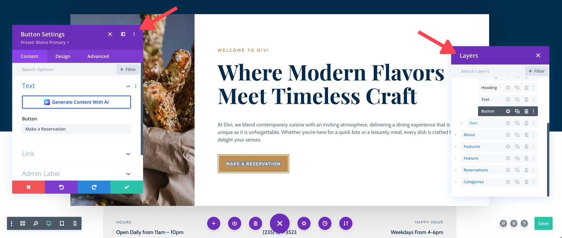
In Divi 5, panels are docked on either side of the page, making it easier to focus on the design you are working on.
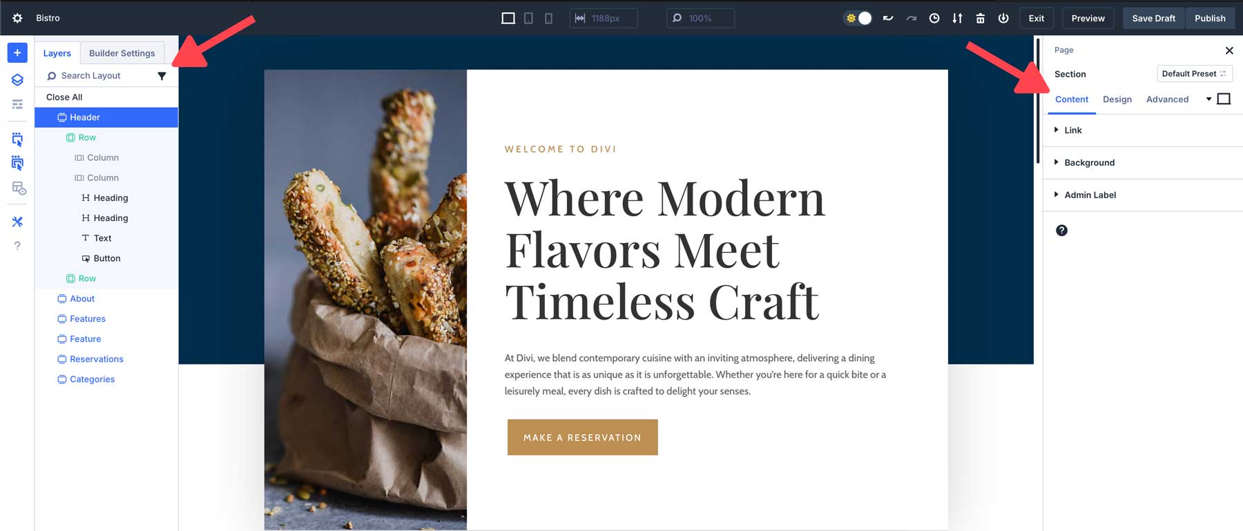
Lean, Mean, & Animation Free Interface
In Divi 4, the interface is riddled with clunky animations that can slow the Visual Builder down. This can be distracting and take away from the design experience.
In Divi 5, these have been all stripped away to reveal a clean, fast interface without animations or distractions.
Performance & Speed:
In Divi 4, the Visual Builder is iconic, but sometimes feels a bit slow, especially when switching between view modes.
In Divi 5, the speed and responsiveness of the Visual Builder are faster, with the re-rendering of elements being a much quicker, more fluid experience.
How These Changes Impact Workflow
The interface changes in Divi 5 are designed to streamline your workflow and make the design process more efficient. Here are some examples of how these improvements translate into real-world benefits:
Faster Editing With One-Click & Right-Click Controls:
The one-click editing and right-click menu drastically reduce the time spent navigating through menus. For example, if you’re working on a page with multiple modules, you can now quickly access settings by simply right-clicking or clicking directly on the module. This means less time spent looking for options and more time designing.
Improved Multitasking With Dockable Panels:
Multi-panel docking makes it easier to work on multiple settings at once. For instance, you can keep the design settings for one module open while adjusting another, allowing you to efficiently handle complex designs without constantly switching between settings panels.
Better Organization With Tabbed Panels:
Tabbed panels are particularly useful when working on large projects with multiple design elements. You can organize your settings into tabs, which helps keep your workspace clean and minimizes the need for scrolling or switching between options.
Comfortable Editing With Light & Dark Mode:
Switching between light and dark mode allows for a more comfortable editing experience. Whether you’re working in a bright or dim environment, Divi 5 adapts to your needs, reducing eye strain and improving focus during long design sessions.
Responsive Design Made Easier With Canvas Scaling:
Canvas scaling is a huge time-saver when working on responsive layouts. Instead of constantly resizing your browser window to preview designs at different breakpoints, you can adjust the canvas directly within the builder, making it easier to create responsive websites that look great on any device.
These changes, while subtle, make a significant difference in how you interact with Divi and ultimately speed up the overall design process.
What’s Coming Next…
As we wrap up this exploration of the Divi 5 interface, stay tuned for our next posts. We’ll explore how the rewritten Divi framework dramatically reduces load times, enhances server response, and optimizes the user experience across the board.
You won’t want to miss the speed and performance boosts that make Divi 5 a game-changer for building lightning-fast websites.
For many Divi 4 users, creating beautiful websites sometimes involved frustrating moments—clicking on tiny icons, navigating through layers of menus, and juggling multiple settings. Divi 5 changes all of that. With a focus on speed, simplicity, and usability, it introduces a range of interface improvements that will make your design workflow smoother than ever before.
Explore the new Divi 5 interface and see how it transforms those old frustrations into a faster, more intuitive experience!
Conclusion: The Promise Of a Better Design Experience
Divi 5’s interface changes are more than just new features. They are solutions to the everyday frustrations that many users face in Divi 4. For example, Divi 5 offers faster and more intuitive editing with one-click and right-click controls. Additionally, the workspace is more organized and flexible, with dockable panels and breadcrumbs. As a result, Divi 5 is designed to make your workflow smoother and more enjoyable.
With the addition of dark mode for comfortable editing at any time, Divi 5 ensures you can create stunning websites faster and more efficiently than ever before. In addition, canvas scaling for effortless responsive design further enhances the website creation process.
The post Getting To Know The Divi 5 Interface: 10 Changes & Improvements appeared first on Elegant Themes Blog.
The Tech Zone
Comments
Post a Comment